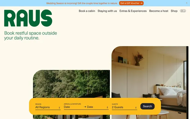
Preview image. Unlock full-res
Warm rustic minimalism: soft natural tones meet crisp, understated typography.
Color palette
Brand logo, primary text elements where emphasis is needed, subtle accents
Yellow wash for highlight backgrounds, decorative bands, and soft emphasis behind content. Do not promote it to the primary CTA color
Soft background for informational sections or subtle highlights, providing a cool contrast
Primary action button background, highlight text for important messages, icon fills — a vivid, earthy accent
Primary text, deep gray backgrounds for secondary buttons and interactive elements, prominent borders
Clean canvas for cards and UI elements, text on dark backgrounds, active indicator borders
Typography
- Weights
- 300, 400
- Sizes
- 12px, 14px, 16px, 18px, 22px, 36px, 40px
- Line height
- 0.95, 1, 1.15, 1.18, 1.22, 1.29, 1.33
- Letter spacing
- -0.02, -0.015, -0.01, -0.005
- Fallback
- Helvetica Neue
All primary interface text, navigation, body copy, and most headings. Its varied weights and negative letter-spacing contribute to a precise, elegant feel.
- Weights
- 300
- Sizes
- 22px, 28px, 36px, 40px
- Line height
- 0.95, 1, 1.07, 1.18
- Letter spacing
- -0.02, -0.015, -0.01
- Fallback
- PT Sans Caption
Used sparingly for prominent headings, specifically at lighter weights to convey a sense of understated importance rather than overt loudness.
Spacing & shape
Components
Filled with Charred Orange (#dd5000), text in Vanilla Cream (#ffffff), 12px border-radius, 10px horizontal padding. A vibrant, inviting button.
Filled with Midnight Pine (#23212c), text in Vanilla Cream (#ffffff), 20px border-radius, 20px horizontal padding. Dark, solid, and reliable.
Transparent background, text in Midnight Pine (#23212c), no border-radius defined, no explicit padding. Blends seamlessly with content.
Transparent background, text in Charred Orange (#dd5000), 12px border-radius, no horizontal padding, 1px solid Charred Orange border. A distinct outlined button.
Background in Vanilla Cream (#ffffff), 20px border-radius, 20px padding on all sides. Creates a soft, raised surface.
Background in Sunflower Gold (#fcbd1c), 40px border-radius, 48px horizontal padding. A highly visible and inviting yellow block with significant rounding.
Midnight Pine (#23212c) text, typically 16px, transparent background. Active state is subtly indicated by a 99px border-radius for pill-like highlight (not explicitly filled).
Default border color is light gray (implied from #23212c usage as border), placeholder text uses Midnight Pine (#23212c). Underlined style suggests minimal boxing.
Guidelines
- Use Midnight Pine (#23212c) for most text and solid backgrounds on secondary buttons, maintaining a grounded feel.
- Apply Forest Green (#006434) exclusively for the brand logo and specific text links where core identity is reinforced.
- Prioritize Charred Orange (#dd5000) for primary action buttons to create a clear, warm focal point.
- Utilize Sunflower Gold (#fcbd1c) as a background for interactive form sections to make them playfully prominent.
- Ensure all cards and many buttons use a soft 20px border-radius to maintain approachability and organic feel.
- For headlines, pair `neue-haas-unica` or `fonts` at weight 300 with negative letter-spacing for refined, understated presence.
- Maintain generous padding of 20px around card content and 48px horizontally in key interactive cards like the search form.
- Avoid using multiple vivid accent colors together; stick to Charred Orange (#dd5000) for primary actions and Sunflower Gold (#fcbd1c) for background blocks.
- Do not use sharp 0px border-radii for any surfaced components; all interactive and content blocks should feature soft rounding.
- Do not introduce heavy shadows; surfaces should primarily rely on background color differences and subtle borders for distinction.
- Refrain from using Forest Green (#006434) for large blocks of text or general UI elements; reserve it for distinct brand marks and key links.
- Do not use bold-weight typography for main headings; the system relies on lighter weights (300) with generous tracking for elegance.
- Avoid tight spacing between elements within cards; use at least 20px padding for comfort.
- Do not use generic system fonts; `neue-haas-unica` and `fonts` are critical for the brand's typographic identity.
About this system
ShowHide
Raus employs a serene wilderness-retreat visual language: naturalistic colors, soft rounded forms, and compact typography that blends seamlessly with rich photography of cabins and nature. The overall impression is one of grounded tranquility with moments of playful vibrancy. Components feature subtle elevation and generous padding, creating a comfortable, inviting experience.
The page maintains a contained layout within an inferred maximum width, centered on a warm, off-white canvas. The hero section features a large, left-aligned headline contrasting with full-width, organically shaped photographic elements. Content sections alternate between visually engaging image cards and text blocks, often with a 2-column arrangement. Card grids are prominent for presenting content like journal entries. Vertical spacing is generous and comfortable, creating a relaxed flow. The top navigation is a fixed header with left-aligned brand logo and right-aligned links. The overall density feels spacious and intentional, guiding the eye through a narrative of tranquil retreats.
The site uses high-quality, authentic photography of small, modern cabins in natural settings, often with lush greenery or expansive views. Images are typically full-bleed within card components, featuring organic, rounded-corner masking. The focus is on rustic yet comfortable lifestyle and the natural environment, rather than posed models or abstract concepts. Illustrations are minimal, primarily consisting of outlined icons (e.g., arrows) that match the precise typographic style. Photography is the primary visual storytelling mechanism, used to evoke a sense of quiet escape and natural beauty, occupying significant visual space.
Reminiscent of Airbnb (early designs), Offseason, Cabinfolk, Getaway.
# Raus — Style Reference
> Warm rustic minimalism: soft natural tones meet crisp, understated typography.

**Theme:** light

**Site:** https://www.raus.life

Raus employs a serene wilderness-retreat visual language: naturalistic colors, soft rounded forms, and compact typography that blends seamlessly with rich photography of cabins and nature. The overall impression is one of grounded tranquility with moments of playful vibrancy. Components feature subtle elevation and generous padding, creating a comfortable, inviting experience.

## Tokens — Colors

| Name | Value | Token | Role |
|------|------|------|------|
| Forest Green | `#006434` | `--color-forest-green` | Brand logo, primary text elements where emphasis is needed, subtle accents |
| Sunflower Gold | `#fcbd1c` | `--color-sunflower-gold` | Yellow wash for highlight backgrounds, decorative bands, and soft emphasis behind content. Do not promote it to the primary CTA color |
| Sky Mist | `#a6dfff` | `--color-sky-mist` | Soft background for informational sections or subtle highlights, providing a cool contrast |
| Charred Orange | `#dd5000` | `--color-charred-orange` | Primary action button background, highlight text for important messages, icon fills — a vivid, earthy accent |
| Midnight Pine | `#23212c` | `--color-midnight-pine` | Primary text, deep gray backgrounds for secondary buttons and interactive elements, prominent borders |
| Vanilla Cream | `#ffffff` | `--color-vanilla-cream` | Clean canvas for cards and UI elements, text on dark backgrounds, active indicator borders |

## Tokens — Typography

### neue-haas-unica
- **Substitute:** Helvetica Neue
- **Weights:** 300, 400
- **Sizes:** 12px, 14px, 16px, 18px, 22px, 36px, 40px
- **Line height:** 0.95, 1, 1.15, 1.18, 1.22, 1.29, 1.33
- **Letter spacing:** -0.02, -0.015, -0.01, -0.005
- **Role:** All primary interface text, navigation, body copy, and most headings. Its varied weights and negative letter-spacing contribute to a precise, elegant feel.

### fonts
- **Substitute:** PT Sans Caption
- **Weights:** 300
- **Sizes:** 22px, 28px, 36px, 40px
- **Line height:** 0.95, 1, 1.07, 1.18
- **Letter spacing:** -0.02, -0.015, -0.01
- **Role:** Used sparingly for prominent headings, specifically at lighter weights to convey a sense of understated importance rather than overt loudness.

## Tokens — Type Scale

Minor Third (1.2) from 16px base.

| Role | Size | Line height | Letter spacing |
|------|------|------|------|
| caption | 12px | 1.22 | -0.24px |
| body-sm | 14px | 1.18 | -0.28px |
| body | 16px | 1.15 | -0.32px |
| subheading | 18px | 1.33 | -0.36px |
| heading | 22px | 1 | -0.44px |
| heading-lg | 36px | 1.07 | -0.54px |
| display | 40px | 0.95 | -0.6px |

## Tokens — Spacing

- **Section gap:** 192px
- **Card padding:** 20px
- **Element gap:** 20px

## Tokens — Radius

- **Buttons:** 20px
- **Cards:** 20px
- **circularElements:** 72px
- **formFields:** 12px
- **navigation:** 99px
- **smallElements:** 4px

## Layout

The page maintains a contained layout within an inferred maximum width, centered on a warm, off-white canvas. The hero section features a large, left-aligned headline contrasting with full-width, organically shaped photographic elements. Content sections alternate between visually engaging image cards and text blocks, often with a 2-column arrangement. Card grids are prominent for presenting content like journal entries. Vertical spacing is generous and comfortable, creating a relaxed flow. The top navigation is a fixed header with left-aligned brand logo and right-aligned links. The overall density feels spacious and intentional, guiding the eye through a narrative of tranquil retreats.

## Imagery

The site uses high-quality, authentic photography of small, modern cabins in natural settings, often with lush greenery or expansive views. Images are typically full-bleed within card components, featuring organic, rounded-corner masking. The focus is on rustic yet comfortable lifestyle and the natural environment, rather than posed models or abstract concepts. Illustrations are minimal, primarily consisting of outlined icons (e.g., arrows) that match the precise typographic style. Photography is the primary visual storytelling mechanism, used to evoke a sense of quiet escape and natural beauty, occupying significant visual space.

## Components

### Primary Action Button (Charred Orange)
*Key calls to action requiring immediate attention.*

Filled with Charred Orange (#dd5000), text in Vanilla Cream (#ffffff), 12px border-radius, 10px horizontal padding. A vibrant, inviting button.

### Secondary Action Button (Midnight Pine)
*General purpose actions, typically less prominent than primary actions.*

Filled with Midnight Pine (#23212c), text in Vanilla Cream (#ffffff), 20px border-radius, 20px horizontal padding. Dark, solid, and reliable.

### Ghost Button (Midnight Pine)
*Subtle actions or navigation links that appear as text.*

Transparent background, text in Midnight Pine (#23212c), no border-radius defined, no explicit padding. Blends seamlessly with content.

### Gift Voucher Button (Charred Orange Outline)
*Call to action specifically for gift vouchers, using brand color as an outline.*

Transparent background, text in Charred Orange (#dd5000), 12px border-radius, no horizontal padding, 1px solid Charred Orange border. A distinct outlined button.

### Information Card (Vanilla Cream)
*Container for content sections like articles or feature descriptions.*

Background in Vanilla Cream (#ffffff), 20px border-radius, 20px padding on all sides. Creates a soft, raised surface.

### Search Form Card (Sunflower Gold)
*Prominent interactive elements for searching or filtering.*

Background in Sunflower Gold (#fcbd1c), 40px border-radius, 48px horizontal padding. A highly visible and inviting yellow block with significant rounding.

### Navigation Link
*Primary site navigation items.*

Midnight Pine (#23212c) text, typically 16px, transparent background. Active state is subtly indicated by a 99px border-radius for pill-like highlight (not explicitly filled).

### Input Field
*User input fields within forms.*

Default border color is light gray (implied from #23212c usage as border), placeholder text uses Midnight Pine (#23212c). Underlined style suggests minimal boxing.

## Guidelines

### Do

- Use Midnight Pine (#23212c) for most text and solid backgrounds on secondary buttons, maintaining a grounded feel.
- Apply Forest Green (#006434) exclusively for the brand logo and specific text links where core identity is reinforced.
- Prioritize Charred Orange (#dd5000) for primary action buttons to create a clear, warm focal point.
- Utilize Sunflower Gold (#fcbd1c) as a background for interactive form sections to make them playfully prominent.
- Ensure all cards and many buttons use a soft 20px border-radius to maintain approachability and organic feel.
- For headlines, pair `neue-haas-unica` or `fonts` at weight 300 with negative letter-spacing for refined, understated presence.
- Maintain generous padding of 20px around card content and 48px horizontally in key interactive cards like the search form.

### Don't

- Avoid using multiple vivid accent colors together; stick to Charred Orange (#dd5000) for primary actions and Sunflower Gold (#fcbd1c) for background blocks.
- Do not use sharp 0px border-radii for any surfaced components; all interactive and content blocks should feature soft rounding.
- Do not introduce heavy shadows; surfaces should primarily rely on background color differences and subtle borders for distinction.
- Refrain from using Forest Green (#006434) for large blocks of text or general UI elements; reserve it for distinct brand marks and key links.
- Do not use bold-weight typography for main headings; the system relies on lighter weights (300) with generous tracking for elegance.
- Avoid tight spacing between elements within cards; use at least 20px padding for comfort.
- Do not use generic system fonts; `neue-haas-unica` and `fonts` are critical for the brand's typographic identity.

## Agent Prompt Guide

Quick Color Reference:
text: #23212c
background: #fcf5e9
border: #23212c
accent: #006434
primary action: #23212c (filled action)

Example Component Prompts:
Create a hero section: Canvas Background (#fcf5e9). Headline 'Book restful space outside your daily routine.' using fonts weight 300, 40px, Midnight Pine (#23212c), letter-spacing -0.6px. Below it, an image card with content padding 20px, 20px radius, image showcasing a cabin in nature.
Create a Primary Action Button: #23212c background, #ffffff text, 9999px radius, compact pill padding. Use this filled treatment for the main CTA.
Create a blog post card: Panel Background (#ffffff), 20px radius, 20px all-side padding. Features a full-bleed natural photo with rounded top, followed by body-sm text 'PERSPECTIVES' in Midnight Pine (#23212c), and a subheading 'Anne-Christin shares: her time in a design cabin' using neue-haas-unica weight 400, 22px, Forest Green (#006434).
More like this







Keep what you find
A free account saves references to boards and can send you a weekly email of picks based on what you save.
To see every result, go Pro.