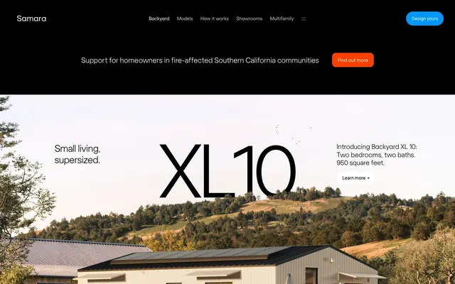
Preview image. Unlock full-res
Sunlit architectural model. The design combines the precision of a blueprint with the warmth and airiness of natural light.
Color palette
Primary CTAs, interactive links, iconography — a single point of vivid color signifying action.
Secondary high-visibility CTAs, often used in dark contexts for urgent calls to action.
Product visualization accents within text blocks.
Headlines, body text, UI labels.
Text on dark or colored backgrounds, button text.
Primary page background, giving a warm, tactile feel.
Card backgrounds.
Button surfaces for secondary or tertiary actions.
Decorative elements, disabled states.
Subtle borders, placeholder text.
Secondary text, metadata.
Typography
- Weights
- 400 (aliased as 'light', 'book', 'regular')
- Sizes
- 12px, 13px, 14px, 15px, 16px, 18px, 21px, 23px, 29px, 30px, 36px, 43px, 48px, 60px, 96px
- Line height
- 0.9, 0.96, 1, 1.1, 1.12, 1.14, 1.16, 1.2, 1.25, 1.28, 1.33, 1.49, 1.5, 1.6
- Fallback
- Plus Jakarta Sans, Manrope
The signature font for the entire system. The 'light' variant is used for large, airy headlines, creating a distinctive look of understated confidence. 'Book' and 'regular' weights are for body copy and UI text. Tight negative letter-spacing is applied at larger sizes, enhancing its geometric precision.
Spacing & shape
Elevation
Components
Background: #0096f7 (Sky Blue). Text: #ffffff (Pure White). Padding: 14px. Radius: 12px. Font: regola, 14-15px.
Background: #ff4000 (Signal Orange). Text: #ffffff (Pure White). Padding: ~8px 18px. Radius: 12px.
Background: rgba(0, 0, 0, 0.04). Text: #000000 (Ink). Radius: 24px. Padding may vary, often used for text links.
Background: #f7f7f0 (darker Parchment). Radius: 12px. Shadow: `rgba(0, 0, 0, 0.2) 0px 2px 4px 0px`. Contains its own padded content.
Background: #f5f2de (Warm Sand). Radius: 18px. Shadow: `rgba(0, 0, 0, 0.12) 0px 0.5px 2px 0px`. Padding: 36px.
Background: rgba(0, 0, 0, 0.03). Border: 1px solid rgba(0, 0, 0, 0.1). Radius: 12px. Padding: 15px. Text: #000000 (Ink).
Initial state: Black (#000000) background with white text and a Sky Blue or Signal Orange CTA. Scrolls to a transparent or white background integrated with the main page content.
Uses `display` or `heading-lg` typography with small, floating product models (e.g., houses) interspersed within the text flow, creating a dynamic, informational headline.
Guidelines
- Use `regola-light` with tight negative letter-spacing for all headlines above 30px.
- Set the primary page background to #fdfdf7 (Parchment), never pure #ffffff.
- Reserve the vibrant #0096f7 (Sky Blue) for primary interactive elements like CTAs and links.
- Apply a consistent 12px border-radius to almost all buttons, inputs, and cards.
- Employ generous whitespace (96px-120px) between major content sections.
- Use subtle, short shadows like `rgba(0, 0, 0, 0.12) 0px 0.5px 2px 0px` to gently lift elements.
- Mix large, airy typography with high-quality product photography and clean 3D renders.
- Don't use pure white (#ffffff) for large background areas.
- Don't use bold or heavy font weights for headlines; use size and light weight instead.
- Don't use sharp 0px corners on primary UI components like buttons and cards.
- Don't use a busy color palette; stick to the core Parchment/Ink/Sky Blue system.
- Don't use strong, deep, or colored shadows.
- Don't neglect typography details; specific letter-spacing and line-height values are critical.
- Don't place elements close together; the design relies on spaciousness.
About this system
ShowHide
The design feels like an architectural plan rendered on warm, premium paper. It establishes authority through restraint, using vast negative space and a whisper-thin display font (Regola Light) for headlines, making them feel expansive and considered rather than loud. The palette is strictly controlled: a warm off-white (#fdfdf7) background, black ink for text, and a single, vibrant Sky Blue (#0096f7) for all primary actions. This creates a calm, focused environment where the product—modern, livable spaces—is the hero. Soft 12px radii on cards and buttons provide a touch of organic friendliness to the otherwise precise, geometric typography.
The layout is built on a centered, max-width container of approximately 1280px, creating generous white space on either side. The page begins with a full-bleed hero image or a dark banner with overlaid text, transitioning to a vertical stack of content sections on the warm Parchment background. Section breaks are defined by large vertical gaps (96-120px) rather than visual dividers, creating a calm, unhurried rhythm. Content is arranged in simple, centered 1-column stacks for narrative and 2- or 3-column grids for feature breakdowns.
The visual language is a dichotomy of warm aspiration and clean objectivity. Product photography is dominant, featuring the homes in bright, natural, sunlit environments, often surrounded by nature to evoke a feeling of peaceful, premium living. This is contrasted with clean, isolated 3D product renders embedded directly within text blocks, which serve to explain features with technical clarity. All imagery is contained within sharp-edged containers or cards with a soft 12px radius; there are no abstract or decorative graphics.
Reminiscent of Oura, Tonal, Anyone, Rivian.
# Samara — Style Reference
> Sunlit architectural model. The design combines the precision of a blueprint with the warmth and airiness of natural light.

**Theme:** light

**Site:** https://samara.com

The design feels like an architectural plan rendered on warm, premium paper. It establishes authority through restraint, using vast negative space and a whisper-thin display font (Regola Light) for headlines, making them feel expansive and considered rather than loud. The palette is strictly controlled: a warm off-white (#fdfdf7) background, black ink for text, and a single, vibrant Sky Blue (#0096f7) for all primary actions. This creates a calm, focused environment where the product—modern, livable spaces—is the hero. Soft 12px radii on cards and buttons provide a touch of organic friendliness to the otherwise precise, geometric typography.

## Tokens — Colors

| Name | Value | Token | Role |
|------|------|------|------|
| Sky Blue | `#0096f7` | `--color-sky-blue` | Primary CTAs, interactive links, iconography — a single point of vivid color signifying action. |
| Signal Orange | `#ff4000` | `--color-signal-orange` | Secondary high-visibility CTAs, often used in dark contexts for urgent calls to action. |
| Evergreen | `#375033` | `--color-evergreen` | Product visualization accents within text blocks. |
| Ink | `#000000` | `--color-ink` | Headlines, body text, UI labels. |
| Pure White | `#ffffff` | `--color-pure-white` | Text on dark or colored backgrounds, button text. |
| Parchment | `#fdfdf7` | `--color-parchment` | Primary page background, giving a warm, tactile feel. |
| Warm Sand | `#f5f2de` | `--color-warm-sand` | Card backgrounds. |
| Driftwood | `#e7e3e1` | `--color-driftwood` | Button surfaces for secondary or tertiary actions. |
| Ash | `#d3d3d3` | `--color-ash` | Decorative elements, disabled states. |
| Stone | `#999999` | `--color-stone` | Subtle borders, placeholder text. |
| Graphite | `#666666` | `--color-graphite` | Secondary text, metadata. |

## Tokens — Typography

### regola
- **Substitute:** Plus Jakarta Sans, Manrope
- **Weights:** 400 (aliased as 'light', 'book', 'regular')
- **Sizes:** 12px, 13px, 14px, 15px, 16px, 18px, 21px, 23px, 29px, 30px, 36px, 43px, 48px, 60px, 96px
- **Line height:** 0.9, 0.96, 1, 1.1, 1.12, 1.14, 1.16, 1.2, 1.25, 1.28, 1.33, 1.49, 1.5, 1.6
- **Role:** The signature font for the entire system. The 'light' variant is used for large, airy headlines, creating a distinctive look of understated confidence. 'Book' and 'regular' weights are for body copy and UI text. Tight negative letter-spacing is applied at larger sizes, enhancing its geometric precision.

## Tokens — Type Scale

Major Third (1.25) from 18px base.

| Role | Size | Line height | Letter spacing |
|------|------|------|------|
| caption-sm | 12px | 1.5 | -0.48px |
| caption | 14px | 1.5 | -0.56px |
| body-sm | 16px | 1.49 | -0.22px |
| body | 18px | 1.33 | -0.18px |
| body-lg | 23px | 1.25 | -0.46px |
| subheading | 30px | 1.14 | -0.9px |
| heading-sm | 36px | 1.1 | -0.5px |
| heading | 48px | 1 | -1.3px |
| heading-lg | 60px | 0.96 | -2.46px |
| display | 96px | 0.9 | -4.51px |

## Tokens — Spacing

- **Max width:** 1280px

## Tokens — Radius

- **Buttons:** 12px
- **Inputs:** 12px
- **Cards:** 12px
- **pills:** 24px
- **specialtyCards:** 18px

## Tokens — Elevation

- **Subtle Card/Button:** `rgba(0, 0, 0, 0.12) 0px 0.5px 2px 0px`
- **Elevated Card:** `rgba(0, 0, 0, 0.2) 0px 2px 4px 0px`
- **Hover/Active Interaction:** `rgba(0, 0, 0, 0.08) 0px 2px 10px 0px`

## Layout

The layout is built on a centered, max-width container of approximately 1280px, creating generous white space on either side. The page begins with a full-bleed hero image or a dark banner with overlaid text, transitioning to a vertical stack of content sections on the warm Parchment background. Section breaks are defined by large vertical gaps (96-120px) rather than visual dividers, creating a calm, unhurried rhythm. Content is arranged in simple, centered 1-column stacks for narrative and 2- or 3-column grids for feature breakdowns.

## Imagery

The visual language is a dichotomy of warm aspiration and clean objectivity. Product photography is dominant, featuring the homes in bright, natural, sunlit environments, often surrounded by nature to evoke a feeling of peaceful, premium living. This is contrasted with clean, isolated 3D product renders embedded directly within text blocks, which serve to explain features with technical clarity. All imagery is contained within sharp-edged containers or cards with a soft 12px radius; there are no abstract or decorative graphics.

## Components

### Alert Banner

### Button Group

### Model Feature Card

### Primary Button
*The main call-to-action button.*

Background: #0096f7 (Sky Blue). Text: #ffffff (Pure White). Padding: 14px. Radius: 12px. Font: regola, 14-15px.

### Urgent CTA Button
*A high-contrast call-to-action for dark headers.*

Background: #ff4000 (Signal Orange). Text: #ffffff (Pure White). Padding: ~8px 18px. Radius: 12px.

### Pill Ghost Button
*A subtle, secondary action link styled as a button.*

Background: rgba(0, 0, 0, 0.04). Text: #000000 (Ink). Radius: 24px. Padding may vary, often used for text links.

### Standard Card
*Default content container for features or testimonials.*

Background: #f7f7f0 (darker Parchment). Radius: 12px. Shadow: `rgba(0, 0, 0, 0.2) 0px 2px 4px 0px`. Contains its own padded content.

### Warm Sand Card
*A warmer, more prominent card variant.*

Background: #f5f2de (Warm Sand). Radius: 18px. Shadow: `rgba(0, 0, 0, 0.12) 0px 0.5px 2px 0px`. Padding: 36px.

### Text Input Field
*Standard user input field.*

Background: rgba(0, 0, 0, 0.03). Border: 1px solid rgba(0, 0, 0, 0.1). Radius: 12px. Padding: 15px. Text: #000000 (Ink).

### Hero Banner
*The top-of-page introduction, transitioning on scroll.*

Initial state: Black (#000000) background with white text and a Sky Blue or Signal Orange CTA. Scrolls to a transparent or white background integrated with the main page content.

### Inline-Render Headline
*A signature component mixing large text with small 3D product renders.*

Uses `display` or `heading-lg` typography with small, floating product models (e.g., houses) interspersed within the text flow, creating a dynamic, informational headline.

## Guidelines

### Do

- Use `regola-light` with tight negative letter-spacing for all headlines above 30px.
- Set the primary page background to #fdfdf7 (Parchment), never pure #ffffff.
- Reserve the vibrant #0096f7 (Sky Blue) for primary interactive elements like CTAs and links.
- Apply a consistent 12px border-radius to almost all buttons, inputs, and cards.
- Employ generous whitespace (96px-120px) between major content sections.
- Use subtle, short shadows like `rgba(0, 0, 0, 0.12) 0px 0.5px 2px 0px` to gently lift elements.
- Mix large, airy typography with high-quality product photography and clean 3D renders.

### Don't

- Don't use pure white (#ffffff) for large background areas.
- Don't use bold or heavy font weights for headlines; use size and light weight instead.
- Don't use sharp 0px corners on primary UI components like buttons and cards.
- Don't use a busy color palette; stick to the core Parchment/Ink/Sky Blue system.
- Don't use strong, deep, or colored shadows.
- Don't neglect typography details; specific letter-spacing and line-height values are critical.
- Don't place elements close together; the design relies on spaciousness.

## Agent Prompt Guide

### Quick Color Reference
- **Background**: `#fdfdf7` (Parchment)
- **Text**: `#000000` (Ink)
- **Primary CTA**: `#0096f7` (Sky Blue)
- **Card Background**: `#f5f2de` (Warm Sand)
- **Border**: `rgba(0, 0, 0, 0.1)` (Black 10%)

### Example Component Prompts
1. **Primary Button:** "Create a button with text 'Design yours'. Use background color #0096f7, white text, 12px border radius, and 14px padding all around. Use a 15px regola font."
2. **Display Headline:** "Create a headline 'Small living, supersized.' using the regola font at 96px size, weight 400 (light), color #000000, line-height 0.9, and letter-spacing -4.51px."
3. **Content Card:** "Create a card with a background color of #f5f2de, a 18px border radius, and a subtle shadow of `rgba(0, 0, 0, 0.12) 0px 0.5px 2px 0px`. Add 36px of padding inside the card."
4. **Hero Section:** "Generate a hero section. Full width dark banner with background #000000. It contains a centered headline 'Support for homeowners' in white text, 36px regola font, and a call-to-action button next to it. The button text is 'Find out more' on a #ff4000 background with white text and a 12px radius."
More like this








Keep what you find
A free account saves references to boards and can send you a weekly email of picks based on what you save.
To see every result, go Pro.