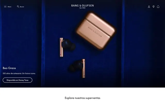
Preview image. Unlock full-res
Gallery of precise objects. A dark, velvet-lined showcase where each product rests, spotlighted with refined exactitude.
Color palette
Footer background, primary accent for deep sections – creating a luxurious, immersive foundation.
Dominant text color for headings and body content on light backgrounds, input borders – provides stark contrast and grounded presence.
Primary text color on dark backgrounds, selected button text – a creamy off-white that softens the high contrast.
Secondary text, subtle link color – offers a muted informational tone against white.
Page backgrounds, card backgrounds, input backgrounds – provides clean, expansive canvas.
Subtle border colors for inputs – an almost imperceptible divider.
Primary icon color, borders on ghost buttons – a hard, crisp edge or fill.
Typography
- Weights
- 400, 500, 700
- Sizes
- 12px, 14px, 16px, 24px, 36px
- Line height
- 1, 1.15, 1.25, 1.33, 1.43, 1.5, 1.63, 1.67, 1.71, 2.19
- Letter spacing
- -0.056em at 36px, -0.014em at 24px, 0.006em at 16px, 0.007em at 14px, 0.008em at 12px, then other specific values for a finely tuned optical balance
- Fallback
- Open Sans
Primary typeface for all headings, body text, and UI elements. Its broad range of weights and precise letter-spacing across sizes is a core visual identity feature, conveying understated luxury.
Spacing & shape
Components
Rounded pill button with 'Carbon Black' (#191817) background and 'Barely White' (#fcfaee) text. Has a 40px border-radius, 8px vertical padding, and 32px horizontal padding. Uses BeoSupreme text.
Transparent background with 'Carbon Black' (#000000) text and border. No border-radius, 0px padding. Used for minimal UI controls.
Transparent background with 'Barely White' (#fcfaee) text and a 'Barely White' (#fcfaee) bottom border of 1px. 4px vertical padding, 0px horizontal padding. Typically used in dark sections like the hero or footer.
A completely transparent card with no padding, border, or shadow. It acts as a container for product images and descriptive text. Text is 'Carbon Black' (#191817) and headings use BeoSupreme.
White background (#ffffff) with 'Carbon Black' (#191817) text and a 1px 'Carbon Black' (#191817) bottom border. No border-radius. 1px vertical padding and 2px right padding.
Rectangular badge with 'Pure White' (#ffffff) background and 'Carbon Black' (#191817) text. Has a 2px border-radius, 4px vertical padding, and 8px horizontal padding. Uses BeoSupreme text.
Guidelines
- Prioritize the custom 'BeoSupreme' font for all textual content, leveraging its unique character and precise letter-spacing.
- Use 'Midnight Indigo' (#060daa) exclusively for foundational elements like the footer to establish a luxurious, deep anchor.
- Maintain a clear visual hierarchy by contrasting 'Carbon Black' (#191817) text on light backgrounds (#ffffff, #fcfaee) and 'Barely White' (#fcfaee) on dark backgrounds (#060daa).
- Employ the 40px border-radius strictly for primary CTA buttons, ensuring they stand out as the sole 'soft' element.
- Utilize generous negative space around product imagery and text blocks to convey a sense of premium quality and focus, with section gaps around 48px.
- Ensure all interactive elements, especially primary CTAs, meet a minimum contrast ratio of 4.5:1 against their background.
- Use a subtle 1px border for ghost button states and text links to provide definition without visual weight.
- Do not introduce additional font families; 'BeoSupreme' defines the typographic identity.
- Avoid using multiple accent colors; 'Midnight Indigo' is reserved for specific, prominent sectional backgrounds.
- Do not deviate from the established border-radius values (0px, 2px, 40px); rounded corners are intentional and scarce.
- Do not use box-shadows; elevation is handled through background color changes and spatial separation.
- Avoid decorative elements or busy backgrounds; the aesthetic emphasizes product clarity and clean UI.
- Do not create dense content blocks; the comfortable density principle with a 4px base unit should be consistently applied.
- Never use the browser default blue for links; control all link colors with 'Carbon Black', 'Ash Gray', or 'Barely White'.
About this system
ShowHide
This design system balances classic luxury with contemporary minimalism. Rich, deep indigo (#060daa) and elegant black (#191817) create a sophisticated backdrop, punctuated by a delicate, almost cream-colored off-white (#fcfaee) for textual contrast. The signature element is the custom BeoSupreme typeface, used across all text sizes, which brings a unique, refined character, with precise letter-spacing adjustments at every size. The dominant visual language is clean, centered product photography on stark backgrounds, framed by generous negative space and a strict typographic hierarchy.
The page uses a mixed layout approach, blending full-bleed sections with constrained content. The hero prominently features a full-bleed dark background ('Midnight Indigo') with a large, centered product image and left-aligned headline/CTA. Subsequent sections alternate between full-bleed white backgrounds for product listings (often displaying items in a clean, centered grid of 4) and some potentially full-bleed sections with strong, singular background colors like the red observed. Content is generally centered within a comfortable maximum width when not full-bleed. Vertical rhythm is maintained by consistent spacing between sections (around 48px), creating a spacious and unhurried browsing experience. The navigation is a minimalist sticky top bar, providing persistent access without visual clutter.
The visual language focuses on meticulously staged product photography. Products are often isolated or tightly cropped, centered on pure white backgrounds or against deep, velvety textiles like the 'Midnight Indigo' in the hero. The treatment is clean and raw-edged, with no masking or overlapping effects. Photography is clearly high-key for white backgrounds and moody/dark for dramatic impact on colored backgrounds, emphasizing the texture and material of the products. Images are explanatory and showcase the product as the hero, occupying significant visual space in sections to convey luxury and technical precision. Icons are minimal, monochromatic, and outlined, primarily in 'Pure Black' or 'Barely White', complementing the UI's precision.
Reminiscent of Apple, Dyson, Bose (certain product lines).
# Bang & Olufsen — Style Reference
> Gallery of precise objects. A dark, velvet-lined showcase where each product rests, spotlighted with refined exactitude.

**Theme:** mixed

**Site:** https://bang-olufsen.com

This design system balances classic luxury with contemporary minimalism. Rich, deep indigo (#060daa) and elegant black (#191817) create a sophisticated backdrop, punctuated by a delicate, almost cream-colored off-white (#fcfaee) for textual contrast. The signature element is the custom BeoSupreme typeface, used across all text sizes, which brings a unique, refined character, with precise letter-spacing adjustments at every size. The dominant visual language is clean, centered product photography on stark backgrounds, framed by generous negative space and a strict typographic hierarchy.

## Tokens — Colors

| Name | Value | Token | Role |
|------|------|------|------|
| Midnight Indigo | `#060daa` | `--color-midnight-indigo` | Footer background, primary accent for deep sections – creating a luxurious, immersive foundation. |
| Carbon Black | `#191817` | `--color-carbon-black` | Dominant text color for headings and body content on light backgrounds, input borders – provides stark contrast and grounded presence. |
| Barely White | `#fcfaee` | `--color-barely-white` | Primary text color on dark backgrounds, selected button text – a creamy off-white that softens the high contrast. |
| Ash Gray | `#555555` | `--color-ash-gray` | Secondary text, subtle link color – offers a muted informational tone against white. |
| Pure White | `#ffffff` | `--color-pure-white` | Page backgrounds, card backgrounds, input backgrounds – provides clean, expansive canvas. |
| Pale Silver | `#e5e5e5` | `--color-pale-silver` | Subtle border colors for inputs – an almost imperceptible divider. |
| Pure Black | `#000000` | `--color-pure-black` | Primary icon color, borders on ghost buttons – a hard, crisp edge or fill. |

## Tokens — Typography

### BeoSupreme
- **Substitute:** Open Sans
- **Weights:** 400, 500, 700
- **Sizes:** 12px, 14px, 16px, 24px, 36px
- **Line height:** 1, 1.15, 1.25, 1.33, 1.43, 1.5, 1.63, 1.67, 1.71, 2.19
- **Letter spacing:** -0.056em at 36px, -0.014em at 24px, 0.006em at 16px, 0.007em at 14px, 0.008em at 12px, then other specific values for a finely tuned optical balance
- **Role:** Primary typeface for all headings, body text, and UI elements. Its broad range of weights and precise letter-spacing across sizes is a core visual identity feature, conveying understated luxury.

## Tokens — Type Scale

Golden Ratio (1.618) from 14px base.

| Role | Size | Line height | Letter spacing |
|------|------|------|------|
| body | 14px | 1.43 | 0.007em |
| heading | 24px | 1.25 | -0.014em |
| display | 36px | 1.15 | -0.056em |

## Tokens — Spacing

- **Section gap:** 48px
- **Card padding:** 0px
- **Element gap:** 4px

## Tokens — Radius

- **Buttons:** 40px
- **badges:** 2px

## Layout

The page uses a mixed layout approach, blending full-bleed sections with constrained content. The hero prominently features a full-bleed dark background ('Midnight Indigo') with a large, centered product image and left-aligned headline/CTA. Subsequent sections alternate between full-bleed white backgrounds for product listings (often displaying items in a clean, centered grid of 4) and some potentially full-bleed sections with strong, singular background colors like the red observed. Content is generally centered within a comfortable maximum width when not full-bleed. Vertical rhythm is maintained by consistent spacing between sections (around 48px), creating a spacious and unhurried browsing experience. The navigation is a minimalist sticky top bar, providing persistent access without visual clutter.

## Imagery

The visual language focuses on meticulously staged product photography. Products are often isolated or tightly cropped, centered on pure white backgrounds or against deep, velvety textiles like the 'Midnight Indigo' in the hero. The treatment is clean and raw-edged, with no masking or overlapping effects. Photography is clearly high-key for white backgrounds and moody/dark for dramatic impact on colored backgrounds, emphasizing the texture and material of the products. Images are explanatory and showcase the product as the hero, occupying significant visual space in sections to convey luxury and technical precision. Icons are minimal, monochromatic, and outlined, primarily in 'Pure Black' or 'Barely White', complementing the UI's precision.

## Components

### Product Cards — Explore Superventas

### Hero CTA — Beo Grace

### Button Group — B&O Style System

### Primary Button (Honey Tone CTA)
*Call to action*

Rounded pill button with 'Carbon Black' (#191817) background and 'Barely White' (#fcfaee) text. Has a 40px border-radius, 8px vertical padding, and 32px horizontal padding. Uses BeoSupreme text.

### Ghost Button (Menu/Search)
*Navigation/Utility*

Transparent background with 'Carbon Black' (#000000) text and border. No border-radius, 0px padding. Used for minimal UI controls.

### Text Link Button
*Tertiary action/Navigation*

Transparent background with 'Barely White' (#fcfaee) text and a 'Barely White' (#fcfaee) bottom border of 1px. 4px vertical padding, 0px horizontal padding. Typically used in dark sections like the hero or footer.

### Feature Card
*Product display*

A completely transparent card with no padding, border, or shadow. It acts as a container for product images and descriptive text. Text is 'Carbon Black' (#191817) and headings use BeoSupreme.

### Input Field
*User entry*

White background (#ffffff) with 'Carbon Black' (#191817) text and a 1px 'Carbon Black' (#191817) bottom border. No border-radius. 1px vertical padding and 2px right padding.

### New Product Badge
*Highlight new items*

Rectangular badge with 'Pure White' (#ffffff) background and 'Carbon Black' (#191817) text. Has a 2px border-radius, 4px vertical padding, and 8px horizontal padding. Uses BeoSupreme text.

## Guidelines

### Do

- Prioritize the custom 'BeoSupreme' font for all textual content, leveraging its unique character and precise letter-spacing.
- Use 'Midnight Indigo' (#060daa) exclusively for foundational elements like the footer to establish a luxurious, deep anchor.
- Maintain a clear visual hierarchy by contrasting 'Carbon Black' (#191817) text on light backgrounds (#ffffff, #fcfaee) and 'Barely White' (#fcfaee) on dark backgrounds (#060daa).
- Employ the 40px border-radius strictly for primary CTA buttons, ensuring they stand out as the sole 'soft' element.
- Utilize generous negative space around product imagery and text blocks to convey a sense of premium quality and focus, with section gaps around 48px.
- Ensure all interactive elements, especially primary CTAs, meet a minimum contrast ratio of 4.5:1 against their background.
- Use a subtle 1px border for ghost button states and text links to provide definition without visual weight.

### Don't

- Do not introduce additional font families; 'BeoSupreme' defines the typographic identity.
- Avoid using multiple accent colors; 'Midnight Indigo' is reserved for specific, prominent sectional backgrounds.
- Do not deviate from the established border-radius values (0px, 2px, 40px); rounded corners are intentional and scarce.
- Do not use box-shadows; elevation is handled through background color changes and spatial separation.
- Avoid decorative elements or busy backgrounds; the aesthetic emphasizes product clarity and clean UI.
- Do not create dense content blocks; the comfortable density principle with a 4px base unit should be consistently applied.
- Never use the browser default blue for links; control all link colors with 'Carbon Black', 'Ash Gray', or 'Barely White'.

## Agent Prompt Guide

### Quick Color Reference
- Text on light: #191817
- Text on dark: #fcfaee
- Page Background: #ffffff
- CTA Background: #191817
- Footer Background: #060daa

### Example Component Prompts
1. Create a hero section: 'Midnight Indigo' (#060daa) full-bleed background. Centered product image. Above it, a 'display' headline: 'Beo Grace' (BeoSupreme, 36px, 1.15lh, -0.056em ls, #fcfaee). Below, a body text: '100 años de artesanía. Un futuro icono.' (BeoSupreme, 16px, 1.33lh, 0.006em ls, #fcfaee). Underneath, a Primary Button: 'Disponible en Honey Tone' (40px radius, 8px 32px padding, #191817 background, #fcfaee text).
2. Generate a product listing grid: 'Pure White' (#ffffff) background. 'subheading' title 'Explore nuestros superventas' (BeoSupreme, 24px, 1.25lh, -0.014em ls, #191817). Display three Feature Cards horizontally, each with a centered product image, 'subheading' product name (BeoSupreme, 16px, 1.33lh, #191817) and price below it, separated by around 24px element gap.
3. Design a form input: 'Pure White' (#ffffff) background. 'Carbon Black' (#191817) text using 'body' style (BeoSupreme, 14px, 1.43lh), with a 1px 'Carbon Black' (#191817) bottom border. Placeholder text color: #555555. Padding: 1px vertical, 2px right.
More like this







Keep what you find
A free account saves references to boards and can send you a weekly email of picks based on what you save.
To see every result, go Pro.