
Preview image. Unlock full-res
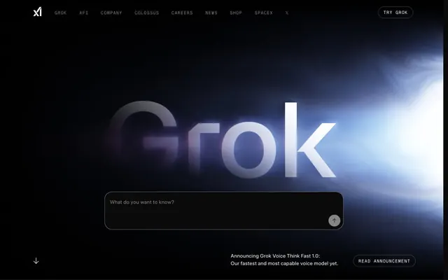
Midnight Command Center
Color palette
Primary call-to-action buttons, active navigation indicators, specific card accents, and important icons — this vivid blue signals interactivity and key brand elements
Page background, primary text on light surfaces, borders, icon fills
Secondary card surfaces, slightly elevated from the background
Muted background for cards and specific information display areas
Input field backgrounds, providing a subtle contrast against other dark surfaces
Primary card backgrounds, offering a distinct visual layer
Primary text, visible on dark backgrounds, selected interactive states, and sometimes as a button background for secondary actions
Muted text, helper text, inactive navigation items, and subtle borders
Secondary muted text, typically for links and less prominent information
Ghost button text and borders, outline icons
Typography
- Weights
- 400
- Sizes
- 12px
- Line height
- 1.2
sans-serif — detected in extracted data but not described by AI
- Weights
- 400
- Sizes
- 16px, 18px, 56px, 72px, 86px
- Line height
- 1, 1.25, 1.33
- Letter spacing
- -0.064em at 86px, -0.042em at 72px, -0.040em at 56px, -0.015em at 18px
Headlines and prominent navigation. Its precise tracking and robust weight give digital screens an authoritative, almost technical feel.
- Weights
- 400, 600
- Sizes
- 12px, 16px, 18px, 20px, 24px
- Line height
- 1.33, 1.4, 1.5, 1.67
- Letter spacing
- -0.027em at 24px, -0.015em at 20px, -0.007em at 18px, -0.005em at 16px
Body text, subheadings, and informational elements. A slightly wider letter spacing than the Medium variant ensures legibility in smaller sizes while maintaining the modern aesthetic.
- Weights
- 400, 700
- Sizes
- 12px, 14px, 16px, 20px, 72px
- Line height
- 1, 1.17
- Letter spacing
- 0.020em at 12px, 0.040em at 14px
Navigation, input fields, and small decorative labels. The rounded terminals soften the otherwise industrial feel, making interactive elements more approachable.
- Weights
- 400
- Sizes
- 13px, 15px, 16px
- Line height
- 1, 1.07, 1.23
- Letter spacing
- 0.033em at 15px, 0.038em at 13px
Supporting text, footnotes, and small interactive prompts. Its generous letter spacing and slightly condensed proportions enhance readability in tight spaces.
- Weights
- 400
- Sizes
- 12px
- Line height
- 1.2
- Letter spacing
- normal
- Fallback
- system-ui, sans-serif
Utility text, data labels within tables or cards, ensuring legibility at minimal sizes.
Spacing & shape
Elevation
Components
Bold, filled button with 'Blue Neon' (#0063e1) background and 'Absolute Zero' (#000000) text. Features a large 59px border-radius for a distinct, pill-like shape. Padding: 39px top, 56px right, 37px bottom, 56px left. Text uses Diatype REKKI Bolder Rounded.
Inverted button with 'Cloud White' (#ffffff) background and browser-default link color text (not a brand color, but for #0000ee from data; use 'Absolute Zero' if a browser default, or 'Blue Neon' if linked). Features a large 59px border-radius. Padding: 32px top/bottom, 44px left/right. Appears sparingly.
Transparent background with 'Mid Grey' (#979797) text and border (when present). No specific border-radius, often inline. No padding.
Uses 'Deep Space' (#040910) background, 8px border-radius, and 32px internal padding on all sides. No shadow. Used for general content grouping.
Background of rgba(87, 89, 89, 0.45), 8px border-radius. Padding: 0px top/bottom, 24px left/right. Used for translucent, less opaque content blocks.
Background is 'Dark Card' (#2b2c2e) with a specific 38px 38px 0px 0px border-radius. Padding: 8px on all sides. Used for input areas or top sections of modular components.
Background is 'Input Charcoal' (#1f1f1f) with 'Cloud White' (#ffffff) text. Features a 100px border-radius, creating an extreme pill shape. Padding: 21px top, 24px right, 19px bottom, 24px left. Has a subtle white inset shadow: rgba(255, 255, 255, 0.2) 0px 0px 1px 0px.
Guidelines
- Prioritize 'Absolute Zero' (#000000) as the canvas background for most page sections, ensuring a dark theme is consistently applied.
- Use 'Blue Neon' (#0063e1) exclusively for primary calls-to-action, active navigation states, and key interactive elements to create focus.
- Apply a 59px border-radius to all primary and secondary action buttons, providing a distinct pill shape.
- Utilize 'Diatype REKKI Medium' for all main headlines (56px, 72px, 86px) with precise negative letter-spacing values to emphasize its sharp, technical feel.
- Employ the 8px border-radius for general content cards and the more extreme 100px radius for input fields to differentiate element types.
- Use 'Cloud White' (#ffffff) for primary text on dark backgrounds and 'Steel Gray' (#858585) for muted or secondary text.
- Maintain an 'elementGap' of 20px and 'cardPadding' of 32px to ensure a comfortable density and clear separation within components and content blocks.
- Do not introduce new saturated accent colors beyond 'Blue Neon' (#0063e1); maintain the dark/monochromatic base with a single color highlight.
- Avoid heavy drop shadows; elevation is primarily achieved through subtle background color shifts between 'Absolute Zero' and 'Dark Card' or 'Deep Space'.
- Do not deviate from the specified extreme border-radii for interactive elements; the 59px (buttons) and 100px (inputs) radius are signature elements.
- Refrain from using 'sans-serif' system font for primary UI text; always use the specific 'Diatype REKKI' fonts to maintain brand typography.
- Do not use generic padding values; adhere to the base unit of 4px and derived component padding (e.g., 32px for cards, 24px for inputs).
- Avoid full-bleed section backgrounds that are not 'Absolute Zero' or a very dark neutral; sections should either be contained or maintain the dark theme.
- Do not use highly textured or photographic backgrounds within core UI components; keep surfaces clean, flat, and dark.
About this system
ShowHide
REKKI embodies a 'night vision command center' aesthetic, utilizing a predominantly dark theme with sharp, almost glowing typography, and carefully chosen pops of vivid blue for primary actions. The interface balances information density with generous padding within components, creating distinct content blocks that stand out against the deep night-mode background. Surface treatments are subtle, relying on slight tonal shifts for hierarchy, almost no shadows, and rounded corners which soften the otherwise assertive, utilitarian design.
Reminiscent of Rive, Linear, Vercel, Notion.
# REKKI — Style Reference
> Midnight Command Center

**Theme:** dark

**Site:** https://rekki.com

REKKI embodies a 'night vision command center' aesthetic, utilizing a predominantly dark theme with sharp, almost glowing typography, and carefully chosen pops of vivid blue for primary actions. The interface balances information density with generous padding within components, creating distinct content blocks that stand out against the deep night-mode background. Surface treatments are subtle, relying on slight tonal shifts for hierarchy, almost no shadows, and rounded corners which soften the otherwise assertive, utilitarian design.

## Tokens — Colors

| Name | Value | Token | Role |
|------|------|------|------|
| Blue Neon | `#0063e1` | `--color-blue-neon` | Primary call-to-action buttons, active navigation indicators, specific card accents, and important icons — this vivid blue signals interactivity and key brand elements |
| Absolute Zero | `#000000` | `--color-absolute-zero` | Page background, primary text on light surfaces, borders, icon fills |
| Deep Space | `#040910` | `--color-deep-space` | Secondary card surfaces, slightly elevated from the background |
| Charcoal Grey | `#0d0d0d` | `--color-charcoal-grey` | Muted background for cards and specific information display areas |
| Input Charcoal | `#1f1f1f` | `--color-input-charcoal` | Input field backgrounds, providing a subtle contrast against other dark surfaces |
| Dark Card | `#2b2c2e` | `--color-dark-card` | Primary card backgrounds, offering a distinct visual layer |
| Cloud White | `#ffffff` | `--color-cloud-white` | Primary text, visible on dark backgrounds, selected interactive states, and sometimes as a button background for secondary actions |
| Steel Gray | `#858585` | `--color-steel-gray` | Muted text, helper text, inactive navigation items, and subtle borders |
| Light Steel | `#8c8c8c` | `--color-light-steel` | Secondary muted text, typically for links and less prominent information |
| Mid Grey | `#979797` | `--color-mid-grey` | Ghost button text and borders, outline icons |

## Tokens — Typography

### sans-serif
- **Weights:** 400
- **Sizes:** 12px
- **Line height:** 1.2
- **Role:** sans-serif — detected in extracted data but not described by AI

### Diatype REKKI Medium
- **Weights:** 400
- **Sizes:** 16px, 18px, 56px, 72px, 86px
- **Line height:** 1, 1.25, 1.33
- **Letter spacing:** -0.064em at 86px, -0.042em at 72px, -0.040em at 56px, -0.015em at 18px
- **Role:** Headlines and prominent navigation. Its precise tracking and robust weight give digital screens an authoritative, almost technical feel.

### Diatype REKKI Regular
- **Weights:** 400, 600
- **Sizes:** 12px, 16px, 18px, 20px, 24px
- **Line height:** 1.33, 1.4, 1.5, 1.67
- **Letter spacing:** -0.027em at 24px, -0.015em at 20px, -0.007em at 18px, -0.005em at 16px
- **Role:** Body text, subheadings, and informational elements. A slightly wider letter spacing than the Medium variant ensures legibility in smaller sizes while maintaining the modern aesthetic.

### Diatype REKKI Bolder Rounded
- **Weights:** 400, 700
- **Sizes:** 12px, 14px, 16px, 20px, 72px
- **Line height:** 1, 1.17
- **Letter spacing:** 0.020em at 12px, 0.040em at 14px
- **Role:** Navigation, input fields, and small decorative labels. The rounded terminals soften the otherwise industrial feel, making interactive elements more approachable.

### OCD-GARRI-V01 Regular
- **Weights:** 400
- **Sizes:** 13px, 15px, 16px
- **Line height:** 1, 1.07, 1.23
- **Letter spacing:** 0.033em at 15px, 0.038em at 13px
- **Role:** Supporting text, footnotes, and small interactive prompts. Its generous letter spacing and slightly condensed proportions enhance readability in tight spaces.

### Inter
- **Substitute:** system-ui, sans-serif
- **Weights:** 400
- **Sizes:** 12px
- **Line height:** 1.2
- **Letter spacing:** normal
- **Role:** Utility text, data labels within tables or cards, ensuring legibility at minimal sizes.

## Tokens — Type Scale

Augmented Fourth (1.414) from 16px base.

| Role | Size | Line height | Letter spacing |
|------|------|------|------|
| caption | 12px | 1.2 | 0.48px |
| body | 16px | 1.5 | -0.08em |
| subheading | 18px | 1.33 | -0.126px |
| heading-sm | 24px | 1.33 | -0.648px |
| heading | 56px | 1.25 | -2.24px |
| heading-lg | 72px | 1 | -3.024px |
| display | 86px | 1 | -5.504px |

## Tokens — Spacing

- **Section gap:** 56px
- **Card padding:** 32px
- **Element gap:** 20px

## Tokens — Radius

- **Buttons:** 59px
- **Inputs:** 100px
- **Cards:** 8px
- **asymmetricCards:** 30px
- **largeImages:** 24px
- **navigationItems:** 2px
- **topRoundedCards:** 38px 38px 0px 0px

## Tokens — Elevation

- **Input Field:** `rgba(255, 255, 255, 0.2) 0px 0px 1px 0px`

## Components

### Primary Action Button
*Call to action*

Bold, filled button with 'Blue Neon' (#0063e1) background and 'Absolute Zero' (#000000) text. Features a large 59px border-radius for a distinct, pill-like shape. Padding: 39px top, 56px right, 37px bottom, 56px left. Text uses Diatype REKKI Bolder Rounded.

### Secondary Action Button
*Alternative call to action*

Inverted button with 'Cloud White' (#ffffff) background and browser-default link color text (not a brand color, but for #0000ee from data; use 'Absolute Zero' if a browser default, or 'Blue Neon' if linked). Features a large 59px border-radius. Padding: 32px top/bottom, 44px left/right. Appears sparingly.

### Ghost Text Button
*Subtle UI interaction*

Transparent background with 'Mid Grey' (#979797) text and border (when present). No specific border-radius, often inline. No padding.

### Dark Base Card
*Content container*

Uses 'Deep Space' (#040910) background, 8px border-radius, and 32px internal padding on all sides. No shadow. Used for general content grouping.

### Semi-Transparent Card
*Overlay content, context cards*

Background of rgba(87, 89, 89, 0.45), 8px border-radius. Padding: 0px top/bottom, 24px left/right. Used for translucent, less opaque content blocks.

### Top-Rounded Input Card
*Dialog or input grouping*

Background is 'Dark Card' (#2b2c2e) with a specific 38px 38px 0px 0px border-radius. Padding: 8px on all sides. Used for input areas or top sections of modular components.

### Input Field
*Data entry*

Background is 'Input Charcoal' (#1f1f1f) with 'Cloud White' (#ffffff) text. Features a 100px border-radius, creating an extreme pill shape. Padding: 21px top, 24px right, 19px bottom, 24px left. Has a subtle white inset shadow: rgba(255, 255, 255, 0.2) 0px 0px 1px 0px.

## Guidelines

### Do

- Prioritize 'Absolute Zero' (#000000) as the canvas background for most page sections, ensuring a dark theme is consistently applied.
- Use 'Blue Neon' (#0063e1) exclusively for primary calls-to-action, active navigation states, and key interactive elements to create focus.
- Apply a 59px border-radius to all primary and secondary action buttons, providing a distinct pill shape.
- Utilize 'Diatype REKKI Medium' for all main headlines (56px, 72px, 86px) with precise negative letter-spacing values to emphasize its sharp, technical feel.
- Employ the 8px border-radius for general content cards and the more extreme 100px radius for input fields to differentiate element types.
- Use 'Cloud White' (#ffffff) for primary text on dark backgrounds and 'Steel Gray' (#858585) for muted or secondary text.
- Maintain an 'elementGap' of 20px and 'cardPadding' of 32px to ensure a comfortable density and clear separation within components and content blocks.

### Don't

- Do not introduce new saturated accent colors beyond 'Blue Neon' (#0063e1); maintain the dark/monochromatic base with a single color highlight.
- Avoid heavy drop shadows; elevation is primarily achieved through subtle background color shifts between 'Absolute Zero' and 'Dark Card' or 'Deep Space'.
- Do not deviate from the specified extreme border-radii for interactive elements; the 59px (buttons) and 100px (inputs) radius are signature elements.
- Refrain from using 'sans-serif' system font for primary UI text; always use the specific 'Diatype REKKI' fonts to maintain brand typography.
- Do not use generic padding values; adhere to the base unit of 4px and derived component padding (e.g., 32px for cards, 24px for inputs).
- Avoid full-bleed section backgrounds that are not 'Absolute Zero' or a very dark neutral; sections should either be contained or maintain the dark theme.
- Do not use highly textured or photographic backgrounds within core UI components; keep surfaces clean, flat, and dark.

## Agent Prompt Guide

Quick Color Reference:
text: #ffffff
background: #000000
border: #858585
accent: #0063e1
primary action: #0063e1 (filled action)

Example Component Prompts:
Create a Primary Action Button: #0063e1 background, #ffffff text, 9999px radius, compact pill padding. Use this filled treatment for the main CTA.

Create a 'Dark Base Card': 'Deep Space' background, 8px border-radius, 32px padding, containing 'Cloud White' text using 'Diatype REKKI Regular' at 16px.

Create an 'Input Field': 'Input Charcoal' background, 'Cloud White' text, 100px border-radius, 24px horizontal padding, with a rgba(255, 255, 255, 0.2) 0px 0px 1px 0px shadow. Placeholder text in 'Steel Gray'.
More like this









Keep what you find
A free account saves references to boards and can send you a weekly email of picks based on what you save.
To see every result, go Pro.