Preview image. Unlock full-res
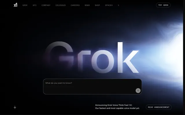
Midnight Command Center: A dark, responsive interface with precise typographic hierarchy and subtle interactive cues.
Color palette
Violet state accent for badges, validation surfaces, and short status labels. Do not promote it to the primary CTA color
Neutral form states, badge text, and quiet UI feedback where color should stay understated. Do not promote it to the primary CTA color
Secondary background, subtle borders for ghost buttons and card outlines. Its slight tint keeps it from being pure black
Primary text, interactive element text, button backgrounds, and subtle highlight shadows. Provides high contrast on dark surfaces
Secondary text for badges, navigation, and body copy. Offers readability without high contrast; Decorative footer background effect, transitioning from dark with subtle color to full black
Subtle button and navigation borders, creating a very soft outline
Typography
- Weights
- 400
- Sizes
- 16px, 20px, 36px, 48px, 80px
- Line height
- 1, 1.11, 1.2, 1.4, 1.5
- Letter spacing
- -0.0250em
- Fallback
- Inter
Primary text for headings, body, navigation, and interactive elements. Its specific negative letter spacing gives titles a distinct, compact feel.
- Weights
- 400
- Sizes
- 12px, 14px
- Line height
- 1.33, 1.43, 2
- Letter spacing
- 0.1000em
- Fallback
- Space Mono
Monospaced font for badges and occasional navigation elements. The explicit positive letter spacing creates a technical, spaced-out effect, contrasting with Universal Sans.
Spacing & shape
Elevation
Components
Background: rgba(0, 0, 0, 0), Text color: #ffffff, Border: 1px solid rgba(255, 255, 255, 0.25), Radius: 9999px, Padding: 8px vertical, 16px horizontal. Text uses universalSans-400.
Background: #ffffff, Text color: #0a0a0a, Border: none, Radius: 9999px, Padding: 4px vertical, 12px horizontal. Text uses universalSans-400.
Background: rgba(0, 0, 0, 0), Text color: #ffffff, Border: none by default, Padding: 6px vertical. Text uses universalSans-400.
Background: #0c0c0b, Text color: #ffffff, Border: 1px solid #1f2228, Radius: 24px, Padding: 20px vertical, 16px left, 64px right. Focus ring: #2563eb 0px 0px 0px 2px.
Background: #0c0c0b, Border: 1px solid #1f2228, Radius: 0px, Padding: variable, often includes 16px internal padding. Text is #ffffff with smaller details in #7d8187.
Background: rgba(0, 0, 0, 0), Text color: #7d8187, Radius: 0px, Padding: 0px. Text uses GeistMono-400.
Guidelines
- Retain the dominant dark theme using Deep Midnight (#0c0c0b) as the canvas and Faded Steel (#1f2228) for secondary surfaces.
- Use Frost White (#ffffff) for all primary text, ensuring high contrast on dark backgrounds.
- Apply universalSans with -0.0250em letter spacing for all headlines and body text to maintain the compact, confident typographic style.
- Reserve Electric Blue (#2563eb) exclusively for interactive input focus states and accents, maintaining its visual impact as a sole chromatic element.
- Apply a 9999px border-radius to all interactive buttons for a soft, pill-shaped appearance.
- Set internal padding for feature cards at 16px to create consistent breathing room for content.
- Utilize GeistMono with 0.1000em letter spacing for all badges and auxiliary labels to establish a technical, distinct text style.
- Avoid introducing additional saturated colors; maintain the restricted palette with Electric Blue as the only vivid accent.
- Do not use heavy box-shadows or significant elevation; prefer subtle borders and slight background shifts for surface differentiation.
- Do not use rectangular, sharp-edged buttons; enforce the 9999px radius for all interactive buttons.
- Avoid large imagery or elaborate illustrations; prioritize clean UI and minimal, abstract graphics.
- Do not use a light theme; the brand identity is firmly established in dark mode.
- Do not vary paragraph line heights or font weights frequently within body text; maintain the universalSans-400, 1.5 lineHeight standard.
- Avoid dense, unbroken blocks of text; break content into manageable sections with clear headings and ample vertical spacing of at least 48px between major sections.
About this system
ShowHide
xAI employs a darkened cosmic canvas aesthetic: deep black backgrounds, muted grays for surfaces, and sharp white typography for contrast. A single, vivid blue accent is reserved for interactive input states, creating a focal point against the otherwise reserved palette. Components are lightweight with minimal borders and generous radius for buttons, aiming for a sense of contained energy rather than heavy presence.
The page uses a max-width contained layout for most content, although the hero section appears full-bleed or extends wider. The main hero pattern features a centered, oversized headline over a dark, subtly glowing background. Sections are typically stacked vertically with consistent 48px vertical spacing. Content is arranged in a text-dominant manner, often using two-column layouts for features or product descriptions, or 3-column grids for cards. The navigation is a sticky top bar with left-aligned branding and right-aligned actions, featuring ghost buttons. The density is comfortable, with ample whitespace and clear section breaks.
This design system uses minimal, abstract, and technical-leaning graphics. Photography is absent. Illustrations are primarily line-based or monochromatic, often appearing as subtle background elements or within product cards (e.g., outline of a laptop). Icons are sparse, simple, and monochrome, usually Frost White (#ffffff) or Muted Ash (#7d8187), and function as functional cues rather than decorative elements. The overall density is text-dominant, with graphics serving a supporting, explanatory role, and sometimes featuring a diffuse, luminous glow effect in hero sections.
Reminiscent of OpenAI, Linear, Apple Developer Documentation, Vercel.
# xAI — Style Reference
> Midnight Command Center: A dark, responsive interface with precise typographic hierarchy and subtle interactive cues.

**Theme:** dark

**Site:** https://x.ai

xAI employs a darkened cosmic canvas aesthetic: deep black backgrounds, muted grays for surfaces, and sharp white typography for contrast. A single, vivid blue accent is reserved for interactive input states, creating a focal point against the otherwise reserved palette. Components are lightweight with minimal borders and generous radius for buttons, aiming for a sense of contained energy rather than heavy presence.

## Tokens — Colors

| Name | Value | Token | Role |
|------|------|------|------|
| Electric Blue | `#2563eb` | `--color-electric-blue` | Violet state accent for badges, validation surfaces, and short status labels. Do not promote it to the primary CTA color |
| Deep Midnight | `#0c0c0b` | `--color-deep-midnight` | Neutral form states, badge text, and quiet UI feedback where color should stay understated. Do not promote it to the primary CTA color |
| Faded Steel | `#1f2228` | `--color-faded-steel` | Secondary background, subtle borders for ghost buttons and card outlines. Its slight tint keeps it from being pure black |
| Frost White | `#ffffff` | `--color-frost-white` | Primary text, interactive element text, button backgrounds, and subtle highlight shadows. Provides high contrast on dark surfaces |
| Muted Ash | `#7d8187` | `--color-muted-ash` | Secondary text for badges, navigation, and body copy. Offers readability without high contrast; Decorative footer background effect, transitioning from dark with subtle color to full black |
| Whisper Gray | `#474747` | `--color-whisper-gray` | Subtle button and navigation borders, creating a very soft outline |

## Tokens — Typography

### universalSans
- **Substitute:** Inter
- **Weights:** 400
- **Sizes:** 16px, 20px, 36px, 48px, 80px
- **Line height:** 1, 1.11, 1.2, 1.4, 1.5
- **Letter spacing:** -0.0250em
- **Role:** Primary text for headings, body, navigation, and interactive elements. Its specific negative letter spacing gives titles a distinct, compact feel.

### GeistMono
- **Substitute:** Space Mono
- **Weights:** 400
- **Sizes:** 12px, 14px
- **Line height:** 1.33, 1.43, 2
- **Letter spacing:** 0.1000em
- **Role:** Monospaced font for badges and occasional navigation elements. The explicit positive letter spacing creates a technical, spaced-out effect, contrasting with Universal Sans.

## Tokens — Type Scale

| Role | Size | Line height | Letter spacing |
|------|------|------|------|
| caption | 12px | 2 | 0.1px |
| body-sm | 14px | 1.43 | 0.1px |
| body | 16px | 1.5 | -0.025em |
| subheading | 20px | 1.4 | -0.025em |
| heading | 36px | 1.2 | -0.025em |
| heading-lg | 48px | 1.11 | -0.025em |
| display | 80px | 1 | -0.025em |

## Tokens — Spacing

- **Section gap:** 48px
- **Card padding:** 16px
- **Element gap:** 12px

## Tokens — Radius

- **Buttons:** 9999px
- **Inputs:** 24px
- **calloutCards:** 0px

## Tokens — Elevation

- **Interactive Text Input Focus:** `rgb(113, 113, 122) 0px 0px 0px 2px`

## Layout

The page uses a max-width contained layout for most content, although the hero section appears full-bleed or extends wider. The main hero pattern features a centered, oversized headline over a dark, subtly glowing background. Sections are typically stacked vertically with consistent 48px vertical spacing. Content is arranged in a text-dominant manner, often using two-column layouts for features or product descriptions, or 3-column grids for cards. The navigation is a sticky top bar with left-aligned branding and right-aligned actions, featuring ghost buttons. The density is comfortable, with ample whitespace and clear section breaks.

## Imagery

This design system uses minimal, abstract, and technical-leaning graphics. Photography is absent. Illustrations are primarily line-based or monochromatic, often appearing as subtle background elements or within product cards (e.g., outline of a laptop). Icons are sparse, simple, and monochrome, usually Frost White (#ffffff) or Muted Ash (#7d8187), and function as functional cues rather than decorative elements. The overall density is text-dominant, with graphics serving a supporting, explanatory role, and sometimes featuring a diffuse, luminous glow effect in hero sections.

## Components

### Ghost Primary Button
*Primary action button with transparent background.*

Background: rgba(0, 0, 0, 0), Text color: #ffffff, Border: 1px solid rgba(255, 255, 255, 0.25), Radius: 9999px, Padding: 8px vertical, 16px horizontal. Text uses universalSans-400.

### Filled Secondary Button
*Secondary action button for explicit actions.*

Background: #ffffff, Text color: #0a0a0a, Border: none, Radius: 9999px, Padding: 4px vertical, 12px horizontal. Text uses universalSans-400.

### Navigation Link
*Top navigation and footer navigation links.*

Background: rgba(0, 0, 0, 0), Text color: #ffffff, Border: none by default, Padding: 6px vertical. Text uses universalSans-400.

### Interactive Text Input
*Text input field for user queries.*

Background: #0c0c0b, Text color: #ffffff, Border: 1px solid #1f2228, Radius: 24px, Padding: 20px vertical, 16px left, 64px right. Focus ring: #2563eb 0px 0px 0px 2px.

### Callout Card
*Section for product features or announcements.*

Background: #0c0c0b, Border: 1px solid #1f2228, Radius: 0px, Padding: variable, often includes 16px internal padding. Text is #ffffff with smaller details in #7d8187.

### Badge Neutral
*Informational tags and date indicators.*

Background: rgba(0, 0, 0, 0), Text color: #7d8187, Radius: 0px, Padding: 0px. Text uses GeistMono-400.

## Guidelines

### Do

- Retain the dominant dark theme using Deep Midnight (#0c0c0b) as the canvas and Faded Steel (#1f2228) for secondary surfaces.
- Use Frost White (#ffffff) for all primary text, ensuring high contrast on dark backgrounds.
- Apply universalSans with -0.0250em letter spacing for all headlines and body text to maintain the compact, confident typographic style.
- Reserve Electric Blue (#2563eb) exclusively for interactive input focus states and accents, maintaining its visual impact as a sole chromatic element.
- Apply a 9999px border-radius to all interactive buttons for a soft, pill-shaped appearance.
- Set internal padding for feature cards at 16px to create consistent breathing room for content.
- Utilize GeistMono with 0.1000em letter spacing for all badges and auxiliary labels to establish a technical, distinct text style.

### Don't

- Avoid introducing additional saturated colors; maintain the restricted palette with Electric Blue as the only vivid accent.
- Do not use heavy box-shadows or significant elevation; prefer subtle borders and slight background shifts for surface differentiation.
- Do not use rectangular, sharp-edged buttons; enforce the 9999px radius for all interactive buttons.
- Avoid large imagery or elaborate illustrations; prioritize clean UI and minimal, abstract graphics.
- Do not use a light theme; the brand identity is firmly established in dark mode.
- Do not vary paragraph line heights or font weights frequently within body text; maintain the universalSans-400, 1.5 lineHeight standard.
- Avoid dense, unbroken blocks of text; break content into manageable sections with clear headings and ample vertical spacing of at least 48px between major sections.

## Agent Prompt Guide

Quick Color Reference:
text: #ffffff
background: #0c0c0b
border: #1f2228
accent: #2563eb
primary action: no distinct CTA color

Example Component Prompts:
Create a hero section: Deep Midnight (#0c0c0b) background. Headline 'AI for all humanity' at 80px universalSans weight 400, #ffffff, letter-spacing -0.025em. Subtext 'Explore new frontiers' below it at 20px universalSans weight 400, #7d8187, letter-spacing -0.025em.
No distinct primary action color was observed; use the extracted neutral button treatments instead of inventing a filled CTA color.
Create an Interactive Text Input: Background #0c0c0b, Text #ffffff, Border 1px solid #1f2228, Radius 24px, Padding 20px vertical, 16px left, 64px right. Placeholder text 'What do you want to know?' in #7d8187. On focus, add shadow: rgb(113, 113, 122) 0px 0px 0px 2px.
More like this










Keep what you find
A free account saves references to boards and can send you a weekly email of picks based on what you save.
To see every result, go Pro.