Preview image. Unlock full-res
Utility-first information panels with minimal fuss.
Color palette
Green outline accent for tags, dividers, and focused UI edges
Outlined action borders for links and interactive elements, providing a clear visual cue for clickable items. Represents the primary interactive color
Text color for interactive text links, a slightly darker shade of Action Blue for distinction
Page backgrounds, default surface color, text backgrounds within content blocks
Primary body text, general darker text elements
Headings, strong text, and significant labels
Key headings, icons, strong outlines – acts as a prominent accent within the monochrome scale
Subtle borders, inactive text, ghost button outlines. Offers a soft differentiation from Canvas White
Typography
- Weights
- 400, 700
- Sizes
- 14px, 16px, 18px
- Line height
- 1.2, 1.31
- Letter spacing
- normal
- Fallback
- system-ui
General body text, subheadings, links, and various informational labels. Its legibility supports the direct communication style.
- Weights
- 400
- Sizes
- 16px
- Line height
- 1.2
- Letter spacing
- normal
- Fallback
- serif
Used for specific body text elements, likely for readability within longer content blocks.
- Weights
- 300, 400, 500, 800
- Sizes
- 17px, 20px, 21px, 22px, 31px, 33px
- Line height
- 1.2, 1.21, 1.41
- Letter spacing
- normal
- Fallback
- Montserrat
Headlines and prominent text elements, offering a sharp, modern alternative to system fonts. Its range of weights allows for distinct hierarchy.
- Weights
- 400
- Sizes
- 14px, 18px
- Line height
- 1.33, 1.36, 1.67
- Letter spacing
- normal
- Fallback
- system-ui
An accessible font for supplementary information and smaller textual components.
- Letter spacing
- normal
- Fallback
- Oswald Bold
Large, impactful display headlines, communicating authority with its condensed, bold appearance.
- Weights
- 400
- Sizes
- 18px
- Line height
- 1.2
- Letter spacing
- normal
- Fallback
- system-ui
Used for specific body text, possibly for callouts or emphasized paragraphs.
- Weights
- 400
- Sizes
- 46px
- Line height
- 1.2
proximacapsbold — detected in extracted data but not described by AI
Spacing & shape
Components
Transparent background, 'Ink Text' color for text. Features a 0px border radius, aligning with the stark, utilitarian aesthetic. Text uses 'Roboto' at 16px, 400 weight.
White background, with a 2px solid border using 'Ghost Gray' or 'Ink Text'. Padding of 15px is applied. Includes a 'Ghost Buy Now Button' and descriptive text in Ink Text or Deep Text.
Text in 'Ink Text' using 'Roboto' font at 14px, 400 weight, with small 'GoDaddy' icon. No distinct background or border, integrated into surrounding content.
Text in 'Link Blue' using 'Roboto' at 14px or 16px, 400 weight. No explicit background, often appears within larger text blocks.
Text in 'Success Green' using 'Roboto' at various smaller sizes, 400 weight. No distinct background or border, visually integrated to highlight specific words.
Guidelines
- Use 'Canvas White' (#ffffff) as the default background for all primary content areas and surfaces to maintain a bright, uncluttered base.
- Employ 'Ink Text' (#444444) for most body text and secondary information, ensuring high readability against light backgrounds.
- Emphasize headlines and critical labels with 'Deep Text' (#222222) or 'Graphite Accent' (#000000) for strong visual hierarchy.
- Reserve 'Action Blue' (#2484f2) for borders of interactive elements and 'Link Blue' (#2374c4) for link text, making interactive elements immediately recognizable.
- Apply a 0px border radius to all components including buttons and cards for a sharp, unrounded aesthetic.
- Maintain a clear visual hierarchy using 'Proxima Nova' weights for headings: 800 for main titles, 500 for subheadings, and 400 for smaller headings.
- Incorporate `36px` as the base `sectionGap` for consistent vertical rhythm between distinct content blocks.
- Do not introduce rounded corners or border radii greater than 0px on any interface elements.
- Avoid using saturated background colors or heavy gradient fills for primary content areas; surfaces should remain neutral and flat.
- Do not use shadows or excessive elevation that would make components appear to float; maintain a flat, panel-like appearance with subtle borders.
- Do not deviate from the specified font families and weights; maintain the established typographical voice across all content.
- Refrain from adding decorative imagery or complex illustrations; the system prioritizes direct communication through text and simple UI elements.
- Do not use 'Success Green' (#7bd428) as a background for buttons or primary actions; it is reserved for highlighting status only.
About this system
ShowHide
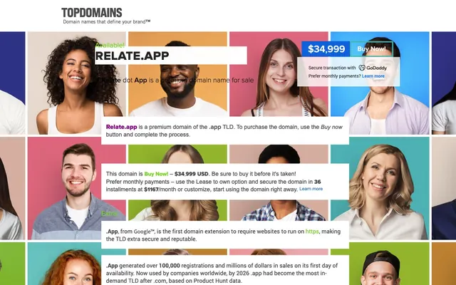
This design system presents domain names with a direct, unembellished style, leveraging high-contrast typography against simple, almost utility-like white panels. Information is segmented into cards with subtle borders rather than heavy visual separation. The overall impression is one of efficiency and clarity, with information delivered plainly without decorative flourishes. A vibrant yet functional blue or green is reserved for links or indicators to guide attention, while the majority of the interface remains in a monochrome palette.
The page exhibits a full-bleed grid layout for its background imagery, allowing diverse headshots to extend to the viewport edges. Foreground content is contained within white, high-contrast panels, which appear to float above this background. The hero section features a prominent domain name with a descriptive tagline centered over the background mosaic. Content sections below are primarily information-driven, arranged in vertically stacked white cards with consistent vertical spacing (likely `36px`) and minimal horizontal offsets. There is no strict alternating light/dark band pattern, as the content panels are consistently white, while the background shifts color depending on the image beneath. Navigation is a simple top bar, distinct from the main content flow.
The site primarily uses diverse headshot photography, cropped tightly and arranged in a grid-like mosaic, serving as a decorative background rather than explanatory content. These images are raw, unedited, and serve no direct product purpose, existing as a visually engaging counterpoint to the stark UI. There are no illustrations, product screenshots, or abstract graphics. Icons are minimal, likely monochrome, used functionally for status (e.g., GoDaddy logo), rather than decoratively. The density is image-heavy in the background, text-dominant in the foreground content panels.
# Relate dot App — Style Reference
> Utility-first information panels with minimal fuss.

**Theme:** light

**Site:** https://relate.app

This design system presents domain names with a direct, unembellished style, leveraging high-contrast typography against simple, almost utility-like white panels. Information is segmented into cards with subtle borders rather than heavy visual separation. The overall impression is one of efficiency and clarity, with information delivered plainly without decorative flourishes. A vibrant yet functional blue or green is reserved for links or indicators to guide attention, while the majority of the interface remains in a monochrome palette.

## Tokens — Colors

| Name | Value | Token | Role |
|------|------|------|------|
| Success Green | `#7bd428` | `--color-success-green` | Green outline accent for tags, dividers, and focused UI edges |
| Action Blue | `#2484f2` | `--color-action-blue` | Outlined action borders for links and interactive elements, providing a clear visual cue for clickable items. Represents the primary interactive color |
| Link Blue | `#2374c4` | `--color-link-blue` | Text color for interactive text links, a slightly darker shade of Action Blue for distinction |
| Canvas White | `#ffffff` | `--color-canvas-white` | Page backgrounds, default surface color, text backgrounds within content blocks |
| Ink Text | `#444444` | `--color-ink-text` | Primary body text, general darker text elements |
| Deep Text | `#222222` | `--color-deep-text` | Headings, strong text, and significant labels |
| Graphite Accent | `#000000` | `--color-graphite-accent` | Key headings, icons, strong outlines – acts as a prominent accent within the monochrome scale |
| Ghost Gray | `#eeeeee` | `--color-ghost-gray` | Subtle borders, inactive text, ghost button outlines. Offers a soft differentiation from Canvas White |

## Tokens — Typography

### Roboto
- **Substitute:** system-ui
- **Weights:** 400, 700
- **Sizes:** 14px, 16px, 18px
- **Line height:** 1.2, 1.31
- **Letter spacing:** normal
- **Role:** General body text, subheadings, links, and various informational labels. Its legibility supports the direct communication style.

### Georgia
- **Substitute:** serif
- **Weights:** 400
- **Sizes:** 16px
- **Line height:** 1.2
- **Letter spacing:** normal
- **Role:** Used for specific body text elements, likely for readability within longer content blocks.

### Proxima Nova
- **Substitute:** Montserrat
- **Weights:** 300, 400, 500, 800
- **Sizes:** 17px, 20px, 21px, 22px, 31px, 33px
- **Line height:** 1.2, 1.21, 1.41
- **Letter spacing:** normal
- **Role:** Headlines and prominent text elements, offering a sharp, modern alternative to system fonts. Its range of weights allows for distinct hierarchy.

### Arial
- **Substitute:** system-ui
- **Weights:** 400
- **Sizes:** 14px, 18px
- **Line height:** 1.33, 1.36, 1.67
- **Letter spacing:** normal
- **Role:** An accessible font for supplementary information and smaller textual components.

### Proxima Nova Condensed
- **Substitute:** Oswald Bold
- **Letter spacing:** normal
- **Role:** Large, impactful display headlines, communicating authority with its condensed, bold appearance.

### Source Sans Pro
- **Substitute:** system-ui
- **Weights:** 400
- **Sizes:** 18px
- **Line height:** 1.2
- **Letter spacing:** normal
- **Role:** Used for specific body text, possibly for callouts or emphasized paragraphs.

### proximacapsbold
- **Weights:** 400
- **Sizes:** 46px
- **Line height:** 1.2
- **Role:** proximacapsbold — detected in extracted data but not described by AI

## Tokens — Type Scale

Major Second (1.125) from 18px base.

| Role | Size | Line height | Letter spacing |
|------|------|------|------|
| caption | 14px | 1.31 | — |
| body-sm | 16px | 1.31 | — |
| body | 18px | 1.31 | — |

## Tokens — Spacing

- **Section gap:** 36px
- **Card padding:** 15px
- **Element gap:** 20px

## Tokens — Radius

- **Default:** 0px

## Layout

The page exhibits a full-bleed grid layout for its background imagery, allowing diverse headshots to extend to the viewport edges. Foreground content is contained within white, high-contrast panels, which appear to float above this background. The hero section features a prominent domain name with a descriptive tagline centered over the background mosaic. Content sections below are primarily information-driven, arranged in vertically stacked white cards with consistent vertical spacing (likely `36px`) and minimal horizontal offsets. There is no strict alternating light/dark band pattern, as the content panels are consistently white, while the background shifts color depending on the image beneath. Navigation is a simple top bar, distinct from the main content flow.

## Imagery

The site primarily uses diverse headshot photography, cropped tightly and arranged in a grid-like mosaic, serving as a decorative background rather than explanatory content. These images are raw, unedited, and serve no direct product purpose, existing as a visually engaging counterpoint to the stark UI. There are no illustrations, product screenshots, or abstract graphics. Icons are minimal, likely monochrome, used functionally for status (e.g., GoDaddy logo), rather than decoratively. The density is image-heavy in the background, text-dominant in the foreground content panels.

## Components

### Ghost Buy Now Button
*Primary action button for purchasing domains.*

Transparent background, 'Ink Text' color for text. Features a 0px border radius, aligning with the stark, utilitarian aesthetic. Text uses 'Roboto' at 16px, 400 weight.

### Information Card with Buy Now Button
*Contains domain details and purchase options.*

White background, with a 2px solid border using 'Ghost Gray' or 'Ink Text'. Padding of 15px is applied. Includes a 'Ghost Buy Now Button' and descriptive text in Ink Text or Deep Text.

### GoDaddy Secure Transaction Label
*Indicates secure purchasing.*

Text in 'Ink Text' using 'Roboto' font at 14px, 400 weight, with small 'GoDaddy' icon. No distinct background or border, integrated into surrounding content.

### Learn More Link
*Secondary action for more information.*

Text in 'Link Blue' using 'Roboto' at 14px or 16px, 400 weight. No explicit background, often appears within larger text blocks.

### Highlighted Status Tag
*Draws attention to key status like 'Available!' or 'Extra:'.*

Text in 'Success Green' using 'Roboto' at various smaller sizes, 400 weight. No distinct background or border, visually integrated to highlight specific words.

## Guidelines

### Do

- Use 'Canvas White' (#ffffff) as the default background for all primary content areas and surfaces to maintain a bright, uncluttered base.
- Employ 'Ink Text' (#444444) for most body text and secondary information, ensuring high readability against light backgrounds.
- Emphasize headlines and critical labels with 'Deep Text' (#222222) or 'Graphite Accent' (#000000) for strong visual hierarchy.
- Reserve 'Action Blue' (#2484f2) for borders of interactive elements and 'Link Blue' (#2374c4) for link text, making interactive elements immediately recognizable.
- Apply a 0px border radius to all components including buttons and cards for a sharp, unrounded aesthetic.
- Maintain a clear visual hierarchy using 'Proxima Nova' weights for headings: 800 for main titles, 500 for subheadings, and 400 for smaller headings.
- Incorporate `36px` as the base `sectionGap` for consistent vertical rhythm between distinct content blocks.

### Don't

- Do not introduce rounded corners or border radii greater than 0px on any interface elements.
- Avoid using saturated background colors or heavy gradient fills for primary content areas; surfaces should remain neutral and flat.
- Do not use shadows or excessive elevation that would make components appear to float; maintain a flat, panel-like appearance with subtle borders.
- Do not deviate from the specified font families and weights; maintain the established typographical voice across all content.
- Refrain from adding decorative imagery or complex illustrations; the system prioritizes direct communication through text and simple UI elements.
- Do not use 'Success Green' (#7bd428) as a background for buttons or primary actions; it is reserved for highlighting status only.

## Agent Prompt Guide

primary action: #2484f2 (outlined action border)
Create an Outlined Primary Action: Transparent background, #2484f2 border and text, 9999px radius, compact pill padding. Use it for the main CTA instead of a filled button.
More like this








Keep what you find
A free account saves references to boards and can send you a weekly email of picks based on what you save.
To see every result, go Pro.