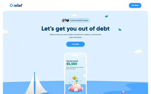
Preview image. Unlock full-res
Oceanic clarity on a paper white canvas. Illustrations and confident blues guide the user through a clear, calm financial journey.
Color palette
Primary heading text, dark section backgrounds, link borders and some dark card surfaces
Primary call-to-action button fills, key interactive elements, subtle accent in some headings
Interactive link text and their hover states, subtly darker than Hope Blue for contrast
Decorative illustration fills, adding lighter blue elements without functional interaction
Decorative illustration fills, providing a mid-toned blue accent
Decorative elements, particularly in illustrations and review card timestamps, indicating secondary information or visual interest
Page background; a soft, warm off-white that creates a friendly and inviting base
Card backgrounds, elevated container surfaces, primary text for some inverted sections
Body text, secondary information, and soft borders
General body text, default text color for cards and other content blocks
Input field text, typically darker for clear readability
The base color for button shadows, ensuring they appear as soft blue rather than harsh gray
Subtle borders and dividers, indicating soft visual separation
Informational badges and subtle background accents, creating a soft blue highlight
Typography
- Weights
- 400, 500, 600, 700, 800
- Sizes
- 12px, 14px, 16px, 18px, 20px, 32px, 40px, 49px, 53px, 58px
- Line height
- 0.94, 1, 1.1, 1.11, 1.2, 1.29, 1.38, 1.4, 1.43, 1.5, 1.6, 1.63, 1.67, 1.7
- Letter spacing
- -0.018
- Fallback
- system-ui
Primary brand typeface, used across all headings, body text, and UI components. Its slightly soft, humanist sans-serif quality adds approachability and friendliness. Consistent negative letter-spacing contributes to its compact, confident presentation.
Spacing & shape
Elevation
Components
Solid 'Hope Blue' fill with 'Arctic Mist' text and 'Shadow Tint' soft blue shadow, featuring a highly rounded '70px' border-radius. Padding is generous `14px 28px` to give ample tap area and visual weight.
A variant of the primary action, using 'Hope Blue' fill and 'Arctic Mist' text. Features a '42px' border-radius for slightly less extreme rounding, and `0px 24px` padding, suggesting a more compact or secondary role without the prominent vertical padding.
A card with 'Deep Ocean' background, '18px' border-radius, and generous `28px` padding. Used for features or content blocks that require a distinct, darker background to stand out.
Cards for displaying user reviews, set against 'Arctic Mist' with '26px' border-radius. Features a subtle `rgba(0, 0, 0, 0.05) 0px 3px 0px 0px` box shadow, giving a slight lift without being overly heavy. Padding is `34px 30px 24px 30px`.
Input fields have an 'Arctic Mist' background with 'Input Charcoal' text, with a `32px` left padding. There's no visible border-radius or border color, implying a minimalist aesthetic where the field itself is visually integrated into the background.
Uses 'Powder Blue' as a background color with 'Slate Text' for content, and a '100px' border-radius to create a full pill shape. Vertical padding is `10.5px` and horizontal is `21px`, indicating a small, rounded tag.
Guidelines
- Prioritize 'Hope Blue' (#2e96ff) for all primary interactive elements like call-to-action buttons, maintaining a '70px' border-radius for their rounded pill shape.
- Use 'Gilroy' font throughout, applying the detected negative letter-spacing for each specific `typeScale` role to maintain a compact and confident appearance.
- Employ 'Deep Ocean' (#13426f) for primary headings and dark content sections, contrasted with 'Sky Canvas' (#f9f7f0) or 'Arctic Mist' (#ffffff) for backgrounds.
- Apply '18px' border-radius to general information cards and `26px` for testimonial cards, providing a consistent soft-edged aesthetic.
- Maintain a clear visual hierarchy by limiting prominent shadows to interactive elements and specific cards (e.g., `rgba(0, 0, 0, 0.05) 0px 3px 0px 0px` for review cards).
- Use 'Sky Canvas' (#f9f7f0) as the underlying page background, with 'Arctic Mist' (#ffffff) for most interactive card surfaces, ensuring a bright and open feel.
- Avoid harsh, dark shadows; instead, use the subtle 'Shadow Tint' (#cde7fb) for button elevation to keep the visual tone light and approachable.
- Do not introduce new saturated accent colors outside of the blues and grays; the color palette is intentionally focused for brand consistency.
- Refrain from using sharp corners; all UI elements from buttons to cards should have a generous border-radius, typically `18px`, `26px`, `70px`, or `100px`.
- Do not deviate from the 'Gilroy' typeface or adjust its letter-spacing outside the defined `typeScale` roles, as its specific tracking is a key brand identifier.
- Avoid dense, information-heavy blocks; ensure generous `28px` card padding and `14px` element gaps to maintain a spacious and airy layout.
- Do not use dark backgrounds for general body text or utility elements; save 'Deep Ocean' for prominent headings or distinct sections.
About this system
ShowHide
Relief's visual system evokes a refreshing, confident simplicity, utilizing a primarily cool blue and white palette. Illustrations are front-and-center, creating a friendly and approachable feel rather than an austere financial one. Typography is robust and direct, anchored by strong, rounded buttons that feel tangible and reassuring. The design favors soft elevation and ample whitespace, framing content with a playful organic rather than rigid geometric structure.
The page primarily uses a max-width contained layout, with content centered. The hero section features a soft 'Sky Canvas' background with a large, centered headline and button, anchored by significant illustrations across the bottom. Sections maintain a consistent vertical rhythm, often alternating between white and blue backgrounds in bands. Content frequently follows a text-left/image-right or image-left/text-right pattern, or stacked centered elements. Feature sections often employ 3-column card grids. There is a strong emphasis on spaciousness, with ample vertical and horizontal padding, creating a comfortable density. Navigation is a simple top bar, with a logo on the left and a 'Primary Action Button' on the far right.
Imagery primarily utilizes custom conceptual illustrations and product screenshots. Illustrations are dimensional and playful, featuring organic, rounded forms in blues, grays, and occasional pops of warm orange or yellow. They often show symbolic objects (money, boats, anchors, piggy banks) within scenes that evoke financial journey narratives, heavily using the brand's blue palette. Product screenshots are typically presented within mockups of mobile devices. Icons are filled, rounded, and mono-color, complementing the illustration style. Imagery plays a dual role: setting a decorative, approachable atmosphere and serving as explanatory content, often adjacent to text blocks. It is image-heavy, balancing UI with illustrative storytelling.
Reminiscent of Wealthfront, Chime, Mint, SoFi.
# Relief — Style Reference
> Oceanic clarity on a paper white canvas. Illustrations and confident blues guide the user through a clear, calm financial journey.

**Theme:** light

**Site:** https://www.relief.app

Relief's visual system evokes a refreshing, confident simplicity, utilizing a primarily cool blue and white palette. Illustrations are front-and-center, creating a friendly and approachable feel rather than an austere financial one. Typography is robust and direct, anchored by strong, rounded buttons that feel tangible and reassuring. The design favors soft elevation and ample whitespace, framing content with a playful organic rather than rigid geometric structure.

## Tokens — Colors

| Name | Value | Token | Role |
|------|------|------|------|
| Deep Ocean | `#13426f` | `--color-deep-ocean` | Primary heading text, dark section backgrounds, link borders and some dark card surfaces |
| Hope Blue | `#2e96ff` | `--color-hope-blue` | Primary call-to-action button fills, key interactive elements, subtle accent in some headings |
| Cerulean Link | `#0254a5` | `--color-cerulean-link` | Interactive link text and their hover states, subtly darker than Hope Blue for contrast |
| Sky Fill | `#73b9ff` | `--color-sky-fill` | Decorative illustration fills, adding lighter blue elements without functional interaction |
| Ocean Fill | `#50a7ff` | `--color-ocean-fill` | Decorative illustration fills, providing a mid-toned blue accent |
| Accent Blue | `#328dd1` | `--color-accent-blue` | Decorative elements, particularly in illustrations and review card timestamps, indicating secondary information or visual interest |
| Sky Canvas | `#f9f7f0` | `--color-sky-canvas` | Page background; a soft, warm off-white that creates a friendly and inviting base |
| Arctic Mist | `#ffffff` | `--color-arctic-mist` | Card backgrounds, elevated container surfaces, primary text for some inverted sections |
| Subtle Gray | `#616c8a` | `--color-subtle-gray` | Body text, secondary information, and soft borders |
| Slate Text | `#333333` | `--color-slate-text` | General body text, default text color for cards and other content blocks |
| Input Charcoal | `#202634` | `--color-input-charcoal` | Input field text, typically darker for clear readability |
| Shadow Tint | `#cde7fb` | `--color-shadow-tint` | The base color for button shadows, ensuring they appear as soft blue rather than harsh gray |
| Dim Gray | `#d0d5dd` | `--color-dim-gray` | Subtle borders and dividers, indicating soft visual separation |
| Powder Blue | `#bde1f9` | `--color-powder-blue` | Informational badges and subtle background accents, creating a soft blue highlight |

## Tokens — Typography

### Gilroy
- **Substitute:** system-ui
- **Weights:** 400, 500, 600, 700, 800
- **Sizes:** 12px, 14px, 16px, 18px, 20px, 32px, 40px, 49px, 53px, 58px
- **Line height:** 0.94, 1, 1.1, 1.11, 1.2, 1.29, 1.38, 1.4, 1.43, 1.5, 1.6, 1.63, 1.67, 1.7
- **Letter spacing:** -0.018
- **Role:** Primary brand typeface, used across all headings, body text, and UI components. Its slightly soft, humanist sans-serif quality adds approachability and friendliness. Consistent negative letter-spacing contributes to its compact, confident presentation.

## Tokens — Type Scale

Major Third (1.25) from 16px base.

| Role | Size | Line height | Letter spacing |
|------|------|------|------|
| caption | 12px | 1.7 | -0.22px |
| body-sm | 14px | 1.63 | -0.25px |
| body | 16px | 1.6 | -0.29px |
| subheading | 18px | 1.5 | -0.32px |
| heading-sm | 20px | 1.43 | -0.36px |
| heading | 32px | 1.29 | -0.58px |
| heading-lg | 40px | 1.2 | -0.72px |
| display | 58px | 1.11 | -1.04px |

## Tokens — Spacing

- **Section gap:** 68px
- **Card padding:** 28px
- **Element gap:** 14px

## Tokens — Radius

- **Buttons:** 70px
- **Cards:** 18px
- **badges:** 100px
- **hero-elements:** 49px

## Tokens — Elevation

- **Primary Action Button:** `rgba(154, 207, 246, 0.5) 0px 7px 0px 0px`
- **Secondary Action Button:** `rgba(154, 207, 246, 0.5) 0px 5px 0px 0px`
- **Review Testimonial Card:** `rgba(0, 0, 0, 0.05) 0px 3px 0px 0px`

## Layout

The page primarily uses a max-width contained layout, with content centered. The hero section features a soft 'Sky Canvas' background with a large, centered headline and button, anchored by significant illustrations across the bottom. Sections maintain a consistent vertical rhythm, often alternating between white and blue backgrounds in bands. Content frequently follows a text-left/image-right or image-left/text-right pattern, or stacked centered elements. Feature sections often employ 3-column card grids. There is a strong emphasis on spaciousness, with ample vertical and horizontal padding, creating a comfortable density. Navigation is a simple top bar, with a logo on the left and a 'Primary Action Button' on the far right.

## Imagery

Imagery primarily utilizes custom conceptual illustrations and product screenshots. Illustrations are dimensional and playful, featuring organic, rounded forms in blues, grays, and occasional pops of warm orange or yellow. They often show symbolic objects (money, boats, anchors, piggy banks) within scenes that evoke financial journey narratives, heavily using the brand's blue palette. Product screenshots are typically presented within mockups of mobile devices. Icons are filled, rounded, and mono-color, complementing the illustration style. Imagery plays a dual role: setting a decorative, approachable atmosphere and serving as explanatory content, often adjacent to text blocks. It is image-heavy, balancing UI with illustrative storytelling.

## Components

### Primary Action Button
*Call-to-action button*

Solid 'Hope Blue' fill with 'Arctic Mist' text and 'Shadow Tint' soft blue shadow, featuring a highly rounded '70px' border-radius. Padding is generous `14px 28px` to give ample tap area and visual weight.

### Compact Action Button
*Secondary call-to-action button*

A variant of the primary action, using 'Hope Blue' fill and 'Arctic Mist' text. Features a '42px' border-radius for slightly less extreme rounding, and `0px 24px` padding, suggesting a more compact or secondary role without the prominent vertical padding.

### Dark Feature Card
*Informational display card*

A card with 'Deep Ocean' background, '18px' border-radius, and generous `28px` padding. Used for features or content blocks that require a distinct, darker background to stand out.

### Review Testimonial Card
*User testimonial display*

Cards for displaying user reviews, set against 'Arctic Mist' with '26px' border-radius. Features a subtle `rgba(0, 0, 0, 0.05) 0px 3px 0px 0px` box shadow, giving a slight lift without being overly heavy. Padding is `34px 30px 24px 30px`.

### Input Field
*User data entry*

Input fields have an 'Arctic Mist' background with 'Input Charcoal' text, with a `32px` left padding. There's no visible border-radius or border color, implying a minimalist aesthetic where the field itself is visually integrated into the background.

### Pill Badge
*Categorization or status indicator*

Uses 'Powder Blue' as a background color with 'Slate Text' for content, and a '100px' border-radius to create a full pill shape. Vertical padding is `10.5px` and horizontal is `21px`, indicating a small, rounded tag.

## Guidelines

### Do

- Prioritize 'Hope Blue' (#2e96ff) for all primary interactive elements like call-to-action buttons, maintaining a '70px' border-radius for their rounded pill shape.
- Use 'Gilroy' font throughout, applying the detected negative letter-spacing for each specific `typeScale` role to maintain a compact and confident appearance.
- Employ 'Deep Ocean' (#13426f) for primary headings and dark content sections, contrasted with 'Sky Canvas' (#f9f7f0) or 'Arctic Mist' (#ffffff) for backgrounds.
- Apply '18px' border-radius to general information cards and `26px` for testimonial cards, providing a consistent soft-edged aesthetic.
- Maintain a clear visual hierarchy by limiting prominent shadows to interactive elements and specific cards (e.g., `rgba(0, 0, 0, 0.05) 0px 3px 0px 0px` for review cards).
- Use 'Sky Canvas' (#f9f7f0) as the underlying page background, with 'Arctic Mist' (#ffffff) for most interactive card surfaces, ensuring a bright and open feel.

### Don't

- Avoid harsh, dark shadows; instead, use the subtle 'Shadow Tint' (#cde7fb) for button elevation to keep the visual tone light and approachable.
- Do not introduce new saturated accent colors outside of the blues and grays; the color palette is intentionally focused for brand consistency.
- Refrain from using sharp corners; all UI elements from buttons to cards should have a generous border-radius, typically `18px`, `26px`, `70px`, or `100px`.
- Do not deviate from the 'Gilroy' typeface or adjust its letter-spacing outside the defined `typeScale` roles, as its specific tracking is a key brand identifier.
- Avoid dense, information-heavy blocks; ensure generous `28px` card padding and `14px` element gaps to maintain a spacious and airy layout.
- Do not use dark backgrounds for general body text or utility elements; save 'Deep Ocean' for prominent headings or distinct sections.

## Agent Prompt Guide

Quick Color Reference:
text: #333333
background: #f9f7f0
border: #d0d5dd
accent: #2e96ff
primary action: #2e96ff (filled action)

Example Component Prompts:
1. Create a Primary Action Button: #2e96ff background, #40444e text, 9999px radius, compact pill padding. Use this filled treatment for the main CTA.
2. Design a 'Dark Feature Card': 'Deep Ocean' background, 18px radius, 28px padding. Headline 'Link your debt' at 20px Gilroy weight 700, #ffffff, letter-spacing -0.36px. Body text 'Discover savings...' at 16px Gilroy weight 400, #ffffff, letter-spacing -0.29px. Include a central illustration.
3. Build a 'Review Testimonial Card': 'Arctic Mist' background, 26px radius, rgba(0, 0, 0, 0.05) 0px 3px 0px 0px shadow. Padding 34px 30px 24px 30px. Body text 'I've already seen improvements...' at 16px Gilroy weight 400, #333333, letter-spacing -0.29px. Author name 'JazzyJ367' at 14px Gilroy weight 700, #333333, letter-spacing -0.25px.
More like this








Keep what you find
A free account saves references to boards and can send you a weekly email of picks based on what you save.
To see every result, go Pro.