Preview image. Unlock full-res
Sustainable canvas, precise purpose
Color palette
Primary body text, headers, strong borders, dark iconography, navigation links
Subtle green text accents, secondary green links
Green action color for filled buttons, selected navigation states, and focused conversion moments
Accent for key headings, primary navigation hover states, and highlighted text
Background for secondary action buttons, often ghosted or outlined
Background for feature cards, often used in contrast with dark text
Secondary surface background, subtle button backgrounds, light card backgrounds
Primary background for cards, modals, and default page sections
Hairline borders, subtle dividers, inactive UI elements
Secondary text, muted links, and low-emphasis information
Muted text, placeholder text, disabled element borders
Strongest text, card backgrounds for high contrast sections, critical iconography
Dark button backgrounds, contrasting small elements
Typography
- Weights
- 200, 300, 400
- Sizes
- 10px, 11px, 12px, 13px, 14px, 16px, 17px, 20px, 22px, 24px, 26px, 32px, 36px
- Line height
- 1, 1.15, 1.2, 1.4, 1.5, 1.6, 1.7, 2
- Letter spacing
- 0.18, -0.9
- Fallback
- system-ui, sans-serif
The primary typeface for all text content including headings, body, buttons, and navigation. Its slightly condensed nature and varying weights, especially the lighter 200 and 300 for larger headings, contribute to the site's airy and precise feel.
Spacing & shape
Elevation
Components
Transparent background, 'Midnight Forest' #0b392f text and 1px border, 0px border-radius, no padding (text-only link style).
'Canvas Fog' #f6f7f7 background, 'Midnight Forest' #0b392f text, 1px 'Ash Cloud' #e7e5e4 border, 8px border-radius, 10px vertical and 20px horizontal padding.
'Carbon Gray' #333c39 background, 'Snowdrift' #ffffff text, 8px border-radius, 10px padding all around. Used for primary actions like 'Book a free call'.
'Canvas Fog' #f6f7f7 background, 8px border-radius, 20px padding (top, right, left) and 5px bottom padding, no shadow.
'Snowdrift' #ffffff background, 12px border-radius, 15px padding all around. Shadow: rgba(0, 0, 0, 0.25) 0px 0px 15px 0px.
Transparent background, 0px border-radius, no specific padding, no shadow.
'Coal Black' #000000 background (for contrast with white text overlay), 8px border-radius, 660px top padding (for image), no shadow. Content usually overlays the image.
'Verdant Sprout' #0cea9 background, black text, 9999px border-radius (pill shape), fixed 1px top/bottom and 2px left/right padding.
Guidelines
- Use 'Midnight Forest' #0b392f for primary text, links, and strong borders to maintain brand consistency.
- Apply 'Canvas Fog' #f6f7f7 as the background for secondary content blocks and subtle button variants.
- Reserve 'Verdant Sprout' #0cea9 and 'Amethyst Glow' #6f52d3 for functional highlights, accents, and call-to-action indicators, avoiding decorative overuse.
- Utilize Planar font with a weight of 400 for body text and 300 for prominent headings, maintaining an airy and readable aesthetic.
- Apply 8px border-radius consistently to all buttons, cards, and images, creating a soft, approachable feel.
- Ensure generous use of 10px element gaps and 20px card padding for a compact, yet not crowded, information density.
- Use rgba(0, 0, 0, 0.25) 0px 0px 15px 0px for all elevated components to provide subtle depth without heavy visual weight.
- Do not introduce strong, saturated colors beyond 'Verdant Sprout' #0cea9 or 'Amethyst Glow' #6f52d3 for UI elements.
- Avoid heavy shadows or gradients on primary UI elements; surfaces should appear mostly flat or with subtle elevation.
- Do not use highly decorative or script fonts; stick to the Planar family to maintain the system's clean, precise tone.
- Do not deviate from the established 8px and 12px border radii for components; sharp corners are not part of this design language.
- Do not create dense, text-heavy blocks without adequate line-height (1.6 for body text) or clear visual separation.
- Avoid using multiple font sizes for adjacent text elements; stick to the defined type scale to maintain visual hierarchy.
About this system
ShowHide
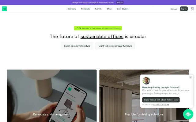
Relieve Furniture uses a calm, sustainable efficiency aesthetic: light, airy canvases, subtle elevation, and a focused palette of muted greens and purples. Typography is precise and airy, conveying information clearly without visual clutter. Components often feature soft rounded corners, suggesting approachability within an otherwise crisp, structured layout. The overall impression is one of organized, eco-conscious professionalism.
The site employs a max-width contained layout, typically centered, with notable exceptions such as full-bleed header and hero sections. The hero prominently features a centered headline over a white background, with calls to action below. Section rhythm is generally consistent with vertical spacing, often alternating between white and very light gray backgrounds, creating distinct content blocks. Content is arranged in alternating text-left/image-right or image-left/text-right patterns, and in grids for cards, particularly 2-column layouts. The overall density is compact but with sufficient breathing room provided by consistent margins and padding, contributing to a clean, organized feel. A sticky top navigation bar provides consistent access to primary sections.
Imagery on Relieve Furniture typically features tightly cropped, professional product photography (office furniture, tech devices) or diverse team member photographs. Product shots often appear against neutral or dark backgrounds, highlighting the object itself. Photos are high-key and well-lit. Illustrations are minimal and functional, often appearing as subtle decorative elements or icons in a solid, filled style. Icons are clean, outlined, and monochromatic, primarily in 'Midnight Forest' #0b392f or 'Verdant Sprout' #0cea9e. There is a strong emphasis on visuals that communicate modern utility and sustainability, with imagery acting as explanatory content or product showcases rather than decorative atmosphere.
Reminiscent of OpenSpace, Fieldguide, Balsamiq, Linear.
# Relieve Furniture — Style Reference
> Sustainable canvas, precise purpose

**Theme:** light

**Site:** https://relievefurniture.com

Relieve Furniture uses a calm, sustainable efficiency aesthetic: light, airy canvases, subtle elevation, and a focused palette of muted greens and purples. Typography is precise and airy, conveying information clearly without visual clutter. Components often feature soft rounded corners, suggesting approachability within an otherwise crisp, structured layout. The overall impression is one of organized, eco-conscious professionalism.

## Tokens — Colors

| Name | Value | Token | Role |
|------|------|------|------|
| Midnight Forest | `#0b392f` | `--color-midnight-forest` | Primary body text, headers, strong borders, dark iconography, navigation links |
| Dark Forest | `#0b704e` | `--color-dark-forest` | Subtle green text accents, secondary green links |
| Verdant Sprout | `#0cea9e` | `--color-verdant-sprout` | Green action color for filled buttons, selected navigation states, and focused conversion moments |
| Amethyst Glow | `#6f52d3` | `--color-amethyst-glow` | Accent for key headings, primary navigation hover states, and highlighted text |
| Deep Plum | `#6043ba` | `--color-deep-plum` | Background for secondary action buttons, often ghosted or outlined |
| Slate Blue | `#7f6de1` | `--color-slate-blue` | Background for feature cards, often used in contrast with dark text |
| Canvas Fog | `#f6f7f7` | `--color-canvas-fog` | Secondary surface background, subtle button backgrounds, light card backgrounds |
| Snowdrift | `#ffffff` | `--color-snowdrift` | Primary background for cards, modals, and default page sections |
| Ash Cloud | `#e7e5e4` | `--color-ash-cloud` | Hairline borders, subtle dividers, inactive UI elements |
| Graphite Text | `#374151` | `--color-graphite-text` | Secondary text, muted links, and low-emphasis information |
| Stone Grey | `#778a83` | `--color-stone-grey` | Muted text, placeholder text, disabled element borders |
| Coal Black | `#000000` | `--color-coal-black` | Strongest text, card backgrounds for high contrast sections, critical iconography |
| Carbon Gray | `#333c39` | `--color-carbon-gray` | Dark button backgrounds, contrasting small elements |

## Tokens — Typography

### Planar
- **Substitute:** system-ui, sans-serif
- **Weights:** 200, 300, 400
- **Sizes:** 10px, 11px, 12px, 13px, 14px, 16px, 17px, 20px, 22px, 24px, 26px, 32px, 36px
- **Line height:** 1, 1.15, 1.2, 1.4, 1.5, 1.6, 1.7, 2
- **Letter spacing:** 0.18, -0.9
- **Role:** The primary typeface for all text content including headings, body, buttons, and navigation. Its slightly condensed nature and varying weights, especially the lighter 200 and 300 for larger headings, contribute to the site's airy and precise feel.

## Tokens — Type Scale

| Role | Size | Line height | Letter spacing |
|------|------|------|------|
| caption | 10px | 1.7 | — |
| body | 14px | 1.6 | — |
| heading-sm | 22px | 1.4 | — |
| heading | 24px | 1.2 | — |
| heading-lg | 32px | 1.15 | — |
| display | 36px | 1 | -0.9px |

## Tokens — Spacing

- **Section gap:** 40px
- **Card padding:** 20px
- **Element gap:** 10px

## Tokens — Radius

- **Buttons:** 8px
- **Cards:** 8px
- **Images:** 8px
- **chips:** 9999px

## Tokens — Elevation

- **Elevated Tooltip Card:** `rgba(0, 0, 0, 0.25) 0px 0px 15px 0px`
- **Card with subtle shadow:** `rgba(0, 0, 0, 0.1) 0px 1px 3px 0px, rgba(0, 0, 0, 0.1) 0px 1px 2px -1px`

## Layout

The site employs a max-width contained layout, typically centered, with notable exceptions such as full-bleed header and hero sections. The hero prominently features a centered headline over a white background, with calls to action below. Section rhythm is generally consistent with vertical spacing, often alternating between white and very light gray backgrounds, creating distinct content blocks. Content is arranged in alternating text-left/image-right or image-left/text-right patterns, and in grids for cards, particularly 2-column layouts. The overall density is compact but with sufficient breathing room provided by consistent margins and padding, contributing to a clean, organized feel. A sticky top navigation bar provides consistent access to primary sections.

## Imagery

Imagery on Relieve Furniture typically features tightly cropped, professional product photography (office furniture, tech devices) or diverse team member photographs. Product shots often appear against neutral or dark backgrounds, highlighting the object itself. Photos are high-key and well-lit. Illustrations are minimal and functional, often appearing as subtle decorative elements or icons in a solid, filled style. Icons are clean, outlined, and monochromatic, primarily in 'Midnight Forest' #0b392f or 'Verdant Sprout' #0cea9e. There is a strong emphasis on visuals that communicate modern utility and sustainability, with imagery acting as explanatory content or product showcases rather than decorative atmosphere.

## Components

### Ghost Primary Button
*Default action button variant, outlines call-to-actions.*

Transparent background, 'Midnight Forest' #0b392f text and 1px border, 0px border-radius, no padding (text-only link style).

### Subtle Recessed Button
*Secondary action button for internal navigation or less prominent actions.*

'Canvas Fog' #f6f7f7 background, 'Midnight Forest' #0b392f text, 1px 'Ash Cloud' #e7e5e4 border, 8px border-radius, 10px vertical and 20px horizontal padding.

### Dark Filled Button
*Prominent action button for high-attention calls to action.*

'Carbon Gray' #333c39 background, 'Snowdrift' #ffffff text, 8px border-radius, 10px padding all around. Used for primary actions like 'Book a free call'.

### Flat Content Card
*Information display card, primarily for textual content or small images without elevation.*

'Canvas Fog' #f6f7f7 background, 8px border-radius, 20px padding (top, right, left) and 5px bottom padding, no shadow.

### Elevated Tooltip Card
*Interactive pop-up or dialog card for focused information.*

'Snowdrift' #ffffff background, 12px border-radius, 15px padding all around. Shadow: rgba(0, 0, 0, 0.25) 0px 0px 15px 0px.

### Text-Only Card
*Flexible card for information display, often used without distinct background or borders.*

Transparent background, 0px border-radius, no specific padding, no shadow.

### Image Feature Card
*Card with background image, typically featuring a large image or visual element.*

'Coal Black' #000000 background (for contrast with white text overlay), 8px border-radius, 660px top padding (for image), no shadow. Content usually overlays the image.

### Highlight Tag
*Small informational tag, often for 'New' features or status updates.*

'Verdant Sprout' #0cea9 background, black text, 9999px border-radius (pill shape), fixed 1px top/bottom and 2px left/right padding.

## Guidelines

### Do

- Use 'Midnight Forest' #0b392f for primary text, links, and strong borders to maintain brand consistency.
- Apply 'Canvas Fog' #f6f7f7 as the background for secondary content blocks and subtle button variants.
- Reserve 'Verdant Sprout' #0cea9 and 'Amethyst Glow' #6f52d3 for functional highlights, accents, and call-to-action indicators, avoiding decorative overuse.
- Utilize Planar font with a weight of 400 for body text and 300 for prominent headings, maintaining an airy and readable aesthetic.
- Apply 8px border-radius consistently to all buttons, cards, and images, creating a soft, approachable feel.
- Ensure generous use of 10px element gaps and 20px card padding for a compact, yet not crowded, information density.
- Use rgba(0, 0, 0, 0.25) 0px 0px 15px 0px for all elevated components to provide subtle depth without heavy visual weight.

### Don't

- Do not introduce strong, saturated colors beyond 'Verdant Sprout' #0cea9 or 'Amethyst Glow' #6f52d3 for UI elements.
- Avoid heavy shadows or gradients on primary UI elements; surfaces should appear mostly flat or with subtle elevation.
- Do not use highly decorative or script fonts; stick to the Planar family to maintain the system's clean, precise tone.
- Do not deviate from the established 8px and 12px border radii for components; sharp corners are not part of this design language.
- Do not create dense, text-heavy blocks without adequate line-height (1.6 for body text) or clear visual separation.
- Avoid using multiple font sizes for adjacent text elements; stick to the defined type scale to maintain visual hierarchy.

## Agent Prompt Guide

**Quick Color Reference:**
- text: #0b392f
- background: #ffffff
- border: #e7e5e4
- accent: #0cea9e
- primary action: #0cea9e (filled action)

**3-5 Example Component Prompts:**
- Create a Hero Headline: 'The future of sustainable offices is circular' using Planar font, size 36px, weight 300, color #0b392f, letter-spacing -0.9px, centered on a #ffffff background.
- Create a Subtle Recessed Button: 'I want to browse circular furniture' using Planar font, size 14px, weight 400, color #0b392f, background #f6f7f7, border 1px solid #e7e5e4, 8px border-radius, 10px vertical and 20px horizontal padding.
- Create an Elevated Tooltip Card: 'Need help finding the right furniture?' using Planar font, size 14px, weight 400, color #0b392f. Background #ffffff, 12px border-radius, 15px padding all around, with a shadow of rgba(0, 0, 0, 0.25) 0px 0px 15px 0px.
- Create a Highlight Tag: 'NEW' using Planar font, size 10px, weight 400, color #000000, background #0cea9e, 9999px border-radius, 1px vertical and 2px horizontal padding.
- Create a Dark Filled Button: 'Book a free call with a team member today' using Planar font, size 14px, weight 400, color #ffffff, background #333c39, 8px border-radius, 10px padding all around.
More like this








Keep what you find
A free account saves references to boards and can send you a weekly email of picks based on what you save.
To see every result, go Pro.