Preview image. Unlock full-res
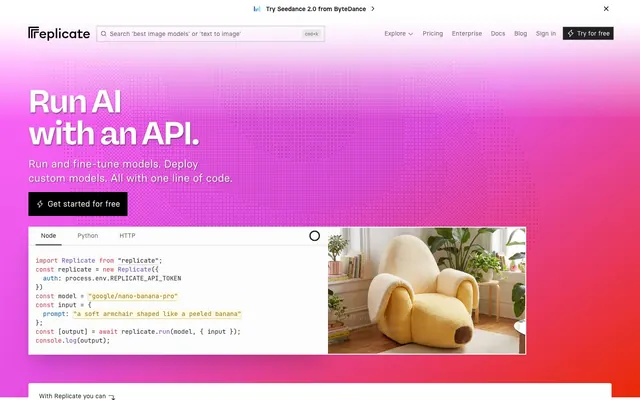
Neon Gradient Playground. The site feels like an interactive playground built on a fluctuating neon energy field.
Color palette
Prominent links, highlighted text, and the dominant color in the hero gradient — an energetic accent that infuses the UI with a sense of playfulness.
Informational text backgrounds, subtle brand accents — provides a sober counterpoint to the vibrant gradients.
Secondary CTA buttons, interactive element outlines — a slightly less intense brand orange.
Hero section background, large brand elements — this gradient defines the site's bold, energetic visual signature.
Primary text, deep backgrounds, icon fills, button text on light buttons.
Page backgrounds, card surfaces, ghost button backgrounds.
Secondary text, subtle borders, input placeholders.
Decorative lines, subtle box shadows, inactive states.
Subtle background for alternating sections or hovered elements.
Light borders and separators, especially for interactive elements.
Strong button backgrounds, prominent icon fills, high-contrast text.
Status indicators, success badges — denotes positive feedback.
Typography
- Weights
- 400, 600, 700
- Sizes
- 16px, 30px, 48px, 72px, 128px
- Line height
- 1, 1.2, 1.5
- Letter spacing
- -0.0250em
- Fallback
- Montserrat
Primary headings and display text. The tight letter-spacing gives headings a compact, impactful look that aligns with a clean, modern aesthetic.
- Weights
- 400, 600
- Sizes
- 12px, 14px, 16px, 18px, 20px, 24px, 29px
- Line height
- 1.11, 1.33, 1.4, 1.43, 1.5, 1.56
- Letter spacing
- -0.0250em
- Fallback
- Inter
Body text, navigation, and most UI elements. The consistent negative letter-spacing subtly distinguishes it from generic sans-serifs, contributing to a polished, readable feel.
- Weights
- 400
- Sizes
- 10px, 11px, 14px, 16px
- Line height
- 1.43, 1.5
- Letter spacing
- normal
- Fallback
- Inconsolata
Code snippets, technical labels, and console-like outputs. Its monospace nature clearly segregates programmatic content from natural language.
Spacing & shape
Components
backgroundColor=#000000, color=#ffffff, borderRadius=0px, paddingTop=12px, paddingRight=16px, paddingBottom=12px, paddingLeft=16px. Typography: 'basier-square', 600, 16px.
backgroundColor=rgba(0, 0, 0, 0), color=#202020, borderRadius=0px, padding: implicit to content. Used for tabs and filtering.
backgroundColor=rgba(0, 0, 0, 0.3), color=rgba(255, 255, 255, 0.9), borderRadius=9999px, paddingTop=2px, paddingRight=10px, paddingBottom=2px, paddingLeft=10px. Often seen within the gradient hero or code blocks.
backgroundColor=rgba(255, 255, 255, 0.1), color=#202020 for text, placeholder color is implicit. paddingTop=6px, paddingRight=56px, paddingBottom=6px, paddingLeft=28px. No visible border initially, blends with background.
backgroundColor=rgba(0, 0, 0, 0), color=#fcfcfc. Used within the multi-tab (Node, Python, HTTP) code display, allowing for code entry without distinct borders.
backgroundColor=#2b9a66, color=#ffffff, borderRadius=9999px. Padding implied from content: 'Official' with minimal padding.
backgroundColor=#ffffff, color=#202020, border: implicit subtle light gray outline, padding: 16px. No explicit border-radius, appears sharp-edged. Features specific image, title, and run count.
color=#202020 (default), #ea2804 (hover/active), no underline by default. Typography: 'basier-square', 400 or 600 weight, 16px.
Guidelines
- Apply the Data Bloom Gradient (`linear-gradient(to right bottom, rgb(255, 107, 252), rgb(234, 40, 4), rgb(246, 244, 127))`) for all new hero sections and large marketing blocks to maintain visual brand identity.
- Use Absolute Zero (#202020) for primary body text, headings, and bold calls to action on light backgrounds, ensuring high contrast.
- Construct buttons with a 0px border-radius unless they are specifically 'pill' style (9999px radius), creating a mix of sharp and soft forms.
- Utilize 'rb-freigeist-neue' with -0.0250em letter-spacing for all significant headings (H1-H3) to impart a distinct, modern, and compact appearance.
- Implement `jetbrains-mono` for all code examples, technical labels, and console-like outputs to clearly delineate them from editorial content, using its default sizing.
- Maintain a default card padding of 16px to ensure consistent content density within information blocks.
- Employ the Pill Accent Button (`backgroundColor=rgba(0, 0, 0, 0.3), color=rgba(255, 255, 255, 0.9), borderRadius=9999px, paddingTop=2px, paddingRight=10px, paddingBottom=2px, paddingLeft=10px`) for secondary, context-specific actions within dynamic areas or code blocks.
- Avoid using generic blue for interactive elements; instead, leverage Cosmic Candy (#ea2804) for primary links and accents.
- Do not introduce heavy shadows or complex elevations; stick to the minimal boxShadow (`rgb(228, 199, 103) 0px 1px 2px 0px`) for subtle visual lift.
- Refrain from using rounded corners on standard content cards or generic inputs; these should generally maintain a 0px border-radius.
- Do not deviate from the specified negative letter-spacing for 'basier-square' and 'rb-freigeist-neue'; it is a key typographic characteristic.
- Avoid decorative imagery or large graphics that distract from the UI elements; primary focus is on functionality and code.
- Do not use dark backgrounds for major content sections below the hero; these should primarily be Alabaster (#ffffff) or Whisper White (#f9f9f9).
- Never replace 'jetbrains-mono' with a proportional font for code snippets; monospace is essential for code readability.
About this system
ShowHide
Replicate offers a dynamic and playful interface that contrasts with its technical subject matter. A vibrant pink-red-yellow gradient serves as a high-energy backdrop, reminiscent of digital signal pathways, while the primary content remains crisp and legible on white and dark gray surfaces. The design balances a bold, almost disruptive hero with a structured, informative presentation lower down the page, using rounded forms sparingly but deliberately to soften areas of interaction amidst sharp-cornered content blocks.
The site employs a mixed layout strategy: the hero section is full-bleed, dominated by a vibrant, energetic gradient background and a prominent centered headline. Below the hero, the layout transitions to a max-width contained area, centered on the page for readability. Section rhythm is varied; some sections have large vertical gaps, while others are more compact, presenting interactive elements like model cards in a loose grid. Content arrangement frequently uses 2-column structures, with code blocks often appearing next to descriptive text. A distinctive feature is the horizontal scrolling carousel of model categories and a 3-column implicit card grid for showcasing individual AI models, giving a dense, explorable feel. The navigation is a sticky top bar, providing persistent access across the site.
The visual language is split between functional UI elements and captivating, almost surreal product examples. Product imagery consists of tight, decontextualized crops (like the banana chair) that are both whimsical and illustrative of AI capabilities. Icons are primarily monochrome, outlining crucial functions without adding visual noise. Visuals serve an explanatory role, showcasing the creative outputs of AI models rather than being decorative or lifestyle-oriented. Density is image-moderate: product examples are interspersed to break up text and code, but text remains dominant in information-heavy sections. Treatment is generally contained, sharp-edged, and presented within clean borders, contrasting with the fluid background gradient.
Reminiscent of Vercel, GitHub, Hugging Face, Stripe (older designs).
# Replicate — Style Reference
> Neon Gradient Playground. The site feels like an interactive playground built on a fluctuating neon energy field.

**Theme:** light

**Site:** https://replicate.com

Replicate offers a dynamic and playful interface that contrasts with its technical subject matter. A vibrant pink-red-yellow gradient serves as a high-energy backdrop, reminiscent of digital signal pathways, while the primary content remains crisp and legible on white and dark gray surfaces. The design balances a bold, almost disruptive hero with a structured, informative presentation lower down the page, using rounded forms sparingly but deliberately to soften areas of interaction amidst sharp-cornered content blocks.

## Tokens — Colors

| Name | Value | Token | Role |
|------|------|------|------|
| Cosmic Candy | `#ea2804` | `--color-cosmic-candy` | Prominent links, highlighted text, and the dominant color in the hero gradient — an energetic accent that infuses the UI with a sense of playfulness. |
| Deep Space Blue | `#032f62` | `--color-deep-space-blue` | Informational text backgrounds, subtle brand accents — provides a sober counterpoint to the vibrant gradients. |
| Sunset Burst | `#dd4425` | `--color-sunset-burst` | Secondary CTA buttons, interactive element outlines — a slightly less intense brand orange. |
| Data Bloom Gradient | `#ff6bfc` | `--color-data-bloom-gradient` | Hero section background, large brand elements — this gradient defines the site's bold, energetic visual signature. |
| Absolute Zero | `#202020` | `--color-absolute-zero` | Primary text, deep backgrounds, icon fills, button text on light buttons. |
| Alabaster | `#ffffff` | `--color-alabaster` | Page backgrounds, card surfaces, ghost button backgrounds. |
| Graphite | `#646464` | `--color-graphite` | Secondary text, subtle borders, input placeholders. |
| Silver Mist | `#bfbfbf` | `--color-silver-mist` | Decorative lines, subtle box shadows, inactive states. |
| Whisper White | `#f9f9f9` | `--color-whisper-white` | Subtle background for alternating sections or hovered elements. |
| Outline Gray | `#d9d9d9` | `--color-outline-gray` | Light borders and separators, especially for interactive elements. |
| Blackhole | `#000000` | `--color-blackhole` | Strong button backgrounds, prominent icon fills, high-contrast text. |
| API Success Green | `#2b9a66` | `--color-api-success-green` | Status indicators, success badges — denotes positive feedback. |

## Tokens — Typography

### rb-freigeist-neue
- **Substitute:** Montserrat
- **Weights:** 400, 600, 700
- **Sizes:** 16px, 30px, 48px, 72px, 128px
- **Line height:** 1, 1.2, 1.5
- **Letter spacing:** -0.0250em
- **Role:** Primary headings and display text. The tight letter-spacing gives headings a compact, impactful look that aligns with a clean, modern aesthetic.

### basier-square
- **Substitute:** Inter
- **Weights:** 400, 600
- **Sizes:** 12px, 14px, 16px, 18px, 20px, 24px, 29px
- **Line height:** 1.11, 1.33, 1.4, 1.43, 1.5, 1.56
- **Letter spacing:** -0.0250em
- **Role:** Body text, navigation, and most UI elements. The consistent negative letter-spacing subtly distinguishes it from generic sans-serifs, contributing to a polished, readable feel.

### jetbrains-mono
- **Substitute:** Inconsolata
- **Weights:** 400
- **Sizes:** 10px, 11px, 14px, 16px
- **Line height:** 1.43, 1.5
- **Letter spacing:** normal
- **Role:** Code snippets, technical labels, and console-like outputs. Its monospace nature clearly segregates programmatic content from natural language.

## Tokens — Type Scale

| Role | Size | Line height | Letter spacing |
|------|------|------|------|
| caption | 10px | 1.43 | — |
| body | 14px | 1.43 | -0.35px |
| body-lg | 16px | 1.5 | -0.4px |
| subheading | 18px | 1.5 | -0.45px |
| heading | 24px | 1.33 | -0.6px |
| heading-lg | 30px | 1.2 | — |
| display | 48px | 1.2 | -1.2px |
| display-lg | 72px | 1 | -1.8px |
| display-xl | 128px | 1 | -3.2px |

## Tokens — Spacing

- **Section gap:** 48px
- **Card padding:** 16px
- **Element gap:** 8px

## Tokens — Radius

- **Buttons:** 9999px
- **Cards:** 0px
- **badges:** 9999px
- **defaults:** 0px

## Layout

The site employs a mixed layout strategy: the hero section is full-bleed, dominated by a vibrant, energetic gradient background and a prominent centered headline. Below the hero, the layout transitions to a max-width contained area, centered on the page for readability. Section rhythm is varied; some sections have large vertical gaps, while others are more compact, presenting interactive elements like model cards in a loose grid. Content arrangement frequently uses 2-column structures, with code blocks often appearing next to descriptive text. A distinctive feature is the horizontal scrolling carousel of model categories and a 3-column implicit card grid for showcasing individual AI models, giving a dense, explorable feel. The navigation is a sticky top bar, providing persistent access across the site.

## Imagery

The visual language is split between functional UI elements and captivating, almost surreal product examples. Product imagery consists of tight, decontextualized crops (like the banana chair) that are both whimsical and illustrative of AI capabilities. Icons are primarily monochrome, outlining crucial functions without adding visual noise. Visuals serve an explanatory role, showcasing the creative outputs of AI models rather than being decorative or lifestyle-oriented. Density is image-moderate: product examples are interspersed to break up text and code, but text remains dominant in information-heavy sections. Treatment is generally contained, sharp-edged, and presented within clean borders, contrasting with the fluid background gradient.

## Components

### Category Filter Pills

### Model Cards Grid

### Code Block with Tabs

### Primary Filled Button
*Call to action.*

backgroundColor=#000000, color=#ffffff, borderRadius=0px, paddingTop=12px, paddingRight=16px, paddingBottom=12px, paddingLeft=16px. Typography: 'basier-square', 600, 16px.

### Standard Ghost Button
*Secondary navigation and non-critical actions.*

backgroundColor=rgba(0, 0, 0, 0), color=#202020, borderRadius=0px, padding: implicit to content. Used for tabs and filtering.

### Pill Accent Button
*Highlighting specific features or actions.*

backgroundColor=rgba(0, 0, 0, 0.3), color=rgba(255, 255, 255, 0.9), borderRadius=9999px, paddingTop=2px, paddingRight=10px, paddingBottom=2px, paddingLeft=10px. Often seen within the gradient hero or code blocks.

### Large Search Input (Hero)
*Prominent site-wide search/query.*

backgroundColor=rgba(255, 255, 255, 0.1), color=#202020 for text, placeholder color is implicit. paddingTop=6px, paddingRight=56px, paddingBottom=6px, paddingLeft=28px. No visible border initially, blends with background.

### Code Block Input
*Interactive code editor or display.*

backgroundColor=rgba(0, 0, 0, 0), color=#fcfcfc. Used within the multi-tab (Node, Python, HTTP) code display, allowing for code entry without distinct borders.

### Success Badge
*Indicating successful status or 'Official' tags.*

backgroundColor=#2b9a66, color=#ffffff, borderRadius=9999px. Padding implied from content: 'Official' with minimal padding.

### Model Card (Small)
*Displaying individual ML models.*

backgroundColor=#ffffff, color=#202020, border: implicit subtle light gray outline, padding: 16px. No explicit border-radius, appears sharp-edged. Features specific image, title, and run count.

### Navigation Link
*Header navigation and secondary links.*

color=#202020 (default), #ea2804 (hover/active), no underline by default. Typography: 'basier-square', 400 or 600 weight, 16px.

## Guidelines

### Do

- Apply the Data Bloom Gradient (`linear-gradient(to right bottom, rgb(255, 107, 252), rgb(234, 40, 4), rgb(246, 244, 127))`) for all new hero sections and large marketing blocks to maintain visual brand identity.
- Use Absolute Zero (#202020) for primary body text, headings, and bold calls to action on light backgrounds, ensuring high contrast.
- Construct buttons with a 0px border-radius unless they are specifically 'pill' style (9999px radius), creating a mix of sharp and soft forms.
- Utilize 'rb-freigeist-neue' with -0.0250em letter-spacing for all significant headings (H1-H3) to impart a distinct, modern, and compact appearance.
- Implement `jetbrains-mono` for all code examples, technical labels, and console-like outputs to clearly delineate them from editorial content, using its default sizing.
- Maintain a default card padding of 16px to ensure consistent content density within information blocks.
- Employ the Pill Accent Button (`backgroundColor=rgba(0, 0, 0, 0.3), color=rgba(255, 255, 255, 0.9), borderRadius=9999px, paddingTop=2px, paddingRight=10px, paddingBottom=2px, paddingLeft=10px`) for secondary, context-specific actions within dynamic areas or code blocks.

### Don't

- Avoid using generic blue for interactive elements; instead, leverage Cosmic Candy (#ea2804) for primary links and accents.
- Do not introduce heavy shadows or complex elevations; stick to the minimal boxShadow (`rgb(228, 199, 103) 0px 1px 2px 0px`) for subtle visual lift.
- Refrain from using rounded corners on standard content cards or generic inputs; these should generally maintain a 0px border-radius.
- Do not deviate from the specified negative letter-spacing for 'basier-square' and 'rb-freigeist-neue'; it is a key typographic characteristic.
- Avoid decorative imagery or large graphics that distract from the UI elements; primary focus is on functionality and code.
- Do not use dark backgrounds for major content sections below the hero; these should primarily be Alabaster (#ffffff) or Whisper White (#f9f9f9).
- Never replace 'jetbrains-mono' with a proportional font for code snippets; monospace is essential for code readability.

## Agent Prompt Guide

### Quick Color Reference
- Text: #202020
- Background: #ffffff
- CTA Button: #000000
- Primary Accent: #ea2804
- Hero Gradient: linear-gradient(to right bottom, rgb(255, 107, 252), rgb(234, 40, 4), rgb(246, 244, 127))

### 3-5 Example Component Prompts
1. Create a hero section: full-bleed background using and animating the Data Bloom Gradient (linear-gradient(to right bottom, rgb(255, 107, 252), rgb(234, 40, 4), rgb(246, 244, 127))). Centered headline 'Run AI with an API.' using 'rb-freigeist-neue' 128px weight 700 with a -3.2px letter-spacing, color #ffffff. Below, a secondary action button 'Get started for free' at 16px font size with weight 600, foreground color #ffffff, background color #000000, 12px 16px padding, 0px border-radius.
2. Design a 'Model Card' component: 0px border-radius, background #ffffff, 16px padding on all sides. Internal text color #202020. Headline 'black-forest-labs/flux-2-max' at 18px 'basier-square' weight 600. A 'Pill Accent Button' (background rgba(0,0,0,0.3), text rgba(255,255,255,0.9), 9999px radius, 2px 10px padding) for 'Official' status.
3. Implement a code block section: Use Alabaster (#ffffff) background for the overall section. Present three tabs (Node, Python, HTTP). Active tab 'Node' with Underground (#202020) text, inactive tabs 'Python' and 'HTTP' with Graphite (#646464) text. The code input area should have a transparent background (rgba(0,0,0,0)) and text color of #fcfcfc, using 'jetbrains-mono' 14px weight 400. Ensure 8px gaps between elements within the block.
More like this








Keep what you find
A free account saves references to boards and can send you a weekly email of picks based on what you save.
To see every result, go Pro.