Preview image. Unlock full-res
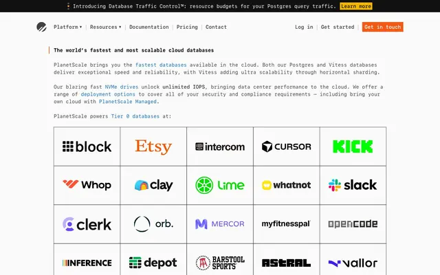
Architectural Blueprint; precise, high-contrast lines on a grid, picked out with sparse, functional color accents.
Color palette
Primary interactive elements like links and key call-to-actions – a high-visibility accent against the monochrome base.
Promotional highlights, attention-grabbing links, 'Get in touch' banner – signals urgency or special offers.
Limited use for specific highlights or informational badges – a secondary accent for variety.
Button backgrounds, dark text on light backgrounds — provides strong contrast for core informational elements.
Primary headline text, strong emphasis text – anchors the visual hierarchy with absolute contrast.
Page backgrounds, card surfaces, text on dark backgrounds – the dominant light backdrop for all content.
Body text, secondary headings, borders, icons – provides readability and defines structural elements without harshness.
Tertiary body text, image captions – for less prominent textual information.
Subtle borders, dividers, less prominent navigation items – a light accent for structure.
Used for success states or specific icon fills – a contextual accent.
Typography
- Weights
- 400, 500, 600, 700
- Sizes
- 16px
- Line height
- 1
- Letter spacing
- -0.006
- Fallback
- Recursive Mono, JetBrains Mono
All text elements, from body to headlines, buttons, and navigation. The consistent use of a monospaced font creates a distinctive technical, code-like aesthetic, emphasizing precision and clarity.
Spacing & shape
Components
No background color, text color #414141, no border, 0px border-radius, no padding. Emphasizes function over form, integrating interaction seamlessly into text.
Background color #111111, text color #fafafa, 0px border-radius. Features 16px vertical padding. Used for prominent active states or secondary actions that need to stand out from a dark background.
Background color #f35815, text color white, letter-spacing -0.006em, text 'Learn more' is 'Flame Orange' with #000000 text. Indicates an important update or promotional message.
Background color #f35815, text color white, 0px border-radius, 10px horizontal padding. A distinct, high-contrast button for direct user actions. Appears only twice, prominently.
Text color #000000, background color #414141. No border-radius. Underlines active state in a bold, solid manner, emphasizing the content section.
Text color #414141, background color transparent. No border-radius. Represents selectable content filters that are not currently in focus.
Individual cells with 24px padding on all sides, bordered with #c1c1c1. Contains logos that use #414141 as a primary color for a monochrome effect. Implies a structured, professional presentation of associated brands.
Guidelines
- Use ui-monospace with a letter-spacing of -0.006em for all text elements to maintain the consistent technical aesthetic.
- Prioritize Cloud White (#fafafa) for background surfaces and Ash Black (#000000) for primary headlines to establish clear visual hierarchy.
- Apply Electric Blue (#0b6ec5) exclusively to interactive text elements like links and hover states to guide user interaction.
- Employ Flame Orange (#f35815) sparingly for urgent calls-to-action or promotional banners to maximize its impact.
- Maintain a strict 0px border-radius for all primary UI elements like buttons, input fields, and cards to reinforce the sharp, precise design language.
- Utilize the 8-pixel base unit for all spacing, particularly 24px for component padding and 96px for section gaps, to create a comfortable yet structured density.
- Render all third-party logos in #414141 (Steel Gray) on a Cloud White (#fafafa) background to integrate them into the monochrome palette.
- Do not introduce any curved forms beyond the 9999px radius for tags; all other elements must maintain sharp, 0px corners.
- Avoid using drop shadows or complex gradients; rely on color contrast and solid borders for definition and depth.
- Do not deviate from the ui-monospace font; introducing other font families will compromise the core identity.
- Refrain from using Electric Blue (#0b6ec5) for purely decorative purposes, as it is reserved for interactive states and primary links.
- Do not use background colors other than Cloud White (#fafafa) or the defined neutral grays for main content areas; maintain the light theme.
- Avoid excessive use of Flame Orange (#f35815) in non-CTA contexts, as its impact is dependent on its limited application.
About this system
ShowHide
This design system presents as a 'technical monochrome' with sharp angles and a restrained color palette. High contrast black, white, and a range of achromatic grays define the structure, accented sparingly by electric blue and a warm orange, creating focused visual hierarchy. Monospaced typography is a core identifier, lending a precise, computational feel to all text elements. The overall impression is one of efficiency and understated authority, suitable for a developer-centric product.
The layout is primarily a max-width 1280px centered container, creating a formal and structured presentation. The hero section features a prominent, centered headline over a white background, setting a direct and informative tone. Content sections are delineated by consistent vertical spacing, often with a 4-column client logo grid. Text blocks are typically left-aligned and stack vertically. Navigation is a fixed top bar on larger screens, supporting content scanning. The overall density is comfortable, with ample white space around elements, reinforcing clarity.
The site's imagery is primarily composed of client logos and monochromatic icons. Logos are treated uniformly in #414141 (Steel Gray) on white backgrounds, presented within a strict grid, emphasizing a technical, brand-agnostic visual. Iconography is simple, outlined, and uses the Steel Gray, maintaining the high-contrast, precise aesthetic. There is no use of photography, illustrations, or complex graphics, indicating a focus on pure function and information delivery.
# PlanetScale — Style Reference
> Architectural Blueprint; precise, high-contrast lines on a grid, picked out with sparse, functional color accents.

**Theme:** light

**Site:** https://planetscale.com

This design system presents as a 'technical monochrome' with sharp angles and a restrained color palette. High contrast black, white, and a range of achromatic grays define the structure, accented sparingly by electric blue and a warm orange, creating focused visual hierarchy. Monospaced typography is a core identifier, lending a precise, computational feel to all text elements. The overall impression is one of efficiency and understated authority, suitable for a developer-centric product.

## Tokens — Colors

| Name | Value | Token | Role |
|------|------|------|------|
| Electric Blue | `#0b6ec5` | `--color-electric-blue` | Primary interactive elements like links and key call-to-actions – a high-visibility accent against the monochrome base. |
| Flame Orange | `#f35815` | `--color-flame-orange` | Promotional highlights, attention-grabbing links, 'Get in touch' banner – signals urgency or special offers. |
| Marigold Yellow | `#f2b600` | `--color-marigold-yellow` | Limited use for specific highlights or informational badges – a secondary accent for variety. |
| Midnight Graphite | `#111111` | `--color-midnight-graphite` | Button backgrounds, dark text on light backgrounds — provides strong contrast for core informational elements. |
| Ash Black | `#000000` | `--color-ash-black` | Primary headline text, strong emphasis text – anchors the visual hierarchy with absolute contrast. |
| Cloud White | `#fafafa` | `--color-cloud-white` | Page backgrounds, card surfaces, text on dark backgrounds – the dominant light backdrop for all content. |
| Steel Gray | `#414141` | `--color-steel-gray` | Body text, secondary headings, borders, icons – provides readability and defines structural elements without harshness. |
| Smoke Gray | `#737373` | `--color-smoke-gray` | Tertiary body text, image captions – for less prominent textual information. |
| Stone Gray | `#c1c1c1` | `--color-stone-gray` | Subtle borders, dividers, less prominent navigation items – a light accent for structure. |
| Verdant Green | `#22a652` | `--color-verdant-green` | Used for success states or specific icon fills – a contextual accent. |

## Tokens — Typography

### ui-monospace
- **Substitute:** Recursive Mono, JetBrains Mono
- **Weights:** 400, 500, 600, 700
- **Sizes:** 16px
- **Line height:** 1
- **Letter spacing:** -0.006
- **Role:** All text elements, from body to headlines, buttons, and navigation. The consistent use of a monospaced font creates a distinctive technical, code-like aesthetic, emphasizing precision and clarity.

## Tokens — Type Scale

| Role | Size | Line height | Letter spacing |
|------|------|------|------|
| body | 16px | 1.5 | -0.006em |

## Tokens — Spacing

- **Max width:** 1280px
- **Section gap:** 96px
- **Card padding:** 16px
- **Element gap:** 24px

## Tokens — Radius

- **Buttons:** 0px
- **Inputs:** 0px
- **tags:** 9999px

## Layout

The layout is primarily a max-width 1280px centered container, creating a formal and structured presentation. The hero section features a prominent, centered headline over a white background, setting a direct and informative tone. Content sections are delineated by consistent vertical spacing, often with a 4-column client logo grid. Text blocks are typically left-aligned and stack vertically. Navigation is a fixed top bar on larger screens, supporting content scanning. The overall density is comfortable, with ample white space around elements, reinforcing clarity.

## Imagery

The site's imagery is primarily composed of client logos and monochromatic icons. Logos are treated uniformly in #414141 (Steel Gray) on white backgrounds, presented within a strict grid, emphasizing a technical, brand-agnostic visual. Iconography is simple, outlined, and uses the Steel Gray, maintaining the high-contrast, precise aesthetic. There is no use of photography, illustrations, or complex graphics, indicating a focus on pure function and information delivery.

## Components

### Announcement Banner

### Tabbed Content Switcher

### Testimonial + CTA Block

### Naked Link Button
*Navigation, inline actions, text-based CTAs.*

No background color, text color #414141, no border, 0px border-radius, no padding. Emphasizes function over form, integrating interaction seamlessly into text.

### Dark Overlay Button
*Contextual navigation, menu items, secondary actions.*

Background color #111111, text color #fafafa, 0px border-radius. Features 16px vertical padding. Used for prominent active states or secondary actions that need to stand out from a dark background.

### Top Banner Link
*Informational banner at the top of the page.*

Background color #f35815, text color white, letter-spacing -0.006em, text 'Learn more' is 'Flame Orange' with #000000 text. Indicates an important update or promotional message.

### Orange Action Button
*Primary call-to-action in the header.*

Background color #f35815, text color white, 0px border-radius, 10px horizontal padding. A distinct, high-contrast button for direct user actions. Appears only twice, prominently.

### Tabbed Navigation Item (Active)
*Indicates the currently active tab in a content switcher.*

Text color #000000, background color #414141. No border-radius. Underlines active state in a bold, solid manner, emphasizing the content section.

### Tabbed Navigation Item (Inactive)
*Available but not currently selected tabs.*

Text color #414141, background color transparent. No border-radius. Represents selectable content filters that are not currently in focus.

### Logo Grid Cell
*Displaying client or partner logos.*

Individual cells with 24px padding on all sides, bordered with #c1c1c1. Contains logos that use #414141 as a primary color for a monochrome effect. Implies a structured, professional presentation of associated brands.

## Guidelines

### Do

- Use ui-monospace with a letter-spacing of -0.006em for all text elements to maintain the consistent technical aesthetic.
- Prioritize Cloud White (#fafafa) for background surfaces and Ash Black (#000000) for primary headlines to establish clear visual hierarchy.
- Apply Electric Blue (#0b6ec5) exclusively to interactive text elements like links and hover states to guide user interaction.
- Employ Flame Orange (#f35815) sparingly for urgent calls-to-action or promotional banners to maximize its impact.
- Maintain a strict 0px border-radius for all primary UI elements like buttons, input fields, and cards to reinforce the sharp, precise design language.
- Utilize the 8-pixel base unit for all spacing, particularly 24px for component padding and 96px for section gaps, to create a comfortable yet structured density.
- Render all third-party logos in #414141 (Steel Gray) on a Cloud White (#fafafa) background to integrate them into the monochrome palette.

### Don't

- Do not introduce any curved forms beyond the 9999px radius for tags; all other elements must maintain sharp, 0px corners.
- Avoid using drop shadows or complex gradients; rely on color contrast and solid borders for definition and depth.
- Do not deviate from the ui-monospace font; introducing other font families will compromise the core identity.
- Refrain from using Electric Blue (#0b6ec5) for purely decorative purposes, as it is reserved for interactive states and primary links.
- Do not use background colors other than Cloud White (#fafafa) or the defined neutral grays for main content areas; maintain the light theme.
- Avoid excessive use of Flame Orange (#f35815) in non-CTA contexts, as its impact is dependent on its limited application.
More like this









Keep what you find
A free account saves references to boards and can send you a weekly email of picks based on what you save.
To see every result, go Pro.