Preview image. Unlock full-res
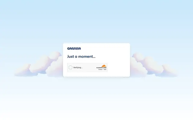
Serene Cloud Sanctuary: A single white card floats effortlessly within a tranquil, sky-blue gradient, cradled by soft, cartoon-like clouds.
Color palette
Brand text, primary headings, interactive elements. Its deep hue provides strong contrast against light backgrounds, signaling importance and trust.
Page background — creates a soft, expansive, and optimistic atmosphere.
Primary surface color for cards and key content areas, providing a clean canvas for information.
Most body text and secondary headings, ensuring high readability and a direct tone.
Typography
- Weights
- 500
- Sizes
- 16px
- Line height
- 1.5
- Letter spacing
- normal
- Fallback
- Inter
Primary body text and links – a slightly thicker weight for standard text gives substance without heaviness. The 'kern' feature implies careful typographic detailing for improved spacing.
- Weights
- 500
- Sizes
- 30px
- Line height
- 1.2
- Letter spacing
- normal
- Fallback
- Roboto, sans-serif
Main headings and key brand elements. Its specific 'ss02' feature suggests a distinct, custom glyph style, likely for branding impact, providing a modern and clear voice at larger sizes.
Spacing & shape
Components
A white card with a 12px border-radius, centered on the page. Uses 32px internal padding on all sides, creating ample breathing room for content. Text elements inside have 8px or 20px vertical spacing between them.
Uses ESBuild font at 30px, weight 500, with a 1.2 line height. Color is Coal Black (#000000), providing high contrast.
Uses PPMori font at 16px, weight 500, with a 1.5 line height. Color is Coal Black (#000000).
Uses PPMori font at 16px, weight 500, with a 1.5 line height. Color is Gamma Blue (#002253), clearly differentiating it as interactive.
A horizontal arrangement of an animated spinner, 'Verifying...' text (PPMori, 16px, #000000), and a Cloudflare logo, implying external background service activity.
Guidelines
- Use 'Sky Gradient' (linear-gradient(to top, rgb(255, 255, 255), rgb(198, 230, 250))) as the primary page background to maintain the airy, optimistic feel.
- Apply a 12px border-radius to all card-like containers and interactive elements for a consistent soft, rounded edge.
- Prioritize PPMori font for all body text at 16px font-size and a 1.5 line-height, using weight 500 for clear readability.
- Employ ESBuild font at 30px font-size and weight 500 for main headings to establish clear visual hierarchy and brand voice.
- Utilize 32px padding within all primary content containers to ensure sufficient whitespace and prevent visual clutter.
- Use Gamma Blue (#002253) exclusively for interactive elements like links and key headings to guide user attention.
- Maintain high contrast ratios with text (e.g., #000000 on #ffffff, #002253 on #ffffff) for optimal accessibility (AAA level).
- Avoid using harsh or highly saturated colors that would disrupt the calming, light aesthetic.
- Do not introduce sharp corners or radii other than 12px on elements intended to be visually grouped or interacted with.
- Refrain from using thin font weights that might compromise readability against the subtle background gradient.
- Do not deviate from the specified font families (PPMori, ESBuild) or their assigned weights/sizes for core text elements.
- Do not use dark backgrounds for main content areas; maintain Cloud White (#ffffff) for card surfaces.
- Avoid excessive use of shadows or complex visual effects that would contradict the clean and light presentation.
- Do not introduce additional brand or accent colors that are not Gamma Blue (#002253), to preserve the focused palette.
About this system
ShowHide
This design system evokes a sense of airy calm and trust, like a quiet moment before a significant event. The pervasive light blue gradient creates an open, optimistic sky-like background. Visual weight is concentrated in the central card with its crisp borders and soft shadows, making the core interaction feel grounded yet gently presented. Typography is minimal and direct, serving the primary purpose of clear communication without visual embellishment.
The site uses minimal abstract graphics. Specifically, the background features soft, pastel pink and blue 3D cloud-like shapes that appear to float, creating a dreamy and friendly atmosphere. These are decorative and atmospheric, lending to the overall sense of calm and approachability. The only other visual element is a small product/brand logo (Cloudflare) within a functional UI element, treated as an icon, not an illustrative feature. The design is heavily text-dominant with visuals serving purely as aesthetic framing.
Reminiscent of Figma, Notion, Linear, Calm.
# Gamma — Style Reference
> Serene Cloud Sanctuary: A single white card floats effortlessly within a tranquil, sky-blue gradient, cradled by soft, cartoon-like clouds.

**Theme:** light

**Site:** https://gamma.app

This design system evokes a sense of airy calm and trust, like a quiet moment before a significant event. The pervasive light blue gradient creates an open, optimistic sky-like background. Visual weight is concentrated in the central card with its crisp borders and soft shadows, making the core interaction feel grounded yet gently presented. Typography is minimal and direct, serving the primary purpose of clear communication without visual embellishment.

## Tokens — Colors

| Name | Value | Token | Role |
|------|------|------|------|
| Gamma Blue | `#002253` | `--color-gamma-blue` | Brand text, primary headings, interactive elements. Its deep hue provides strong contrast against light backgrounds, signaling importance and trust. |
| Sky Gradient | `#c6e6fa` | `--color-sky-gradient` | Page background — creates a soft, expansive, and optimistic atmosphere. |
| Cloud White | `#ffffff` | `--color-cloud-white` | Primary surface color for cards and key content areas, providing a clean canvas for information. |
| Coal Black | `#000000` | `--color-coal-black` | Most body text and secondary headings, ensuring high readability and a direct tone. |

## Tokens — Typography

### PPMori
- **Substitute:** Inter
- **Weights:** 500
- **Sizes:** 16px
- **Line height:** 1.5
- **Letter spacing:** normal
- **Role:** Primary body text and links – a slightly thicker weight for standard text gives substance without heaviness. The 'kern' feature implies careful typographic detailing for improved spacing.

### ESBuild
- **Substitute:** Roboto, sans-serif
- **Weights:** 500
- **Sizes:** 30px
- **Line height:** 1.2
- **Letter spacing:** normal
- **Role:** Main headings and key brand elements. Its specific 'ss02' feature suggests a distinct, custom glyph style, likely for branding impact, providing a modern and clear voice at larger sizes.

## Tokens — Spacing

- **Section gap:** 32px
- **Card padding:** 32px
- **Element gap:** 8px

## Tokens — Radius

- **Buttons:** 12px
- **Cards:** 12px
- **fields:** 12px

## Imagery

The site uses minimal abstract graphics. Specifically, the background features soft, pastel pink and blue 3D cloud-like shapes that appear to float, creating a dreamy and friendly atmosphere. These are decorative and atmospheric, lending to the overall sense of calm and approachability. The only other visual element is a small product/brand logo (Cloudflare) within a functional UI element, treated as an icon, not an illustrative feature. The design is heavily text-dominant with visuals serving purely as aesthetic framing.

## Components

### Centered Content Card

### Status / Alert Banner

### Button Group

### Centered Content Card
*Contains focal content or interaction points.*

A white card with a 12px border-radius, centered on the page. Uses 32px internal padding on all sides, creating ample breathing room for content. Text elements inside have 8px or 20px vertical spacing between them.

### Main Heading
*Introduces sections or key messages.*

Uses ESBuild font at 30px, weight 500, with a 1.2 line height. Color is Coal Black (#000000), providing high contrast.

### Body Text
*Standard informational text.*

Uses PPMori font at 16px, weight 500, with a 1.5 line height. Color is Coal Black (#000000).

### Link Text
*Interactive text elements.*

Uses PPMori font at 16px, weight 500, with a 1.5 line height. Color is Gamma Blue (#002253), clearly differentiating it as interactive.

### Loading Indicator Region
*Shows background processing status.*

A horizontal arrangement of an animated spinner, 'Verifying...' text (PPMori, 16px, #000000), and a Cloudflare logo, implying external background service activity.

## Guidelines

### Do

- Use 'Sky Gradient' (linear-gradient(to top, rgb(255, 255, 255), rgb(198, 230, 250))) as the primary page background to maintain the airy, optimistic feel.
- Apply a 12px border-radius to all card-like containers and interactive elements for a consistent soft, rounded edge.
- Prioritize PPMori font for all body text at 16px font-size and a 1.5 line-height, using weight 500 for clear readability.
- Employ ESBuild font at 30px font-size and weight 500 for main headings to establish clear visual hierarchy and brand voice.
- Utilize 32px padding within all primary content containers to ensure sufficient whitespace and prevent visual clutter.
- Use Gamma Blue (#002253) exclusively for interactive elements like links and key headings to guide user attention.
- Maintain high contrast ratios with text (e.g., #000000 on #ffffff, #002253 on #ffffff) for optimal accessibility (AAA level).

### Don't

- Avoid using harsh or highly saturated colors that would disrupt the calming, light aesthetic.
- Do not introduce sharp corners or radii other than 12px on elements intended to be visually grouped or interacted with.
- Refrain from using thin font weights that might compromise readability against the subtle background gradient.
- Do not deviate from the specified font families (PPMori, ESBuild) or their assigned weights/sizes for core text elements.
- Do not use dark backgrounds for main content areas; maintain Cloud White (#ffffff) for card surfaces.
- Avoid excessive use of shadows or complex visual effects that would contradict the clean and light presentation.
- Do not introduce additional brand or accent colors that are not Gamma Blue (#002253), to preserve the focused palette.

## Agent Prompt Guide

### Quick Color Reference
- Text: #000000
- Background: linear-gradient(to top, #ffffff, #c6e6fa)
- CTA/Accent: #002253
- Card Surface: #ffffff
- Border/Outline: #000000 (though used sparingly for definition)

### Example Component Prompts
1. Create a centered content card: background #ffffff, border-radius 12px, internal padding 32px. Add a headline 'Just a moment...' using ESBuild font 30px weight 500 #000000. Below it, add body text 'Verifying...' using PPMori font 16px weight 500 #000000. Ensure 20px vertical gap between headline and body text, and 8px between 'Verifying...' and an inline Cloudflare logo.
2. Design a primary link: text 'Click Here' using PPMori font 16px weight 500 #002253, with normal letter-spacing and 1.5 line-height. Ensure it has the 'kern' font feature enabled.
3. Implement the page background: a CSS linear gradient (to top, #ffffff, #c6e6fa) with soft 3D cloud illustration elements positioned to the sides and bottom, maintaining the airy feel. No specific dimensions for clouds, just general placement.
4. Create a loading text element: PPMori font, 16px, weight 500, color #000000, with the text 'Verifying...' and an accompanying small animated spinner icon to its left.
More like this








Keep what you find
A free account saves references to boards and can send you a weekly email of picks based on what you save.
To see every result, go Pro.