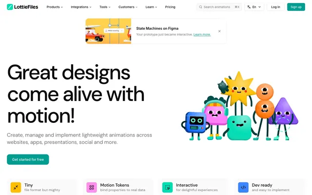
Preview image. Unlock full-res
Playful Precision amidst Animation; a digital canvas vibrant with motion, grounded by clear, spacious layouts.
Color palette
Primary call to action buttons, active navigation indicators, key brand accents. This moderate teal provides a fresh, energetic touch without being overly aggressive.
Used within illustrations and occasionally for very bold accent elements, appearing brighter than Lottie Teal.
Highlighting specific elements in illustrations, secondary accent color for badges or notifications.
Used for specific interactive elements in illustrations, providing a bright, modern accent.
A softer green, used primarily inside illustrations to add to the playful aesthetic.
A vibrant pink used in illustrations for character elements and other playful accents.
Page background, primary surface color for cards and interactive elements.
Slightly off-white background where subtle contrast is needed, input fields, subtle section dividers.
Subtle borders, dividers, outlines for card elements.
Secondary background for sections, muted buttons.
Primary text, prominent headings, strong contrast elements.
Hover states for dark text, occasionally as button background.
Secondary text, icons, muted brand elements.
Fainter text, placeholder text, disabled states.
Typography
- Weights
- 400, 500, 600
- Sizes
- 14px, 16px, 18px, 20px, 24px, 32px, 48px, 64px, 96px
- Line height
- 1.04
- Letter spacing
- -0.05em at 96px, progressing to 0.01em at 14px
- Fallback
- DM Sans (Google Fonts)
Display headlines and prominent marketing text. The tight letter spacing on larger sizes creates a modern, impactful feel, while maintaining readability at smaller headline sizes.
- Weights
- 400, 500, 600
- Sizes
- 10px, 12px, 14px, 16px, 18px, 24px, 32px
- Line height
- 1.1
- Letter spacing
- -0.01em
- Fallback
- Inter (Google Fonts)
Body text, navigation, buttons, and most UI elements. Its neutrality and legibility ensure a consistent and approachable voice across the interface, supporting the more expressive DM Sans.
Spacing & shape
Elevation
Components
backgroundColor: #019d91, color: #ffffff, borderRadius: 12px, paddingTop: 8px, paddingRight: 24px, paddingBottom: 8px, paddingLeft: 24px. Text uses Inter font family. Prominent, inviting interaction.
backgroundColor: oklch(1 0 0) (transparent), color: #09090b, borderRadius: 0px, paddingTop: 0px, paddingRight: 0px, paddingBottom: 0px, paddingLeft: 0px. Text uses Inter font family. Understated but clear for navigation.
backgroundColor: rgba(0, 0, 0, 0) (transparent), color: #71717b, borderRadius: 6px, paddingTop: 4px, paddingRight: 24px, paddingBottom: 4px, paddingLeft: 24px. Text uses Inter font family. Muted to guide focus to active elements.
backgroundColor: oklch(1 0 0) (white), color: #09090b, borderRadius: 6px, paddingTop: 8px, paddingRight: 16px, paddingBottom: 8px, paddingLeft: 16px. Border is #e4e4e7. Text uses Inter font family. Offers a contrasting action without being as dominant as the primary button.
backgroundColor: #ffffff, borderRadius: 16px, padding: 32px (inferred from common elementGap around text/icon blocks). Shadow: rgba(0, 0, 0, 0.05) 0px 1px 2px 0px. Contains a headline using DM Sans and body text using Inter, with a small icon.
backgroundColor: #ffffff, borderRadius: 16px, padding: 24px, or `auto` due to image crops. Shadow: rgba(0, 0, 0, 0.05) 0px 1px 2px 0px. Features imagery with rounded corners and accompanying text. The card often uses a specific background color from the site's palette for variety (e.g. #fff8e5, #94d19f).
backgroundColor: #fafafa, border: 1px solid #e4e4e7, borderRadius: 8px. Placeholder text uses Cadet Gray (#9f9fa9) and Inter font. Icons are Steel Gray (#71717b).
backgroundColor: #ffffff, borderRadius: 16px, padding: 32px. Shadow: rgba(0, 0, 0, 0.05) 0px 1px 2px 0px. Features a bold quote in DM Sans, and author details in Inter.
Guidelines
- Prioritize DM Sans for headlines (sizes > 24px) with specific letter-spacing as defined in typography, using Carbon Black (#09090b) for high impact.
- Use Lottie Teal (#019d91) exclusively for primary calls to action, maintaining its distinctive brand presence.
- Apply rounded corners consistently: 12px for buttons, 16px for cards, and 24px for larger visual elements like image containers to reinforce approachability.
- Maintain generous spacing with elementGap at 8px, 16px, or 24px, and sectionGap between 40-80px to ensure visual comfort and focus.
- Employ the subtle shadow rgba(0, 0, 0, 0.05) 0px 1px 2px 0px for all elevated cards and interactive elements, adding minimal depth.
- Utilize Inter font at 14px or 16px for all body text, links, and UI labels, ensuring high readability with a default letter-spacing of -0.01em.
- Ensure adequate contrast: Carbon Black (#09090b) on Cloud White (#ffffff) or Ash White (#fafafa) for all primary text content.
- Avoid applying excessive shadows; stick to the single, subtle shadow defined for elevation.
- Do not introduce new chromatic colors outside of the defined brand and accent palette; maintain the vibrant teal focus with select pops of yellow/blue.
- Refrain from using sharp corners or radii smaller than 8px for interactive elements; the visual style leans into softer, friendlier shapes.
- Do not use DM Sans for large blocks of body text; reserve it for headlines and short, impactful statements to preserve its distinctive role.
- Avoid dense, information-heavy sections without adequate white space; prioritize breathability and comfortable reading experiences.
- Do not deviate from the specified dark neutral colors for primary text and headings; maintain high contrast and legibility.
- Do not use Lottie Teal (#019d91) for body text or non-interactive elements; keep it reserved for key actions and brand accents.
About this system
ShowHide
LottieFiles presents a playful yet precise aesthetic, balancing approachable organic illustrations with crisp, systematic UI elements. The design centers on a vibrant teal accent that energizes a largely achromatic palette, hinting at creativity and innovation without overwhelming. Rounded forms and generous spacing contribute to a friendly and user-centric experience, ensuring complex animation tools feel accessible to a broad audience. The strategic use of a robust sans-serif for headlines anchors the lighthearted visuals with a sense of reliable technology.
The layout follows a centered, max-width contained model, with a pageMaxWidth of approximately 1200px providing ample breathing room. The hero section is a split design with a large, bold headline on the left and a prominent, playful illustration on the right, setting an inviting tone. Sections alternate between full-bleed background colors (e.g., white, light gray bands) and content blocks, creating a consistent visual rhythm. Content is frequently arranged in two-column layouts (text alongside imagery/cards) or multi-column grids (3-4 columns for feature cards or customer showcases), maintaining clear visual hierarchy. Vertical spacing between sections is generous (40-80px). The navigation is a sticky top bar, providing constant access without being obtrusive.
The site heavily relies on custom, vibrant, and character-driven illustrations featuring a mix of geometric and organic shapes with bold outlines and a wide palette of vivid colors like Sunshine Yellow, Electric Blue, and Coral Pink. These illustrations are primarily decorative but also explanatory, conveying functionality or emotional tone through anthropomorphic elements and playful scenarios. Photography is limited to product screenshots, often presented within mockups (e.g., phone screens) with softly rounded corners. Icons are typically solid, monocolor (Steel Gray or Lottie Teal), and have a uniform stroke weight (inferred from visual consistency), used for navigation and feature highlighting. Image density is moderate to high, often taking up significant visual space in primary sections to support the text and enhance visual appeal.
Reminiscent of Figma, Canva, Webflow, Miro, Storybook.
# LottieFiles — Style Reference
> Playful Precision amidst Animation; a digital canvas vibrant with motion, grounded by clear, spacious layouts.

**Theme:** light

**Site:** https://lottiefiles.com

LottieFiles presents a playful yet precise aesthetic, balancing approachable organic illustrations with crisp, systematic UI elements. The design centers on a vibrant teal accent that energizes a largely achromatic palette, hinting at creativity and innovation without overwhelming. Rounded forms and generous spacing contribute to a friendly and user-centric experience, ensuring complex animation tools feel accessible to a broad audience. The strategic use of a robust sans-serif for headlines anchors the lighthearted visuals with a sense of reliable technology.

## Tokens — Colors

| Name | Value | Token | Role |
|------|------|------|------|
| Lottie Teal | `#019d91` | `--color-lottie-teal` | Primary call to action buttons, active navigation indicators, key brand accents. This moderate teal provides a fresh, energetic touch without being overly aggressive. |
| Vivid Aqua | `#00ddb3` | `--color-vivid-aqua` | Used within illustrations and occasionally for very bold accent elements, appearing brighter than Lottie Teal. |
| Sunshine Yellow | `#f0b100` | `--color-sunshine-yellow` | Highlighting specific elements in illustrations, secondary accent color for badges or notifications. |
| Electric Blue | `#3a86ff` | `--color-electric-blue` | Used for specific interactive elements in illustrations, providing a bright, modern accent. |
| Jolly Green | `#94d19f` | `--color-jolly-green` | A softer green, used primarily inside illustrations to add to the playful aesthetic. |
| Coral Pink | `#ff8eed` | `--color-coral-pink` | A vibrant pink used in illustrations for character elements and other playful accents. |
| Cloud White | `#ffffff` | `--color-cloud-white` | Page background, primary surface color for cards and interactive elements. |
| Ash White | `#fafafa` | `--color-ash-white` | Slightly off-white background where subtle contrast is needed, input fields, subtle section dividers. |
| Slate Gray | `#e4e4e7` | `--color-slate-gray` | Subtle borders, dividers, outlines for card elements. |
| Dark Graphite | `#f4f4f5` | `--color-dark-graphite` | Secondary background for sections, muted buttons. |
| Carbon Black | `#09090b` | `--color-carbon-black` | Primary text, prominent headings, strong contrast elements. |
| Charcoal Black | `#18181b` | `--color-charcoal-black` | Hover states for dark text, occasionally as button background. |
| Steel Gray | `#71717b` | `--color-steel-gray` | Secondary text, icons, muted brand elements. |
| Cadet Gray | `#9f9fa9` | `--color-cadet-gray` | Fainter text, placeholder text, disabled states. |

## Tokens — Typography

### DM Sans
- **Substitute:** DM Sans (Google Fonts)
- **Weights:** 400, 500, 600
- **Sizes:** 14px, 16px, 18px, 20px, 24px, 32px, 48px, 64px, 96px
- **Line height:** 1.04
- **Letter spacing:** -0.05em at 96px, progressing to 0.01em at 14px
- **Role:** Display headlines and prominent marketing text. The tight letter spacing on larger sizes creates a modern, impactful feel, while maintaining readability at smaller headline sizes.

### Inter
- **Substitute:** Inter (Google Fonts)
- **Weights:** 400, 500, 600
- **Sizes:** 10px, 12px, 14px, 16px, 18px, 24px, 32px
- **Line height:** 1.1
- **Letter spacing:** -0.01em
- **Role:** Body text, navigation, buttons, and most UI elements. Its neutrality and legibility ensure a consistent and approachable voice across the interface, supporting the more expressive DM Sans.

## Tokens — Type Scale

Perfect Fourth (1.333) from 14px base.

| Role | Size | Line height | Letter spacing |
|------|------|------|------|
| caption | 10px | 1.5 | -0.1px |
| body | 14px | 1.71 | 0.1px |
| subheading | 18px | 1.5 | -0.1px |
| heading-sm | 24px | 1.56 | -0.3px |
| heading | 32px | 1.25 | -0.5px |
| heading-lg | 48px | 1.2 | -1.44px |
| display | 64px | 1.15 | -1.92px |

## Tokens — Spacing

- **Max width:** 1200px
- **Section gap:** 40-80px
- **Card padding:** 24-32px
- **Element gap:** 8-24px

## Tokens — Radius

- **Buttons:** 12px
- **Cards:** 16px
- **forms:** 8px
- **thumbnails:** 24px

## Tokens — Elevation

- **Card, Button:** `rgba(0, 0, 0, 0.05) 0px 1px 2px 0px`

## Layout

The layout follows a centered, max-width contained model, with a pageMaxWidth of approximately 1200px providing ample breathing room. The hero section is a split design with a large, bold headline on the left and a prominent, playful illustration on the right, setting an inviting tone. Sections alternate between full-bleed background colors (e.g., white, light gray bands) and content blocks, creating a consistent visual rhythm. Content is frequently arranged in two-column layouts (text alongside imagery/cards) or multi-column grids (3-4 columns for feature cards or customer showcases), maintaining clear visual hierarchy. Vertical spacing between sections is generous (40-80px). The navigation is a sticky top bar, providing constant access without being obtrusive.

## Imagery

The site heavily relies on custom, vibrant, and character-driven illustrations featuring a mix of geometric and organic shapes with bold outlines and a wide palette of vivid colors like Sunshine Yellow, Electric Blue, and Coral Pink. These illustrations are primarily decorative but also explanatory, conveying functionality or emotional tone through anthropomorphic elements and playful scenarios. Photography is limited to product screenshots, often presented within mockups (e.g., phone screens) with softly rounded corners. Icons are typically solid, monocolor (Steel Gray or Lottie Teal), and have a uniform stroke weight (inferred from visual consistency), used for navigation and feature highlighting. Image density is moderate to high, often taking up significant visual space in primary sections to support the text and enhance visual appeal.

## Components

### Feature Highlight Badges

### Testimonial Card

### CTA Button Group with Search

### Primary Lottie Teal Button
*Primary call to action*

backgroundColor: #019d91, color: #ffffff, borderRadius: 12px, paddingTop: 8px, paddingRight: 24px, paddingBottom: 8px, paddingLeft: 24px. Text uses Inter font family. Prominent, inviting interaction.

### Ghost Navigation Button (Active)
*Navigation links and secondary actions*

backgroundColor: oklch(1 0 0) (transparent), color: #09090b, borderRadius: 0px, paddingTop: 0px, paddingRight: 0px, paddingBottom: 0px, paddingLeft: 0px. Text uses Inter font family. Understated but clear for navigation.

### Ghost Navigation Button (Inactive)
*Inactive/secondary navigation links*

backgroundColor: rgba(0, 0, 0, 0) (transparent), color: #71717b, borderRadius: 6px, paddingTop: 4px, paddingRight: 24px, paddingBottom: 4px, paddingLeft: 24px. Text uses Inter font family. Muted to guide focus to active elements.

### Outline White Button
*Secondary actions requiring emphasis*

backgroundColor: oklch(1 0 0) (white), color: #09090b, borderRadius: 6px, paddingTop: 8px, paddingRight: 16px, paddingBottom: 8px, paddingLeft: 16px. Border is #e4e4e7. Text uses Inter font family. Offers a contrasting action without being as dominant as the primary button.

### Feature Card
*Showcasing product features or benefits*

backgroundColor: #ffffff, borderRadius: 16px, padding: 32px (inferred from common elementGap around text/icon blocks). Shadow: rgba(0, 0, 0, 0.05) 0px 1px 2px 0px. Contains a headline using DM Sans and body text using Inter, with a small icon.

### Customer Showcase Card
*Highlighting customer projects or testimonials*

backgroundColor: #ffffff, borderRadius: 16px, padding: 24px, or `auto` due to image crops. Shadow: rgba(0, 0, 0, 0.05) 0px 1px 2px 0px. Features imagery with rounded corners and accompanying text. The card often uses a specific background color from the site's palette for variety (e.g. #fff8e5, #94d19f).

### Search Input Field
*Site-wide search functionality*

backgroundColor: #fafafa, border: 1px solid #e4e4e7, borderRadius: 8px. Placeholder text uses Cadet Gray (#9f9fa9) and Inter font. Icons are Steel Gray (#71717b).

### Testimonial Card
*Displaying customer feedback*

backgroundColor: #ffffff, borderRadius: 16px, padding: 32px. Shadow: rgba(0, 0, 0, 0.05) 0px 1px 2px 0px. Features a bold quote in DM Sans, and author details in Inter.

## Guidelines

### Do

- Prioritize DM Sans for headlines (sizes > 24px) with specific letter-spacing as defined in typography, using Carbon Black (#09090b) for high impact.
- Use Lottie Teal (#019d91) exclusively for primary calls to action, maintaining its distinctive brand presence.
- Apply rounded corners consistently: 12px for buttons, 16px for cards, and 24px for larger visual elements like image containers to reinforce approachability.
- Maintain generous spacing with elementGap at 8px, 16px, or 24px, and sectionGap between 40-80px to ensure visual comfort and focus.
- Employ the subtle shadow rgba(0, 0, 0, 0.05) 0px 1px 2px 0px for all elevated cards and interactive elements, adding minimal depth.
- Utilize Inter font at 14px or 16px for all body text, links, and UI labels, ensuring high readability with a default letter-spacing of -0.01em.
- Ensure adequate contrast: Carbon Black (#09090b) on Cloud White (#ffffff) or Ash White (#fafafa) for all primary text content.

### Don't

- Avoid applying excessive shadows; stick to the single, subtle shadow defined for elevation.
- Do not introduce new chromatic colors outside of the defined brand and accent palette; maintain the vibrant teal focus with select pops of yellow/blue.
- Refrain from using sharp corners or radii smaller than 8px for interactive elements; the visual style leans into softer, friendlier shapes.
- Do not use DM Sans for large blocks of body text; reserve it for headlines and short, impactful statements to preserve its distinctive role.
- Avoid dense, information-heavy sections without adequate white space; prioritize breathability and comfortable reading experiences.
- Do not deviate from the specified dark neutral colors for primary text and headings; maintain high contrast and legibility.
- Do not use Lottie Teal (#019d91) for body text or non-interactive elements; keep it reserved for key actions and brand accents.

## Agent Prompt Guide

### Quick Color Reference
- Text: Carbon Black (#09090b)
- Background: Cloud White (#ffffff)
- CTA: Lottie Teal (#019d91)
- Border: Slate Gray (#e4e4e7)
- Accent: Sunshine Yellow (#f0b100)

### 3-5 Example Component Prompts
1. Create a hero section: Cloud White background. Headline 'Great designs come alive with motion!' using DM Sans weight 600, size 64px, #09090b, letter-spacing -1.92px. Body text 'Create, manage and implement lightweight animations across websites, apps, presentations, social and more.' in Inter weight 400, size 18px, #09090b, line-height 1.5. Include a Primary Lottie Teal Button with text 'Get started for free'.
2. Design a feature card: Cloud White background, 16px border-radius, shadow rgba(0, 0, 0, 0.05) 0px 1px 2px 0px, 32px padding on all sides. Headline 'Tiny' in DM Sans weight 500, size 24px, #09090b, line-height 1.56, letter-spacing -0.3px. Body text 'file format but mighty' in Inter weight 400, size 16px, #09090b, line-height 1.5.
3. Implement a navigation bar: Ash White (#fafafa) background header, max-width 1200px centered. Main navigation links are Ghost Navigation Buttons (Active: #09090b, Inactive: #71717b), using Inter font weight 500, size 16px, padding 8px vertical, 16px horizontal. Include a Primary Lottie Teal Button 'Sign up' with no left/right padding specified, and a 'Log in' Outline White Button.
4. Build a customer testimonial card: Cloud White background, 16px border-radius, shadow rgba(0, 0, 0, 0.05) 0px 1px 2px 0px, 32px padding. Quote text in DM Sans weight 500, size 24px, #09090b, line-height 1.25. Author name in Inter weight 500, size 16px, #09090b. Role in Inter weight 400, size 14px, #71717b.
More like this





Keep what you find
A free account saves references to boards and can send you a weekly email of picks based on what you save.
To see every result, go Pro.