Preview image. Unlock full-res
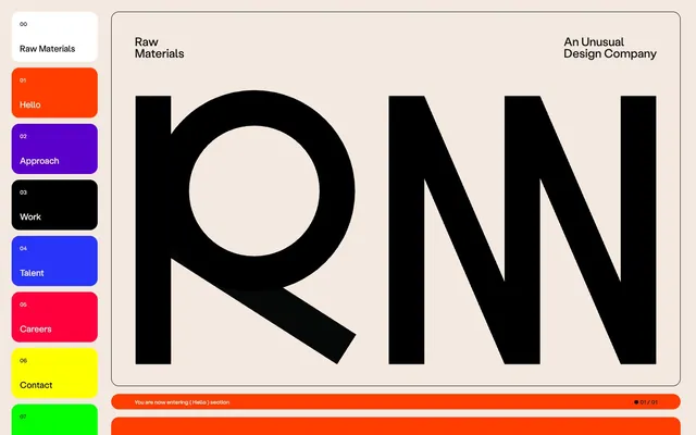
Color-blocked minimalist architecture. Imagine a de Stijl painting brought to life as interactive digital canvas.
Color palette
Primary action buttons, active navigation states — creates urgency and focus.
Highlighting elements, secondary calls to action, text accent — adds a high-energy, playful touch.
Interactive elements, success indicators — provides a striking, unconventional positive feedback.
Navigation items, secondary interactive states — adds unexpected depth and a contemporary edge.
Navigation items, key information highlighting — bold, distinct counterpoint to the warm accents.
Interactive elements, urgent notices.
Subtle visual flourish, particularly for bottom borders of sections, indicating progression.
Page backgrounds, card backgrounds, main text contrast.
Secondary text, subtle backgrounds for content.
Button backgrounds, specific interactive highlights.
Subtle background shifts, content blocks.
Subtle background shifts, content blocks.
Badge backgrounds, success states.
Typography
- Weights
- 100, 400, 500
- Sizes
- 12px, 13px, 14px, 16px, 17px, 18px, 19px, 20px, 22px, 23px, 24px, 28px, 29px, 32px, 40px, 46px, 95px, 99px, 100px, 101px, 140px, 199px, 200px
- Line height
- 0.8, 1, 1.03, 1.04, 1.07, 1.08, 1.1, 1.14, 1.17, 1.2, 1.38, 1.69, 2.08
- Letter spacing
- -0.0500em at largest sizes, -0.0200em at mid-sizes, -0.0100em at smaller text, creating a visually dense text block for graphic impact.
- Fallback
- Inter
Primary UI text, general body copy, navigation, and smaller headings. Its wide range of weights and sizes makes it the workhorse for most text elements, creating cohesion across content.
- Weights
- 100, 400, 700
- Sizes
- 18px, 23px, 80px, 95px, 193px
- Line height
- 1, 1.06, 1.2, 1.38
- Letter spacing
- -0.0400em at largest sizes, -0.0300em at large, -0.0200em at medium, and 0.1120em for highly spaced, possibly decorative text; used for prominent headlines contrasting with StabilGrotesk.
- Fallback
- Montserrat
Display headlines and hero text. The condensed letter-spacing at large sizes creates a blocky, monumental aesthetic, while the expansive spacing provides a distinct stylistic alternative.
- Weights
- 400, 500
- Sizes
- 20px, 40px, 79px, 107px, 200px, 259px
- Line height
- 1, 1.03, 1.2
- Letter spacing
- -0.0400em for largest, -0.0200em for smaller sizes, emphasizing readability through tight spacing.
- Fallback
- Arial Black
Large, impactful headings. Its heavy, condensed nature makes it suitable for brand statements and section titles where visual weight is paramount.
- Weights
- 500, 700
- Sizes
- 95px, 193px
- Line height
- 1, 1.06
- Letter spacing
- -0.0210em, -0.0020em; extremely tight letter-spacing to create a solid, bold block of text, accentuating the "FettSchmal" (fat narrow) characteristic.
- Fallback
- Impact
Maximal display headlines. This typeface is used for core brand statements at the largest possible sizes, leveraging its unique condensed-bold characteristic and tight kerning to fill space assertively.
- Weights
- 700
- Sizes
- 98px, 199px
- Line height
- 1, 1.14
- Letter spacing
- -0.0200em, -0.0100em; consistently tight kerning maintains a strong visual presence.
- Fallback
- Oswald
Major section headings and graphic text. Its bold weight and precise spacing provide a consistent feel with the other display fonts, contributing to the brand's graphic impact.
- Weights
- 400
- Sizes
- 14px
- Line height
- 1
- Letter spacing
- -0.0700em; a highly condensed monospace approach.
- Fallback
- Courier New
Monospace text for code snippets or specific, technical annotations; its extremely tight letter-spacing makes it appear dense and precise.
- Weights
- 400
- Sizes
- 24px, 120px
- Line height
- 1, 1.2
- Letter spacing
- -0.0100em for most uses, 0.0840em for decorative high spacing, providing versatility in expressing different moods within large headlines.
- Fallback
- Work Sans
Alternative display headings. Used for certain prominent titles, offering a slightly different personality due to its more open letter-spacing when explicitly set, distinguishing it from the other condensed display fonts.
Spacing & shape
Components
Rounded rectangle button with a 16px border radius. Background color is a vivid brand color with 'Snow White' text, like #ff3d00 (Coral Flame) with #f4e9e1 (Canvas White) text. No padding is explicitly defined at component level, relying on text size and shape for clickable area.
Rounded rectangle button with 'Canvas White' background and 'Ink Black' text and border, 16px border radius. Used for the 'Raw Materials' primary navigation button.
Fully pill-shaped button with a 44px border radius. Background color is 'Electric Yellow' (#ffff00) with 'Ink Black' (#000000) text and border. No explicit padding, text defines size.
Pill-shaped button (44px radius) with a vibrant brand color background like 'Neon Green' (#05ff00) or 'Deep Violet' (#5900cc) and 'Canvas White' (#f4e9e1) text. No explicit padding.
Transparent background with a 16px border radius. No box shadow, relying on spacious layout for separation. No padding defined, content dictates internal spacing.
Subtle 'Ink Black' (#0e0e0e) background with a 16px border radius. Minimal 1px padding on all sides, creating a tight container for nested elements. No box shadow.
Transparent background with 'Ink Black' (#000000) text. Features a bottom border in 'Ink Black'. No padding or border radius, creating a minimalist, raw input style.
Transparent background with 'Ink Black' (#0e0e0e) text. No border-radius or padding initially, appearing as a plain text label.
Transparent background with 'Ink Black' (#0e0e0e) text, featuring a 24px border radius and 6px padding on top/bottom, 12px on left/right. Used for 'PRODUCT & UX' style tags.
Background color of 'Mint Glaze' (#b6c9ce) with 'Charcoal Grey' (#242320) text and a 16px border radius. No explicit padding defined for this variant.
Flat bar with 'Coral Flame' (#ff3d00) background. Contains text like 'You are now entering ( Hello ) section' in Canvas White. Features a 16px border radius on the sides, creating a rounded capsule appearance.
Guidelines
- Prioritize brand colors like 'Coral Flame' (#ff3d00), 'Electric Yellow' (#ffff00), 'Neon Green' (#05ff00), 'Deep Violet' (#5900cc), and 'Royal Blue' (#2835f8) for all interactive elements to reinforce brand identity.
- Use 'StabilGrotesk' as the primary font for all body text and UI elements at weights 100, 400, and 500, with letter spacing optimized for readability and visual density.
- Apply a consistent 16px border radius to all cards, standard buttons, and many general UI elements for a cohesive, softened aesthetic.
- Employ the 44px border radius specifically for prominent CTA pill buttons (e.g., 'Pill Button - Action' and 'Accent Pill Button') to visually differentiate them.
- Utilize a tight letter-spacing approach for all display headings (e.g., Optimistic Text, KlarheitKurrent, HTQ-Waldenburg-FettSchmal) to create a graphic, solid block of text, rather than overly spaced headlines.
- Ensure 'Ink Black' (#0e0e0e) text is always set against 'Canvas White' (#f4e9e1) backgrounds, or inverse, for maximum contrast and brand recognition.
- Maintain an element gap of 8px for vertical and horizontal spacing between small UI elements.
- Do not use generic system fonts for any primary content or headings; stick to the custom font families for brand consistency.
- Avoid applying excessive shadows or complex elevation to elements; the design emphasizes flat color blocking and subtle background shifts.
- Do not use a default 0px border radius for interactive elements, as the rounded aesthetic is a core visual characteristic.
- Do not introduce new vibrant colors outside the established brand and accent palettes, as the limited, high-contrast palette is signature.
- Avoid using wide letter-spacing for body copy or small text, as it conflicts with the tight, graphic text treatment of the display fonts.
- Do not assume padding; for buttons and cards, padding is often minimal or entirely absent, allowing text size and element dimensions to define layout.
About this system
ShowHide
Raw Materials' design evokes a playful yet assertive mood, like a meticulously organized artisan's workshop using high-contrast, bold blocks of color. The visual identity is defined by its vibrant, almost fluorescent brand colors that pop against a soft, near-white background, creating an immediate, high-energy impact. This is reinforced by chunky custom typography with highly controlled letter-spacing, giving the text a graphic, almost sculptural presence rather than a purely communicative one. The consistent use of generous border-radii on interactive elements adds a touch of friendliness to the otherwise stark and deliberate composition.
The page uses a maximum-width contained layout, approximately 940px, with the main content centered. The hero section features oversized, bold typography directly on the 'Canvas White' background, immediately establishing the brand's graphic identity. The left sidebar acts as a fixed navigation with vibrant, color-blocked buttons that define each section. Content sections appear to flow seamlessly, potentially using alternating backgrounds (`Canvas White` and `Mint Glaze`) but without strong visual dividers. Content elements, such as the status bar at the bottom, maintain the contained width. The layout is structured and grid-like, emphasizing order and clear separation of information through distinct, often color-coded blocks.
The site's visual language for imagery is minimal, focusing more on a pure UI approach with bold typography and color. When imagery is present, it appears to be either abstract graphics or possibly highly stylized, tight product crops (not clearly visible in screenshot, but implied by 'Raw Materials' concept). The overall density is text-dominant, with visual impact derived from large typography and vibrant color blocks rather than photographic content. No complex masking, overlays, or varied corner treatments beyond the general rounded aesthetic for UI elements are evident. Icons are likely monochrome and outlined, complementing the clean, graphic style.
Reminiscent of Huge Inc., Fantasy, Basic (Design Agency), Red Antler.
# Raw Materials — Style Reference
> Color-blocked minimalist architecture. Imagine a de Stijl painting brought to life as interactive digital canvas.

**Theme:** light

**Site:** https://therawmaterials.com

Raw Materials' design evokes a playful yet assertive mood, like a meticulously organized artisan's workshop using high-contrast, bold blocks of color. The visual identity is defined by its vibrant, almost fluorescent brand colors that pop against a soft, near-white background, creating an immediate, high-energy impact. This is reinforced by chunky custom typography with highly controlled letter-spacing, giving the text a graphic, almost sculptural presence rather than a purely communicative one. The consistent use of generous border-radii on interactive elements adds a touch of friendliness to the otherwise stark and deliberate composition.

## Tokens — Colors

| Name | Value | Token | Role |
|------|------|------|------|
| Coral Flame | `#ff3d00` | `--color-coral-flame` | Primary action buttons, active navigation states — creates urgency and focus. |
| Electric Yellow | `#ffff00` | `--color-electric-yellow` | Highlighting elements, secondary calls to action, text accent — adds a high-energy, playful touch. |
| Neon Green | `#05ff00` | `--color-neon-green` | Interactive elements, success indicators — provides a striking, unconventional positive feedback. |
| Deep Violet | `#5900cc` | `--color-deep-violet` | Navigation items, secondary interactive states — adds unexpected depth and a contemporary edge. |
| Royal Blue | `#2835f8` | `--color-royal-blue` | Navigation items, key information highlighting — bold, distinct counterpoint to the warm accents. |
| Alert Red | `#ff003d` | `--color-alert-red` | Interactive elements, urgent notices. |
| Gradient Highlight | `#3eea5a` | `--color-gradient-highlight` | Subtle visual flourish, particularly for bottom borders of sections, indicating progression. |
| Canvas White | `#f4e9e1` | `--color-canvas-white` | Page backgrounds, card backgrounds, main text contrast. |
| Charcoal Grey | `#242320` | `--color-charcoal-grey` | Secondary text, subtle backgrounds for content. |
| Snow White | `#ffffff` | `--color-snow-white` | Button backgrounds, specific interactive highlights. |
| Mint Glaze | `#cee4cd` | `--color-mint-glaze` | Subtle background shifts, content blocks. |
| Canvas Pink | `#e4d0cd` | `--color-canvas-pink` | Subtle background shifts, content blocks. |
| Leaf Green | `#20db70` | `--color-leaf-green` | Badge backgrounds, success states. |

## Tokens — Typography

### StabilGrotesk
- **Substitute:** Inter
- **Weights:** 100, 400, 500
- **Sizes:** 12px, 13px, 14px, 16px, 17px, 18px, 19px, 20px, 22px, 23px, 24px, 28px, 29px, 32px, 40px, 46px, 95px, 99px, 100px, 101px, 140px, 199px, 200px
- **Line height:** 0.8, 1, 1.03, 1.04, 1.07, 1.08, 1.1, 1.14, 1.17, 1.2, 1.38, 1.69, 2.08
- **Letter spacing:** -0.0500em at largest sizes, -0.0200em at mid-sizes, -0.0100em at smaller text, creating a visually dense text block for graphic impact.
- **Role:** Primary UI text, general body copy, navigation, and smaller headings. Its wide range of weights and sizes makes it the workhorse for most text elements, creating cohesion across content.

### Optimistic Text
- **Substitute:** Montserrat
- **Weights:** 100, 400, 700
- **Sizes:** 18px, 23px, 80px, 95px, 193px
- **Line height:** 1, 1.06, 1.2, 1.38
- **Letter spacing:** -0.0400em at largest sizes, -0.0300em at large, -0.0200em at medium, and 0.1120em for highly spaced, possibly decorative text; used for prominent headlines contrasting with StabilGrotesk.
- **Role:** Display headlines and hero text. The condensed letter-spacing at large sizes creates a blocky, monumental aesthetic, while the expansive spacing provides a distinct stylistic alternative.

### KlarheitKurrent
- **Substitute:** Arial Black
- **Weights:** 400, 500
- **Sizes:** 20px, 40px, 79px, 107px, 200px, 259px
- **Line height:** 1, 1.03, 1.2
- **Letter spacing:** -0.0400em for largest, -0.0200em for smaller sizes, emphasizing readability through tight spacing.
- **Role:** Large, impactful headings. Its heavy, condensed nature makes it suitable for brand statements and section titles where visual weight is paramount.

### HTQ-Waldenburg-FettSchmal
- **Substitute:** Impact
- **Weights:** 500, 700
- **Sizes:** 95px, 193px
- **Line height:** 1, 1.06
- **Letter spacing:** -0.0210em, -0.0020em; extremely tight letter-spacing to create a solid, bold block of text, accentuating the "FettSchmal" (fat narrow) characteristic.
- **Role:** Maximal display headlines. This typeface is used for core brand statements at the largest possible sizes, leveraging its unique condensed-bold characteristic and tight kerning to fill space assertively.

### RightGrotesk
- **Substitute:** Oswald
- **Weights:** 700
- **Sizes:** 98px, 199px
- **Line height:** 1, 1.14
- **Letter spacing:** -0.0200em, -0.0100em; consistently tight kerning maintains a strong visual presence.
- **Role:** Major section headings and graphic text. Its bold weight and precise spacing provide a consistent feel with the other display fonts, contributing to the brand's graphic impact.

### courier new
- **Substitute:** Courier New
- **Weights:** 400
- **Sizes:** 14px
- **Line height:** 1
- **Letter spacing:** -0.0700em; a highly condensed monospace approach.
- **Role:** Monospace text for code snippets or specific, technical annotations; its extremely tight letter-spacing makes it appear dense and precise.

### Moderat
- **Substitute:** Work Sans
- **Weights:** 400
- **Sizes:** 24px, 120px
- **Line height:** 1, 1.2
- **Letter spacing:** -0.0100em for most uses, 0.0840em for decorative high spacing, providing versatility in expressing different moods within large headlines.
- **Role:** Alternative display headings. Used for certain prominent titles, offering a slightly different personality due to its more open letter-spacing when explicitly set, distinguishing it from the other condensed display fonts.

## Tokens — Spacing

- **Section gap:** 48px
- **Card padding:** 12px
- **Element gap:** 8px

## Tokens — Radius

- **Default:** 16px
- **Buttons:** 44px
- **badges:** 24px
- **largerElements:** 99.36px

## Layout

The page uses a maximum-width contained layout, approximately 940px, with the main content centered. The hero section features oversized, bold typography directly on the 'Canvas White' background, immediately establishing the brand's graphic identity. The left sidebar acts as a fixed navigation with vibrant, color-blocked buttons that define each section. Content sections appear to flow seamlessly, potentially using alternating backgrounds (`Canvas White` and `Mint Glaze`) but without strong visual dividers. Content elements, such as the status bar at the bottom, maintain the contained width. The layout is structured and grid-like, emphasizing order and clear separation of information through distinct, often color-coded blocks.

## Imagery

The site's visual language for imagery is minimal, focusing more on a pure UI approach with bold typography and color. When imagery is present, it appears to be either abstract graphics or possibly highly stylized, tight product crops (not clearly visible in screenshot, but implied by 'Raw Materials' concept). The overall density is text-dominant, with visual impact derived from large typography and vibrant color blocks rather than photographic content. No complex masking, overlays, or varied corner treatments beyond the general rounded aesthetic for UI elements are evident. Icons are likely monochrome and outlined, complementing the clean, graphic style.

## Components

### Navigation Menu - Color Blocked

### Status Bar - Section Indicator

### Button Group - CTA Variants

### Navigation Button - Primary
*Primary navigation interaction*

Rounded rectangle button with a 16px border radius. Background color is a vivid brand color with 'Snow White' text, like #ff3d00 (Coral Flame) with #f4e9e1 (Canvas White) text. No padding is explicitly defined at component level, relying on text size and shape for clickable area.

### Navigation Button - Outline
*Secondary navigation interaction*

Rounded rectangle button with 'Canvas White' background and 'Ink Black' text and border, 16px border radius. Used for the 'Raw Materials' primary navigation button.

### Pill Button - Action
*Prominent Calls to Action*

Fully pill-shaped button with a 44px border radius. Background color is 'Electric Yellow' (#ffff00) with 'Ink Black' (#000000) text and border. No explicit padding, text defines size.

### Accent Pill Button - Primary
*Accentuated calls to action*

Pill-shaped button (44px radius) with a vibrant brand color background like 'Neon Green' (#05ff00) or 'Deep Violet' (#5900cc) and 'Canvas White' (#f4e9e1) text. No explicit padding.

### Content Card - Default
*Informational content container*

Transparent background with a 16px border radius. No box shadow, relying on spacious layout for separation. No padding defined, content dictates internal spacing.

### Content Card - Elevated
*Higher emphasis content container*

Subtle 'Ink Black' (#0e0e0e) background with a 16px border radius. Minimal 1px padding on all sides, creating a tight container for nested elements. No box shadow.

### Input Field - Underlined
*Standard text input*

Transparent background with 'Ink Black' (#000000) text. Features a bottom border in 'Ink Black'. No padding or border radius, creating a minimalist, raw input style.

### Badge - Flat
*Categorization and metadata*

Transparent background with 'Ink Black' (#0e0e0e) text. No border-radius or padding initially, appearing as a plain text label.

### Badge - Rounded
*Categorization and metadata in a more visually distinct style*

Transparent background with 'Ink Black' (#0e0e0e) text, featuring a 24px border radius and 6px padding on top/bottom, 12px on left/right. Used for 'PRODUCT & UX' style tags.

### Badge - Colored
*Colored categorization with emphasis*

Background color of 'Mint Glaze' (#b6c9ce) with 'Charcoal Grey' (#242320) text and a 16px border radius. No explicit padding defined for this variant.

### Status Bar - Section Indicator
*Contextual navigation and status*

Flat bar with 'Coral Flame' (#ff3d00) background. Contains text like 'You are now entering ( Hello ) section' in Canvas White. Features a 16px border radius on the sides, creating a rounded capsule appearance.

## Guidelines

### Do

- Prioritize brand colors like 'Coral Flame' (#ff3d00), 'Electric Yellow' (#ffff00), 'Neon Green' (#05ff00), 'Deep Violet' (#5900cc), and 'Royal Blue' (#2835f8) for all interactive elements to reinforce brand identity.
- Use 'StabilGrotesk' as the primary font for all body text and UI elements at weights 100, 400, and 500, with letter spacing optimized for readability and visual density.
- Apply a consistent 16px border radius to all cards, standard buttons, and many general UI elements for a cohesive, softened aesthetic.
- Employ the 44px border radius specifically for prominent CTA pill buttons (e.g., 'Pill Button - Action' and 'Accent Pill Button') to visually differentiate them.
- Utilize a tight letter-spacing approach for all display headings (e.g., Optimistic Text, KlarheitKurrent, HTQ-Waldenburg-FettSchmal) to create a graphic, solid block of text, rather than overly spaced headlines.
- Ensure 'Ink Black' (#0e0e0e) text is always set against 'Canvas White' (#f4e9e1) backgrounds, or inverse, for maximum contrast and brand recognition.
- Maintain an element gap of 8px for vertical and horizontal spacing between small UI elements.

### Don't

- Do not use generic system fonts for any primary content or headings; stick to the custom font families for brand consistency.
- Avoid applying excessive shadows or complex elevation to elements; the design emphasizes flat color blocking and subtle background shifts.
- Do not use a default 0px border radius for interactive elements, as the rounded aesthetic is a core visual characteristic.
- Do not introduce new vibrant colors outside the established brand and accent palettes, as the limited, high-contrast palette is signature.
- Avoid using wide letter-spacing for body copy or small text, as it conflicts with the tight, graphic text treatment of the display fonts.
- Do not assume padding; for buttons and cards, padding is often minimal or entirely absent, allowing text size and element dimensions to define layout.

## Agent Prompt Guide

### Quick Color Reference
- Text: #0e0e0 (Ink Black)
- Background: #f4e9e1 (Canvas White)
- CTA (Primary): #ff3d00 (Coral Flame)
- CTA (Accent): #ffff00 (Electric Yellow)
- Border: #0e0e0 (Ink Black)
- Navigation Active: #5900cc (Deep Violet)

### 3-5 Example Component Prompts
1. Create a `Primary Navigation Button` for 'Work': background color `#0e0e0e`, text `#f4e9e1`, border radius `16px`. Text should be 'Work' in StabilGrotesk weight 400.
2. Generate a `Pill Button - Action` labeled 'Contact Us': background color `#ffff00`, text `#000000`, border radius `44px`. Text should be in StabilGrotesk weight 400.
3. Design a `Content Card - Elevated`: background color `#0e0e0e`, border radius `16px`, with 1px padding on all sides. Inside, place a heading in StabilGrotesk weight 500, color `#f4e9e1`, and body text in StabilGrotesk weight 400, color `#f4e9e1`.
4. Produce a `Badge - Rounded` for 'PRODUCT & UX': transparent background, text `#0e0e0e`, border radius `24px`, padding `6px` vertical and `12px` horizontal. Text should be in StabilGrotesk weight 400.
5. Create a `Status Bar - Section Indicator`: background color `#ff3d00`, text `#f4e9e1`, border radius `16px` on the sides. The text should read 'You are now entering ( Hello ) section' in StabilGrotesk weight 400.
More like this








Keep what you find
A free account saves references to boards and can send you a weekly email of picks based on what you save.
To see every result, go Pro.