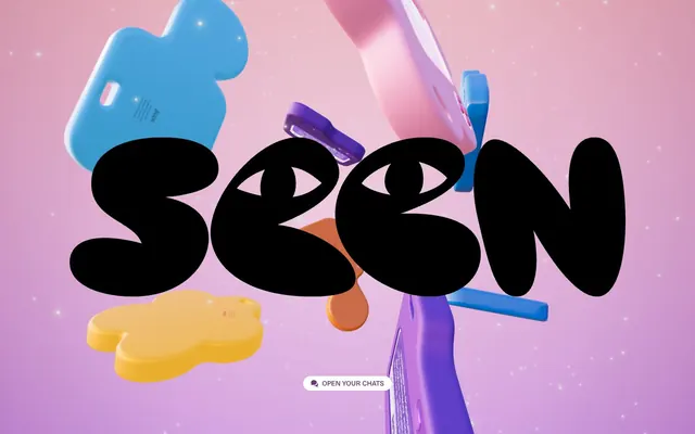
Preview image. Unlock full-res
Vibrant dreamscape playground
Color palette
Primary background color, creating a soft, ethereal canvas for content. This gradient gives pages a subtly shifting depth
Outlined button borders, iconic element borders, and button text — it provides distinct interactive affordances against lighter backgrounds without being a solid fill
Subtle highlight color in background gradients
Warm accent color within background gradients, providing a soft contrast
Cool accent color within background gradients, blending with the primary lilac
Darkest accent for background gradients, creating depth with a subtle radial vignette
Primary text color, providing high contrast against light and gradient backgrounds, as well as decorative elements and borders
Typography
- Weights
- 400, 500
- Sizes
- 14px, 16px
- Line height
- 1
- Fallback
- Inter
Custom display and body font. The custom font contributes significantly to the brand's unique, approachable, and playful voice. It appears at 16px weight 400 for primary content and 14px for smaller interactive elements.
Spacing & shape
Components
Ghost button with Bubblegum Outline (#683c72) border and text color, white background, and a generous 32px border radius for a distinct, soft pill shape. Padding is 4px top, 2px bottom, 16px left/right. Font is BB Sans, weight 500, 16px.
Guidelines
- Always use 'Dreamdust Gradient' (#d49ae2) as the base background, allowing for subtle color shifts and depth.
- Apply 'Bubblegum Outline' (#683c72) exclusively for interactive elements like button borders, icons, and button text.
- Use 'Ink' (#000000) for all primary text content to ensure optimal legibility against gradient backgrounds.
- Maintain a consistent 32px border-radius for all interactive components such as buttons to reinforce the soft, organic aesthetic.
- Incorporate `BB Sans` at 16px weight 400 for body text and 14px for smaller captions and labels, avoiding other font families.
- Implement an 8px base unit for all element spacing, with elements like buttons using 16px horizontal padding.
- Do not use solid fills for primary backgrounds; always leverage the 'Dreamdust Gradient'.
- Avoid using 'Bubblegum Outline' (#683c72) as a solid background fill for any interactive element.
- Do not use highly saturated colors for large areas of text; restrict 'Ink' (#000000) for body and headline text.
- Avoid sharp or low border-radius values; all elements should adhere to the rounded and soft aesthetic.
- Do not introduce additional font families or weights outside of BB Sans 400 and 500.
- Do not use values other than 8px or 16px for element padding and spacing unless explicitly defined for a specific component.
About this system
ShowHide
SEEN's design system embraces a playful, otherworldly aesthetic where vibrant colors are central to its identity. The core visual language is an expressive, gradient-rich fantasy with rounded, organic forms and bold, custom typography. Color is used for soft background washes and as a distinct outline for interactive elements, creating an inviting and whimsical user experience.
The page appears to be full-bleed, with no defined maximum width, utilizing a hero section that covers the entire viewport. The main content (the 'seen' typography) is centrally aligned and dominant. The layout prioritizes a single, compelling visual statement, implying subsequent content sections would follow a similar, spacious, and visually rich pattern without hard section dividers.
The site heavily features whimsical, 3D rendered surreal objects in vibrant, pastel colors with soft, glowing highlights and starry overlay effects. These are treated as full-bleed, atmospheric backdrops rather than contained elements, creating an immersive, dreamlike environment. The primary visual focal point is custom-rendered, blob-like typography with emotive eyes, making the text itself an expressive visual element. The imagery is purely decorative and atmospheric, setting a unique brand mood rather than conveying literal information.
Reminiscent of Gooey, Calm, Stripe (early branding), Superhuman.
# SEEN — Style Reference
> Vibrant dreamscape playground

**Theme:** light

**Site:** https://www.seen.space

SEEN's design system embraces a playful, otherworldly aesthetic where vibrant colors are central to its identity. The core visual language is an expressive, gradient-rich fantasy with rounded, organic forms and bold, custom typography. Color is used for soft background washes and as a distinct outline for interactive elements, creating an inviting and whimsical user experience.

## Tokens — Colors

| Name | Value | Token | Role |
|------|------|------|------|
| Dreamdust Gradient | `#d49ae2` | `--color-dreamdust-gradient` | Primary background color, creating a soft, ethereal canvas for content. This gradient gives pages a subtly shifting depth |
| Bubblegum Outline | `#683c72` | `--color-bubblegum-outline` | Outlined button borders, iconic element borders, and button text — it provides distinct interactive affordances against lighter backgrounds without being a solid fill |
| Twilight Mist | `#f7d1ff` | `--color-twilight-mist` | Subtle highlight color in background gradients |
| Sunrise Glow | `#f7ae47` | `--color-sunrise-glow` | Warm accent color within background gradients, providing a soft contrast |
| Grape Vine | `#a35ab3` | `--color-grape-vine` | Cool accent color within background gradients, blending with the primary lilac |
| Midnight Vignette | `#390b5d` | `--color-midnight-vignette` | Darkest accent for background gradients, creating depth with a subtle radial vignette |
| Ink | `#000000` | `--color-ink` | Primary text color, providing high contrast against light and gradient backgrounds, as well as decorative elements and borders |

## Tokens — Typography

### BB Sans
- **Substitute:** Inter
- **Weights:** 400, 500
- **Sizes:** 14px, 16px
- **Line height:** 1
- **Role:** Custom display and body font. The custom font contributes significantly to the brand's unique, approachable, and playful voice. It appears at 16px weight 400 for primary content and 14px for smaller interactive elements.

## Tokens — Spacing

- **Section gap:** 64px
- **Card padding:** 16px
- **Element gap:** 8px

## Tokens — Radius

- **Buttons:** 32px

## Layout

The page appears to be full-bleed, with no defined maximum width, utilizing a hero section that covers the entire viewport. The main content (the 'seen' typography) is centrally aligned and dominant. The layout prioritizes a single, compelling visual statement, implying subsequent content sections would follow a similar, spacious, and visually rich pattern without hard section dividers.

## Imagery

The site heavily features whimsical, 3D rendered surreal objects in vibrant, pastel colors with soft, glowing highlights and starry overlay effects. These are treated as full-bleed, atmospheric backdrops rather than contained elements, creating an immersive, dreamlike environment. The primary visual focal point is custom-rendered, blob-like typography with emotive eyes, making the text itself an expressive visual element. The imagery is purely decorative and atmospheric, setting a unique brand mood rather than conveying literal information.

## Components

### Outlined Button
*Primary interactive element.*

Ghost button with Bubblegum Outline (#683c72) border and text color, white background, and a generous 32px border radius for a distinct, soft pill shape. Padding is 4px top, 2px bottom, 16px left/right. Font is BB Sans, weight 500, 16px.

## Guidelines

### Do

- Always use 'Dreamdust Gradient' (#d49ae2) as the base background, allowing for subtle color shifts and depth.
- Apply 'Bubblegum Outline' (#683c72) exclusively for interactive elements like button borders, icons, and button text.
- Use 'Ink' (#000000) for all primary text content to ensure optimal legibility against gradient backgrounds.
- Maintain a consistent 32px border-radius for all interactive components such as buttons to reinforce the soft, organic aesthetic.
- Incorporate `BB Sans` at 16px weight 400 for body text and 14px for smaller captions and labels, avoiding other font families.
- Implement an 8px base unit for all element spacing, with elements like buttons using 16px horizontal padding.

### Don't

- Do not use solid fills for primary backgrounds; always leverage the 'Dreamdust Gradient'.
- Avoid using 'Bubblegum Outline' (#683c72) as a solid background fill for any interactive element.
- Do not use highly saturated colors for large areas of text; restrict 'Ink' (#000000) for body and headline text.
- Avoid sharp or low border-radius values; all elements should adhere to the rounded and soft aesthetic.
- Do not introduce additional font families or weights outside of BB Sans 400 and 500.
- Do not use values other than 8px or 16px for element padding and spacing unless explicitly defined for a specific component.

## Agent Prompt Guide

Quick Color Reference:
text: #000000
background: #d49ae2 (Dreamdust Gradient)
border: #683c72 (Bubblegum Outline)
accent: #f7d1ff
primary action: #683c72 (outlined action border)

Example Component Prompts:

1. Create a hero section: radial-gradient(circle, rgba(250, 230, 255, 0.67) 0%, rgba(212, 154, 226, 0.55) 100%) background. Place a large custom 'seen' typography element with black fill at its center. Below, position an Outlined Button with text `Open your chats`.

2. Design an interactive icon: Use #683c72 as the stroke color. The icon should be simple and line-based, suggesting an action or navigation element.

3. Create a secondary content block: Use the 'Dreamdust Gradient' as the background. Include body text `BB Sans` 16px, weight 400, #000000. Add a decorative element with a #a35ab3 tint within a linear gradient: `linear-gradient(0deg, rgba(163, 90, 179, 0.54) 0%, rgba(247, 174, 71, 0.65) 100%)`.
More like this







Keep what you find
A free account saves references to boards and can send you a weekly email of picks based on what you save.
To see every result, go Pro.