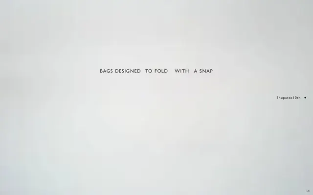
Preview image. Unlock full-res
Gallery Wall Typography
Color palette
Accent color for navigation highlights, active states, and informative badges — a single, vivid hue that provides functional punctuation in an otherwise monochromatic design
Page backgrounds, card surfaces, and subtle borders — the expansive white canvas that defines the brand's minimalist aesthetic
Primary text, headings, and significant borders – provides high contrast against Canvas White
Strongest accent for text, borders, and icons, used sparingly for emphasis
Muted secondary text and subtle borders, for less prominent information or secondary UI elements
Typography
- Weights
- 500
- Sizes
- 12px, 16px, 18px, 19px, 21px, 22px, 28px
- Line height
- 1, 1.22, 1.25, 1.29, 1.33
- Letter spacing
- 0.071em at 28px, 0.150em at 12px
Primary body text, paragraph content, and some navigation elements. The wide tracking and relatively light weight maintain an airy, spacious feel without sacrificing legibility.
- Weights
- 800
- Sizes
- 8px, 18px, 21px, 28px
- Line height
- 1, 1.22, 1.29, 1.33, 2.5
- Letter spacing
- 0.064em at 28px, 0.100em at 8px
Headings, prominent labels, and call-to-action text, where a stronger visual presence is required without becoming heavy. The semi-bold weight combined with wide tracking retains the minimalist aesthetic.
- Sizes
- 18px
- Line height
- 1
- Letter spacing
- 0.100em
Alternative body text or specific UI elements where a clear, sans-serif is needed, possibly for localization or specific functional text.
- Weights
- 600
- Sizes
- 15px
- Line height
- 1, 1.33
- Letter spacing
- 0.133em
Decorative or specialized text, offering a slightly more distinguished feel without deviating from the overall minimalist, editorial tone. Especially suited for titles or unique statements.
- Weights
- 600
- Sizes
- 10px, 17px
- Line height
- 1, 1.41
- Letter spacing
- 0.071em at 17px, 0.180em at 10px
Small functional text, footnotes, or metadata. The slightly heavier weight ensures legibility at smaller sizes, while maintaining the brand's characteristic wide tracking.
- Weights
- 400
- Sizes
- 18px
- Line height
- 1
- Letter spacing
- 0.1
游ゴシック体 — detected in extracted data but not described by AI
Spacing & shape
Components
Text in Charcoal Text (#2d2d2d), GillSansNova-Book weight 500, with a `0px` border-radius and `0px` padding. The focus is on the widespread letter-spacing as the primary visual differentiator.
Background is Highlight Violet (#738ae5), text is Canvas White (#ffffff). Features `0px` border-radius and `0px` padding. Uses GillSansNova-SemiBold weight 800 for strong presence despite its small size.
Transparent background, text is Charcoal Text (#2d2d2d). Features `0px` border-radius and `0px` padding. Uses GillSansNova-SemiBold weight 800 for clarity.
Guidelines
- Prioritize Canvas White (#ffffff) for backgrounds to maintain an open, minimalist aesthetic.
- Use Charcoal Text (#2d2d2d) for primary text and Deepest Ink (#000000) for strong emphasis, employing Slate Gray (#878887) for secondary content.
- Apply wide letter-spacing (`0.071em` to `0.180em`) consistently across all typography to reinforce the brand's spacious, editorial feel.
- Utilize Highlight Violet (#738ae5) exclusively for functional accents such as active navigation items, badges, or subtle hover states.
- Maintain `0px` border-radius for buttons, badges, and most UI elements, reserving `3px` for very specific, minor 'other' elements as detected.
- Employ Gill Sans Nova Book (weight 500) for core body content and Gill Sans Nova Semibold (weight 800) for all headings and prominent labels, ensuring visual harmony across different hierarchical levels.
- Keep components visually lightweight, often using transparent backgrounds or minimal borders, allowing the typography and spacing to define them.
- Avoid using saturated colors other than Highlight Violet (#738ae5); all other hues should be achieved through tints and shades of neutral colors.
- Do not introduce heavy shadows or gradients; rely on contrasting typography, spacing, and subtle border lines for hierarchy.
- Refrain from using tight letter-spacing; the brand identity is built on generous character spacing that feels artistic.
- Do not use generic button styles; buttons should be either ghost-like (text-only) or monochromatic text with subtle box model cues, never fully filled with a neutral color as a primary actionable.
- Avoid content-packed layouts; ensure ample negative space around every element to maintain the site's airy and premium feel.
- Do not use highly decorative imagery or illustrations; imagery should be minimal and complement the clean UI, often product-focused or abstract.
- Do not deviate from the specified font families; their distinctive widespread tracking and weights are critical to the brand's typographic identity.
About this system
ShowHide
Shupatto's design system is a study in minimalist elegance, prioritizing abundant negative space and a clean, typographic hierarchy. Its muted palette features primary charcoal and white, punctuated by a single vivid violet for functional highlights. This creates a serene, almost art-book like experience, where compact, widely tracked typography carries primary emphasis, allowing products to breathe and take center stage without visual clutter. Components are understated, often borderless, and integrate seamlessly into the expansive white canvas.
The page model is largely full-bleed, but with content often centered and implicitly constrained by wide margins, suggesting a strong content-width discipline. The hero pattern is a simple, expansive white canvas with a centered, minimalist headline in widely tracked text. Section rhythms are defined by consistent vertical spacing and the clear demarcation of content blocks against the white background, rarely using visual dividers but instead relying on typographic shifts and element grouping. Content arrangement is primarily composed of centered text blocks or simple linear arrangements, emphasizing clarity and breathability. There are no prominent card grids or complex column layouts evident, favoring a more editorial, single-flow presentation. The navigation is a minimalist top bar, likely sticky, with widely tracked text links.
This site predominantly uses minimal, product-focused imagery. Visuals are often cropped tightly or isolated against white backgrounds, emphasizing the product's form and function, similar to an art exhibit. There is an absence of lifestyle photography or complex illustrations. Icons, when present, are simple, monochromatic, and outline-based, maintaining the clean, unobtrusive aesthetic. Imagery serves purely to showcase or subtly explain, acting as content anchors without contributing visual noise. The overall density is text-dominant, allowing images to serve as deliberate pauses or highlights.
Reminiscent of Aēsop, MUJI, Rimowa, Bauhaus Archive.
# Shupatto — Style Reference
> Gallery Wall Typography

**Theme:** light

**Site:** https://www.shupatto.com/en

Shupatto's design system is a study in minimalist elegance, prioritizing abundant negative space and a clean, typographic hierarchy. Its muted palette features primary charcoal and white, punctuated by a single vivid violet for functional highlights. This creates a serene, almost art-book like experience, where compact, widely tracked typography carries primary emphasis, allowing products to breathe and take center stage without visual clutter. Components are understated, often borderless, and integrate seamlessly into the expansive white canvas.

## Tokens — Colors

| Name | Value | Token | Role |
|------|------|------|------|
| Highlight Violet | `#738ae5` | `--color-highlight-violet` | Accent color for navigation highlights, active states, and informative badges — a single, vivid hue that provides functional punctuation in an otherwise monochromatic design |
| Canvas White | `#ffffff` | `--color-canvas-white` | Page backgrounds, card surfaces, and subtle borders — the expansive white canvas that defines the brand's minimalist aesthetic |
| Charcoal Text | `#2d2d2d` | `--color-charcoal-text` | Primary text, headings, and significant borders – provides high contrast against Canvas White |
| Deepest Ink | `#000000` | `--color-deepest-ink` | Strongest accent for text, borders, and icons, used sparingly for emphasis |
| Slate Gray | `#878887` | `--color-slate-gray` | Muted secondary text and subtle borders, for less prominent information or secondary UI elements |

## Tokens — Typography

### Gill Sans Nova Book
- **Weights:** 500
- **Sizes:** 12px, 16px, 18px, 19px, 21px, 22px, 28px
- **Line height:** 1, 1.22, 1.25, 1.29, 1.33
- **Letter spacing:** 0.071em at 28px, 0.150em at 12px
- **Role:** Primary body text, paragraph content, and some navigation elements. The wide tracking and relatively light weight maintain an airy, spacious feel without sacrificing legibility.

### Gill Sans Nova Semibold
- **Weights:** 800
- **Sizes:** 8px, 18px, 21px, 28px
- **Line height:** 1, 1.22, 1.29, 1.33, 2.5
- **Letter spacing:** 0.064em at 28px, 0.100em at 8px
- **Role:** Headings, prominent labels, and call-to-action text, where a stronger visual presence is required without becoming heavy. The semi-bold weight combined with wide tracking retains the minimalist aesthetic.

### Yu Gothic
- **Sizes:** 18px
- **Line height:** 1
- **Letter spacing:** 0.100em
- **Role:** Alternative body text or specific UI elements where a clear, sans-serif is needed, possibly for localization or specific functional text.

### Cezanne Pro DB
- **Weights:** 600
- **Sizes:** 15px
- **Line height:** 1, 1.33
- **Letter spacing:** 0.133em
- **Role:** Decorative or specialized text, offering a slightly more distinguished feel without deviating from the overall minimalist, editorial tone. Especially suited for titles or unique statements.

### Gill Sans Nova Medium
- **Weights:** 600
- **Sizes:** 10px, 17px
- **Line height:** 1, 1.41
- **Letter spacing:** 0.071em at 17px, 0.180em at 10px
- **Role:** Small functional text, footnotes, or metadata. The slightly heavier weight ensures legibility at smaller sizes, while maintaining the brand's characteristic wide tracking.

### 游ゴシック体
- **Weights:** 400
- **Sizes:** 18px
- **Line height:** 1
- **Letter spacing:** 0.1
- **Role:** 游ゴシック体 — detected in extracted data but not described by AI

## Tokens — Type Scale

Minor Third (1.2) from 16px base.

| Role | Size | Line height | Letter spacing |
|------|------|------|------|
| body | 16px | 1.25 | 0.071em |
| subheading | 18px | 1.22 | 0.072em |
| heading-lg | 22px | 1.33 | 0.095em |
| display | 28px | 1 | 0.071em |

## Tokens — Spacing

- **Section gap:** 56px
- **Card padding:** 0px
- **Element gap:** 10px

## Tokens — Radius

- **Buttons:** 0px
- **Cards:** 0px
- **badges:** 0px
- **other:** 3px

## Layout

The page model is largely full-bleed, but with content often centered and implicitly constrained by wide margins, suggesting a strong content-width discipline. The hero pattern is a simple, expansive white canvas with a centered, minimalist headline in widely tracked text. Section rhythms are defined by consistent vertical spacing and the clear demarcation of content blocks against the white background, rarely using visual dividers but instead relying on typographic shifts and element grouping. Content arrangement is primarily composed of centered text blocks or simple linear arrangements, emphasizing clarity and breathability. There are no prominent card grids or complex column layouts evident, favoring a more editorial, single-flow presentation. The navigation is a minimalist top bar, likely sticky, with widely tracked text links.

## Imagery

This site predominantly uses minimal, product-focused imagery. Visuals are often cropped tightly or isolated against white backgrounds, emphasizing the product's form and function, similar to an art exhibit. There is an absence of lifestyle photography or complex illustrations. Icons, when present, are simple, monochromatic, and outline-based, maintaining the clean, unobtrusive aesthetic. Imagery serves purely to showcase or subtly explain, acting as content anchors without contributing visual noise. The overall density is text-dominant, allowing images to serve as deliberate pauses or highlights.

## Components

### Ghost Navigation Link
*Interactive element for global navigation and secondary calls-to-action.*

Text in Charcoal Text (#2d2d2d), GillSansNova-Book weight 500, with a `0px` border-radius and `0px` padding. The focus is on the widespread letter-spacing as the primary visual differentiator.

### Highlight Badge
*Small, informative labels indicating status or new content.*

Background is Highlight Violet (#738ae5), text is Canvas White (#ffffff). Features `0px` border-radius and `0px` padding. Uses GillSansNova-SemiBold weight 800 for strong presence despite its small size.

### Monochrome Badge
*Neutral, understated label often used for categories or tags.*

Transparent background, text is Charcoal Text (#2d2d2d). Features `0px` border-radius and `0px` padding. Uses GillSansNova-SemiBold weight 800 for clarity.

## Guidelines

### Do

- Prioritize Canvas White (#ffffff) for backgrounds to maintain an open, minimalist aesthetic.
- Use Charcoal Text (#2d2d2d) for primary text and Deepest Ink (#000000) for strong emphasis, employing Slate Gray (#878887) for secondary content.
- Apply wide letter-spacing (`0.071em` to `0.180em`) consistently across all typography to reinforce the brand's spacious, editorial feel.
- Utilize Highlight Violet (#738ae5) exclusively for functional accents such as active navigation items, badges, or subtle hover states.
- Maintain `0px` border-radius for buttons, badges, and most UI elements, reserving `3px` for very specific, minor 'other' elements as detected.
- Employ Gill Sans Nova Book (weight 500) for core body content and Gill Sans Nova Semibold (weight 800) for all headings and prominent labels, ensuring visual harmony across different hierarchical levels.
- Keep components visually lightweight, often using transparent backgrounds or minimal borders, allowing the typography and spacing to define them.

### Don't

- Avoid using saturated colors other than Highlight Violet (#738ae5); all other hues should be achieved through tints and shades of neutral colors.
- Do not introduce heavy shadows or gradients; rely on contrasting typography, spacing, and subtle border lines for hierarchy.
- Refrain from using tight letter-spacing; the brand identity is built on generous character spacing that feels artistic.
- Do not use generic button styles; buttons should be either ghost-like (text-only) or monochromatic text with subtle box model cues, never fully filled with a neutral color as a primary actionable.
- Avoid content-packed layouts; ensure ample negative space around every element to maintain the site's airy and premium feel.
- Do not use highly decorative imagery or illustrations; imagery should be minimal and complement the clean UI, often product-focused or abstract.
- Do not deviate from the specified font families; their distinctive widespread tracking and weights are critical to the brand's typographic identity.

## Agent Prompt Guide

Quick Color Reference:
text: #2d2d2d
background: #ffffff
border: #2d2d2d
accent: #738ae5
primary action: no distinct CTA color

Example Component Prompts:
1. Create a minimalist page header: Background Canvas White (#ffffff). Left-aligned text 'Shupatto 10th' in Charcoal Text (#2d2d2d), GillSansNova-Book weight 500, size 18px, letter-spacing 0.072em. A small circular indicator next to the text, Deepest Ink (#000000).
2. Generate a standard body text block: Paragraph text using Charcoal Text (#2d2d2d), GillSansNova-Book weight 500, size 16px, line-height 1.25, letter-spacing 0.071em. Ensure ample vertical spacing of 10px between this block and adjacent elements.
3. Design an informational badge: Text 'NEW' in Canvas White (#ffffff), GillSansNova-SemiBold weight 800, size 8px, letter-spacing 0.100em. Background Highlight Violet (#738ae5), with 0px border-radius and 0px padding. This badge should be small, acting as a functional highlight.
More like this









Keep what you find
A free account saves references to boards and can send you a weekly email of picks based on what you save.
To see every result, go Pro.