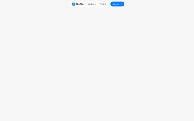
Preview image. Unlock full-res
Crisp digital canvas
Color palette
Primary action buttons, active navigation items, and brand accents — signals interactivity and importance
Yellow text accent for links, tags, and emphasized short phrases. Use as a supporting accent, not as a status color
Red text accent for links, tags, and emphasized short phrases. Use as a supporting accent, not as a status color
Page and card backgrounds, interactive elements — establishes a clean, expansive workspace
Subtle background for grouped elements, provides a gentle visual separation from Canvas White
Hairline borders for cards, inputs, and dividers — delineates content without heavy visual weight
Subtle shadows for buttons and cards, creating a sense of shallow elevation
Primary text, headings, and significant icon fills — ensures high contrast and clarity
Secondary text and inactive icon strokes — provides visual relief while remaining legible
Body text and links — a softer alternative to Graphite Black for extended reading
Typography
- Weights
- 400, 500, 600, 700
- Sizes
- 10px, 11px, 12px, 14px, 15px, 16px, 62px
- Line height
- 1, 1.16, 1.25, 1.33, 1.4, 1.43, 1.5, 1.67
- Letter spacing
- -0.025
- Fallback
- Inter
Primary UI font for all elements – its consistent negative letter-spacing ensures a tight, modern feel even at smaller sizes.
Spacing & shape
Elevation
Components
Filled with Shuttle Blue (#0077ff), white text, and 8px rounded corners. Padding is 0px vertical and 12px horizontal.
Transparent background, Graphite Black (#000000) text, and a Border Fog (#e5e7eb) border. No border radius, 0px vertical and 48px horizontal padding.
White background, Graphite Black (#000000) text, and Border Fog (#e5e7eb) border. Features 8px rounded corners and 0px vertical, 12px right, 6px left padding.
Canvas White (#ffffff) background with 16px border-radius. Features a prominent shadow: rgba(0, 0, 0, 0.25) 0px 25px 50px -12px.
Cloud Gray (#fafafa) background with 24px border-radius. A subtle shadow: rgba(0, 0, 0, 0.25) 0px 0px 1px 0px.
Transparent background, Graphite Black (#000000) text, and a Border Fog (#e5e7eb) bottom border. Has 6px border-radius and 12px vertical padding.
Utilizes 9999px border-radius for an elliptical shape. Background and text color vary by context but often feature neutral tones or the brand's accent colors.
Guidelines
- Use InterVariable font with the default negative letter-spacing of -0.025em for all text elements to maintain a compact, tight aesthetic.
- Prioritize Canvas White (#ffffff) for primary content backgrounds and Cloud Gray (#f9f9f9) for secondary grouped elements to create subtle depth.
- Apply Shuttle Blue (#0077ff) exclusively for primary calls to action and active states to guide user interaction.
- Borders should primarily use Border Fog (#e5e7eb) at 1px solid, maintaining a light, clean separation of elements.
- Implement 8px border-radius for interactive elements like buttons and inputs, and 16px for content cards to unify component shaping.
- Separate major page sections with a vertical gap of 128px to ensure ample breathing room and clear content distinctions.
- Elevate primary content cards using the prominent shadow rgba(0, 0, 0, 0.25) 0px 25px 50px -12px to give them visual priority.
- Avoid using highly saturated colors outside of the defined brand and semantic palette; maintain a predominantly neutral visual space.
- Do not vary letter-spacing for different text sizes or roles, as InterVariable's consistent -0.025em is a signature styling choice.
- Refrain from introducing heavy or opaque background colors for cards or containers; favor transparent or very light backgrounds.
- Do not use box-shadows beyond the specified subtle options; the design minimizes aggressive 3D effects.
- Avoid mixed border radii on the same component (e.g., 8px for one corner, 16px for another); ensure consistent rounding.
- Do not introduce gradients unless they are purely decorative and do not interfere with legibility or functional contrast.
- Do not use excessive visual decoration or embellishment; the system prioritizes clarity and functional simplicity.
About this system
ShowHide
Shuttle employs a crisp, utility-focused aesthetic, blending a stark monochrome palette with a single vibrant blue accent. Surfaces are predominantly white or near-white, providing a clean digital canvas for functional elements. Typography is compact and precise, maintaining a high information density without visual clutter, while subtle shadows and rounded corners soften interactive components.
The page maintains a full-bleed layout for its overall canvas (Canvas White), but content within sections appears to be centered with a distinct max-width, though not explicitly defined in the data. The header features a compact, centrally aligned navigation with the brand logo, links, and a primary action button. Sections exhibit a consistent vertical rhythm, often using a section gap of 128px. Content arrangement varies, but often involves focused, centered blocks within the main flow. There's an indication of some content alternating with text and implied visuals. The navigation is a sticky top bar, providing persistent access to key actions.
The site's imagery is minimal, focusing on UI elements and functional icons rather than photography or complex illustrations. Icons are primarily outlined or filled with Graphite Black (#000000) or subtle gray tones, occasionally highlighted with a vibrant accent color like Warning Gold (#f59e0b). Visual treatment is clean, contained, and without ornate stylization, emphasizing product utility and clarity. The density is text-dominant, with icons serving as functional aids rather than large decorative elements.
Reminiscent of Figma, Linear, Replit.
# Shuttle — Style Reference
> Crisp digital canvas

**Theme:** light

**Site:** https://shuttle.zip/about

Shuttle employs a crisp, utility-focused aesthetic, blending a stark monochrome palette with a single vibrant blue accent. Surfaces are predominantly white or near-white, providing a clean digital canvas for functional elements. Typography is compact and precise, maintaining a high information density without visual clutter, while subtle shadows and rounded corners soften interactive components.

## Tokens — Colors

| Name | Value | Token | Role |
|------|------|------|------|
| Shuttle Blue | `#0077ff` | `--color-shuttle-blue` | Primary action buttons, active navigation items, and brand accents — signals interactivity and importance |
| Warning Gold | `#f59e0b` | `--color-warning-gold` | Yellow text accent for links, tags, and emphasized short phrases. Use as a supporting accent, not as a status color |
| Error Ember | `#ef4444` | `--color-error-ember` | Red text accent for links, tags, and emphasized short phrases. Use as a supporting accent, not as a status color |
| Canvas White | `#ffffff` | `--color-canvas-white` | Page and card backgrounds, interactive elements — establishes a clean, expansive workspace |
| Cloud Gray | `#f9f9f9` | `--color-cloud-gray` | Subtle background for grouped elements, provides a gentle visual separation from Canvas White |
| Border Fog | `#e5e7eb` | `--color-border-fog` | Hairline borders for cards, inputs, and dividers — delineates content without heavy visual weight |
| Stroke Silver | `#b8b8b8` | `--color-stroke-silver` | Subtle shadows for buttons and cards, creating a sense of shallow elevation |
| Graphite Black | `#000000` | `--color-graphite-black` | Primary text, headings, and significant icon fills — ensures high contrast and clarity |
| Muted Ash | `#a3a3a3` | `--color-muted-ash` | Secondary text and inactive icon strokes — provides visual relief while remaining legible |
| Text Slate | `#525252` | `--color-text-slate` | Body text and links — a softer alternative to Graphite Black for extended reading |

## Tokens — Typography

### InterVariable
- **Substitute:** Inter
- **Weights:** 400, 500, 600, 700
- **Sizes:** 10px, 11px, 12px, 14px, 15px, 16px, 62px
- **Line height:** 1, 1.16, 1.25, 1.33, 1.4, 1.43, 1.5, 1.67
- **Letter spacing:** -0.025
- **Role:** Primary UI font for all elements – its consistent negative letter-spacing ensures a tight, modern feel even at smaller sizes.

## Tokens — Type Scale

Perfect Fourth (1.333) from 12px base.

| Role | Size | Line height | Letter spacing |
|------|------|------|------|
| caption | 10px | 1.4 | — |
| body-sm | 11px | 1.4 | — |
| body | 12px | 1.4 | — |
| body-lg | 14px | 1.4 | — |
| heading-sm | 15px | 1.4 | — |
| heading | 16px | 1.4 | — |
| heading-lg | 62px | 1.3 | — |

## Tokens — Spacing

- **Section gap:** 128px
- **Card padding:** 12px
- **Element gap:** 8px

## Tokens — Radius

- **Buttons:** 8px
- **Inputs:** 8px
- **Cards:** 16px
- **avatars:** 9999px
- **badges:** 9999px

## Tokens — Elevation

- **Elevated Content Card:** `rgba(0, 0, 0, 0.25) 0px 25px 50px -12px`
- **Subtle Background Card:** `rgba(0, 0, 0, 0.25) 0px 0px 1px 0px`
- **Button:** `rgba(0, 0, 0, 0.25) 0px 0px 1px 0px`

## Layout

The page maintains a full-bleed layout for its overall canvas (Canvas White), but content within sections appears to be centered with a distinct max-width, though not explicitly defined in the data. The header features a compact, centrally aligned navigation with the brand logo, links, and a primary action button. Sections exhibit a consistent vertical rhythm, often using a section gap of 128px. Content arrangement varies, but often involves focused, centered blocks within the main flow. There's an indication of some content alternating with text and implied visuals. The navigation is a sticky top bar, providing persistent access to key actions.

## Imagery

The site's imagery is minimal, focusing on UI elements and functional icons rather than photography or complex illustrations. Icons are primarily outlined or filled with Graphite Black (#000000) or subtle gray tones, occasionally highlighted with a vibrant accent color like Warning Gold (#f59e0b). Visual treatment is clean, contained, and without ornate stylization, emphasizing product utility and clarity. The density is text-dominant, with icons serving as functional aids rather than large decorative elements.

## Components

### Primary Action Button
*Key interactions*

Filled with Shuttle Blue (#0077ff), white text, and 8px rounded corners. Padding is 0px vertical and 12px horizontal.

### Ghost Button
*Secondary actions*

Transparent background, Graphite Black (#000000) text, and a Border Fog (#e5e7eb) border. No border radius, 0px vertical and 48px horizontal padding.

### Light Ghost Button
*Contextual actions within cards or other surfaces*

White background, Graphite Black (#000000) text, and Border Fog (#e5e7eb) border. Features 8px rounded corners and 0px vertical, 12px right, 6px left padding.

### Elevated Content Card
*Prominent content blocks*

Canvas White (#ffffff) background with 16px border-radius. Features a prominent shadow: rgba(0, 0, 0, 0.25) 0px 25px 50px -12px.

### Subtle Background Card
*Informational panels*

Cloud Gray (#fafafa) background with 24px border-radius. A subtle shadow: rgba(0, 0, 0, 0.25) 0px 0px 1px 0px.

### Simple Input Field
*User data entry*

Transparent background, Graphite Black (#000000) text, and a Border Fog (#e5e7eb) bottom border. Has 6px border-radius and 12px vertical padding.

### Badge/Tag
*Categorization and status*

Utilizes 9999px border-radius for an elliptical shape. Background and text color vary by context but often feature neutral tones or the brand's accent colors.

## Guidelines

### Do

- Use InterVariable font with the default negative letter-spacing of -0.025em for all text elements to maintain a compact, tight aesthetic.
- Prioritize Canvas White (#ffffff) for primary content backgrounds and Cloud Gray (#f9f9f9) for secondary grouped elements to create subtle depth.
- Apply Shuttle Blue (#0077ff) exclusively for primary calls to action and active states to guide user interaction.
- Borders should primarily use Border Fog (#e5e7eb) at 1px solid, maintaining a light, clean separation of elements.
- Implement 8px border-radius for interactive elements like buttons and inputs, and 16px for content cards to unify component shaping.
- Separate major page sections with a vertical gap of 128px to ensure ample breathing room and clear content distinctions.
- Elevate primary content cards using the prominent shadow rgba(0, 0, 0, 0.25) 0px 25px 50px -12px to give them visual priority.

### Don't

- Avoid using highly saturated colors outside of the defined brand and semantic palette; maintain a predominantly neutral visual space.
- Do not vary letter-spacing for different text sizes or roles, as InterVariable's consistent -0.025em is a signature styling choice.
- Refrain from introducing heavy or opaque background colors for cards or containers; favor transparent or very light backgrounds.
- Do not use box-shadows beyond the specified subtle options; the design minimizes aggressive 3D effects.
- Avoid mixed border radii on the same component (e.g., 8px for one corner, 16px for another); ensure consistent rounding.
- Do not introduce gradients unless they are purely decorative and do not interfere with legibility or functional contrast.
- Do not use excessive visual decoration or embellishment; the system prioritizes clarity and functional simplicity.

## Agent Prompt Guide

Quick Color Reference:
text: #000000
background: #ffffff
border: #e5e7eb
accent: #0077ff
primary action: #0077ff (filled action)

Example Component Prompts:
1. Create a Primary Action Button: #0077ff background, #ffffff text, 9999px radius, compact pill padding. Use this filled treatment for the main CTA.
2. Create an Elevated Content Card: Canvas White (#ffffff) background, 16px border-radius, with shadow rgba(0, 0, 0, 0.25) 0px 25px 50px -12px. Use Graphite Black (#000000) for headlines and Text Slate (#525252) for body copy (both InterVariable, -0.025em letter-spacing).
3. Design a Simple Input Field: Transparent background, Border Fog (#e5e7eb) bottom border, 8px border-radius, 12px vertical padding. Use Graphite Black (#000000) for input text (InterVariable, weight 400, -0.025em letter-spacing).
More like this








Keep what you find
A free account saves references to boards and can send you a weekly email of picks based on what you save.
To see every result, go Pro.