Preview image. Unlock full-res
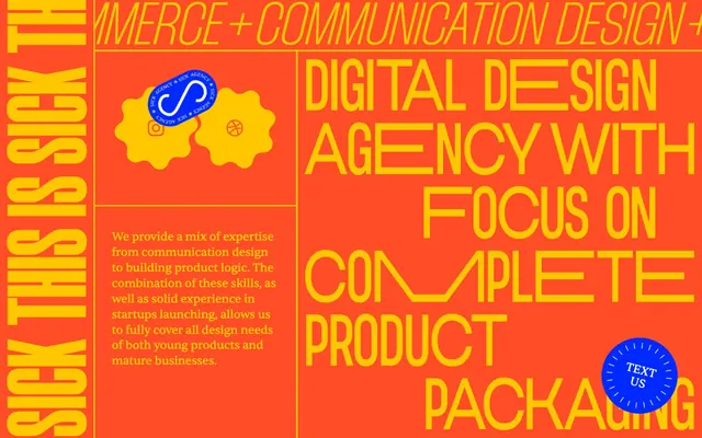
Neon Pop Art poster
Color palette
Page background, significant accent borders, minor text elements and icons — creates a warm, high-energy canvas
Prominent headings and display text, interactive button backgrounds, decorative borders — provides high contrast and a sense of urgent highlight
Primary action button backgrounds, accent borders — a distinct, high-saturation color that commands attention for interactive elements
Input borders — a muted, almost-black red for subtle framing in form elements
Primary text, prominent borders, illustrative fills — provides a grounding, high-contrast element against the vivid brand colors
Button text, secondary text, illustrative fills and strokes — offers stark contrast against the dark and chromatic backgrounds
Typography
- Weights
- 900
- Sizes
- 229px
- Line height
- 0.7
- Fallback
- Anton, Impact
Super-display headings – immense size and bold weight create an almost sculptural text element rather than just words.
- Weights
- 300
- Sizes
- 122px
- Line height
- normal
- Letter spacing
- normal
- Fallback
- Bebas Neue, League Gothic
Display headings – large and light, used for impactful, sparse statements where the form of the text is as important as the content.
- Weights
- 400
- Sizes
- 12px, 16px, 24px
- Line height
- 1.1, 1.15, 1.33, 1.44, 2.25
- Letter spacing
- -0.0200em, -0.0150em, -0.0100em
- Fallback
- Inter, Montserrat
Body text, buttons, icons, and links – a versatile, highly tracked sans-serif that maintains readability despite dense layout.
- Weights
- 400
- Sizes
- 10px
- Line height
- 1.15
- Letter spacing
- normal
- Fallback
- Times New Roman
Fine print, small links, and icon labels – provides a classic, compact counterpoint to the dominant display typography.
Spacing & shape
Components
A filled button with a 'Shocking Blue' (#0029ff) background and 'Pure Canvas' (#ffffff) text, utilizing a full pill (999px) border radius. Padding is minimal at 5px top, 1px bottom, and 6px horizontal.
A filled button with an 'Electric Yellow' (#ffc700) background and 'Abyss' (#000000) text, with a 'Fiery Orange' (#ff4e27) border. It features a full pill (999px) border radius with no explicit padding, relying on content for sizing.
A transparent button with 'Pure Canvas' (#ffffff) text and a 'Fiery Orange' (#ff4e27) border. It uses a full pill (999px) border radius, with padding of 5px top, 1px bottom, and 6px horizontal.
A transparent input field with 'Fiery Orange' (#ff4e27) text and a 'Deep Crimson' (#4d170c) bottom border. It has a 0px border radius and generous vertical padding (16px top and bottom) with 0px horizontal padding.
Guidelines
- Use 'Fiery Orange' (#ff4e27) as the dominant background for sections or the entire page to establish the high-energy brand presence.
- Apply 'Electric Yellow' (#ffc700) liberally for main headlines, display text, and high-visibility interactive elements to create strong visual anchors.
- Reserve 'Shocking Blue' (#0029ff) exclusively for primary calls to action or critical interactive states to maximize its impact and distinction.
- Set headlines using 'Thunder' or 'Morganite' families to their maximum available size, embracing the almost architectural scale of the typography.
- Utilize a 999px border radius for all buttons, tags, and small interactive elements to maintain a distinct, rounded, almost pill-like aesthetic.
- Incorporate Sentient font with its tight letter-spacing (-0.0200em to -0.0100em) for body text and labels to maintain a compact, detailed look.
- Employ the 5px element gap for all inline and block spacing to ensure elements feel connected but not cramped.
- Avoid using soft, desaturated colors; the system thrives on vivid, high-chroma contrasts.
- Do not use subtle shadows or gradients for elevation; opt for flat, bold color blocks and hard outlines.
- Refrain from using conventional sans-serif fonts for display texts; leverage the unique character of 'Morganite' and 'Thunder'.
- Do not introduce square or minimally rounded corners for interactive elements; all buttons and tags must use a 999px radius.
- Avoid excessive whitespace; the design is dense and dynamic, preferring tightly packed, high-impact visuals.
- Do not rely solely on default text colors; always ensure text is either 'Abyss' (#000000) or 'Pure Canvas' (#ffffff) for maximum contrast against colored backgrounds.
- Do not dilute the brand's graphic, often chaotic style with conventional grid-based arrangements for hero sections; embrace bold, asymmetric compositions.
About this system
ShowHide
SICK AGENCY embodies a raw, high-contrast, and somewhat chaotic energy. It leverages a vibrant, almost aggressive color palette of fiery orange, electric yellow, and shocking blue against stark black and white for maximum visual impact. Typography is bold and unconventional, ranging from tightly packed, heavy display faces to a more understated body text. The system embraces non-standard shapes and circular motifs, creating a sense of playful disruption rather than traditional corporate polish.
The page exhibits a full-bleed, dynamic layout that appears to largely ignore a fixed max-width, allowing sections to extend to the edges of the viewport. The hero section is a full-bleed block of 'Fiery Orange' (#ff4e27) with oversized, graphically treated headlines. Section rhythm is driven by these large, colorful blocks and distinct horizontal lines which divide content areas. Content is arranged in an unconventional, broken grid, with large typographic elements often running vertically and horizontally, creating an almost collage-like effect. Text blocks are contained, but often positioned against these larger graphic elements. Grid usage is loose, more about visual hierarchy and impact than strict alignment. The density is on the denser side, with elements often overlapping or butting up against each other. Navigation is not immediately visible in the provided screenshot but implied to be minimal given the page content.
The visual language is graphic and abstract, almost resembling pop art or street art. It heavily utilizes flat, vibrant color blocks. Illustrations consist of abstract, often organic or gear-like shapes, sometimes outlined in a contrasting color. Icons are simple, outlined, and monochromatic, often contained within a vivid colored circle or pill shape. Photography is notably absent, ensuring that the UI and custom graphics are the sole visual focus. Its role is primarily decorative atmosphere and brand identity showcase, rather than explanatory content. The density is image-heavy in decorative sections, but functional content uses text-dominant blocks. Overlapping elements and non-standard shapes are common, creating a sense of dynamic composition.
Reminiscent of Huge Inc., Kilo Kish (website), Active Theory, The Brand Father.
# SICK AGENCY — Style Reference
> Neon Pop Art poster

**Theme:** dark

**Site:** https://sick.agency

SICK AGENCY embodies a raw, high-contrast, and somewhat chaotic energy. It leverages a vibrant, almost aggressive color palette of fiery orange, electric yellow, and shocking blue against stark black and white for maximum visual impact. Typography is bold and unconventional, ranging from tightly packed, heavy display faces to a more understated body text. The system embraces non-standard shapes and circular motifs, creating a sense of playful disruption rather than traditional corporate polish.

## Tokens — Colors

| Name | Value | Token | Role |
|------|------|------|------|
| Fiery Orange | `#ff4e27` | `--color-fiery-orange` | Page background, significant accent borders, minor text elements and icons — creates a warm, high-energy canvas |
| Electric Yellow | `#ffc700` | `--color-electric-yellow` | Prominent headings and display text, interactive button backgrounds, decorative borders — provides high contrast and a sense of urgent highlight |
| Shocking Blue | `#0029ff` | `--color-shocking-blue` | Primary action button backgrounds, accent borders — a distinct, high-saturation color that commands attention for interactive elements |
| Deep Crimson | `#4d170c` | `--color-deep-crimson` | Input borders — a muted, almost-black red for subtle framing in form elements |
| Abyss | `#000000` | `--color-abyss` | Primary text, prominent borders, illustrative fills — provides a grounding, high-contrast element against the vivid brand colors |
| Pure Canvas | `#ffffff` | `--color-pure-canvas` | Button text, secondary text, illustrative fills and strokes — offers stark contrast against the dark and chromatic backgrounds |

## Tokens — Typography

### Morganite
- **Substitute:** Anton, Impact
- **Weights:** 900
- **Sizes:** 229px
- **Line height:** 0.7
- **Role:** Super-display headings – immense size and bold weight create an almost sculptural text element rather than just words.

### Thunder
- **Substitute:** Bebas Neue, League Gothic
- **Weights:** 300
- **Sizes:** 122px
- **Line height:** normal
- **Letter spacing:** normal
- **Role:** Display headings – large and light, used for impactful, sparse statements where the form of the text is as important as the content.

### Sentient
- **Substitute:** Inter, Montserrat
- **Weights:** 400
- **Sizes:** 12px, 16px, 24px
- **Line height:** 1.1, 1.15, 1.33, 1.44, 2.25
- **Letter spacing:** -0.0200em, -0.0150em, -0.0100em
- **Role:** Body text, buttons, icons, and links – a versatile, highly tracked sans-serif that maintains readability despite dense layout.

### Times
- **Substitute:** Times New Roman
- **Weights:** 400
- **Sizes:** 10px
- **Line height:** 1.15
- **Letter spacing:** normal
- **Role:** Fine print, small links, and icon labels – provides a classic, compact counterpoint to the dominant display typography.

## Tokens — Type Scale

| Role | Size | Line height | Letter spacing |
|------|------|------|------|
| caption | 10px | 1.15 | — |
| body | 16px | 1.15 | -0.24px |
| subheading | 24px | 1.33 | -0.24px |
| heading | 122px | 1 | — |
| display | 229px | 0.7 | — |

## Tokens — Spacing

- **Section gap:** 50px
- **Card padding:** 16px
- **Element gap:** 5px

## Tokens — Radius

- **Buttons:** 999px
- **icons:** 999px
- **tags:** 999px

## Layout

The page exhibits a full-bleed, dynamic layout that appears to largely ignore a fixed max-width, allowing sections to extend to the edges of the viewport. The hero section is a full-bleed block of 'Fiery Orange' (#ff4e27) with oversized, graphically treated headlines. Section rhythm is driven by these large, colorful blocks and distinct horizontal lines which divide content areas. Content is arranged in an unconventional, broken grid, with large typographic elements often running vertically and horizontally, creating an almost collage-like effect. Text blocks are contained, but often positioned against these larger graphic elements. Grid usage is loose, more about visual hierarchy and impact than strict alignment. The density is on the denser side, with elements often overlapping or butting up against each other. Navigation is not immediately visible in the provided screenshot but implied to be minimal given the page content.

## Imagery

The visual language is graphic and abstract, almost resembling pop art or street art. It heavily utilizes flat, vibrant color blocks. Illustrations consist of abstract, often organic or gear-like shapes, sometimes outlined in a contrasting color. Icons are simple, outlined, and monochromatic, often contained within a vivid colored circle or pill shape. Photography is notably absent, ensuring that the UI and custom graphics are the sole visual focus. Its role is primarily decorative atmosphere and brand identity showcase, rather than explanatory content. The density is image-heavy in decorative sections, but functional content uses text-dominant blocks. Overlapping elements and non-standard shapes are common, creating a sense of dynamic composition.

## Components

### Primary Action Button
*Interactive element*

A filled button with a 'Shocking Blue' (#0029ff) background and 'Pure Canvas' (#ffffff) text, utilizing a full pill (999px) border radius. Padding is minimal at 5px top, 1px bottom, and 6px horizontal.

### Accent Highlight Button
*Interactive element*

A filled button with an 'Electric Yellow' (#ffc700) background and 'Abyss' (#000000) text, with a 'Fiery Orange' (#ff4e27) border. It features a full pill (999px) border radius with no explicit padding, relying on content for sizing.

### Ghost Accent Button
*Interactive element*

A transparent button with 'Pure Canvas' (#ffffff) text and a 'Fiery Orange' (#ff4e27) border. It uses a full pill (999px) border radius, with padding of 5px top, 1px bottom, and 6px horizontal.

### Underlined Text Input
*Form element*

A transparent input field with 'Fiery Orange' (#ff4e27) text and a 'Deep Crimson' (#4d170c) bottom border. It has a 0px border radius and generous vertical padding (16px top and bottom) with 0px horizontal padding.

## Guidelines

### Do

- Use 'Fiery Orange' (#ff4e27) as the dominant background for sections or the entire page to establish the high-energy brand presence.
- Apply 'Electric Yellow' (#ffc700) liberally for main headlines, display text, and high-visibility interactive elements to create strong visual anchors.
- Reserve 'Shocking Blue' (#0029ff) exclusively for primary calls to action or critical interactive states to maximize its impact and distinction.
- Set headlines using 'Thunder' or 'Morganite' families to their maximum available size, embracing the almost architectural scale of the typography.
- Utilize a 999px border radius for all buttons, tags, and small interactive elements to maintain a distinct, rounded, almost pill-like aesthetic.
- Incorporate Sentient font with its tight letter-spacing (-0.0200em to -0.0100em) for body text and labels to maintain a compact, detailed look.
- Employ the 5px element gap for all inline and block spacing to ensure elements feel connected but not cramped.

### Don't

- Avoid using soft, desaturated colors; the system thrives on vivid, high-chroma contrasts.
- Do not use subtle shadows or gradients for elevation; opt for flat, bold color blocks and hard outlines.
- Refrain from using conventional sans-serif fonts for display texts; leverage the unique character of 'Morganite' and 'Thunder'.
- Do not introduce square or minimally rounded corners for interactive elements; all buttons and tags must use a 999px radius.
- Avoid excessive whitespace; the design is dense and dynamic, preferring tightly packed, high-impact visuals.
- Do not rely solely on default text colors; always ensure text is either 'Abyss' (#000000) or 'Pure Canvas' (#ffffff) for maximum contrast against colored backgrounds.
- Do not dilute the brand's graphic, often chaotic style with conventional grid-based arrangements for hero sections; embrace bold, asymmetric compositions.

## Agent Prompt Guide

primary action: #0029ff (filled action)
Create a Primary Action Button: #0029ff background, #ffffff text, 9999px radius, compact pill padding. Use this filled treatment for the main CTA.

Example Component Prompts:
1. Create a hero section: 'Fiery Orange' (#ff4e27) background. Headline at 229px Morganite weight 900, 'Electric Yellow' (#ffc700), line height 0.70. Subtext paragraph at 16px Sentient weight 400, 'Abyss' (#000000), letter-spacing -0.24px.
2. Design a primary action button: 'Shocking Blue' (#0029ff) background, 'Pure Canvas' (#ffffff) text at 12px Sentient weight 400, letter-spacing -0.24px. Radius 999px. Padding 5px top, 1px bottom, 6px horizontal.
3. Build a feature block: 'Electric Yellow' (#ffc700) background. Heading at 122px Thunder weight 300, 'Abyss' (#000000). Body text at 16px Sentient weight 400, 'Abyss' (#000000), letter-spacing -0.24px. Add a circular icon with a 'Fiery Orange' (#ff4e27) border.
4. Construct an input field: transparent background with a 'Deep Crimson' (#4d170c) bottom border. Placeholder text 'Fiery Orange' (#ff4e27) at 16px Sentient weight 400, letter-spacing -0.24px. Padding 16px vertical, 0px horizontal.
More like this







Keep what you find
A free account saves references to boards and can send you a weekly email of picks based on what you save.
To see every result, go Pro.