Preview image. Unlock full-res
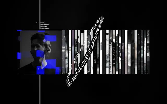
Glitchy digital void. A deep black canvas punctuated by stark white text and electric blue data anomalies creates a raw, technical feel.
Color palette
Accent color for interactive elements, data visualizations, and graphic overlays, suggesting digital activity and highlighting key information.
Primary background for pages and sections, creating an immersive, infinite dark canvas.
Primary text, borders, and interactive elements – stands in sharp contrast against the Void Black for maximum legibility and impact.
Typography
- Weights
- 600
- Sizes
- 16px
- Line height
- 1
- Letter spacing
- normal
- Fallback
- Space Mono
Used for all text content, including navigation, body text, and headings. Its monospace nature reinforces the technical, code-like aesthetic, creating a consistent, no-nonsense tone across the experience.
Spacing & shape
Components
Text link using Siro font at 16px, weight 600, color Terminal White (#ffffff). No hover state visible but implied interaction with Electric Blue (#0000FF) on active/hover.
A square frame with a 1px border of Terminal White (#ffffff) around a greyscale image. Electric Blue (#0000FF) blocks appear as a digital overlay or glitch effect on the image.
Text in Siro font (implied 16px, weight 600) in Terminal White (#ffffff), rotated to a sharp diagonal angle, layered over background elements.
A thin 1px vertical line in Terminal White (#ffffff) used to visually segment content or indicate structural divisions. Extends full height or a significant portion of the viewport.
Guidelines
- Prioritize Void Black (#000000) for all backgrounds to maintain the deep, immersive dark theme.
- Use Terminal White (#ffffff) exclusively for text and essential UI elements to ensure stark contrast and readability.
- Incorporate Electric Blue (#0000FF) sparingly for interactive states, key highlights, or abstract graphic elements, contrasting sharply with the dominant black and white.
- Maintain a rigid 0px border-radius across all elements to preserve the sharp, angular aesthetic.
- Employ the Siro (Space Mono) font at weight 600 for all textual content, ensuring a consistent monospace, technical feel.
- Leverage vertical and horizontal lines of Terminal White (#ffffff) to define spatial relationships and boundaries, rather than relying on padding or margin alone.
- Avoid any soft shadows or subtle elevation effects; the design relies on flat, stark contrasts.
- Do not introduce gradients or chromatic colors beyond Electric Blue (#0000FF); the palette is intentionally limited.
- Refrain from using rounded corners on any UI elements; all shapes must be rectilinear.
- Do not use multiple font families or weights outside of Siro 600; consistency in typography is key.
- Avoid decorative imagery that introduces organic forms or complex color palettes; visual elements should be abstract, geometric, or heavily processed.
- Do not attempt to soften edges or blend elements; the aesthetic values abrupt transitions and hard lines.
About this system
ShowHide
This design system conjures a digital void, where stark black dominates and content appears through a subtle play of white and electric blue. The aesthetic feels like a glitch art exhibit or a command line interface, prioritizing raw data and fragmented visuals over traditional polish. Monospaced typography and an absence of soft edges or shadows create an atmosphere of technical precision and almost raw, unfiltered expression.
The layout is full-bleed black, with content segments often presented in a deconstructed, almost abstract manner. There's an asymmetric, grid-like division for the main content, featuring a prominent, frameless image container on the left, which itself has a 1px white border. Text elements for navigation/contact are vertically stacked and left-aligned. A distinctive angular text overlay breaks the strict horizontal/vertical lines, providing visual dynamism and a 'glitch' effect. Overall, the layout is sparse and centers information and unique visual elements without adhering to a strict max-width container, allowing the profound blackness to dominate.
The visual language is characterized by highly processed photography, specifically a monochrome portrait with aggressive, fragmented Electric Blue (#0000FF) overlays that simulate digital glitches or data corruption. Graphics include abstract vertical strips of content, suggesting data streams or code, further reinforcing the technical, deconstructed aesthetic. Imagery serves a decorative, mood-setting role, enhancing the 'digital void' metaphor rather than providing literal information.
Reminiscent of Are.na, Certain artist portfolios, Terminal interfaces.
# Philipp Antoni — Style Reference
> Glitchy digital void. A deep black canvas punctuated by stark white text and electric blue data anomalies creates a raw, technical feel.

**Theme:** dark

**Site:** https://phlntn.com

This design system conjures a digital void, where stark black dominates and content appears through a subtle play of white and electric blue. The aesthetic feels like a glitch art exhibit or a command line interface, prioritizing raw data and fragmented visuals over traditional polish. Monospaced typography and an absence of soft edges or shadows create an atmosphere of technical precision and almost raw, unfiltered expression.

## Tokens — Colors

| Name | Value | Token | Role |
|------|------|------|------|
| Electric Blue | `#0000FF` | `--color-electric-blue` | Accent color for interactive elements, data visualizations, and graphic overlays, suggesting digital activity and highlighting key information. |
| Void Black | `#000000` | `--color-void-black` | Primary background for pages and sections, creating an immersive, infinite dark canvas. |
| Terminal White | `#ffffff` | `--color-terminal-white` | Primary text, borders, and interactive elements – stands in sharp contrast against the Void Black for maximum legibility and impact. |

## Tokens — Typography

### Siro
- **Substitute:** Space Mono
- **Weights:** 600
- **Sizes:** 16px
- **Line height:** 1
- **Letter spacing:** normal
- **Role:** Used for all text content, including navigation, body text, and headings. Its monospace nature reinforces the technical, code-like aesthetic, creating a consistent, no-nonsense tone across the experience.

## Tokens — Spacing

- **Section gap:** 64px
- **Card padding:** 24px
- **Element gap:** 16px

## Tokens — Radius

- **all:** 0px

## Layout

The layout is full-bleed black, with content segments often presented in a deconstructed, almost abstract manner. There's an asymmetric, grid-like division for the main content, featuring a prominent, frameless image container on the left, which itself has a 1px white border. Text elements for navigation/contact are vertically stacked and left-aligned. A distinctive angular text overlay breaks the strict horizontal/vertical lines, providing visual dynamism and a 'glitch' effect. Overall, the layout is sparse and centers information and unique visual elements without adhering to a strict max-width container, allowing the profound blackness to dominate.

## Imagery

The visual language is characterized by highly processed photography, specifically a monochrome portrait with aggressive, fragmented Electric Blue (#0000FF) overlays that simulate digital glitches or data corruption. Graphics include abstract vertical strips of content, suggesting data streams or code, further reinforcing the technical, deconstructed aesthetic. Imagery serves a decorative, mood-setting role, enhancing the 'digital void' metaphor rather than providing literal information.

## Components

### Social Links Panel

### Profile Frame with Glitch

### Identity Tag Strip

### Navigation Link
*Interactive text link*

Text link using Siro font at 16px, weight 600, color Terminal White (#ffffff). No hover state visible but implied interaction with Electric Blue (#0000FF) on active/hover.

### Profile Frame
*Image container*

A square frame with a 1px border of Terminal White (#ffffff) around a greyscale image. Electric Blue (#0000FF) blocks appear as a digital overlay or glitch effect on the image.

### Rotated Headline
*Branding/decorative text*

Text in Siro font (implied 16px, weight 600) in Terminal White (#ffffff), rotated to a sharp diagonal angle, layered over background elements.

### Vertical Divider Line
*Structural separator*

A thin 1px vertical line in Terminal White (#ffffff) used to visually segment content or indicate structural divisions. Extends full height or a significant portion of the viewport.

## Guidelines

### Do

- Prioritize Void Black (#000000) for all backgrounds to maintain the deep, immersive dark theme.
- Use Terminal White (#ffffff) exclusively for text and essential UI elements to ensure stark contrast and readability.
- Incorporate Electric Blue (#0000FF) sparingly for interactive states, key highlights, or abstract graphic elements, contrasting sharply with the dominant black and white.
- Maintain a rigid 0px border-radius across all elements to preserve the sharp, angular aesthetic.
- Employ the Siro (Space Mono) font at weight 600 for all textual content, ensuring a consistent monospace, technical feel.
- Leverage vertical and horizontal lines of Terminal White (#ffffff) to define spatial relationships and boundaries, rather than relying on padding or margin alone.

### Don't

- Avoid any soft shadows or subtle elevation effects; the design relies on flat, stark contrasts.
- Do not introduce gradients or chromatic colors beyond Electric Blue (#0000FF); the palette is intentionally limited.
- Refrain from using rounded corners on any UI elements; all shapes must be rectilinear.
- Do not use multiple font families or weights outside of Siro 600; consistency in typography is key.
- Avoid decorative imagery that introduces organic forms or complex color palettes; visual elements should be abstract, geometric, or heavily processed.
- Do not attempt to soften edges or blend elements; the aesthetic values abrupt transitions and hard lines.

## Agent Prompt Guide

### Quick Color Reference
- Text: #ffffff (Terminal White)
- Background: #000000 (Void Black)
- Accent: #0000FF (Electric Blue)
- Borders: #ffffff (Terminal White)

### Example Component Prompts
1. Create a navigation link: `Text 'EMAIL', font 'Siro' (substitute 'Space Mono'), weight 600, size 16px, color #ffffff. Align left.`
2. Create a profile image section: `An image frame, 300px by 300px, 1px solid border #ffffff. Inside, a greyscale portrait image. Overlay this image with scattered 20px by 20px blocks of #0000FF.`
3. Create a rotated branding text: `Text 'CREATIVE CODER PHILIPP ANTONI', font 'Siro' (substitute 'Space Mono'), weight 600, size 16px, color #ffffff. Rotate this text -25 degrees.`
4. Create a vertical divider line: `A vertical line, 1px wide, color #ffffff, extending 500px in height.`
More like this







Keep what you find
A free account saves references to boards and can send you a weekly email of picks based on what you save.
To see every result, go Pro.