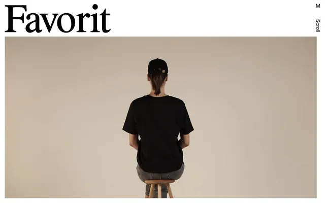
Preview image. Unlock full-res
High-contrast editorial canvas – bold, no-nonsense.
Color palette
Supporting palette color for small decorative accents when the core palette needs contrast. Do not promote it to the primary CTA color
Hairline borders, dividers, input outlines, and card edges on light surfaces. Do not promote it to the primary CTA color
Dark borders and separators for elevated surfaces and inverted UI. Do not promote it to the primary CTA color
Typography
- Weights
- 400
- Sizes
- 14px, 23px, 135px, 159px, 189px
- Line height
- 1, 1.2
- Letter spacing
- -0.0250em, -0.0170em, -0.0100em
- Fallback
- system-ui, sans-serif
The primary workhorse sans-serif for navigation, body text, and expressive large-scale headlines. Its consistent weight across varied sizes establishes a contemporary yet approachable tone.
- Weights
- 400
- Sizes
- 44px, 55px, 179px
- Line height
- 1, 1.2
- Letter spacing
- -0.0250em
- Fallback
- serif
Used for distinctive, large-format headlines and brand elements, this serif font provides a classic, editorial counterpoint to the sans-serif, infusing gravitas and visual weight without adding additional colors or ornaments.
Spacing & shape
Components
Text-only button with a transparent background, primary text color #000000, and no border radius. Used for interactive elements on light backgrounds, maintaining a minimal aesthetic. No padding specified by extracted data.
Text-only button with a transparent background, primary text color #ffffff and no border radius. Used for interactive elements within dark sections, maintaining a minimal aesthetic. Padding of 16px on all sides.
Typography set in TWKLausanne regular, often with implied padding around text. No explicit background or border, relying on stark contrast for definition. Appears with padding of 21px right/left and 47px top/bottom in some contexts.
Employs Favorit Times, weight 400, at very large sizes (179px, 55px, 44px) with tight letter-spacing (-0.0250em) to create a bold, impactful statement. Typically rendered in Midnight Ink (#000000) on Canvas White (#ffffff).
Rendered in TWKLausanne, weight 400, in Midnight Ink (#000000) on a Canvas White (#ffffff) background. Offers high readability for substantial content, with comfortable line height and standard letter spacing.
Guidelines
- Prioritize high contrast between text and background using only Midnight Ink (#000000) and Canvas White (#ffffff).
- Use TWKLausanne for all body text, navigation elements, and secondary headlines at weight 400.
- Employ Favorit Times at weight 400 exclusively for large, impactful display headlines.
- Apply a 0px border-radius consistently across all interactive elements and containers.
- Utilize specific letter-spacing values from TWKLausanne (-0.0250em, -0.0170em, -0.0100em) and Favorit Times (-0.0250em) to maintain typographic precision.
- Maintain comfortable density for sections by using a section gap of 46px and element gaps of 21px.
- Accentuate interactive elements and active states through border changes or the 'Swiper Accent' color (#007aff) within designated components.
- Do not introduce soft shadows or complex elevation schemes; rely on hard visual breaks and direct contrast.
- Avoid using multiple colors for text or backgrounds; the palette is strictly monochrome with a single accent.
- Do not use rounded corners on any elements; all corners should be sharp 0px radius.
- Do not use generic padding values; adhere to the established spacing tokens like 16px for card-like elements and 21px for element gaps.
- Do not use gradients or complex background patterns; backgrounds should be flat Canvas White (#ffffff) or Midnight Ink (#000000).
- Avoid decorative icons or illustrations that are not strictly black and white; visual content should align with the stark aesthetic.
About this system
ShowHide
Favorit Studio employs a stark and confident editorial aesthetic, blending classic serif headlines with a modern sans-serif for body text and navigation. The design emphasizes high contrast monochrome surfaces with minimal visual embellishment, allowing crisp typography and bold photography to dominate. Interactive elements are subtle, relying on text and slight border changes rather than color fills, creating an atmosphere of understated luxury and directness.
The page primarily uses a max-width contained layout, though specific hero sections may appear full-bleed. The hero pattern features large, imposing typography (Favorit Times) often layered directly over or immediately adjacent to minimalist photography. Section rhythm is driven by strong vertical separation and high-contrast typography, creating distinct content blocks without explicit dividers. Content arrangement leans towards large, singular visual statements combined with textual hierarchy, using implicit grid structures for text blocks and navigation where elements are well-spaced and distinct. Navigation is minimal, typically a sticky header with a simple menu icon that expands to a full-screen overlay.
Photography is central, featuring a stark, minimalist aesthetic. It typically focuses on a single subject, often a person, shot against a plain, light background with neutral or achromatic color palettes. The treatment is full-bleed or large contained blocks, with sharp edges and no overlap. Imagery serves purely decorative and atmospheric purposes, creating a mood rather than conveying specific information. There are no illustrations or complex graphical elements; the focus is on clean photography and typography.
Reminiscent of Agency TK, Marius Roosendaal, Basic Theory, Studio VØ.
# Favorit Studio — Style Reference
> High-contrast editorial canvas – bold, no-nonsense.

**Theme:** light

**Site:** https://favorit.studio

Favorit Studio employs a stark and confident editorial aesthetic, blending classic serif headlines with a modern sans-serif for body text and navigation. The design emphasizes high contrast monochrome surfaces with minimal visual embellishment, allowing crisp typography and bold photography to dominate. Interactive elements are subtle, relying on text and slight border changes rather than color fills, creating an atmosphere of understated luxury and directness.

## Tokens — Colors

| Name | Value | Token | Role |
|------|------|------|------|
| Swiper Accent | `#007aff` | `--color-swiper-accent` | Supporting palette color for small decorative accents when the core palette needs contrast. Do not promote it to the primary CTA color |
| Canvas White | `#ffffff` | `--color-canvas-white` | Hairline borders, dividers, input outlines, and card edges on light surfaces. Do not promote it to the primary CTA color |
| Midnight Ink | `#000000` | `--color-midnight-ink` | Dark borders and separators for elevated surfaces and inverted UI. Do not promote it to the primary CTA color |

## Tokens — Typography

### TWKLausanne
- **Substitute:** system-ui, sans-serif
- **Weights:** 400
- **Sizes:** 14px, 23px, 135px, 159px, 189px
- **Line height:** 1, 1.2
- **Letter spacing:** -0.0250em, -0.0170em, -0.0100em
- **Role:** The primary workhorse sans-serif for navigation, body text, and expressive large-scale headlines. Its consistent weight across varied sizes establishes a contemporary yet approachable tone.

### Favorit Times
- **Substitute:** serif
- **Weights:** 400
- **Sizes:** 44px, 55px, 179px
- **Line height:** 1, 1.2
- **Letter spacing:** -0.0250em
- **Role:** Used for distinctive, large-format headlines and brand elements, this serif font provides a classic, editorial counterpoint to the sans-serif, infusing gravitas and visual weight without adding additional colors or ornaments.

## Tokens — Type Scale

| Role | Size | Line height | Letter spacing |
|------|------|------|------|
| caption | 14px | 1.2 | -0.14px |
| body | 23px | 1.2 | -0.39px |
| heading-sm | 44px | 1.2 | -1.1px |
| heading | 55px | 1.2 | -1.375px |
| heading-lg | 135px | 1 | -3.375px |
| display | 179px | 1 | -4.475px |

## Tokens — Spacing

- **Section gap:** 46px
- **Card padding:** 16px
- **Element gap:** 21px

## Tokens — Radius

- **all:** 0px

## Layout

The page primarily uses a max-width contained layout, though specific hero sections may appear full-bleed. The hero pattern features large, imposing typography (Favorit Times) often layered directly over or immediately adjacent to minimalist photography. Section rhythm is driven by strong vertical separation and high-contrast typography, creating distinct content blocks without explicit dividers. Content arrangement leans towards large, singular visual statements combined with textual hierarchy, using implicit grid structures for text blocks and navigation where elements are well-spaced and distinct. Navigation is minimal, typically a sticky header with a simple menu icon that expands to a full-screen overlay.

## Imagery

Photography is central, featuring a stark, minimalist aesthetic. It typically focuses on a single subject, often a person, shot against a plain, light background with neutral or achromatic color palettes. The treatment is full-bleed or large contained blocks, with sharp edges and no overlap. Imagery serves purely decorative and atmospheric purposes, creating a mood rather than conveying specific information. There are no illustrations or complex graphical elements; the focus is on clean photography and typography.

## Components

### Ghost Button (Light BG)
*Primary Call to Action, Navigation Item*

Text-only button with a transparent background, primary text color #000000, and no border radius. Used for interactive elements on light backgrounds, maintaining a minimal aesthetic. No padding specified by extracted data.

### Ghost Button (Dark BG)
*Primary Call to Action, Navigation Item*

Text-only button with a transparent background, primary text color #ffffff and no border radius. Used for interactive elements within dark sections, maintaining a minimal aesthetic. Padding of 16px on all sides.

### Main Navigation Item
*Top-level navigation links*

Typography set in TWKLausanne regular, often with implied padding around text. No explicit background or border, relying on stark contrast for definition. Appears with padding of 21px right/left and 47px top/bottom in some contexts.

### Headline Display
*Hero Section Headlines, Major Section Titles*

Employs Favorit Times, weight 400, at very large sizes (179px, 55px, 44px) with tight letter-spacing (-0.0250em) to create a bold, impactful statement. Typically rendered in Midnight Ink (#000000) on Canvas White (#ffffff).

### Body Text Block
*Paragraphs, Detailed descriptions*

Rendered in TWKLausanne, weight 400, in Midnight Ink (#000000) on a Canvas White (#ffffff) background. Offers high readability for substantial content, with comfortable line height and standard letter spacing.

## Guidelines

### Do

- Prioritize high contrast between text and background using only Midnight Ink (#000000) and Canvas White (#ffffff).
- Use TWKLausanne for all body text, navigation elements, and secondary headlines at weight 400.
- Employ Favorit Times at weight 400 exclusively for large, impactful display headlines.
- Apply a 0px border-radius consistently across all interactive elements and containers.
- Utilize specific letter-spacing values from TWKLausanne (-0.0250em, -0.0170em, -0.0100em) and Favorit Times (-0.0250em) to maintain typographic precision.
- Maintain comfortable density for sections by using a section gap of 46px and element gaps of 21px.
- Accentuate interactive elements and active states through border changes or the 'Swiper Accent' color (#007aff) within designated components.

### Don't

- Do not introduce soft shadows or complex elevation schemes; rely on hard visual breaks and direct contrast.
- Avoid using multiple colors for text or backgrounds; the palette is strictly monochrome with a single accent.
- Do not use rounded corners on any elements; all corners should be sharp 0px radius.
- Do not use generic padding values; adhere to the established spacing tokens like 16px for card-like elements and 21px for element gaps.
- Do not use gradients or complex background patterns; backgrounds should be flat Canvas White (#ffffff) or Midnight Ink (#000000).
- Avoid decorative icons or illustrations that are not strictly black and white; visual content should align with the stark aesthetic.

## Agent Prompt Guide

### Quick Color Reference
- text: #000000
- background: #ffffff
- border: #000000
- accent: #007aff
- primary action: no distinct CTA color

### 3-5 Example Component Prompts
1. Create a page header: A 'Menu' button (text: 'Menu', TWKLausanne, 23px, #000000, 0px radius, 0px padding) on a #ffffff background, positioned subtly in the top right. Main logo text 'Favorit' (Favorit Times, 179px, #000000) aligned left.
2. Create a hero section: Full-width photographic image. Overlaid large text 'Favorit' (Favorit Times, 179px, #000000, letter-spacing -0.0250em) on the left, and 'Studio' (Favorit Times, 179px, #000000, letter-spacing -0.0250em) on a separate line below 'Favorit'. A ghost 'Scroll' button (TWKLausanne, 23px, #000000, 0px radius, 0px padding) vertically oriented on the right.
3. Create a dark-themed ghost navigation button: A button with transparent background, #ffffff text (TWKLausanne, 23px), 0px radius, and 16px padding on all sides, suitable for a full-screen menu overlay.
More like this









Keep what you find
A free account saves references to boards and can send you a weekly email of picks based on what you save.
To see every result, go Pro.