Preview image. Unlock full-res
Vibrant digital workbench.
Color palette
Primary brand color, used for key UI components like navigation backgrounds and interactive elements.
Primary button background, active states, and emphasized UI elements.
Accent text, links within dark backgrounds, and subtle branding elements.
Text color for buttons with transparent backgrounds, emphasizing interaction.
Darkest brand shade, used for subtle backgrounds in branded sections.
Hero background gradient, creating a vibrant, dynamic backdrop for key messages.
Subtle background gradient for specific content blocks, adding a soft brand touch.
Primary link color, secondary interactive elements, and highlight indicator for certain actions.
Accent text and graphic elements, drawing attention in a playful manner.
Bright accent for special iconography or decorative elements.
Light accent border for subtle interaction states.
Decorative radial gradient, contributing to the site's playful atmosphere, bottom-left emphasis.
Decorative radial gradient, contributing to the site's playful atmosphere, mid-left emphasis.
Decorative radial gradient, contributing to the site's playful atmosphere, mid-right emphasis.
Decorative radial gradient, contributing to the site's playful atmosphere, bottom-right emphasis.
Primary page background, expansive neutral space for content.
Elevated card backgrounds, component containers.
Subtle background for UI elements, light hovered states.
Background for active navigation items, subtle highlights.
Primary text color for headings, body, and high-emphasis elements.
Secondary text and icon color, slightly softer than Charcoal Black.
Tertiary text, muted labels, helper text.
Informational text, list item details.
Subtle borders and dividers for UI separation.
Placeholder text, disabled states, default icon color.
Specific icon color within navigation and utility areas.
Typography
- Weights
- 300, 400, 600, 700
- Sizes
- 12px, 14px, 15px, 16px, 18px
- Line height
- 1.2, 1.29, 1.3, 1.38, 1.4, 1.43, 1.56
- Letter spacing
- -0.004em, -0.002em, -0.001em, 0.007em, 0.012em, 0.013em, 0.057em
- Fallback
- Open Sans, Arial, sans-serif
Used for all body text, navigation items, buttons, and detailed descriptive content, providing clarity and an approachable tone across all UI elements.
- Weights
- 400, 600, 700
- Sizes
- 18px, 21px, 22px, 24px, 32px, 50px, 58px, 64px, 76px, 96px
- Line height
- 0.97, 1, 1.08, 1.11, 1.12, 1.2, 1.25, 1.33, 1.5
- Letter spacing
- -0.012em, -0.008em, -0.004em, -0.001em
- Fallback
- Montserrat, Georgia, serif
Reserved for headlines and high-impact textual elements, where its distinctive character creates a strong brand presence and visual hierarchy.
Spacing & shape
Elevation
Components
Solid Purple Heart (#611f69) background with white (#ffffff) text. Padding: 19px vertical, 40px horizontal. Border radius: 4px. Features a subtle inset shadow by rgb(97, 31, 105) for depth.
Transparent background with Deep Aubergine (#3d0157) text. Padding: 12px circular. Border radius: 90px (pill shape). No border. Used for 'Find your plan' and other secondary CTAs.
Default text is Pewter (#696969) or Charcoal Black (#000000). Hover state uses Electric Blue (#1264a3) for text. No specific padding or border, inherits from layout.
Transparent background, Charcoal Black (#000000) text (color: rgb(0, 0, 0)). Padding: 0px. Border radius: 4px. Used for subtle actions like 'Skip to main content'.
Surface Frost (#ffffff) background. Border radius: 16px. Padding: 16px. No box shadow in most contexts.
Uses Magic Dust Gradient (linear-gradient(104deg, rgb(0, 0, 0) 9.56%, rgb(186, 1, 255) 102.66%)) for a dynamic backdrop. Contains various radial gradients for additional visual flair.
Logos displayed against the Canvas Ice (#fefbff) background. Uses a subtle box-shadow: rgba(0, 0, 0, 0.1) 0px 0px 32px 0px for some elements.
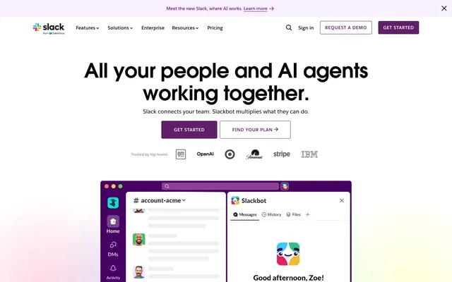
Top-most banner with Deep Aubergine (#3d0157) or similar dark purple background and white text. Height 40-80px. Used for site-wide messages like 'Meet the new Slack, where AI works.'
Transparent button with Pewter (#696969) text. Active state might have an Orchid Glow (#d17dfe) or Purple Heart (#611f69) accent, defined by context (e.g., underlines or background fills). Padding approximately 10px vertical, 30px horizontal, with 0px radius.
Guidelines
- Prioritize Salesforce-Avant-Garde for all headings and large display text to maintain brand voice.
- Use Purple Heart (#611f69) for primary call-to-action buttons, ensuring a visible contrast against white or near-white backgrounds.
- Apply a 4px `border-radius` to all functional buttons and input fields for a consistent interactive element shape.
- Use Charcoal Black (#000000) for primary body text and headings on light backgrounds to ensure AAA contrast.
- Utilize Electric Blue (#1264a3) exclusively for interactive links and secondary accents, reserving it for clear action points.
- Maintain a comfortable `elementGap` of 16px for spacing between most UI elements, and `cardPadding` of 16px for internal card content.
- Implement the Magic Dust Gradient (linear-gradient(104deg, rgb(0, 0, 0) 9.56%, rgb(186, 1, 255) 102.66%)) sparingly, typically for hero sections or significant brand statements.
- Do not use generic system fonts; always map to Salesforce-Sans or Salesforce-Avant-Garde with appropriate substitutes.
- Avoid using multiple shades of purple for primary actions; stick to Purple Heart (#611f69) for consistency.
- Do not introduce sharp corners; maintain 4px or 16px `border-radius` based on component type, or 90px for pill shapes.
- Refrain from using Electric Blue (#1264a3) for large blocks of text; it is an accent and link color, not a primary text color.
- Do not neglect the subtle radial gradients in hero backgrounds; they contribute significantly to the playful brand feel.
- Avoid arbitrary elevation shadows; use the defined `rgba(0, 0, 0, 0.1) 0px 0px 32px 0px` for elevated elements.
About this system
ShowHide
The Slack design system evokes a sense of vibrant, collaborative professionalism, grounded in a playful yet authoritative use of color. Deep purples and a vivid blue serve as primary brand identifiers, balanced against a clean, near-white canvas. Subtle gradients and distinct radial color washes provide depth and visual interest without overwhelming the functional UI, while custom typography maintains a unique, approachable voice.
The page primarily uses a max-width contained layout, though specific hero sections and decorative gradients (like the radial washes) span full viewport width. The hero section often features a centered headline over a dark, gradient background. Subsequent content sections typically alternate between clean white and light off-white bands, creating a visible rhythm. Content is arranged in alternating text-left/image-right or text-right/image-left patterns, or organized into multi-column card grids for features. Vertical spacing between sections is generous and consistent. The top navigation bar is sticky and features a fixed width, centered content, with a clear brand logo on the left and primary actions (sign-in, get started) on the right.
Imagery on Slack's site predominantly features product screenshots and abstract graphic elements. Product screenshots are typically contained within device mocks or UI frames, often showcasing the Slack interface with examples of AI integration. Abstract graphics include geometric shapes, sparkling effects, and subtle background gradients like the radial washes, used decoratively to add dynamism and a playful vibe. Icons are outlined, simple, and mono-color, often using the brand's purple or accent blue. Photography is minimal, appearing mostly for social proof with small headshots. The imagery serves primarily to illustrate product functionality and create an aspirational, slightly whimsical brand atmosphere, rather than purely decorative content.
Reminiscent of Airtable, Figma, Notion, Discord.
# Slack — Style Reference
> Vibrant digital workbench.

**Theme:** light

**Site:** https://slack.com

The Slack design system evokes a sense of vibrant, collaborative professionalism, grounded in a playful yet authoritative use of color. Deep purples and a vivid blue serve as primary brand identifiers, balanced against a clean, near-white canvas. Subtle gradients and distinct radial color washes provide depth and visual interest without overwhelming the functional UI, while custom typography maintains a unique, approachable voice.

## Tokens — Colors

| Name | Value | Token | Role |
|------|------|------|------|
| Dark Plum | `#481a54` | `--color-dark-plum` | Primary brand color, used for key UI components like navigation backgrounds and interactive elements. |
| Purple Heart | `#611f69` | `--color-purple-heart` | Primary button background, active states, and emphasized UI elements. |
| Dark Violet | `#730394` | `--color-dark-violet` | Accent text, links within dark backgrounds, and subtle branding elements. |
| Deep Aubergine | `#3d0157` | `--color-deep-aubergine` | Text color for buttons with transparent backgrounds, emphasizing interaction. |
| Grape Jelly | `#2e0039` | `--color-grape-jelly` | Darkest brand shade, used for subtle backgrounds in branded sections. |
| Magic Dust Gradient | `#000000` | `--color-magic-dust-gradient` | Hero background gradient, creating a vibrant, dynamic backdrop for key messages. |
| Purple Aura Gradient | `#83388a` | `--color-purple-aura-gradient` | Subtle background gradient for specific content blocks, adding a soft brand touch. |
| Electric Blue | `#1264a3` | `--color-electric-blue` | Primary link color, secondary interactive elements, and highlight indicator for certain actions. |
| Orchid Glow | `#d17dfe` | `--color-orchid-glow` | Accent text and graphic elements, drawing attention in a playful manner. |
| Vivid Amethyst | `#9602c7` | `--color-vivid-amethyst` | Bright accent for special iconography or decorative elements. |
| Pale Orchid | `#eac8fe` | `--color-pale-orchid` | Light accent border for subtle interaction states. |
| Rainbow Wash Bottom Left (pink) | `#ff6496` | `--color-rainbow-wash-bottom-left-pink` | Decorative radial gradient, contributing to the site's playful atmosphere, bottom-left emphasis. |
| Rainbow Wash Mid Left (blue) | `#6496ff` | `--color-rainbow-wash-mid-left-blue` | Decorative radial gradient, contributing to the site's playful atmosphere, mid-left emphasis. |
| Rainbow Wash Mid Right (green) | `#64ff96` | `--color-rainbow-wash-mid-right-green` | Decorative radial gradient, contributing to the site's playful atmosphere, mid-right emphasis. |
| Rainbow Wash Bottom Right (yellow) | `#ffff64` | `--color-rainbow-wash-bottom-right-yellow` | Decorative radial gradient, contributing to the site's playful atmosphere, bottom-right emphasis. |
| Canvas Ice | `#fefbff` | `--color-canvas-ice` | Primary page background, expansive neutral space for content. |
| Surface Frost | `#ffffff` | `--color-surface-frost` | Elevated card backgrounds, component containers. |
| Whisper Cloud | `#f9f0ff` | `--color-whisper-cloud` | Subtle background for UI elements, light hovered states. |
| Active Lavender | `#f2defe` | `--color-active-lavender` | Background for active navigation items, subtle highlights. |
| Charcoal Black | `#000000` | `--color-charcoal-black` | Primary text color for headings, body, and high-emphasis elements. |
| Carbon Gray | `#1d1c1d` | `--color-carbon-gray` | Secondary text and icon color, slightly softer than Charcoal Black. |
| Pewter | `#696969` | `--color-pewter` | Tertiary text, muted labels, helper text. |
| Cement Gray | `#757575` | `--color-cement-gray` | Informational text, list item details. |
| Slate Border | `#edeaed` | `--color-slate-border` | Subtle borders and dividers for UI separation. |
| Medium Gray | `#808080` | `--color-medium-gray` | Placeholder text, disabled states, default icon color. |
| Icon Gray | `#5e5d60` | `--color-icon-gray` | Specific icon color within navigation and utility areas. |

## Tokens — Typography

### Salesforce-Sans
- **Substitute:** Open Sans, Arial, sans-serif
- **Weights:** 300, 400, 600, 700
- **Sizes:** 12px, 14px, 15px, 16px, 18px
- **Line height:** 1.2, 1.29, 1.3, 1.38, 1.4, 1.43, 1.56
- **Letter spacing:** -0.004em, -0.002em, -0.001em, 0.007em, 0.012em, 0.013em, 0.057em
- **Role:** Used for all body text, navigation items, buttons, and detailed descriptive content, providing clarity and an approachable tone across all UI elements.

### Salesforce-Avant-Garde
- **Substitute:** Montserrat, Georgia, serif
- **Weights:** 400, 600, 700
- **Sizes:** 18px, 21px, 22px, 24px, 32px, 50px, 58px, 64px, 76px, 96px
- **Line height:** 0.97, 1, 1.08, 1.11, 1.12, 1.2, 1.25, 1.33, 1.5
- **Letter spacing:** -0.012em, -0.008em, -0.004em, -0.001em
- **Role:** Reserved for headlines and high-impact textual elements, where its distinctive character creates a strong brand presence and visual hierarchy.

## Tokens — Type Scale

Perfect Fourth (1.333) from 16px base.

| Role | Size | Line height | Letter spacing |
|------|------|------|------|
| caption | 12px | 1.4 | 0.057em |
| body-sm | 14px | 1.29 | 0.013em |
| body | 16px | 1.3 | 0.007em |
| subheading | 18px | 1.4 | -0.002em |
| heading-sm | 22px | 1.08 | -0.001em |
| heading | 32px | 1.12 | -0.004em |
| heading-lg | 58px | 1 | -0.008em |
| display | 96px | 0.97 | -0.012em |

## Tokens — Spacing

- **Section gap:** 98px
- **Card padding:** 16px
- **Element gap:** 16px

## Tokens — Radius

- **Default:** 8px
- **Buttons:** 4px
- **Inputs:** 4px
- **Cards:** 16px
- **pills:** 90px

## Tokens — Elevation

- **Card Shadow:** `rgba(0, 0, 0, 0.1) 0px 0px 32px 0px`
- **Button Inset Focus/Highlight:** `rgb(97, 31, 105) 0px 0px 0px 1px inset`
- **Subtle Button Shadow:** `rgba(0, 0, 0, 0.1) 0px 5px 20px 0px`

## Layout

The page primarily uses a max-width contained layout, though specific hero sections and decorative gradients (like the radial washes) span full viewport width. The hero section often features a centered headline over a dark, gradient background. Subsequent content sections typically alternate between clean white and light off-white bands, creating a visible rhythm. Content is arranged in alternating text-left/image-right or text-right/image-left patterns, or organized into multi-column card grids for features. Vertical spacing between sections is generous and consistent. The top navigation bar is sticky and features a fixed width, centered content, with a clear brand logo on the left and primary actions (sign-in, get started) on the right.

## Imagery

Imagery on Slack's site predominantly features product screenshots and abstract graphic elements. Product screenshots are typically contained within device mocks or UI frames, often showcasing the Slack interface with examples of AI integration. Abstract graphics include geometric shapes, sparkling effects, and subtle background gradients like the radial washes, used decoratively to add dynamism and a playful vibe. Icons are outlined, simple, and mono-color, often using the brand's purple or accent blue. Photography is minimal, appearing mostly for social proof with small headshots. The imagery serves primarily to illustrate product functionality and create an aspirational, slightly whimsical brand atmosphere, rather than purely decorative content.

## Components

### CTA Button Group

### AI Features Tab Selector

### Pill Tab Navigation Selector

### Primary Filled Button
*Call to action*

Solid Purple Heart (#611f69) background with white (#ffffff) text. Padding: 19px vertical, 40px horizontal. Border radius: 4px. Features a subtle inset shadow by rgb(97, 31, 105) for depth.

### Ghost Button
*Secondary action*

Transparent background with Deep Aubergine (#3d0157) text. Padding: 12px circular. Border radius: 90px (pill shape). No border. Used for 'Find your plan' and other secondary CTAs.

### Navigation Link
*Navigation, in-text link*

Default text is Pewter (#696969) or Charcoal Black (#000000). Hover state uses Electric Blue (#1264a3) for text. No specific padding or border, inherits from layout.

### Text Only Button
*Utility action*

Transparent background, Charcoal Black (#000000) text (color: rgb(0, 0, 0)). Padding: 0px. Border radius: 4px. Used for subtle actions like 'Skip to main content'.

### Content Card
*Information display*

Surface Frost (#ffffff) background. Border radius: 16px. Padding: 16px. No box shadow in most contexts.

### Hero Section Gradient Background
*Thematic background*

Uses Magic Dust Gradient (linear-gradient(104deg, rgb(0, 0, 0) 9.56%, rgb(186, 1, 255) 102.66%)) for a dynamic backdrop. Contains various radial gradients for additional visual flair.

### Trusted By Logo Grid
*Social proof*

Logos displayed against the Canvas Ice (#fefbff) background. Uses a subtle box-shadow: rgba(0, 0, 0, 0.1) 0px 0px 32px 0px for some elements.

### Annoucement Banner
*Global alert*

Top-most banner with Deep Aubergine (#3d0157) or similar dark purple background and white text. Height 40-80px. Used for site-wide messages like 'Meet the new Slack, where AI works.'

### Tab Navigation Item
*Content filtering*

Transparent button with Pewter (#696969) text. Active state might have an Orchid Glow (#d17dfe) or Purple Heart (#611f69) accent, defined by context (e.g., underlines or background fills). Padding approximately 10px vertical, 30px horizontal, with 0px radius.

## Guidelines

### Do

- Prioritize Salesforce-Avant-Garde for all headings and large display text to maintain brand voice.
- Use Purple Heart (#611f69) for primary call-to-action buttons, ensuring a visible contrast against white or near-white backgrounds.
- Apply a 4px `border-radius` to all functional buttons and input fields for a consistent interactive element shape.
- Use Charcoal Black (#000000) for primary body text and headings on light backgrounds to ensure AAA contrast.
- Utilize Electric Blue (#1264a3) exclusively for interactive links and secondary accents, reserving it for clear action points.
- Maintain a comfortable `elementGap` of 16px for spacing between most UI elements, and `cardPadding` of 16px for internal card content.
- Implement the Magic Dust Gradient (linear-gradient(104deg, rgb(0, 0, 0) 9.56%, rgb(186, 1, 255) 102.66%)) sparingly, typically for hero sections or significant brand statements.

### Don't

- Do not use generic system fonts; always map to Salesforce-Sans or Salesforce-Avant-Garde with appropriate substitutes.
- Avoid using multiple shades of purple for primary actions; stick to Purple Heart (#611f69) for consistency.
- Do not introduce sharp corners; maintain 4px or 16px `border-radius` based on component type, or 90px for pill shapes.
- Refrain from using Electric Blue (#1264a3) for large blocks of text; it is an accent and link color, not a primary text color.
- Do not neglect the subtle radial gradients in hero backgrounds; they contribute significantly to the playful brand feel.
- Avoid arbitrary elevation shadows; use the defined `rgba(0, 0, 0, 0.1) 0px 0px 32px 0px` for elevated elements.

## Agent Prompt Guide

### Quick Color Reference
- Text (Primary): #000000
- Background (Canvas): #fefbff
- CTA (Primary): #611f69
- Links/Accent: #1264a3
- Borders (Subtle): #edeaed

### 3-5 Example Component Prompts
1. Create a Hero Section: Background uses `Magic Dust Gradient`. Headline text `All your people and AI agents working together.` with `display` role, `Charcoal Black` color. Subtext `Slack connects your team. Slackbot multiplies what they can do.` with `body` role, `Pewter` color. Include two buttons: filled `Primary Filled Button` (text `Get Started`) and ghost `Ghost Button` (text `Find your plan`).
2. Create a Feature Card: Background `Surface Frost`. Border radius `cards`. Padding `cardPadding`. Heading `Meet Slackbot` using `Salesforce-Sans` weight 700 at 22px, `Charcoal Black`. Body text `Slack isn't just any AI...` using `body` role, `Pewter`. Include a link `Learn more about Slackbot` using `Electric Blue`.
3. Create a Primary Navigation Bar: Background `Surface Frost`. Height 80px. Left-aligned Slack logo (SVG color `Dark Plum`). Right-aligned `Primary Filled Button` (`Get started`) and `Ghost Button` (`Request a demo`). Navigation links use `Salesforce-Sans` weight 400 at 16px, `Pewter` color, with `Electric Blue` on hover.
More like this









Keep what you find
A free account saves references to boards and can send you a weekly email of picks based on what you save.
To see every result, go Pro.