Preview image. Unlock full-res
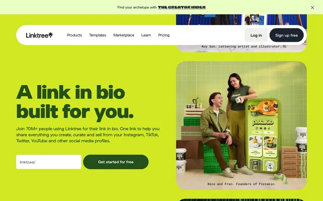
Vibrant digital playground: link in bio as a personal, colorful hub
Color palette
Decorative card backgrounds, accent text on light backgrounds — conveys growth and natural energy
Primary action button backgrounds, highlighted card accents, energetic background fill. This vivid lime serves as the main interactive accent
Hero section backgrounds, prominent links, accent for specific UI elements — a complementary, strong color that frames content
Decorative background sections, signaling depth and richness
Decorative card backgrounds, strong accent where high contrast and intensity are desired
Elevated card backgrounds, soft button fills, decorative section backgrounds
Button backgrounds, card backgrounds, a profound, darker blue for functional elements
Distinct card backgrounds for callouts or special features
Primary body text, headers, neutral button backgrounds, prominent borders — the core dark text color
Component backgrounds, form fields, text on dark backgrounds, icon fills
Page background, container backgrounds — the base canvas of the application
Subtle background surfaces, slight variation on the main canvas
Muted text, secondary links, subtle borders
Card backgrounds, placeholder text
Placeholder text in input fields
Dominant text color, borders, icon fills, utility elements
Typography
- Weights
- 400
- Sizes
- 16px
- Line height
- 1.5
- Letter spacing
- normal
- Fallback
- Helvetica Neue
Fallback for general body text and default page elements, providing a robust system font base.
- Weights
- 400, 500, 700, 800
- Sizes
- 14px, 16px, 18px, 24px, 28px, 56px, 80px
- Line height
- 1, 1.06, 1.07, 1.2, 1.3, 1.5
- Letter spacing
- -0.0200em at 80px, -0.0100em at 56px, 0.0100em at 14px
- Fallback
- Inter
Primary brand typeface for headings, interactive elements, and key informational text. Its variable font nature allows for precise weight control, contributing to distinct visual hierarchy.
- Weights
- 400, 500, 700
- Sizes
- 12px, 13px, 14px, 15px, 20px, 24px, 25px, 51px
- Line height
- 1.06, 1.2, 1.31, 1.5, 2.32
- Letter spacing
- -0.0430em at 51px, -0.0240em at 25px, -0.0200em at 24px, -0.0130em at 15px
- Fallback
- Inter
Supporting brand typeface for navigation, labels, and smaller details, reinforcing the primary Linksans aesthetic with slightly tighter tracking on larger sizes.
- Weights
- 400
- Sizes
- 14px
- Line height
- 1.5
yerk — detected in extracted data but not described by AI
Spacing & shape
Components
Background: Chartreuse Pop (#d2e823). Text: Graphite (#1e2330). Border Radius: 99px. Padding: 20px vertical, 26px horizontal. Font: Linksans Linksansvf, 16px, weight 500.
Background: transparent. Text: Black (#000000). No border. No explicit padding, implied by content.
Background: White (#ffffff). Text: Gray Text (#757575). Border: 1px solid Black (#000000). Border Radius: 8px. Padding: 8px vertical, 16px horizontal.
Background: Marble (#f3f3f1). Text: Graphite (#1e2330). Border: 1px solid Graphite (#1e2330). Border Radius: 8px. Padding: 22px vertical, 26px horizontal.
Background: Lavender Mist (#e9c0e9). Text: Black (#000000). Border: 1px solid Black (#000000). Border Radius: 99px. Padding: 20px vertical, 26px horizontal.
Background: transparent. Border Radius: 0px. No shadow. Padding: 0px.
Background: rgba(0, 0, 0, 0.32). Border Radius: 32px. No explicit shadow, the background tint provides a sense of depth.
Background: Goldenrod (#d6a337), Iris Blue (#061492), Forest Green (#254f1a), or Lavender Mist (#e9c0e9). Border Radius: 64px or 1000px. No shadow.
Guidelines
- Prioritize Chartreuse Pop (#d2e823) for all primary calls to action, ensuring it is the brightest element on the screen.
- Utilize 99px border-radius generously for all buttons and rounded interactive elements, for a soft, friendly feel.
- Employ the full spectrum of brand colors (Hydrangea Blue, Dahlia Purple, Currant Red, etc.) for distinct section backgrounds and decorative panels.
- Maintain high visual contrast for text elements, preferring Graphite (#1e2330) on light backgrounds and White (#ffffff) on saturated or dark backgrounds.
- Apply Linksans Linksansvf or Linksans for all headings and key UI text, adjusting letter-spacing according to the type scale for subtle refinement.
- Use Marble (#f3f3f1) as the default page canvas, creating a consistent light foundation.
- Structure layouts with a 1504px max-width, centering content horizontally for coherence.
- Avoid using flat, desaturated background colors for major sections; Linktree's identity relies on vibrant, distinct color blocks.
- Do not use sharp 0px corners for interactive elements or containers; leverage the specified border radii to maintain the organic, friendly aesthetic.
- Refrain from introducing system default shadows; Linktree uses tinted backgrounds and color blocks to create visual depth instead of drop shadows.
- Do not rely solely on neutral colors for visual hierarchy; use brand colors as primary indicators for interaction and distinction.
- Do not use generic, default system fonts for headings or prominent text; always use Linksans or Linksans Linksansvf to uphold brand typography.
- Avoid tight element spacing; ensure at least 10px element gaps and 16px card padding for a comfortable density.
- Do not apply excessive letter spacing to body text; maintain normal tracking for readability, using negative tracking points only for display headings.
About this system
ShowHide
Linktree presents a playful, high-energy digital identity built on vibrant, contrasting color blocks and rounded, organic shapes. The design emphasizes clear calls to action and distinct content zones through a dynamic interplay of saturated hues. Typography is primarily functional, leaning into a friendly, approachable tone with varying weights and subtle tracking adjustments to maintain a conversational cadence. Components are often expressed with maximal border-radii, contributing to an overall soft, engaging user experience.
The page maintains a centered, contained layout with a maximum width of 1504px. Heroes often feature full-width color backgrounds (e.g., Hydrangea Blue or Chartreuse Pop) with centrally aligned headline text. Sections are distinct, often using alternating vibrant color blocks to break vertical rhythm rather than subtle dividers. Content is arranged in alternating text-left/image-right patterns or centered stacks for feature descriptions. Card grids are prevalent, showcasing features or examples within the highly rounded feature highlight cards. The navigation is a sticky top bar with prominent 'Log in' and 'Sign up free' buttons, maintaining a tight, accessible structure.
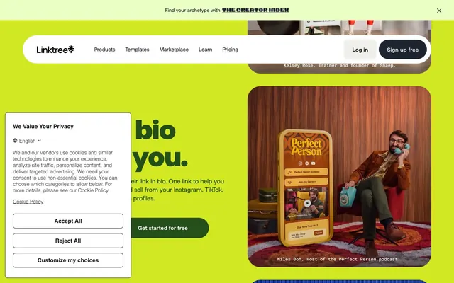
Linktree's imagery palette is a mix of product-in-use photography and abstract, organic shapes. Photography features diverse individuals or product shots, often with a vibrant, playful filter or color overlay, integrated into color-blocked sections rather than being full-bleed. Illustrations are minimal, generally functional icons or simple, bold shapes rather than complex scenes. The emphasis is on product showcase and community representation, with a high density of visual elements carefully choreographed within the colorful blocks. Icons are typically filled and monochromatic in either black or white, varying based on background contrast.
Reminiscent of Bento.me, Canva, Figma, VSCO.
# Linktr — Style Reference
> Vibrant digital playground: link in bio as a personal, colorful hub

**Theme:** light

**Site:** https://linktr.ee

Linktree presents a playful, high-energy digital identity built on vibrant, contrasting color blocks and rounded, organic shapes. The design emphasizes clear calls to action and distinct content zones through a dynamic interplay of saturated hues. Typography is primarily functional, leaning into a friendly, approachable tone with varying weights and subtle tracking adjustments to maintain a conversational cadence. Components are often expressed with maximal border-radii, contributing to an overall soft, engaging user experience.

## Tokens — Colors

| Name | Value | Token | Role |
|------|------|------|------|
| Forest Green | `#254f1a` | `--color-forest-green` | Decorative card backgrounds, accent text on light backgrounds — conveys growth and natural energy |
| Chartreuse Pop | `#d2e823` | `--color-chartreuse-pop` | Primary action button backgrounds, highlighted card accents, energetic background fill. This vivid lime serves as the main interactive accent |
| Hydrangea Blue | `#2665d6` | `--color-hydrangea-blue` | Hero section backgrounds, prominent links, accent for specific UI elements — a complementary, strong color that frames content |
| Dahlia Purple | `#502274` | `--color-dahlia-purple` | Decorative background sections, signaling depth and richness |
| Currant Red | `#780016` | `--color-currant-red` | Decorative card backgrounds, strong accent where high contrast and intensity are desired |
| Lavender Mist | `#e9c0e9` | `--color-lavender-mist` | Elevated card backgrounds, soft button fills, decorative section backgrounds |
| Iris Blue | `#061492` | `--color-iris-blue` | Button backgrounds, card backgrounds, a profound, darker blue for functional elements |
| Goldenrod | `#d6a337` | `--color-goldenrod` | Distinct card backgrounds for callouts or special features |
| Graphite | `#1e2330` | `--color-graphite` | Primary body text, headers, neutral button backgrounds, prominent borders — the core dark text color |
| White | `#ffffff` | `--color-white` | Component backgrounds, form fields, text on dark backgrounds, icon fills |
| Marble | `#f3f3f1` | `--color-marble` | Page background, container backgrounds — the base canvas of the application |
| Lunar Dust | `#e8efd6` | `--color-lunar-dust` | Subtle background surfaces, slight variation on the main canvas |
| Slate Gray | `#676b5f` | `--color-slate-gray` | Muted text, secondary links, subtle borders |
| Whisper Gray | `#adadad` | `--color-whisper-gray` | Card backgrounds, placeholder text |
| Text Gray | `#757575` | `--color-text-gray` | Placeholder text in input fields |
| Black | `#000000` | `--color-black` | Dominant text color, borders, icon fills, utility elements |

## Tokens — Typography

### Arial
- **Substitute:** Helvetica Neue
- **Weights:** 400
- **Sizes:** 16px
- **Line height:** 1.5
- **Letter spacing:** normal
- **Role:** Fallback for general body text and default page elements, providing a robust system font base.

### Linksans Linksansvf
- **Substitute:** Inter
- **Weights:** 400, 500, 700, 800
- **Sizes:** 14px, 16px, 18px, 24px, 28px, 56px, 80px
- **Line height:** 1, 1.06, 1.07, 1.2, 1.3, 1.5
- **Letter spacing:** -0.0200em at 80px, -0.0100em at 56px, 0.0100em at 14px
- **Role:** Primary brand typeface for headings, interactive elements, and key informational text. Its variable font nature allows for precise weight control, contributing to distinct visual hierarchy.

### Linksans
- **Substitute:** Inter
- **Weights:** 400, 500, 700
- **Sizes:** 12px, 13px, 14px, 15px, 20px, 24px, 25px, 51px
- **Line height:** 1.06, 1.2, 1.31, 1.5, 2.32
- **Letter spacing:** -0.0430em at 51px, -0.0240em at 25px, -0.0200em at 24px, -0.0130em at 15px
- **Role:** Supporting brand typeface for navigation, labels, and smaller details, reinforcing the primary Linksans aesthetic with slightly tighter tracking on larger sizes.

### yerk
- **Weights:** 400
- **Sizes:** 14px
- **Line height:** 1.5
- **Role:** yerk — detected in extracted data but not described by AI

## Tokens — Type Scale

| Role | Size | Line height | Letter spacing |
|------|------|------|------|
| caption | 12px | 1.5 | — |
| body-sm | 14px | 1.5 | 0.1px |
| body | 16px | 1.5 | — |
| subheading | 24px | 1.3 | — |
| heading-sm | 28px | 1.2 | — |
| heading | 56px | 1.07 | -0.56px |
| display | 80px | 1 | -1.6px |

## Tokens — Spacing

- **Max width:** 1504px
- **Section gap:** 48px
- **Card padding:** 16px
- **Element gap:** 10px

## Tokens — Radius

- **Buttons:** 99px
- **Inputs:** 8px
- **Cards:** 64px
- **accentBlobs:** 1000px
- **pillForms:** 99px

## Layout

The page maintains a centered, contained layout with a maximum width of 1504px. Heroes often feature full-width color backgrounds (e.g., Hydrangea Blue or Chartreuse Pop) with centrally aligned headline text. Sections are distinct, often using alternating vibrant color blocks to break vertical rhythm rather than subtle dividers. Content is arranged in alternating text-left/image-right patterns or centered stacks for feature descriptions. Card grids are prevalent, showcasing features or examples within the highly rounded feature highlight cards. The navigation is a sticky top bar with prominent 'Log in' and 'Sign up free' buttons, maintaining a tight, accessible structure.

## Imagery

Linktree's imagery palette is a mix of product-in-use photography and abstract, organic shapes. Photography features diverse individuals or product shots, often with a vibrant, playful filter or color overlay, integrated into color-blocked sections rather than being full-bleed. Illustrations are minimal, generally functional icons or simple, bold shapes rather than complex scenes. The emphasis is on product showcase and community representation, with a high density of visual elements carefully choreographed within the colorful blocks. Icons are typically filled and monochromatic in either black or white, varying based on background contrast.

## Components

### Primary Action Button
*Main call-to-action button, highly visible.*

Background: Chartreuse Pop (#d2e823). Text: Graphite (#1e2330). Border Radius: 99px. Padding: 20px vertical, 26px horizontal. Font: Linksans Linksansvf, 16px, weight 500.

### Navigation Link Button
*Transparent button for navigation items.*

Background: transparent. Text: Black (#000000). No border. No explicit padding, implied by content.

### Input Field
*Standard input for user data entry.*

Background: White (#ffffff). Text: Gray Text (#757575). Border: 1px solid Black (#000000). Border Radius: 8px. Padding: 8px vertical, 16px horizontal.

### Tertiary Ghost Button
*Alternative action button with minimal visual hierarchy.*

Background: Marble (#f3f3f1). Text: Graphite (#1e2330). Border: 1px solid Graphite (#1e2330). Border Radius: 8px. Padding: 22px vertical, 26px horizontal.

### Pill Accent Button
*Decorative button with high curvature for specific actions.*

Background: Lavender Mist (#e9c0e9). Text: Black (#000000). Border: 1px solid Black (#000000). Border Radius: 99px. Padding: 20px vertical, 26px horizontal.

### Default Card
*Standard container for content.*

Background: transparent. Border Radius: 0px. No shadow. Padding: 0px.

### Elevated Content Card
*Card with subtle elevation and rounded corners.*

Background: rgba(0, 0, 0, 0.32). Border Radius: 32px. No explicit shadow, the background tint provides a sense of depth.

### Feature Highlight Card
*Cards designed to stand out with bold colors and maximal rounding.*

Background: Goldenrod (#d6a337), Iris Blue (#061492), Forest Green (#254f1a), or Lavender Mist (#e9c0e9). Border Radius: 64px or 1000px. No shadow.

## Guidelines

### Do

- Prioritize Chartreuse Pop (#d2e823) for all primary calls to action, ensuring it is the brightest element on the screen.
- Utilize 99px border-radius generously for all buttons and rounded interactive elements, for a soft, friendly feel.
- Employ the full spectrum of brand colors (Hydrangea Blue, Dahlia Purple, Currant Red, etc.) for distinct section backgrounds and decorative panels.
- Maintain high visual contrast for text elements, preferring Graphite (#1e2330) on light backgrounds and White (#ffffff) on saturated or dark backgrounds.
- Apply Linksans Linksansvf or Linksans for all headings and key UI text, adjusting letter-spacing according to the type scale for subtle refinement.
- Use Marble (#f3f3f1) as the default page canvas, creating a consistent light foundation.
- Structure layouts with a 1504px max-width, centering content horizontally for coherence.

### Don't

- Avoid using flat, desaturated background colors for major sections; Linktree's identity relies on vibrant, distinct color blocks.
- Do not use sharp 0px corners for interactive elements or containers; leverage the specified border radii to maintain the organic, friendly aesthetic.
- Refrain from introducing system default shadows; Linktree uses tinted backgrounds and color blocks to create visual depth instead of drop shadows.
- Do not rely solely on neutral colors for visual hierarchy; use brand colors as primary indicators for interaction and distinction.
- Do not use generic, default system fonts for headings or prominent text; always use Linksans or Linksans Linksansvf to uphold brand typography.
- Avoid tight element spacing; ensure at least 10px element gaps and 16px card padding for a comfortable density.
- Do not apply excessive letter spacing to body text; maintain normal tracking for readability, using negative tracking points only for display headings.

## Agent Prompt Guide

Quick Color Reference:
- text: #000000
- background: #f3f3f1
- border: #000000
- accent: #2665d6
- primary action: #d2e823 (filled action)

Example Component Prompts:
- Create a Primary Action Button: #d2e823 background, #000000 text, 9999px radius, compact pill padding. Use this filled treatment for the main CTA.
- Create a feature card: Forest Green (#254f1a) background, 64px border radius. Title 'Unlimited Links' in Linksans, 24px, weight 700, #ffffff. Description 'Add as many links as you need, no limits.' in Arial, 16px, weight 400, #ffffff. Padding: 16px.
- Create an input field: White (#ffffff) background, 1px solid Black (#000000) border, 8px border radius. Placeholder text 'Your Linktree username' in Text Gray (#757575), 16px. Padding: 8px vertical, 16px horizontal.
- Create a navigation link: Black (#000000) text (Arial, 16px, weight 400). No background or border. On hover, change text color to Hydrangea Blue (#2665d6).
More like this







Keep what you find
A free account saves references to boards and can send you a weekly email of picks based on what you save.
To see every result, go Pro.