Preview image. Unlock full-res
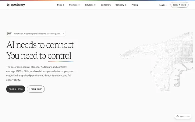
Monochrome Blueprint, Rainbow Spectrum. A highly structured and functional interface with a vibrant, linear brand accent.
Color palette
Prominent brand identifier, top-level separator, decorative element, active state highlight for navigation. The full spectrum gradient is critical to the brand's visual identity
Dark borders and separators for elevated surfaces and inverted UI. Do not promote it to the primary CTA color
Primary page background, elevated card surfaces, light button text, subtle borders
Muted borders, subtle dividers, secondary backgrounds for sections, placeholder text
Navigation foreground, dark gray text, subtle background tones
Iconography, body text, secondary text, muted borders
Muted body text, subtle icon accents, light borders
Subtle background for UI elements, light surface accents
Dark button background, badge borders, secondary text
Typography
- Weights
- 400, 500, 600, 700
- Sizes
- 9px, 10px, 11px, 12px, 13px, 14px, 16px, 18px
- Line height
- 1.43, 1.5, 1.75
- Letter spacing
- 0.05em at 9px to 0em at higher weights
- Fallback
- system-ui, sans-serif
Functional UI text: buttons, navigation, small labels, body text; provides a solid, readable base.
- Weights
- 300, 400, 500
- Sizes
- 14px, 16px, 18px, 23px, 26px
- Line height
- 1.29, 1.38, 1.6, 1.75
- Letter spacing
- 0.002em, 0.003em
- Fallback
- Georgia, serif
Secondary headings and descriptive content: Offers a more refined, readable quality with slightly tighter tracking.
- Weights
- 100
- Sizes
- 20px, 38px, 51px, 67px, 140px
- Line height
- 1, 1.2, 1.3, 1.38, 1.4
- Letter spacing
- -0.04em at 140px, -0.02em at 67px
- Fallback
- serif
Display headings and hero text: characterized by an extremely light, almost wispy weight and tight tracking, conveying authority through understated elegance. The 100 weight for headings is highly distinctive.
- Weights
- 400
- Sizes
- 16px
- Line height
- 1.5
- Letter spacing
- normal
- Fallback
- monospace
Decorative ASCII art and code snippets: provides a unique, digital-native visual texture for specific content.
Spacing & shape
Elevation
Components
Background: Midnight Ink (#333333), Text: Canvas White (#ffffff). Radius: Full pill (1.67772e+07px). Padding: 8px vertical, 20px horizontal. Subtle drop shadow on hover/active.
Background: transparent (rgba(0,0,0,0)), Text: Midnight Ink (#000000) or Slate (#545454). Radius: Full pill (1.67772e+07px). Padding: 8px vertical, 16px horizontal. 1px Midnight Ink border. No explicit shadows, relies on hover state for interaction feedback.
Background: transparent (rgba(0,0,0,0)), Text: Primary Foreground (#18181b), Border: Ash Gray (#dbdbdb). Radius: 2px. Padding: 5px vertical, 6px horizontal.
Background: Canvas White (#ffffff). No distinct border. Radius: 10px. Padding: 32px. No distinct shadow for static cards.
Background: transparent, Text: Charcoal (#242424) or Midnight Ink (#000000). Active state indicated by a Rainbow Horizon gradient border at the bottom.
Background: Canvas White (#ffffff), Border: Ash Gray (#dbdbdb) 1px solid. Text: Midnight Ink (#000000). Focus state uses a distinct ring color (--ring: #3c83f6).
Background: Canvas White (#ffffff) with a subtle inset shadow (rgb(255, 255, 255) 0px 2px 1px inset, rgba(0, 0, 0, 0.1) 0px -2px 1px inset). Radius: 8px. Padding: 32px. Features a bottom border or element with a distinct color (e.g., #4b6c42, or other vivid colors) as a visual queue.
Guidelines
- Use Midnight Ink (#000000) for all primary body text and major headlines, ensuring AAA contrast.
- Apply Canvas White (#ffffff) as the default background for all primary content sections and cards.
- Implement the Rainbow Horizon linear gradient only as a top-border or divider for significant sections or the main navigation, reserving its unique presence.
- Set display headlines (tobias font family) with weight 100 and negative letter-spacing for a distinct, airy feel.
- Employ Ash Gray (#dbdbdb) for all hairline borders, dividers, and secondary component outlines, maintaining a clean, understated separation.
- Utilize a full pill radius (1.67772e+07px) for primary and ghost buttons to convey a modern, approachable interactive element.
- Maintain compact density with an elementGap of 6px and cardPadding of 24px to keep information concise yet readable.
- Do not use saturated colors for large background areas or extensive text; restrict them to small, functional accents like icons or status indicators.
- Avoid applying heavy drop shadows; elevation should be subtle, using rgba(0, 0, 0, 0.1) 0px 1px 3px 0px for hierarchy, not depth.
- Do not introduce new font families; the current selection (ui-sans-serif, diatype, tobias, speakeasyAscii) defines the brand's typographic voice.
- Never compromise the contrast of text against backgrounds; prioritize readability first, especially for functional UI elements.
- Resist using bold (700) weights for main headings; the system's signature is achieved via tobias 100 weight.
- Do not use distinct background colors for action buttons other than Midnight Ink for filled or transparent for ghost; avoid chromatic button fills.
- Avoid wide page layouts; content should generally be contained within a maximum width section, even if the canvas is full-bleed.
About this system
ShowHide
Speakeasy employs a stark, high-contrast digital blueprint aesthetic. It combines bold, ultra-thin headlines that command attention through restraint, with compact, functional body text. Most elements are monochrome, set against clean white surfaces, fostering a sense of precision and control. A distinctive rainbow gradient acts as a vibrant brand identifier, appearing strategically at page edges and as a subtle accent. User interface elements are crisp, with soft rounded corners on interactive components and subtle, functional shadows that provide hierarchy without visual weight.
The page primarily uses a series of vertically stacked, full-width sections. Some sections feature a max-width centered content container, while others are truly full-bleed. The hero section is characterized by a prominent, ultra-light headline centered or left-aligned against a clean white background, often accompanied by a large, minimalist graphic. Section rhythm is created through consistent vertical spacing (80px sectionGap) and alternating background tones (Canvas White and Ghost Gray). Content frequently arranges into two-column layouts featuring text on one side and a visual element or card grid on the other. Navigation is a sticky top bar, lightweight and minimal, with logical dropdowns indicated by chevrons, and accented by the Rainbow Horizon gradient.
This system primarily uses abstract, stylized graphic elements and minimal product-focused visuals. The dominant visual is a 'digital hand' composed of ASCII-like characters, suggesting AI and technology in a minimalist, almost ethereal manner. Imagery is almost always monochromatic or line-based, using a 'ghosted' or 'wireframe' aesthetic. When product illustrations appear, they are dimensional but simplified, showing layered components (e.g., stacked platforms) with soft, muted pastel tones. Icons are consistently outlined, with a moderate stroke weight, and may use a single accent color from the small semantic palette (like green or orange) for contextual meaning. The overall density of imagery is low, allowing text to dominate.
Reminiscent of Linear, Vercel, Stripe, Amie.
# Speakeasy — Style Reference
> Monochrome Blueprint, Rainbow Spectrum. A highly structured and functional interface with a vibrant, linear brand accent.

**Theme:** light

**Site:** https://www.speakeasy.com

Speakeasy employs a stark, high-contrast digital blueprint aesthetic. It combines bold, ultra-thin headlines that command attention through restraint, with compact, functional body text. Most elements are monochrome, set against clean white surfaces, fostering a sense of precision and control. A distinctive rainbow gradient acts as a vibrant brand identifier, appearing strategically at page edges and as a subtle accent. User interface elements are crisp, with soft rounded corners on interactive components and subtle, functional shadows that provide hierarchy without visual weight.

## Tokens — Colors

| Name | Value | Token | Role |
|------|------|------|------|
| Rainbow Horizon | `#330f1f` | `--color-rainbow-horizon` | Prominent brand identifier, top-level separator, decorative element, active state highlight for navigation. The full spectrum gradient is critical to the brand's visual identity |
| Midnight Ink | `#000000` | `--color-midnight-ink` | Dark borders and separators for elevated surfaces and inverted UI. Do not promote it to the primary CTA color |
| Canvas White | `#ffffff` | `--color-canvas-white` | Primary page background, elevated card surfaces, light button text, subtle borders |
| Ash Gray | `#dbdbdb` | `--color-ash-gray` | Muted borders, subtle dividers, secondary backgrounds for sections, placeholder text |
| Charcoal | `#242424` | `--color-charcoal` | Navigation foreground, dark gray text, subtle background tones |
| Slate | `#545454` | `--color-slate` | Iconography, body text, secondary text, muted borders |
| Silver Thread | `#969696` | `--color-silver-thread` | Muted body text, subtle icon accents, light borders |
| Ghost Gray | `#f1f1f1` | `--color-ghost-gray` | Subtle background for UI elements, light surface accents |
| Deep Space | `#333333` | `--color-deep-space` | Dark button background, badge borders, secondary text |

## Tokens — Typography

### ui-sans-serif
- **Substitute:** system-ui, sans-serif
- **Weights:** 400, 500, 600, 700
- **Sizes:** 9px, 10px, 11px, 12px, 13px, 14px, 16px, 18px
- **Line height:** 1.43, 1.5, 1.75
- **Letter spacing:** 0.05em at 9px to 0em at higher weights
- **Role:** Functional UI text: buttons, navigation, small labels, body text; provides a solid, readable base.

### diatype
- **Substitute:** Georgia, serif
- **Weights:** 300, 400, 500
- **Sizes:** 14px, 16px, 18px, 23px, 26px
- **Line height:** 1.29, 1.38, 1.6, 1.75
- **Letter spacing:** 0.002em, 0.003em
- **Role:** Secondary headings and descriptive content: Offers a more refined, readable quality with slightly tighter tracking.

### tobias
- **Substitute:** serif
- **Weights:** 100
- **Sizes:** 20px, 38px, 51px, 67px, 140px
- **Line height:** 1, 1.2, 1.3, 1.38, 1.4
- **Letter spacing:** -0.04em at 140px, -0.02em at 67px
- **Role:** Display headings and hero text: characterized by an extremely light, almost wispy weight and tight tracking, conveying authority through understated elegance. The 100 weight for headings is highly distinctive.

### speakeasyAscii
- **Substitute:** monospace
- **Weights:** 400
- **Sizes:** 16px
- **Line height:** 1.5
- **Letter spacing:** normal
- **Role:** Decorative ASCII art and code snippets: provides a unique, digital-native visual texture for specific content.

## Tokens — Type Scale

| Role | Size | Line height | Letter spacing |
|------|------|------|------|
| subheading | 18px | 1.75 | — |
| heading-sm | 26px | 1.75 | 0.003em |
| heading | 38px | 1.2 | -0.02em |
| heading-lg | 67px | 1.3 | -0.02em |
| display | 140px | 1 | -0.04em |

## Tokens — Spacing

- **Section gap:** 80px
- **Card padding:** 24px
- **Element gap:** 6px

## Tokens — Radius

- **Default:** 4px
- **Buttons:** 1.67772e+07px
- **Cards:** 8px
- **badges:** 2px

## Tokens — Elevation

- **Card (General):** `rgba(0, 0, 0, 0.1) 0px 1px 3px 0px, rgba(0, 0, 0, 0.1) 0px 1px 2px -1px`
- **Button (Inset):** `rgb(65, 65, 65) 0px 2px 1px 0px inset, rgba(0, 0, 0, 0.05) 0px -2px 1px 0px inset`
- **Button (Light Inset):** `rgb(255, 255, 255) 0px 2px 1px 0px inset, rgba(0, 0, 0, 0.1) 0px -2px 1px 0px inset`
- **Button (Hover/Focus):** `rgba(0, 0, 0, 0.1) 0px 10px 15px -3px, rgba(0, 0, 0, 0.1) 0px 4px 6px -4px`

## Layout

The page primarily uses a series of vertically stacked, full-width sections. Some sections feature a max-width centered content container, while others are truly full-bleed. The hero section is characterized by a prominent, ultra-light headline centered or left-aligned against a clean white background, often accompanied by a large, minimalist graphic. Section rhythm is created through consistent vertical spacing (80px sectionGap) and alternating background tones (Canvas White and Ghost Gray). Content frequently arranges into two-column layouts featuring text on one side and a visual element or card grid on the other. Navigation is a sticky top bar, lightweight and minimal, with logical dropdowns indicated by chevrons, and accented by the Rainbow Horizon gradient.

## Imagery

This system primarily uses abstract, stylized graphic elements and minimal product-focused visuals. The dominant visual is a 'digital hand' composed of ASCII-like characters, suggesting AI and technology in a minimalist, almost ethereal manner. Imagery is almost always monochromatic or line-based, using a 'ghosted' or 'wireframe' aesthetic. When product illustrations appear, they are dimensional but simplified, showing layered components (e.g., stacked platforms) with soft, muted pastel tones. Icons are consistently outlined, with a moderate stroke weight, and may use a single accent color from the small semantic palette (like green or orange) for contextual meaning. The overall density of imagery is low, allowing text to dominate.

## Components

### Primary Filled Button
*Calls to action, form submissions, primary interactions.*

Background: Midnight Ink (#333333), Text: Canvas White (#ffffff). Radius: Full pill (1.67772e+07px). Padding: 8px vertical, 20px horizontal. Subtle drop shadow on hover/active.

### Ghost Button
*Secondary actions, navigation links, less prominent calls to action.*

Background: transparent (rgba(0,0,0,0)), Text: Midnight Ink (#000000) or Slate (#545454). Radius: Full pill (1.67772e+07px). Padding: 8px vertical, 16px horizontal. 1px Midnight Ink border. No explicit shadows, relies on hover state for interaction feedback.

### Badge
*Categorization, status indicators, small labels.*

Background: transparent (rgba(0,0,0,0)), Text: Primary Foreground (#18181b), Border: Ash Gray (#dbdbdb). Radius: 2px. Padding: 5px vertical, 6px horizontal.

### Content Card
*To encapsulate related information, features, or testimonials.*

Background: Canvas White (#ffffff). No distinct border. Radius: 10px. Padding: 32px. No distinct shadow for static cards.

### Nav Item
*Top navigation links.*

Background: transparent, Text: Charcoal (#242424) or Midnight Ink (#000000). Active state indicated by a Rainbow Horizon gradient border at the bottom.

### Input Field
*User entry for forms.*

Background: Canvas White (#ffffff), Border: Ash Gray (#dbdbdb) 1px solid. Text: Midnight Ink (#000000). Focus state uses a distinct ring color (--ring: #3c83f6).

### Product Feature Card
*Showcasing individual product features with an icon and description.*

Background: Canvas White (#ffffff) with a subtle inset shadow (rgb(255, 255, 255) 0px 2px 1px inset, rgba(0, 0, 0, 0.1) 0px -2px 1px inset). Radius: 8px. Padding: 32px. Features a bottom border or element with a distinct color (e.g., #4b6c42, or other vivid colors) as a visual queue.

## Guidelines

### Do

- Use Midnight Ink (#000000) for all primary body text and major headlines, ensuring AAA contrast.
- Apply Canvas White (#ffffff) as the default background for all primary content sections and cards.
- Implement the Rainbow Horizon linear gradient only as a top-border or divider for significant sections or the main navigation, reserving its unique presence.
- Set display headlines (tobias font family) with weight 100 and negative letter-spacing for a distinct, airy feel.
- Employ Ash Gray (#dbdbdb) for all hairline borders, dividers, and secondary component outlines, maintaining a clean, understated separation.
- Utilize a full pill radius (1.67772e+07px) for primary and ghost buttons to convey a modern, approachable interactive element.
- Maintain compact density with an elementGap of 6px and cardPadding of 24px to keep information concise yet readable.

### Don't

- Do not use saturated colors for large background areas or extensive text; restrict them to small, functional accents like icons or status indicators.
- Avoid applying heavy drop shadows; elevation should be subtle, using rgba(0, 0, 0, 0.1) 0px 1px 3px 0px for hierarchy, not depth.
- Do not introduce new font families; the current selection (ui-sans-serif, diatype, tobias, speakeasyAscii) defines the brand's typographic voice.
- Never compromise the contrast of text against backgrounds; prioritize readability first, especially for functional UI elements.
- Resist using bold (700) weights for main headings; the system's signature is achieved via tobias 100 weight.
- Do not use distinct background colors for action buttons other than Midnight Ink for filled or transparent for ghost; avoid chromatic button fills.
- Avoid wide page layouts; content should generally be contained within a maximum width section, even if the canvas is full-bleed.

## Agent Prompt Guide

Quick Color Reference:
text: #000000
background: #ffffff
border: #dbdbdb
accent: #330f1f (as gradient starting point)
primary action: #333333 (filled action)

Example Component Prompts:

1. Create a Primary Action Button: #333333 background, #ffffff text, 9999px radius, compact pill padding. Use this filled treatment for the main CTA.

2. Design a Card for product features: background Canvas White, 10px radius, 32px padding on all sides. Use ui-sans-serif weight 600 for the title at 16px, color Midnight Ink. Body text in ui-sans-serif weight 400 at 14px, color Slate. Add a subtle shadow 'rgba(0, 0, 0, 0.1) 0px 1px 3px 0px, rgba(0, 0, 0, 0.1) 0px 1px 2px -1px'.

3. Construct a navigation bar item: Text 'Products' in ui-sans-serif weight 500 at 14px, color Charcoal. Add a bottom border of 2px height using the Rainbow Horizon gradient when active and a transparent border when inactive. Use a small down arrow icon next to the text.
More like this









Keep what you find
A free account saves references to boards and can send you a weekly email of picks based on what you save.
To see every result, go Pro.