Preview image. Unlock full-res
White canvas, thoughtful function
Color palette
Decorative gradient for product showcases and section backgrounds. Adds a touch of atmospheric color
Decorative gradient for headers and hero sections. Infuses warmth
Decorative gradient for imagery or backgrounds. Cool, soothing effect
Page backgrounds, light surfaces, header backdrop. The primary visual canvas
Primary text, informational icons, button text, accented borders. The main dark anchor of the UI
Dark borders and separators for elevated surfaces and inverted UI. Do not promote it to the primary CTA color
Subtle background for badges and secondary button backgrounds
Tertiary backgrounds, dark card fills
Muted secondary text, descriptive copy, ghost button text
Filled button background for primary actions. Provides strong contrast
Subtle borders, dividers, ghost button borders
Heading text, strong links. Darker, more authoritative text than Midnight Ink
Body text, navigation links, secondary button borders
Background for certain ghost buttons, creating very low contrast
Subtle link text and decorative strokes
Typography
- Weights
- 400, 500
- Sizes
- 14px, 16px, 24px, 32px, 40px
- Line height
- 1.2, 1.3, 1.4
- Fallback
- Inter
Headings, body text, links, and buttons. Its clean, geometric forms provide a modern, functional voice.
- Weights
- 400
- Sizes
- 16px, 18px, 40px
- Line height
- 1.5
- Fallback
- Montserrat
Used for specific body text, hero text, and badges, complementing ABC Diatype with geometric simplicity.
Spacing & shape
Components
Background: Charcoal Button (#272420), Text: Canvas White (#faf9f8), Border: 1px solid Canvas White (#faf9f8), Padding: 8px vertical, 16px horizontal, Radius: 32px.
Background: transparent, Text: Medium Gray (#575653), Border: 1px solid Medium Gray (#575653), Padding: 6px vertical, 12px horizontal, Radius: 32px.
Background: transparent, Text: Midnight Ink (#0b2330), Border: 1px solid transparent, Padding: 6px vertical, 12px horizontal, Radius: 32px.
Background: Fog Gray (#f3f3f3), Text: Midnight Ink (#0b2330), Padding: 48px vertical, 48px horizontal, Radius: 4px.
Background: transparent, Border: none, Shadow: none, Padding: 0px, Radius: 100px or 1600px for larger shapes.
Guidelines
- Prioritize Canvas White (#faf9f8) as the dominant background color for body sections and interface elements.
- Use Midnight Ink (#0b2330) for primary text and strong link states, ensuring high contrast and legibility.
- Apply 32px radius to all buttons and navigation elements for a consistent soft, approachable feel.
- Separate content sections with generous vertical spacing (sectionGap: 80px) to create an open and spacious layout.
- Integrate subtle linear gradients like Light Mauve Gradient or Peach Sunset Gradient for decorative backgrounds or imagery, not for functional UI elements.
- Use ABC Diatype for all headings and general body text, with TT Commons Pro for specific hero text or badges.
- Utilize Charcoal Button (#272420) for filled primary CTAs and Border Ash (#e8e7e6) for ghost button borders.
- Avoid using highly saturated colors for functional UI elements; reserve them for decorative imagery or gradients.
- Do not use dark gray/black backgrounds (Jet Black #000000 or Graphite #1c1a17) for large sections; they are for specific element contrasts.
- Do not break the 32px or 4px radius pattern for buttons and badges, respectively; maintain consistent corner treatments.
- Avoid excessive use of borders; lean on spacing and background color shifts to delineate sections.
- Do not introduce new font families; the system relies on ABC Diatype and TT Commons Pro for its typographic identity.
- Do not add drop shadows to components; the system relies on flat surfaces and subtle background shifts.
- Do not compress vertical spacing; maintain the spacious rhythm established by the 80px section gap and element gaps.
About this system
ShowHide
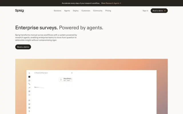
Sprig employs a soft, minimalist aesthetic with a focus on clear information hierarchy, using a primarily achromatic palette grounded by a deep navy. Strategic use of subtle gradients and large radii on imagery introduces a touch of warmth and visual interest. Typography is compact and precise, maintaining a high information density while generous vertical spacing creates an airy, uncrowded feel. Interactive elements are softly delineated with rounded corners and muted borders, emphasizing functionality over ornamentation.
The page uses a contained layout with a maximum content width, centered on a Canvas White background. The hero section features a centered headline and description over the Canvas White, occasionally accented by a full-width subtle gradient at the bottom. Sections are separated by generous vertical spacing (80px), often alternating between content blocks on white and subtle gradient backdrops. Content is arranged predominantly in centered stacks for headlines and descriptions, with occasional two-column layouts featuring text on one side and a visual on the other, or multi-column card grids for features. Navigation is a consistent top bar that remains visible.
The site uses a mix of photographic and abstract elements. Photography often features tight product crops or individuals in professional settings, sometimes with a desaturated or subtly tinted color overlay (e.g., cool blue tones). Abstract graphics primarily consist of subtle linear gradients (Light Mauve Gradient, Peach Sunset Gradient) that serve as atmospheric backgrounds or design accents, often with large, organic, or significantly rounded shapes that spill out of bounds or create soft visual containers. Iconography is minimal, outlined, and monochromatic, used for functional clarity. Imagery primarily serves a decorative or atmospheric role.
Reminiscent of Linear, Stripe, Figma, Vercel.
# Sprig — Style Reference
> White canvas, thoughtful function

**Theme:** light

**Site:** https://sprig.com

Sprig employs a soft, minimalist aesthetic with a focus on clear information hierarchy, using a primarily achromatic palette grounded by a deep navy. Strategic use of subtle gradients and large radii on imagery introduces a touch of warmth and visual interest. Typography is compact and precise, maintaining a high information density while generous vertical spacing creates an airy, uncrowded feel. Interactive elements are softly delineated with rounded corners and muted borders, emphasizing functionality over ornamentation.

## Tokens — Colors

| Name | Value | Token | Role |
|------|------|------|------|
| Light Mauve Gradient | `#efdcb6` | `--color-light-mauve-gradient` | Decorative gradient for product showcases and section backgrounds. Adds a touch of atmospheric color |
| Peach Sunset Gradient | `#ffd9a0` | `--color-peach-sunset-gradient` | Decorative gradient for headers and hero sections. Infuses warmth |
| Sea Mist Gradient | `#bad4d5` | `--color-sea-mist-gradient` | Decorative gradient for imagery or backgrounds. Cool, soothing effect |
| Canvas White | `#faf9f8` | `--color-canvas-white` | Page backgrounds, light surfaces, header backdrop. The primary visual canvas |
| Midnight Ink | `#0b2330` | `--color-midnight-ink` | Primary text, informational icons, button text, accented borders. The main dark anchor of the UI |
| Jet Black | `#000000` | `--color-jet-black` | Dark borders and separators for elevated surfaces and inverted UI. Do not promote it to the primary CTA color |
| Fog Gray | `#f3f3f3` | `--color-fog-gray` | Subtle background for badges and secondary button backgrounds |
| Graphite | `#1c1a17` | `--color-graphite` | Tertiary backgrounds, dark card fills |
| Slate Text | `#6e6d6a` | `--color-slate-text` | Muted secondary text, descriptive copy, ghost button text |
| Charcoal Button | `#272420` | `--color-charcoal-button` | Filled button background for primary actions. Provides strong contrast |
| Border Ash | `#e8e7e6` | `--color-border-ash` | Subtle borders, dividers, ghost button borders |
| Deep Space | `#141312` | `--color-deep-space` | Heading text, strong links. Darker, more authoritative text than Midnight Ink |
| Medium Gray | `#575653` | `--color-medium-gray` | Body text, navigation links, secondary button borders |
| Ghost Button | `#8f8d8b` | `--color-ghost-button` | Background for certain ghost buttons, creating very low contrast |
| Subtle Link | `#9a9a91` | `--color-subtle-link` | Subtle link text and decorative strokes |

## Tokens — Typography

### ABC Diatype
- **Substitute:** Inter
- **Weights:** 400, 500
- **Sizes:** 14px, 16px, 24px, 32px, 40px
- **Line height:** 1.2, 1.3, 1.4
- **Role:** Headings, body text, links, and buttons. Its clean, geometric forms provide a modern, functional voice.

### TT Commons Pro
- **Substitute:** Montserrat
- **Weights:** 400
- **Sizes:** 16px, 18px, 40px
- **Line height:** 1.5
- **Role:** Used for specific body text, hero text, and badges, complementing ABC Diatype with geometric simplicity.

## Tokens — Type Scale

Major Third (1.25) from 18px base.

| Role | Size | Line height | Letter spacing |
|------|------|------|------|
| caption | 14px | 1.4 | — |
| body-sm | 16px | 1.5 | — |
| body | 18px | 1.5 | — |
| subheading | 24px | 1.3 | — |
| heading | 32px | 1.2 | — |
| display | 40px | 1.2 | — |

## Tokens — Spacing

- **Section gap:** 80px
- **Card padding:** 16px
- **Element gap:** 8px

## Tokens — Radius

- **Buttons:** 32px
- **Cards:** 100px
- **badges:** 4px
- **deepCurve:** 1600px

## Layout

The page uses a contained layout with a maximum content width, centered on a Canvas White background. The hero section features a centered headline and description over the Canvas White, occasionally accented by a full-width subtle gradient at the bottom. Sections are separated by generous vertical spacing (80px), often alternating between content blocks on white and subtle gradient backdrops. Content is arranged predominantly in centered stacks for headlines and descriptions, with occasional two-column layouts featuring text on one side and a visual on the other, or multi-column card grids for features. Navigation is a consistent top bar that remains visible.

## Imagery

The site uses a mix of photographic and abstract elements. Photography often features tight product crops or individuals in professional settings, sometimes with a desaturated or subtly tinted color overlay (e.g., cool blue tones). Abstract graphics primarily consist of subtle linear gradients (Light Mauve Gradient, Peach Sunset Gradient) that serve as atmospheric backgrounds or design accents, often with large, organic, or significantly rounded shapes that spill out of bounds or create soft visual containers. Iconography is minimal, outlined, and monochromatic, used for functional clarity. Imagery primarily serves a decorative or atmospheric role.

## Components

### Primary Filled Button
*Call to action button for key conversions.*

Background: Charcoal Button (#272420), Text: Canvas White (#faf9f8), Border: 1px solid Canvas White (#faf9f8), Padding: 8px vertical, 16px horizontal, Radius: 32px.

### Secondary Outlined Button
*Supporting actions or navigation links.*

Background: transparent, Text: Medium Gray (#575653), Border: 1px solid Medium Gray (#575653), Padding: 6px vertical, 12px horizontal, Radius: 32px.

### Ghost Header Button
*Subtle button with minimal styling for navigation or secondary actions in header.*

Background: transparent, Text: Midnight Ink (#0b2330), Border: 1px solid transparent, Padding: 6px vertical, 12px horizontal, Radius: 32px.

### Subtle Information Badge
*Used for categorization or small labels.*

Background: Fog Gray (#f3f3f3), Text: Midnight Ink (#0b2330), Padding: 48px vertical, 48px horizontal, Radius: 4px.

### Product Display Card
*Highlights features or product screenshots with a curved frame.*

Background: transparent, Border: none, Shadow: none, Padding: 0px, Radius: 100px or 1600px for larger shapes.

## Guidelines

### Do

- Prioritize Canvas White (#faf9f8) as the dominant background color for body sections and interface elements.
- Use Midnight Ink (#0b2330) for primary text and strong link states, ensuring high contrast and legibility.
- Apply 32px radius to all buttons and navigation elements for a consistent soft, approachable feel.
- Separate content sections with generous vertical spacing (sectionGap: 80px) to create an open and spacious layout.
- Integrate subtle linear gradients like Light Mauve Gradient or Peach Sunset Gradient for decorative backgrounds or imagery, not for functional UI elements.
- Use ABC Diatype for all headings and general body text, with TT Commons Pro for specific hero text or badges.
- Utilize Charcoal Button (#272420) for filled primary CTAs and Border Ash (#e8e7e6) for ghost button borders.

### Don't

- Avoid using highly saturated colors for functional UI elements; reserve them for decorative imagery or gradients.
- Do not use dark gray/black backgrounds (Jet Black #000000 or Graphite #1c1a17) for large sections; they are for specific element contrasts.
- Do not break the 32px or 4px radius pattern for buttons and badges, respectively; maintain consistent corner treatments.
- Avoid excessive use of borders; lean on spacing and background color shifts to delineate sections.
- Do not introduce new font families; the system relies on ABC Diatype and TT Commons Pro for its typographic identity.
- Do not add drop shadows to components; the system relies on flat surfaces and subtle background shifts.
- Do not compress vertical spacing; maintain the spacious rhythm established by the 80px section gap and element gaps.

## Agent Prompt Guide

Quick Color Reference:
text: #0b2330
background: #faf9f8
border: #e8e7e6
accent: #efdcb6 (Light Mauve Gradient)
primary action: #272420 (filled action)

Example Component Prompts:
1. Create a primary call-to-action button: background Charcoal Button (#272420), text Canvas White (#faf9f8), 1px solid Canvas White (#faf9f8) border, 32px radius, 8px vertical padding, 16px horizontal padding, ABC Diatype 400 at 16px.
2. Create a navigation link in the header: text Medium Gray (#575653), transparent background, no border, 32px radius, ABC Diatype 400 at 16px.
3. Design a hero section headline: text Deep Space (#141312), ABC Diatype 500 at 40px, lineHeight 1.2, centered.
4. Produce a subtle information badge: background Fog Gray (#f3f3f3), text Midnight Ink (#0b2330), 4px radius, TT Commons Pro 400 at 16px, 48px padding all sides.
5. Create a secondary outlined button: background transparent, text Midnight Ink (#0b2330), 1px solid Border Ash (#e8e7e6) border, 32px radius, 6px vertical padding, 12px horizontal padding, ABC Diatype 400 at 16px.
More like this









Keep what you find
A free account saves references to boards and can send you a weekly email of picks based on what you save.
To see every result, go Pro.