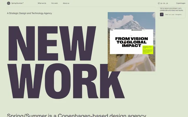
Preview image. Unlock full-res
Vintage academic journal — muted tones on rough-cut paper.
Color palette
Primary text, interactive elements, navigation — a deep, muted purple-gray that provides strong contrast against Greige Canvas without being harsh.
Not explicitly used as a brand color, but present in sample imagery as a highlighter-like accent. Implies editorial emphasis.
Page backgrounds, section dividers — a soft, desaturated beige that acts as a primary canvas.
Overlay content, occasional text highlights.
Subtle borders and dividers for UI elements.
Input field borders when not focused.
Iconography, specific text accents for highest contrast.
Typography
- Weights
- 400
- Sizes
- 12px, 13px, 14px, 18px, 43px
- Line height
- 1.1, 1.2, 1.3, 1.4, 1.5
- Letter spacing
- 0.0200em, 0.0230em
- Fallback
- Inter
Support text, navigation items, body copy, and secondary headlines. Its consistent weight and relatively generous letter-spacing across sizes contribute to a legible, functional aesthetic, ensuring information is clear without competing with the display typography.
- Weights
- 400
- Sizes
- 40px, 170px, 386px
- Line height
- 0.75, 0.76
- Letter spacing
- normal
- Fallback
- IBM Plex Sans Bold
Primary display headlines — massive, unadorned, and often appearing with extreme negative space. The 'normal' line-height and letter-spacing for such large sizes make it feel raw and direct, almost like protest signage, creating the brand's bold, uncompromising visual identity.
Spacing & shape
Components
Text link, color Deep Plum (#44394c), font Montreal weight 400. No background, no border, no radius. Padding is 0px.
Text, color Deep Plum (#44394c), font Montreal weight 400. Background rgba(0, 0, 0, 0), border Top Color Deep Plum (#44394c) for an underline effect. No radius. Padding is 0px for minimal visual impact.
Background rgba(0, 0, 0, 0), text color Deep Plum (#44394c), border color Input Pale Gray (rgba(68, 57, 76, 0.3)). Border radius 4px. Padding 8px top/bottom, 6px left/right.
Background rgba(0, 0, 0, 0), text color Pure White (#ffffff). No radius. Padding is 0px, appearing as plain text.
These cards primarily use imagery. The underlying text (from screenshot) uses Montreal font, with Deep Plum text on a Greige Canvas background or Pure White text on a project image. Specific padding, border, and radius values are inherited from the surrounding context or element, with 0 radius being common for project images.
Color Deep Plum (#44394c), font Montreal weight 400, sizes 14px or 18px. Line height 1.4 or 1.5. Ample surrounding white space.
Color Deep Plum (#44394c), font Grotesk weight 400, sizes 170px or 386px. Line height normal. Often appears semi-cropped or overlapping other elements due to its scale and placement.
Guidelines
- Prioritize text as primary UI elements; use plain text for navigation and buttons unless explicit interaction styling is required.
- Use Deep Plum (#44394c) for all primary text and interactive elements to maintain a restrained, authoritative tone.
- Deploy Grotesk only for very large headlines (170px, 386px) with 'normal' letter and line spacing, embracing its raw, impactful nature.
- Maintain generous negative space, especially around Grotesk headlines, to emphasize content and create an editorial feel.
- Ensure all interactive elements and links use Deep Plum (#44394c) for color and Montreal font for consistency.
- Apply 4px border-radius sparingly, primarily for input fields and specific interactive text elements, to create a subtle softening.
- Use Greige Canvas (#e5ebda) as the default background for most page sections, and Layered Beige (#c0c3b6) for subtle dividers or secondary borders.
- Avoid using highly saturated colors for branding elements; stick to the muted palette of Deep Plum and Greige Canvas.
- Do not add shadows or overly complex styling to buttons or navigation items; interaction cues should be subtle like underlines or background shifts.
- Disallow custom font weights other than 400 for both Montreal and Grotesk to preserve the distinct 'unadorned' character.
- Refrain from using animated or highly decorative visual effects that could detract from the content-first, editorial aesthetic.
- Do not use small, multi-weight display typography; Grotesk is for monumental statements, not nuanced headlines.
- Avoid decorative icons or illustrations that are not monochrome; any visual elements should be minimalist and functional.
- Do not break the subtle color palette with vibrant, unbranded accents; the only allowed accent is implied by the 'highlight yellow' in imagery, not in the UI.
About this system
ShowHide
This system projects an academic-editorial mood, blending the starkness of brutalist typography with a muted, almost vintage color palette. The signature move is the expansive negative space around headlines set in Grotesk, which dominates the visual field and suggests an understated confidence. Text-based navigation and calls-to-action avoid typical button aesthetics, relying on subtle underlines or a neutral background for interaction cues, making the design feel more like a printed journal than a typical website. The overall impression is one of grounded authority, achieved through deliberate understatement rather than overt design flourishes.
The page adheres to a max-width contained layout for most content, framed by the Greige Canvas background. The hero section is characterized by a colossal, off-center Grotesk headline ('NEW WORK') overlaid on a background of Greige Canvas, sometimes interacting with a large, unbordered image that seemingly floats or overlaps. Subsequent sections alternate between large, impactful imagery and text blocks, often with a 2-column or 3-column grid for project previews. Vertical spacing is comfortable but not overly spacious, creating a dense, magazine-like flow. Navigation is a minimalist top bar, utilizing styled text links rather than explicit buttons, emphasizing content over chrome.
The visual language blends raw, often textured photography with abstract or product-focused imagery. Photography appears full-bleed or contained within large, uncropped sections, with a slight desaturated or cool tint, often focusing on landscapes, architecture, or tight product crops. There's an absence of overly staged lifestyle photography. Overlaid on these images are bold, high-contrast typography elements, creating a magazine-layout feel. Icons are monochrome (True Black #000000 or Deep Plum #44394c), simple, and often part of structural UI. The use of yellow 'highlight' elements within showcased work adds an editorial, annotation-like quality, breaking the otherwise muted palette for deliberate emphasis. The density is image-heavy in portfolio sections, but in a structured, often gridded manner, allowing the work to speak for itself.
Reminiscent of AIGA Journal, Other Planet, Basic. Space, DIA Agency.
# Spring/Summer — Style Reference
> Vintage academic journal — muted tones on rough-cut paper.

**Theme:** light

**Site:** https://springsummer.dk

This system projects an academic-editorial mood, blending the starkness of brutalist typography with a muted, almost vintage color palette. The signature move is the expansive negative space around headlines set in Grotesk, which dominates the visual field and suggests an understated confidence. Text-based navigation and calls-to-action avoid typical button aesthetics, relying on subtle underlines or a neutral background for interaction cues, making the design feel more like a printed journal than a typical website. The overall impression is one of grounded authority, achieved through deliberate understatement rather than overt design flourishes.

## Tokens — Colors

| Name | Value | Token | Role |
|------|------|------|------|
| Deep Plum | `#44394c` | `--color-deep-plum` | Primary text, interactive elements, navigation — a deep, muted purple-gray that provides strong contrast against Greige Canvas without being harsh. |
| Accent Yellow | `#FFFF00` | `--color-accent-yellow` | Not explicitly used as a brand color, but present in sample imagery as a highlighter-like accent. Implies editorial emphasis. |
| Greige Canvas | `#e5ebda` | `--color-greige-canvas` | Page backgrounds, section dividers — a soft, desaturated beige that acts as a primary canvas. |
| Pure White | `#ffffff` | `--color-pure-white` | Overlay content, occasional text highlights. |
| Ash Border | `#c0c3b6` | `--color-ash-border` | Subtle borders and dividers for UI elements. |
| Input Pale Gray | `#b0b2a9` | `--color-input-pale-gray` | Input field borders when not focused. |
| True Black | `#000000` | `--color-true-black` | Iconography, specific text accents for highest contrast. |

## Tokens — Typography

### Montreal
- **Substitute:** Inter
- **Weights:** 400
- **Sizes:** 12px, 13px, 14px, 18px, 43px
- **Line height:** 1.1, 1.2, 1.3, 1.4, 1.5
- **Letter spacing:** 0.0200em, 0.0230em
- **Role:** Support text, navigation items, body copy, and secondary headlines. Its consistent weight and relatively generous letter-spacing across sizes contribute to a legible, functional aesthetic, ensuring information is clear without competing with the display typography.

### Grotesk
- **Substitute:** IBM Plex Sans Bold
- **Weights:** 400
- **Sizes:** 40px, 170px, 386px
- **Line height:** 0.75, 0.76
- **Letter spacing:** normal
- **Role:** Primary display headlines — massive, unadorned, and often appearing with extreme negative space. The 'normal' line-height and letter-spacing for such large sizes make it feel raw and direct, almost like protest signage, creating the brand's bold, uncompromising visual identity.

## Tokens — Spacing

- **Section gap:** 30px
- **Element gap:** 10px

## Tokens — Radius

- **Inputs:** 4px
- **links:** 4px

## Layout

The page adheres to a max-width contained layout for most content, framed by the Greige Canvas background. The hero section is characterized by a colossal, off-center Grotesk headline ('NEW WORK') overlaid on a background of Greige Canvas, sometimes interacting with a large, unbordered image that seemingly floats or overlaps. Subsequent sections alternate between large, impactful imagery and text blocks, often with a 2-column or 3-column grid for project previews. Vertical spacing is comfortable but not overly spacious, creating a dense, magazine-like flow. Navigation is a minimalist top bar, utilizing styled text links rather than explicit buttons, emphasizing content over chrome.

## Imagery

The visual language blends raw, often textured photography with abstract or product-focused imagery. Photography appears full-bleed or contained within large, uncropped sections, with a slight desaturated or cool tint, often focusing on landscapes, architecture, or tight product crops. There's an absence of overly staged lifestyle photography. Overlaid on these images are bold, high-contrast typography elements, creating a magazine-layout feel. Icons are monochrome (True Black #000000 or Deep Plum #44394c), simple, and often part of structural UI. The use of yellow 'highlight' elements within showcased work adds an editorial, annotation-like quality, breaking the otherwise muted palette for deliberate emphasis. The density is image-heavy in portfolio sections, but in a structured, often gridded manner, allowing the work to speak for itself.

## Components

### Contact CTA Banner

### Project Card Grid

### Agency Description Block

### Navigation Link
*Primary navigation within header/footer.*

Text link, color Deep Plum (#44394c), font Montreal weight 400. No background, no border, no radius. Padding is 0px.

### Unstyled Button
*Functional clickable elements (e.g., 'What we do').*

Text, color Deep Plum (#44394c), font Montreal weight 400. Background rgba(0, 0, 0, 0), border Top Color Deep Plum (#44394c) for an underline effect. No radius. Padding is 0px for minimal visual impact.

### Bordered Input Field
*User input fields.*

Background rgba(0, 0, 0, 0), text color Deep Plum (#44394c), border color Input Pale Gray (rgba(68, 57, 76, 0.3)). Border radius 4px. Padding 8px top/bottom, 6px left/right.

### Plain Text Badge
*Informational tags, typically within blocks of content.*

Background rgba(0, 0, 0, 0), text color Pure White (#ffffff). No radius. Padding is 0px, appearing as plain text.

### Project Card Thumbnail
*Clickable overview of project case studies.*

These cards primarily use imagery. The underlying text (from screenshot) uses Montreal font, with Deep Plum text on a Greige Canvas background or Pure White text on a project image. Specific padding, border, and radius values are inherited from the surrounding context or element, with 0 radius being common for project images.

### Editorial Body Text
*General content paragraphs and article text.*

Color Deep Plum (#44394c), font Montreal weight 400, sizes 14px or 18px. Line height 1.4 or 1.5. Ample surrounding white space.

### Impact Headline
*Dominant, section-starting headlines.*

Color Deep Plum (#44394c), font Grotesk weight 400, sizes 170px or 386px. Line height normal. Often appears semi-cropped or overlapping other elements due to its scale and placement.

## Guidelines

### Do

- Prioritize text as primary UI elements; use plain text for navigation and buttons unless explicit interaction styling is required.
- Use Deep Plum (#44394c) for all primary text and interactive elements to maintain a restrained, authoritative tone.
- Deploy Grotesk only for very large headlines (170px, 386px) with 'normal' letter and line spacing, embracing its raw, impactful nature.
- Maintain generous negative space, especially around Grotesk headlines, to emphasize content and create an editorial feel.
- Ensure all interactive elements and links use Deep Plum (#44394c) for color and Montreal font for consistency.
- Apply 4px border-radius sparingly, primarily for input fields and specific interactive text elements, to create a subtle softening.
- Use Greige Canvas (#e5ebda) as the default background for most page sections, and Layered Beige (#c0c3b6) for subtle dividers or secondary borders.

### Don't

- Avoid using highly saturated colors for branding elements; stick to the muted palette of Deep Plum and Greige Canvas.
- Do not add shadows or overly complex styling to buttons or navigation items; interaction cues should be subtle like underlines or background shifts.
- Disallow custom font weights other than 400 for both Montreal and Grotesk to preserve the distinct 'unadorned' character.
- Refrain from using animated or highly decorative visual effects that could detract from the content-first, editorial aesthetic.
- Do not use small, multi-weight display typography; Grotesk is for monumental statements, not nuanced headlines.
- Avoid decorative icons or illustrations that are not monochrome; any visual elements should be minimalist and functional.
- Do not break the subtle color palette with vibrant, unbranded accents; the only allowed accent is implied by the 'highlight yellow' in imagery, not in the UI.

## Agent Prompt Guide

Quick Color Reference:
- Text: #44394c (Deep Plum)
- Background: #e5ebda (Greige Canvas)
- Input Border: #b0b2a9 (Input Pale Gray)
- Icons: #000000 (True Black)

Example Component Prompts:
1. Create a primary navigation item: text 'Our Work', color #44394c, font Montreal weight 400, size 18px.
2. Generate a large section headline: text 'NEW WORK', color #44394c, font Grotesk weight 400, size 386px, with ample surrounding space.
3. Design an input field: background transparent, text #44394c, border color rgba(68, 57, 76, 0.3), border radius 4px, padding 8px vertical, 6px horizontal. Placeholder text in #44394c with 30% opacity.
4. Create a textual button link: text 'What we do', color #44394c, font Montreal weight 400, 0px padding, with a 1px solid #44394c bottom border on hover.
More like this









Keep what you find
A free account saves references to boards and can send you a weekly email of picks based on what you save.
To see every result, go Pro.