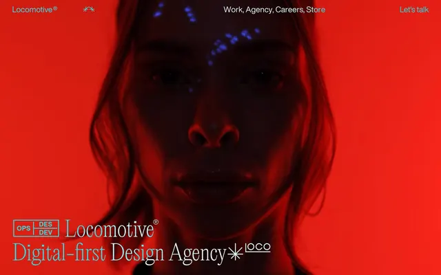
Preview image. Unlock full-res
monochrome editorial manifesto – where stark blocks of content meet fluid, almost invisible interactions.
Color palette
Primary text, borders, dividers, dark mode backgrounds for specific elements, icon fills.
Page backgrounds, card backgrounds, primary surface areas, navigation text in inverted contexts.
Typography
- Weights
- 400
- Sizes
- 15px, 26px
- Line height
- 1, 1.2, 1.3
- Letter spacing
- normal
- Fallback
- system-ui
Body copy (15px), general links, navigation items, descriptive text, and some smaller headings. Its neutrality provides a stable foundation for the more expressive LocomotiveNew.
- Weights
- 400
- Sizes
- 70px, 110px
- Line height
- 1, 1.1
- Letter spacing
- normal
- Fallback
- Georgia
Display headings (70px, 110px). This custom serif font adds a distinctive editorial and somewhat artistic touch, providing gravitas and a unique brand voice at larger sizes, breaking from the HelveticaNowDisplay's modernism.
Spacing & shape
Components
Appears as plain black text (HelveticaNowDisplay, 400) on a white background. No explicit padding or border, relying on typographic spacing. Interaction implied by context and cursor change, not visual styling.
Rendered as text (color: #000000, background: rgba(0, 0, 0, 0)). Features no border, padding, or border-radius, presenting as a clickable typographic element rather than a traditional button shape.
Completely borderless and shadow-free with rgba(0, 0, 0, 0) background and 0px border-radius. Content stands on its own, flush against the background, emphasizing an editorial layout over distinct UI segmentation.
A thin horizontal line (implicitly Pitch Black) used to segment content areas, particularly visible in the articles/culture/store listing. Emphasizes structure without visual bulk.
Utilizes LocomotiveNew at large sizes (70px or 110px) with Pitch Black text on a Canvas White background. Offers generous vertical padding (150px) above and below, providing significant whitespace.
HelveticaNowDisplay, 400, Pitch Black text. Each item is typically underlined or bordered lightly (implicitly Pitch Black) and separated by minimal vertical spacing (e.g. 7px padding) to maintain density.
Guidelines
- Prioritize text content by using HelveticaNowDisplay 400 for all functional text at 15px.
- Use LocomotiveNew 400 at 70px or 110px exclusively for prominent display headings, creating a strong editorial presence.
- Maintain an achromatic palette using only Pitch Black (#000000) and Canvas White (#ffffff) for all UI elements and text.
- Separate major content sections using a generous vertical padding of 150px, establishing a spacious layout.
- Design all interactive elements as text-based, without explicit button containers, borders, or background fills, relying solely on hover states and cursor changes for affordance.
- Do not introduce any color other than Pitch Black (#000000) and Canvas White (#ffffff) into the primary UI.
- Avoid using box-shadows or any form of elevation for UI elements; maintain a flat, print-like aesthetic.
- Do not use border-radius; all corners should be sharp and 0px.
- Do not deviate from the specified font families; avoid system fonts or other custom typefaces.
- Never add explicit padding or background colors to buttons; let them exist purely as interactive text.
About this system
ShowHide
This system projects an aura of intellectual rigor and understated luxury, using stark achromatic contrasts and precise typography. The visual mood is serious and art-directed, prioritizing content and a sense of curated exclusivity over overt flair. The absence of traditional buttons, shadows, or rounded corners emphasizes a flat, print-like aesthetic where content is king and interactive elements are subtly integrated into the typographic flow.
The page primarily employs a max-width contained model for most content, implicitly centered. The hero section, however, is full-bleed, using a dramatic background image with centered, large typographic headlines. A strong vertical rhythm is established by generous section gaps (150px). Content is often arranged in large textual blocks or two-column layouts where text is juxtaposed with either negative space or a precisely placed image. Navigation is a simple top bar with a 'Let's talk' link, alongside a minimal footer. The site is text-dominant with key visuals dropped in strategically, giving a very spacious, almost sparse, feel.
The visual language is impactful and sparse. Hero sections feature high-contrast, moody photography with dramatic lighting and often a single muted color cast (e.g., the red-tinted image in the hero). Subsequent sections are text-heavy, with product/object photography (like the ring image) presented as isolated, high-fidelity crops on a black background, emphasizing the object's detail. Visuals are treated as art pieces within the layout, full-bleed at the top, or precisely contained for product showcases, never overlapping or masked with soft edges. Icons are kept to a minimum, likely outlined mono-color for navigational accents. The density is heavily text-dominant, with images serving as focal points rather than decorative elements.
Reminiscent of AIGA Design Archives, Studio Fathom, Pentagram, The New York Times (digital layout).
# Locomotive — Style Reference
> monochrome editorial manifesto – where stark blocks of content meet fluid, almost invisible interactions.

**Theme:** light

**Site:** https://locomotive.ca

This system projects an aura of intellectual rigor and understated luxury, using stark achromatic contrasts and precise typography. The visual mood is serious and art-directed, prioritizing content and a sense of curated exclusivity over overt flair. The absence of traditional buttons, shadows, or rounded corners emphasizes a flat, print-like aesthetic where content is king and interactive elements are subtly integrated into the typographic flow.

## Tokens — Colors

| Name | Value | Token | Role |
|------|------|------|------|
| Pitch Black | `#000000` | `--color-pitch-black` | Primary text, borders, dividers, dark mode backgrounds for specific elements, icon fills. |
| Canvas White | `#ffffff` | `--color-canvas-white` | Page backgrounds, card backgrounds, primary surface areas, navigation text in inverted contexts. |

## Tokens — Typography

### HelveticaNowDisplay
- **Substitute:** system-ui
- **Weights:** 400
- **Sizes:** 15px, 26px
- **Line height:** 1, 1.2, 1.3
- **Letter spacing:** normal
- **Role:** Body copy (15px), general links, navigation items, descriptive text, and some smaller headings. Its neutrality provides a stable foundation for the more expressive LocomotiveNew.

### LocomotiveNew
- **Substitute:** Georgia
- **Weights:** 400
- **Sizes:** 70px, 110px
- **Line height:** 1, 1.1
- **Letter spacing:** normal
- **Role:** Display headings (70px, 110px). This custom serif font adds a distinctive editorial and somewhat artistic touch, providing gravitas and a unique brand voice at larger sizes, breaking from the HelveticaNowDisplay's modernism.

## Tokens — Spacing

- **Section gap:** 150px
- **Card padding:** 0px

## Tokens — Radius

- **all:** 0px

## Layout

The page primarily employs a max-width contained model for most content, implicitly centered. The hero section, however, is full-bleed, using a dramatic background image with centered, large typographic headlines. A strong vertical rhythm is established by generous section gaps (150px). Content is often arranged in large textual blocks or two-column layouts where text is juxtaposed with either negative space or a precisely placed image. Navigation is a simple top bar with a 'Let's talk' link, alongside a minimal footer. The site is text-dominant with key visuals dropped in strategically, giving a very spacious, almost sparse, feel.

## Imagery

The visual language is impactful and sparse. Hero sections feature high-contrast, moody photography with dramatic lighting and often a single muted color cast (e.g., the red-tinted image in the hero). Subsequent sections are text-heavy, with product/object photography (like the ring image) presented as isolated, high-fidelity crops on a black background, emphasizing the object's detail. Visuals are treated as art pieces within the layout, full-bleed at the top, or precisely contained for product showcases, never overlapping or masked with soft edges. Icons are kept to a minimum, likely outlined mono-color for navigational accents. The density is heavily text-dominant, with images serving as focal points rather than decorative elements.

## Components

### Article List

### Work Card — Seven Years

### Hero Brand Badge

### Navigation Link
*Interactive text link*

Appears as plain black text (HelveticaNowDisplay, 400) on a white background. No explicit padding or border, relying on typographic spacing. Interaction implied by context and cursor change, not visual styling.

### Ghost Button
*Call to action with minimal visual footprint*

Rendered as text (color: #000000, background: rgba(0, 0, 0, 0)). Features no border, padding, or border-radius, presenting as a clickable typographic element rather than a traditional button shape.

### Text-Only Card
*Content container for articles or items*

Completely borderless and shadow-free with rgba(0, 0, 0, 0) background and 0px border-radius. Content stands on its own, flush against the background, emphasizing an editorial layout over distinct UI segmentation.

### Section Divider
*Visual separation between content blocks*

A thin horizontal line (implicitly Pitch Black) used to segment content areas, particularly visible in the articles/culture/store listing. Emphasizes structure without visual bulk.

### Headline Section
*Prominent page titles or section headers*

Utilizes LocomotiveNew at large sizes (70px or 110px) with Pitch Black text on a Canvas White background. Offers generous vertical padding (150px) above and below, providing significant whitespace.

### Article List Item
*Entry in a textual list of content*

HelveticaNowDisplay, 400, Pitch Black text. Each item is typically underlined or bordered lightly (implicitly Pitch Black) and separated by minimal vertical spacing (e.g. 7px padding) to maintain density.

## Guidelines

### Do

- Prioritize text content by using HelveticaNowDisplay 400 for all functional text at 15px.
- Use LocomotiveNew 400 at 70px or 110px exclusively for prominent display headings, creating a strong editorial presence.
- Maintain an achromatic palette using only Pitch Black (#000000) and Canvas White (#ffffff) for all UI elements and text.
- Separate major content sections using a generous vertical padding of 150px, establishing a spacious layout.
- Design all interactive elements as text-based, without explicit button containers, borders, or background fills, relying solely on hover states and cursor changes for affordance.

### Don't

- Do not introduce any color other than Pitch Black (#000000) and Canvas White (#ffffff) into the primary UI.
- Avoid using box-shadows or any form of elevation for UI elements; maintain a flat, print-like aesthetic.
- Do not use border-radius; all corners should be sharp and 0px.
- Do not deviate from the specified font families; avoid system fonts or other custom typefaces.
- Never add explicit padding or background colors to buttons; let them exist purely as interactive text.

## Agent Prompt Guide

### Quick Color Reference
- Text: #000000 (Pitch Black)
- Background: #ffffff (Canvas White)
- Accent: None (achromatic only)
- Border: #000000 (Pitch Black)
- Interactive Text: #000000 (Pitch Black)

### Example Component Prompts
1. Create a hero section: full-bleed background, centered headline using LocomotiveNew 400, 110px, Pitch Black text. Below it, a line of supporting text using HelveticaNowDisplay 400, 26px, Pitch Black. Max available vertical space between elements as per 150px section gap for surrounding elements.
2. Design a navigation link: Text 'Work' using HelveticaNowDisplay 400, 15px, Pitch Black. No background, no border, no padding. Ensure it is functionally clickable.
3. Build an article list item: Text 'Locomotive x Lightship : Innovation Needs a Companion' using HelveticaNowDisplay 400, 15px, Pitch Black. Include an implied 7px vertical padding for proper line spacing. This item should not have visible borders or background, relying on its text for presence, but able to act as a clickable unit.
4. Produce a section divider: A simple horizontal line, 0px border-radius, Pitch Black, appearing subtly between content blocks like those in the 'Articles' and 'Culture' sections.
5. Create a large display title for a section like 'Featured work': Using LocomotiveNew 400, 70px, Pitch Black text. Ensure it is surrounded by 150px vertical spacing.
More like this







Keep what you find
A free account saves references to boards and can send you a weekly email of picks based on what you save.
To see every result, go Pro.