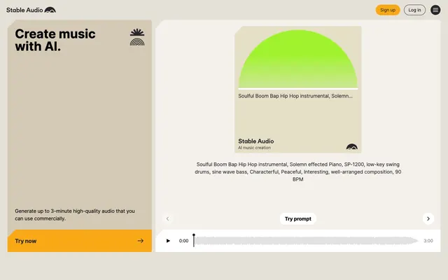
Preview image. Unlock full-res
Warm parchment; vibrant neon bursts.
Color palette
Graphical accent within UI, drawing attention to visual elements.
UI element highlights, emphasizing key data or states.
Primary call-to-action buttons, crucial interactive elements.
Distinctive card background, accent color for specific content areas.
Subtle background for specific interactive blocks.
Highlight and distinct section background, signaling a content shift.
Unique sectional background, providing visual interest.
Primary text, critical icons, high-contrast elements.
Secondary text, button borders, subtle UI accents.
Overlay backgrounds, card surfaces, active states.
Body background, large content sections.
Component backgrounds, subtle borders, dividers.
Section backgrounds, visually separating content blocks.
Typography
- Weights
- 400, 700
- Sizes
- 12px, 14px, 16px, 18px, 20px, 30px, 40px
- Line height
- 1, 1.15, 1.33, 1.5, 1.71, 1.78
- Letter spacing
- -0.0210em, -0.0170em, -0.0150em, -0.0140em, -0.0110em, -0.0060em
- Fallback
- system-ui, sans-serif
The sole typeface, Inter, handles all text roles. Its variable weights provide flexibility, but the consistent family choice ensures cohesion. The subtle negative letter-spacing on larger sizes creates a tighter, more deliberate appearance, while standard spacing on smaller text maintains readability.
Spacing & shape
Components
Rounded pill button with transparent background, 'Midnight Ink' (000000) text (Inter 16px/1.50/400). Border 'Charcoal Accent' (27262b) 1px. Padding 4px vertical, 14px horizontal.
Rounded pill button with 'Clean Canvas' (#ffffff) background, 'Midnight Ink' (000000) text (Inter 16px/1.50/400). Border 'Subtle Ash' (#e2e2e7) 1px. No explicit padding, likely uses inherent text spacing.
Text is Inter 40px/1.00/700 with letter-spacing -0.0210em, in 'Midnight Ink' (#000000).
Text is Inter 16px/1.50/400, in 'Midnight Ink' (#000000).
Background 'Clean Canvas' (#ffffff), border 1px 'Subtle Ash' (#e2e2e7). Border radius 4px. Internal padding varies (e.g. 16px). Contains body text and icon.
Background 'Deep Plum' (#c4bae3), border radius 4px. Contains imagery, heading.
Background 'Goldenrod Pop' (#e1ca46), border radius 4px. Contains imagery, heading.
Square shaped with a 4px border-radius, background colors vary (e.g., 'Vivid Chartreuse' (#a0f32f), 'Goldenrod Pop' (#e1ca46)), containing a semi-circular visual element.
Guidelines
- Use 'Parchment Base' (#f4f1ec) as the default page background.
- Apply 'Midnight Ink' (#000000) for all primary text elements, including headings and body copy.
- Utilize 'Sunset Orange' (#f9a916) exclusively for primary call-to-action buttons, paired with 'Midnight Ink' text.
- Implement a 9999px border-radius for all interactive buttons and input fields to maintain a soft, approachable feel.
- Maintain a 4px border-radius for static containers like cards and images.
- Employ the Inter typeface for all content, selecting weights 400 for body and 700 for headings, adjusting letter-spacing as per type scale.
- Separate major content sections using a `sectionGap` of 64px.
- Do not use dark backgrounds for large content blocks; stick to the light, muted neutral palette.
- Avoid sharp corners on interactive elements; maintain the 9999px radius for buttons and form fields.
- Do not introduce new typefaces; Inter is the sole font allowed.
- Do not add additional drop shadows unless explicitly specified for an overlay; rely on background color changes for hierarchy.
- Avoid complex, multi-color gradients for backgrounds; stick to solid or subtly varying background colors.
- Do not introduce additional vivid accent colors beyond 'Sunset Orange', 'Vivid Chartreuse', and 'Goldenrod Pop' without explicit approval.
About this system
ShowHide
Stable Audio presents a playful and accessible aesthetic built on a foundation of warm, muted neutrals that evoke aged paper, punctuated by vibrant, almost neon, pops of color. This system employs gentle, rounded forms for interactive elements set against a backdrop of crisp, geometric content blocks. The primary contrast comes from a dark, near-black text on these soft backgrounds, giving it a friendly yet structured feel.
The site employs a contained layout with a `pageMaxWidth` of 1764px, centrally aligned. The hero section presents as a split layout: a prominent headline on a 'Parchment Base' background on the left, balanced by an interactive content block on the right. Section rhythm is marked by alternating subtle background colors (e.g., 'Pale Earth', 'Deep Plum', 'Ocean Mist') creating distinct yet flowing content zones. Content arrangement frequently uses a 2-column pattern, with text on one side and a corresponding visual component (like an abstract graphic or product screenshot) on the other. Feature grids are present, likely 3-column. Spacing between sections is generous, lending a comfortable and breathable feel, rather than information-dense blocks. Navigation is a simple top bar with aligned 'Sign up' and 'Log in' buttons, appearing minimal and functional.
The visual language for imagery is characterized by minimalist, geometric abstract shapes acting as placeholders for audio content, frequently rendered in vivid brand colors like 'Vivid Chartreuse' (#a0f32f) or 'Goldenrod Pop' (#e1ca46). These abstract forms (often semi-circles) are contained within square or rectangular frames with a 4px border-radius, giving them a polished, almost 'album art' feel for UI elements. Product screenshots are clean and direct, showing the interface in action without heavy masking or stylized effects. Icons are simple, outlined, and monochromatic, typically in 'Midnight Ink' (#000000), serving a functional rather than decorative role. The overall density is balanced, with imagery serving as clear visual anchors in text-rich sections.
Reminiscent of Framer, Linear, Canva, Webflow.
# Stable Audio — Style Reference
> Warm parchment; vibrant neon bursts.

**Theme:** light

**Site:** https://stableaudio.com

Stable Audio presents a playful and accessible aesthetic built on a foundation of warm, muted neutrals that evoke aged paper, punctuated by vibrant, almost neon, pops of color. This system employs gentle, rounded forms for interactive elements set against a backdrop of crisp, geometric content blocks. The primary contrast comes from a dark, near-black text on these soft backgrounds, giving it a friendly yet structured feel.

## Tokens — Colors

| Name | Value | Token | Role |
|------|------|------|------|
| Vivid Chartreuse | `#a0f32f` | `--color-vivid-chartreuse` | Graphical accent within UI, drawing attention to visual elements. |
| Goldenrod Pop | `#e1ca46` | `--color-goldenrod-pop` | UI element highlights, emphasizing key data or states. |
| Sunset Orange | `#f9a916` | `--color-sunset-orange` | Primary call-to-action buttons, crucial interactive elements. |
| Muted Sage | `#c9d19c` | `--color-muted-sage` | Distinctive card background, accent color for specific content areas. |
| Desert Sand | `#d4c9b4` | `--color-desert-sand` | Subtle background for specific interactive blocks. |
| Deep Plum | `#c4bae3` | `--color-deep-plum` | Highlight and distinct section background, signaling a content shift. |
| Ocean Mist | `#9fc2c7` | `--color-ocean-mist` | Unique sectional background, providing visual interest. |
| Midnight Ink | `#000000` | `--color-midnight-ink` | Primary text, critical icons, high-contrast elements. |
| Charcoal Accent | `#27262b` | `--color-charcoal-accent` | Secondary text, button borders, subtle UI accents. |
| Clean Canvas | `#ffffff` | `--color-clean-canvas` | Overlay backgrounds, card surfaces, active states. |
| Parchment Base | `#f4f1ec` | `--color-parchment-base` | Body background, large content sections. |
| Subtle Ash | `#e2e2e7` | `--color-subtle-ash` | Component backgrounds, subtle borders, dividers. |
| Pale Earth | `#e5dfc8` | `--color-pale-earth` | Section backgrounds, visually separating content blocks. |

## Tokens — Typography

### Inter
- **Substitute:** system-ui, sans-serif
- **Weights:** 400, 700
- **Sizes:** 12px, 14px, 16px, 18px, 20px, 30px, 40px
- **Line height:** 1, 1.15, 1.33, 1.5, 1.71, 1.78
- **Letter spacing:** -0.0210em, -0.0170em, -0.0150em, -0.0140em, -0.0110em, -0.0060em
- **Role:** The sole typeface, Inter, handles all text roles. Its variable weights provide flexibility, but the consistent family choice ensures cohesion. The subtle negative letter-spacing on larger sizes creates a tighter, more deliberate appearance, while standard spacing on smaller text maintains readability.

## Tokens — Type Scale

Minor Third (1.2) from 16px base.

| Role | Size | Line height | Letter spacing |
|------|------|------|------|
| caption | 12px | 1.71 | — |
| body-sm | 14px | 1.71 | -0.011em |
| body | 16px | 1.5 | -0.006em |
| subheading | 18px | 1.33 | -0.014em |
| heading-sm | 20px | 1.33 | -0.015em |
| heading | 30px | 1.15 | -0.017em |
| display | 40px | 1 | -0.021em |

## Tokens — Spacing

- **Max width:** 1764px
- **Section gap:** 64px
- **Card padding:** 24px
- **Element gap:** 8px

## Tokens — Radius

- **Default:** 4px
- **Buttons:** 9999px
- **Cards:** 4px
- **Images:** 4px
- **forms:** 9999px

## Layout

The site employs a contained layout with a `pageMaxWidth` of 1764px, centrally aligned. The hero section presents as a split layout: a prominent headline on a 'Parchment Base' background on the left, balanced by an interactive content block on the right. Section rhythm is marked by alternating subtle background colors (e.g., 'Pale Earth', 'Deep Plum', 'Ocean Mist') creating distinct yet flowing content zones. Content arrangement frequently uses a 2-column pattern, with text on one side and a corresponding visual component (like an abstract graphic or product screenshot) on the other. Feature grids are present, likely 3-column. Spacing between sections is generous, lending a comfortable and breathable feel, rather than information-dense blocks. Navigation is a simple top bar with aligned 'Sign up' and 'Log in' buttons, appearing minimal and functional.

## Imagery

The visual language for imagery is characterized by minimalist, geometric abstract shapes acting as placeholders for audio content, frequently rendered in vivid brand colors like 'Vivid Chartreuse' (#a0f32f) or 'Goldenrod Pop' (#e1ca46). These abstract forms (often semi-circles) are contained within square or rectangular frames with a 4px border-radius, giving them a polished, almost 'album art' feel for UI elements. Product screenshots are clean and direct, showing the interface in action without heavy masking or stylized effects. Icons are simple, outlined, and monochromatic, typically in 'Midnight Ink' (#000000), serving a functional rather than decorative role. The overall density is balanced, with imagery serving as clear visual anchors in text-rich sections.

## Components

### Primary CTA Card

### Feature Toggle Pills + Text-to-Audio Section Card

### Audio Track History List

### Secondary Ghost Button
*Less prominent actions*

Rounded pill button with transparent background, 'Midnight Ink' (000000) text (Inter 16px/1.50/400). Border 'Charcoal Accent' (27262b) 1px. Padding 4px vertical, 14px horizontal.

### Navigation Button
*Header navigation actions*

Rounded pill button with 'Clean Canvas' (#ffffff) background, 'Midnight Ink' (000000) text (Inter 16px/1.50/400). Border 'Subtle Ash' (#e2e2e7) 1px. No explicit padding, likely uses inherent text spacing.

### Section Title (Main)
*Hero and major section headings*

Text is Inter 40px/1.00/700 with letter-spacing -0.0210em, in 'Midnight Ink' (#000000).

### Body Text
*Paragraphs and descriptions*

Text is Inter 16px/1.50/400, in 'Midnight Ink' (#000000).

### Minor Card
*Information blocks, e.g., prompt details*

Background 'Clean Canvas' (#ffffff), border 1px 'Subtle Ash' (#e2e2e7). Border radius 4px. Internal padding varies (e.g. 16px). Contains body text and icon.

### Highlight Card (Purple)
*Visually distinct content sections*

Background 'Deep Plum' (#c4bae3), border radius 4px. Contains imagery, heading.

### Highlight Card (Yellow)
*Highlighting unique features or categories*

Background 'Goldenrod Pop' (#e1ca46), border radius 4px. Contains imagery, heading.

### Image Placeholder
*Visual representation for audio/music*

Square shaped with a 4px border-radius, background colors vary (e.g., 'Vivid Chartreuse' (#a0f32f), 'Goldenrod Pop' (#e1ca46)), containing a semi-circular visual element.

## Guidelines

### Do

- Use 'Parchment Base' (#f4f1ec) as the default page background.
- Apply 'Midnight Ink' (#000000) for all primary text elements, including headings and body copy.
- Utilize 'Sunset Orange' (#f9a916) exclusively for primary call-to-action buttons, paired with 'Midnight Ink' text.
- Implement a 9999px border-radius for all interactive buttons and input fields to maintain a soft, approachable feel.
- Maintain a 4px border-radius for static containers like cards and images.
- Employ the Inter typeface for all content, selecting weights 400 for body and 700 for headings, adjusting letter-spacing as per type scale.
- Separate major content sections using a `sectionGap` of 64px.

### Don't

- Do not use dark backgrounds for large content blocks; stick to the light, muted neutral palette.
- Avoid sharp corners on interactive elements; maintain the 9999px radius for buttons and form fields.
- Do not introduce new typefaces; Inter is the sole font allowed.
- Do not add additional drop shadows unless explicitly specified for an overlay; rely on background color changes for hierarchy.
- Avoid complex, multi-color gradients for backgrounds; stick to solid or subtly varying background colors.
- Do not introduce additional vivid accent colors beyond 'Sunset Orange', 'Vivid Chartreuse', and 'Goldenrod Pop' without explicit approval.

## Agent Prompt Guide

### Quick Color Reference
- Text: #000000 (Midnight Ink)
- Background (Page): #f4f1ec (Parchment Base)
- CTA Button: #f9a916 (Sunset Orange)
- Border (Subtle): #e2e2e7 (Subtle Ash)
- Accent (Highlight Card): #c4bae3 (Deep Plum)

### 3-5 Example Component Prompts
1. **Create a Hero Section:** Use 'Parchment Base' background (#f4f1ec) for the left panel. Set a headline 'Create music with AI.' using Inter 40px, weight 700, line-height 1, letter-spacing -0.021em, color 'Midnight Ink' (#000000). Below it, add a body text 'Generate up to 3-minute high-quality audio...' using Inter 16px, weight 400, line-height 1.5, color 'Midnight Ink'. Include a 'Try now' button matching the 'Primary Action Button' spec.
2. **Generate a Primary Action Button:** Button text 'Try Now'. Background 'Sunset Orange' (#f9a916). Text color 'Midnight Ink' (#000000). Font Inter 16px, weight 400, line-height 1.5. Border radius 9999px. Padding 6px vertical, 16px horizontal.
3. **Design a Secondary Ghost Button:** Button text 'Learn more'. Transparent background. Text color 'Midnight Ink' (#000000). Font Inter 16px, weight 400, line-height 1.5. Border 'Charcoal Accent' (#27262b) 1px. Border radius 9999px. Padding 4px vertical, 14px horizontal.
4. **Build a Highlight Card (Purple):** Full-width card with background set to 'Deep Plum' (#c4bae3). Inner padding of 24px across all sides. Add a heading (e.g. 'Text-to-audio') using Inter 30px, weight 700, line-height 1.15, letter-spacing -0.017em, color 'Midnight Ink'. Include a square image placeholder with 4px border-radius within this card.
5. **Create a Body Text Block:** Render the paragraph 'Soulful Boom Bap Hip Hop instrumental...' using Inter 16px, weight 400, line-height 1.5, letter-spacing -0.006em, color 'Midnight Ink' (#000000).
More like this









Keep what you find
A free account saves references to boards and can send you a weekly email of picks based on what you save.
To see every result, go Pro.