Preview image. Unlock full-res
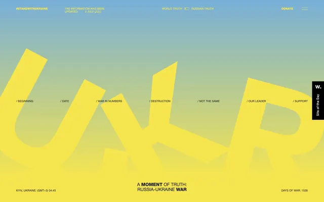
Stark Contrast, Urgent Resolve
Color palette
Yellow accent for outlined action borders, linked labels, and lightweight interactive emphasis
Background for specific hero sections and decorative graphical elements. Represents a secondary, softer component of the national colors, providing a visual counterpoint to the dominant dark theme
Predominant background for canvas and card surfaces, primary text color for headings and body text, and border color for UI elements. Establishes the somber, impactful tone of the site
Secondary text color for content that needs to stand out against dark backgrounds, such as card headers or important statements
Typography
- Weights
- 400, 700
- Sizes
- 12px, 16px, 20px, 28px, 72px, 80px, 168px
- Line height
- 0.86, 1.12, 1.15, 1.2
- Letter spacing
- -0.96px at 72px, 2.4px at 12px
- Fallback
- Arial
Primary typeface for all headings, body text, navigation, and interactive elements. Its strong, sans-serif character supports the site's direct and urgent messaging.
- Weights
- 400
- Sizes
- 12px
- Line height
- 1.12
- Letter spacing
- normal
- Fallback
- Menlo
Used for code snippets and specific data entries where a more monospace, functional presentation is desired for clarity.
Spacing & shape
Components
Transparent background with a 4px `Freedom Yellow` border and `Freedom Yellow` text. Padding is 4px on all sides, with 0px border-radius. One variant has a `20px` border-radius.
Transparent background with a 4px `Deep Night` border and `Deep Night` text. Padding is 4px on all sides, with 0px border-radius.
Text in `Deep Night` or `Freedom Yellow` without explicit borders or background. Appears with 24px vertical padding and varied horizontal spacing.
Background in `Deep Night` with `Deep Night` text, 0px border-radius and 0px padding. Sometimes appears with 16px padding and transparent background.
Transparent background, no shadow, 0px border-radius, and 0px internal padding. Uses `Deep Night` or `Ghost White` as text color depending on contrast needs.
Guidelines
- Prioritize text content readability by using `Deep Night` (#202020) for most text against neutral backgrounds, and `Ghost White` (#ffffff) against `Deep Night` backgrounds.
- Use `Freedom Yellow` (#f6e54e) exclusively for primary interactive elements (outlined buttons, links) and key informational accents to maintain its impact.
- Maintain a spacious layout with `32px` vertical gaps between major sections and `8px` between smaller elements.
- Apply `0px` border-radius for general UI components like cards and text containers, reserving `20px` for specific button variants.
- Employ the Helvetica Neue Cyr font family for all primary text, leveraging its bold weights for headings and wider letter-spacing for dramatic effect.
- Use transparent backgrounds and `Freedom Yellow` (#f6e54e) borders for call-to-action buttons, avoiding solid fills to maintain a lightweight, urgent feel.
- Feature large, impactful headlines (72px or 168px) with tight line heights and significant negative letter-spacing for a sculptural, authoritative presence.
- Do not introduce new saturated accent colors beyond `Freedom Yellow` (#f6e54e) and `Sky Blue` (#77afd8) to preserve the stark brand identity.
- Avoid solid background fills for interactive buttons; use the outlined style with `Freedom Yellow` (#f6e54e) to signify interactivity.
- Do not use subtle elevation or shadows on card components; maintain a flat aesthetic for content containers.
- Refrain from using decorative gradients or complex visual textures, as the system relies on stark contrasts and direct presentation.
- Do not use generic system fonts; stick to Helvetica Neue Cyr and Nitti-Normal to uphold the unique typographic voice.
- Avoid dense information blocks; use generous spacing and clear divisions to ensure content is easily digestible.
- Do not dilute the contrast by placing light text on `Sky Blue` (#77afd8) backgrounds, as the contrast ratio is insufficient (`2.4:1`).
About this system
ShowHide
The #standwithukraine design system conveys a sense of urgent, stark information delivery. It utilizes a striking contrast between dark backgrounds and vivid yellow accents, evoking the Ukrainian flag. Typography is dominant and forceful, often with wide letter-spacing, set against minimal UI elements. The overall aesthetic is raw and direct, prioritizing message over decorative flourishes, with a spacious, almost sparse layout that reinforces the gravity of the content.
The page exhibits a full-bleed layout contrasting with sections restricted by a max-width, suggesting a hybrid model that maximizes impact for key sections while containing detailed content. The hero section leverages a full-viewport gradient background with centered, large-scale typographic elements. Sections typically stack vertically with consistent `32px` gaps, utilizing alternating color bands (dark canvas, yellow accents). Content is often arranged in centered stacks or simple text blocks, with a notable absence of complex grid structures for features, instead relying on clear hierarchical typography. Navigation is via a fixed top bar and a prominent vertical side navigation, both minimalistic.
The site predominantly uses abstract, large-scale typography and graphic elements over traditional imagery. When present, images appear as background elements or within cards, treated with a stark, often monochromatic filter that aligns with the overall somber mood. Icons are minimal, outlined, and monochromatic, primarily serving functional navigation. The visual density is image-light, focusing on text as the primary informational and emotional carrier.
Reminiscent of Amnesty International, The New York Times (digital edition), The Intercept, WIRED (older designs).
# #standwithukraine — Style Reference
> Stark Contrast, Urgent Resolve

**Theme:** dark

**Site:** https://theothersideoftruth.com

The #standwithukraine design system conveys a sense of urgent, stark information delivery. It utilizes a striking contrast between dark backgrounds and vivid yellow accents, evoking the Ukrainian flag. Typography is dominant and forceful, often with wide letter-spacing, set against minimal UI elements. The overall aesthetic is raw and direct, prioritizing message over decorative flourishes, with a spacious, almost sparse layout that reinforces the gravity of the content.

## Tokens — Colors

| Name | Value | Token | Role |
|------|------|------|------|
| Freedom Yellow | `#f6e54e` | `--color-freedom-yellow` | Yellow accent for outlined action borders, linked labels, and lightweight interactive emphasis |
| Sky Blue | `#77afd8` | `--color-sky-blue` | Background for specific hero sections and decorative graphical elements. Represents a secondary, softer component of the national colors, providing a visual counterpoint to the dominant dark theme |
| Deep Night | `#202020` | `--color-deep-night` | Predominant background for canvas and card surfaces, primary text color for headings and body text, and border color for UI elements. Establishes the somber, impactful tone of the site |
| Ghost White | `#ffffff` | `--color-ghost-white` | Secondary text color for content that needs to stand out against dark backgrounds, such as card headers or important statements |

## Tokens — Typography

### Helvetica Neue Cyr
- **Substitute:** Arial
- **Weights:** 400, 700
- **Sizes:** 12px, 16px, 20px, 28px, 72px, 80px, 168px
- **Line height:** 0.86, 1.12, 1.15, 1.2
- **Letter spacing:** -0.96px at 72px, 2.4px at 12px
- **Role:** Primary typeface for all headings, body text, navigation, and interactive elements. Its strong, sans-serif character supports the site's direct and urgent messaging.

### Nitti-Normal
- **Substitute:** Menlo
- **Weights:** 400
- **Sizes:** 12px
- **Line height:** 1.12
- **Letter spacing:** normal
- **Role:** Used for code snippets and specific data entries where a more monospace, functional presentation is desired for clarity.

## Tokens — Type Scale

| Role | Size | Line height | Letter spacing |
|------|------|------|------|
| caption | 12px | 1.12 | 0.24px |
| body | 16px | 1.15 | — |
| subheading | 20px | 1.15 | — |
| heading | 28px | 1.15 | — |
| heading-lg | 72px | 0.86 | -0.96px |
| display | 168px | 0.86 | 79px |

## Tokens — Spacing

- **Section gap:** 32px
- **Card padding:** 16px
- **Element gap:** 8px

## Tokens — Radius

- **Buttons:** 20px

## Layout

The page exhibits a full-bleed layout contrasting with sections restricted by a max-width, suggesting a hybrid model that maximizes impact for key sections while containing detailed content. The hero section leverages a full-viewport gradient background with centered, large-scale typographic elements. Sections typically stack vertically with consistent `32px` gaps, utilizing alternating color bands (dark canvas, yellow accents). Content is often arranged in centered stacks or simple text blocks, with a notable absence of complex grid structures for features, instead relying on clear hierarchical typography. Navigation is via a fixed top bar and a prominent vertical side navigation, both minimalistic.

## Imagery

The site predominantly uses abstract, large-scale typography and graphic elements over traditional imagery. When present, images appear as background elements or within cards, treated with a stark, often monochromatic filter that aligns with the overall somber mood. Icons are minimal, outlined, and monochromatic, primarily serving functional navigation. The visual density is image-light, focusing on text as the primary informational and emotional carrier.

## Components

### Outlined CTA Button
*Primary call to action.*

Transparent background with a 4px `Freedom Yellow` border and `Freedom Yellow` text. Padding is 4px on all sides, with 0px border-radius. One variant has a `20px` border-radius.

### Neutral Outlined Button
*Secondary call to action.*

Transparent background with a 4px `Deep Night` border and `Deep Night` text. Padding is 4px on all sides, with 0px border-radius.

### Navigation Link
*Primary site navigation.*

Text in `Deep Night` or `Freedom Yellow` without explicit borders or background. Appears with 24px vertical padding and varied horizontal spacing.

### Info Badge
*Informational highlight.*

Background in `Deep Night` with `Deep Night` text, 0px border-radius and 0px padding. Sometimes appears with 16px padding and transparent background.

### Text Card
*Container for content sections.*

Transparent background, no shadow, 0px border-radius, and 0px internal padding. Uses `Deep Night` or `Ghost White` as text color depending on contrast needs.

## Guidelines

### Do

- Prioritize text content readability by using `Deep Night` (#202020) for most text against neutral backgrounds, and `Ghost White` (#ffffff) against `Deep Night` backgrounds.
- Use `Freedom Yellow` (#f6e54e) exclusively for primary interactive elements (outlined buttons, links) and key informational accents to maintain its impact.
- Maintain a spacious layout with `32px` vertical gaps between major sections and `8px` between smaller elements.
- Apply `0px` border-radius for general UI components like cards and text containers, reserving `20px` for specific button variants.
- Employ the Helvetica Neue Cyr font family for all primary text, leveraging its bold weights for headings and wider letter-spacing for dramatic effect.
- Use transparent backgrounds and `Freedom Yellow` (#f6e54e) borders for call-to-action buttons, avoiding solid fills to maintain a lightweight, urgent feel.
- Feature large, impactful headlines (72px or 168px) with tight line heights and significant negative letter-spacing for a sculptural, authoritative presence.

### Don't

- Do not introduce new saturated accent colors beyond `Freedom Yellow` (#f6e54e) and `Sky Blue` (#77afd8) to preserve the stark brand identity.
- Avoid solid background fills for interactive buttons; use the outlined style with `Freedom Yellow` (#f6e54e) to signify interactivity.
- Do not use subtle elevation or shadows on card components; maintain a flat aesthetic for content containers.
- Refrain from using decorative gradients or complex visual textures, as the system relies on stark contrasts and direct presentation.
- Do not use generic system fonts; stick to Helvetica Neue Cyr and Nitti-Normal to uphold the unique typographic voice.
- Avoid dense information blocks; use generous spacing and clear divisions to ensure content is easily digestible.
- Do not dilute the contrast by placing light text on `Sky Blue` (#77afd8) backgrounds, as the contrast ratio is insufficient (`2.4:1`).

## Agent Prompt Guide

Quick Color Reference:
text: #202020
background: #202020
border: #202020
accent: #f6e54e
primary action: #f6e54e (outlined action border)

Example Component Prompts:
1. Create a hero section: Full-bleed `Sky Blue` (#77afd8) background for the top. Centered headline 'A MOMENT OF TRUTH' in Helvetica Neue Cyr bold, `Ghost White` (#ffffff), 72px size, 0.86 line-height, -0.96px letter-spacing. Subheading 'RUSSIA-UKRAINE WAR' in Helvetica Neue Cyr regular, `Ghost White` (#ffffff), 28px size, 1.15 line-height.
2. Create an Outlined Primary Action: Transparent background, #f6e54e border and text, 9999px radius, compact pill padding. Use it for the main CTA instead of a filled button.
3. Create a navigation item: `/beginning` text in Helvetica Neue Cyr regular, `Freedom Yellow` (#f6e45e), 16px size, 24px vertical padding. Transparent background, no border.
4. Create a text card for statistics: `Deep Night` (#202020) background. 'UKRAINE ARMY' heading in Helvetica Neue Cyr bold, `Ghost White` (#ffffff), 28px size, 1.15 line-height. Body text 'IBAK:' in Nitti-Normal regular, `Ghost White` (#ffffff), 12px size, 1.12 line-height. Card has 0px radius and 0px padding.
More like this








Keep what you find
A free account saves references to boards and can send you a weekly email of picks based on what you save.
To see every result, go Pro.