Preview image. Unlock full-res
Soft-edged transparency on cloud-white
Color palette
Accent color for important headings, icons, and decorative fills — a primary brand splash
Accent stroke for graphics and illustrations, hints at technical sophistication
Border and text for ghost buttons and interactive elements, a deep, muted action color
Vivid linear gradient used for dynamic background effects or highlighting specific content areas with vibrant color transitions
Subtle linear gradient used for soft overlays or to add depth to background elements, enhancing the light and airy feel
Primary page background, provides a soft, warm-neutral base
Subtle background for UI elements, creates a slight separation from the canvas
Dominant text color for headings and body content, ensures high contrast on light backgrounds
Decorative fills primarily for subtle background graphics and UI elements, contributes to the light, desaturated aesthetic
Muted border color, helper text, and secondary link states, offering softer visual weight than Graphite
Light borders for subtle separation and decorative elements, harmonizes with the soft UI palette
Typography
- Weights
- 400, 500, 600, 700, 800
- Sizes
- 14px, 15px, 16px, 17px, 19px, 27px, 28px, 50px, 53px, 62px, 98px
- Line height
- 1, 1.1, 1.15, 1.2, 1.25, 1.35, 1.4
- Letter spacing
- -0.21, -0.23, -0.26, -0.28, -0.32, -0.44, -0.45, -0.8, -0.85, -1, -1.57
- Fallback
- system-ui, sans-serif
Primary typeface for all elements, from headings to body text and buttons. It offers a compact, modern feel with precise letter-spacing, ensuring readability and a sleek aesthetic across all scales. The controlled letter-spacing on larger sizes gives headlines a confident, understated presence.
Spacing & shape
Elevation
Components
Text: Midnight Indigo Outline (#3a4766) on a transparent background, bordered with Midnight Indigo Outline (#3a4766), very rounded corners (100px radius). Padding: 13px vertical, 30px horizontal. Font: averta standard, weight 400.
Background: rgba(83, 116, 152, 0.07). Border Radius: 18px. Shadow: rgba(97, 110, 124, 0.114) 0px 4px 15px 0px, rgba(255, 255, 255, 0.39) 0px 1px 1px 0px inset, rgba(34, 50, 94, 0.08) 0px 1px 1px 0px. No internal padding.
Padded with 16px vertically. Icon in Luminescent Violet (#995bb9). Text in Graphite (#000000) for main points, Slate (#9aa1b2) for descriptions. Uses averta standard font.
Background: transparent. No border radius, no shadow. Padding varies by content, no intrinsic styling.
Guidelines
- Use Canvas (#e0dde2) for primary backgrounds to maintain the light and airy theme.
- Apply a 100px border radius to all buttons and tags to create a consistent, soft, 'pill' shape.
- For primary headings, use Luminescent Violet (#995bb9) with averta standard weight 800 at appropriate scale sizes.
- Employ the Soft Card shadow (rgba(97, 110, 124, 0.114) 0px 4px 15px 0px with insets) for all elevated containers to achieve delicate depth.
- Ensure letter-spacing is applied precisely from the Typography tokens, especially for larger text, to maintain the sophisticated, compact feel (e.g., -1.57px at 98px).
- Separate sections with a `sectionGap` of 40px to provide comfortable visual breaks.
- Avoid heavy drop shadows or opaque backgrounds that would counteract the light and transparent aesthetic.
- Do not use saturated colors for large UI areas; chromatic colors are reserved for accents and small functional elements.
- Do not deviate from the averta standard font family or its specified weights and letter-spacing for UI text.
- Avoid sharp corners; all UI components should feature rounded corners, preferably 18px or 22px defaults, or 100px for pill shapes.
- Do not introduce new border colors for interactive elements; use Midnight Indigo Outline (#3a4766) for ghost action borders.
- Do not overuse bold weights; reserve averta standard 800 primarily for main headings.
About this system
ShowHide
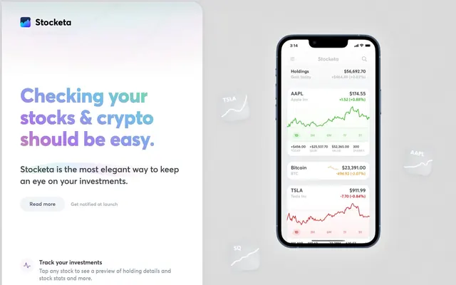
Stocketa presents a focused financial interface with a light, almost ethereal feel. Its design language is dominated by soft, rounded forms and transparent components, creating a sense of lightness and openness. Color is used sparingly, primarily for functional accents and a subtle brand gradient, letting the content breathe. Typography is compact and precise, maintaining clarity within dense information displays, while nuanced shadows and inset effects give components a sophisticated, layered depth without heaviness.
The page primarily uses a max-width contained layout, centered on a light canvas. The hero section features a prominent, large headline in the Brand Gradient area, positioned centrally on the left, juxtaposed with a product showcase on the right. Subsequent sections follow a consistent vertical rhythm with minimal content density, using comfortable spacing. Content is largely presented as centered stacks of text with occasional feature lists, each item often accompanied by an icon. There's a subtle grid implied by the arrangement of features, but without hard lines. Navigation appears to be a minimal top bar, suggesting an application-focused approach.
The site uses a blend of abstract 3D elements and realistic product screenshots. Product screenshots are cleanly displayed within device frames, demonstrating functionality in a direct, uncluttered manner. Abstract 3D elements, characterized by soft, rounded, light gray forms, mimic organic shapes like pebbles or softly worn artifacts. These are used decoratively in the background, interacting with subtle light and shadow to create a sense of depth and modernity. Icons are outlined, featuring smooth, continuous strokes and are typically monochromatic or highlighted with Luminescent Violet. Visuals play a subtle, atmospheric role rather than a dominant, content-heavy one.
Reminiscent of Rize, Copilot Money, Wealthfront, Amie.
# Stocketa — Style Reference
> Soft-edged transparency on cloud-white

**Theme:** light

**Site:** https://stocketa.com

Stocketa presents a focused financial interface with a light, almost ethereal feel. Its design language is dominated by soft, rounded forms and transparent components, creating a sense of lightness and openness. Color is used sparingly, primarily for functional accents and a subtle brand gradient, letting the content breathe. Typography is compact and precise, maintaining clarity within dense information displays, while nuanced shadows and inset effects give components a sophisticated, layered depth without heaviness.

## Tokens — Colors

| Name | Value | Token | Role |
|------|------|------|------|
| Luminescent Violet | `#995bb9` | `--color-luminescent-violet` | Accent color for important headings, icons, and decorative fills — a primary brand splash |
| Blue Violet | `#5b638c` | `--color-blue-violet` | Accent stroke for graphics and illustrations, hints at technical sophistication |
| Midnight Indigo Outline | `#3a4766` | `--color-midnight-indigo-outline` | Border and text for ghost buttons and interactive elements, a deep, muted action color |
| Highlight Gradient | `#60eb8c` | `--color-highlight-gradient` | Vivid linear gradient used for dynamic background effects or highlighting specific content areas with vibrant color transitions |
| Faint Blue Overlay | `#84a1d0` | `--color-faint-blue-overlay` | Subtle linear gradient used for soft overlays or to add depth to background elements, enhancing the light and airy feel |
| Canvas | `#e0dde2` | `--color-canvas` | Primary page background, provides a soft, warm-neutral base |
| Ash | `#f0f0f0` | `--color-ash` | Subtle background for UI elements, creates a slight separation from the canvas |
| Graphite | `#000000` | `--color-graphite` | Dominant text color for headings and body content, ensures high contrast on light backgrounds |
| Stone Gray | `#abbdcf` | `--color-stone-gray` | Decorative fills primarily for subtle background graphics and UI elements, contributes to the light, desaturated aesthetic |
| Slate | `#9aa1b2` | `--color-slate` | Muted border color, helper text, and secondary link states, offering softer visual weight than Graphite |
| Cloud Mist | `#a5afcb` | `--color-cloud-mist` | Light borders for subtle separation and decorative elements, harmonizes with the soft UI palette |

## Tokens — Typography

### averta standard
- **Substitute:** system-ui, sans-serif
- **Weights:** 400, 500, 600, 700, 800
- **Sizes:** 14px, 15px, 16px, 17px, 19px, 27px, 28px, 50px, 53px, 62px, 98px
- **Line height:** 1, 1.1, 1.15, 1.2, 1.25, 1.35, 1.4
- **Letter spacing:** -0.21, -0.23, -0.26, -0.28, -0.32, -0.44, -0.45, -0.8, -0.85, -1, -1.57
- **Role:** Primary typeface for all elements, from headings to body text and buttons. It offers a compact, modern feel with precise letter-spacing, ensuring readability and a sleek aesthetic across all scales. The controlled letter-spacing on larger sizes gives headlines a confident, understated presence.

## Tokens — Type Scale

Perfect Fifth (1.5) from 16px base.

| Role | Size | Line height | Letter spacing |
|------|------|------|------|
| caption | 14px | 1.4 | -0.21px |
| body | 16px | 1.4 | -0.26px |
| subheading | 19px | 1.25 | -0.32px |
| heading | 27px | 1.2 | -0.44px |
| heading-lg | 53px | 1.15 | -0.85px |
| display | 98px | 1 | -1.57px |

## Tokens — Spacing

- **Section gap:** 40px
- **Card padding:** 14px
- **Element gap:** 16px

## Tokens — Radius

- **Default:** 22px
- **Buttons:** 100px
- **Cards:** 18px
- **pill:** 100px

## Tokens — Elevation

- **Soft Card:** `rgba(97, 110, 124, 0.114) 0px 4px 15px 0px, rgba(255, 255, 255, 0.39) 0px 1px 1px 0px inset, rgba(34, 50, 94, 0.08) 0px 1px 1px 0px`

## Layout

The page primarily uses a max-width contained layout, centered on a light canvas. The hero section features a prominent, large headline in the Brand Gradient area, positioned centrally on the left, juxtaposed with a product showcase on the right. Subsequent sections follow a consistent vertical rhythm with minimal content density, using comfortable spacing. Content is largely presented as centered stacks of text with occasional feature lists, each item often accompanied by an icon. There's a subtle grid implied by the arrangement of features, but without hard lines. Navigation appears to be a minimal top bar, suggesting an application-focused approach.

## Imagery

The site uses a blend of abstract 3D elements and realistic product screenshots. Product screenshots are cleanly displayed within device frames, demonstrating functionality in a direct, uncluttered manner. Abstract 3D elements, characterized by soft, rounded, light gray forms, mimic organic shapes like pebbles or softly worn artifacts. These are used decoratively in the background, interacting with subtle light and shadow to create a sense of depth and modernity. Icons are outlined, featuring smooth, continuous strokes and are typically monochromatic or highlighted with Luminescent Violet. Visuals play a subtle, atmospheric role rather than a dominant, content-heavy one.

## Components

### Ghost Action Button
*Secondary call to action or navigation link.*

Text: Midnight Indigo Outline (#3a4766) on a transparent background, bordered with Midnight Indigo Outline (#3a4766), very rounded corners (100px radius). Padding: 13px vertical, 30px horizontal. Font: averta standard, weight 400.

### Soft Card
*Container for content, elevated slightly from the background.*

Background: rgba(83, 116, 152, 0.07). Border Radius: 18px. Shadow: rgba(97, 110, 124, 0.114) 0px 4px 15px 0px, rgba(255, 255, 255, 0.39) 0px 1px 1px 0px inset, rgba(34, 50, 94, 0.08) 0px 1px 1px 0px. No internal padding.

### Feature List Item
*Padded container for individual features or information blocks.*

Padded with 16px vertically. Icon in Luminescent Violet (#995bb9). Text in Graphite (#000000) for main points, Slate (#9aa1b2) for descriptions. Uses averta standard font.

### Content Card (No Shadow)
*Simple, flat content area on the page background.*

Background: transparent. No border radius, no shadow. Padding varies by content, no intrinsic styling.

## Guidelines

### Do

- Use Canvas (#e0dde2) for primary backgrounds to maintain the light and airy theme.
- Apply a 100px border radius to all buttons and tags to create a consistent, soft, 'pill' shape.
- For primary headings, use Luminescent Violet (#995bb9) with averta standard weight 800 at appropriate scale sizes.
- Employ the Soft Card shadow (rgba(97, 110, 124, 0.114) 0px 4px 15px 0px with insets) for all elevated containers to achieve delicate depth.
- Ensure letter-spacing is applied precisely from the Typography tokens, especially for larger text, to maintain the sophisticated, compact feel (e.g., -1.57px at 98px).
- Separate sections with a `sectionGap` of 40px to provide comfortable visual breaks.

### Don't

- Avoid heavy drop shadows or opaque backgrounds that would counteract the light and transparent aesthetic.
- Do not use saturated colors for large UI areas; chromatic colors are reserved for accents and small functional elements.
- Do not deviate from the averta standard font family or its specified weights and letter-spacing for UI text.
- Avoid sharp corners; all UI components should feature rounded corners, preferably 18px or 22px defaults, or 100px for pill shapes.
- Do not introduce new border colors for interactive elements; use Midnight Indigo Outline (#3a4766) for ghost action borders.
- Do not overuse bold weights; reserve averta standard 800 primarily for main headings.

## Agent Prompt Guide

Quick Color Reference:
text: #000000
background: #e0dde2
border: #9aa1b2
accent: #995bb9
primary action: #3a4766 (outlined action border)

Example Component Prompts:
1. Create an Outlined Primary Action: Transparent background, #3a4766 border and text, 9999px radius, compact pill padding. Use it for the main CTA instead of a filled button.
2. Create a content section with a Soft Card: Background is Canvas (#e0dde2). Inside the Soft Card, place a subheading (averta standard, 19px, weight 600, #000000, letter-spacing -0.32px) and a body element (averta standard, 16px, weight 400, #000000, letter-spacing -0.26px). The card's border radius is 18px and uses the Soft Card shadow.
3. Create a feature list: Use Canvas (#e0dde2) background. Each feature item should have an outlined icon in Luminescent Violet (#995bb9), followed by a body text description (averta standard, 16px, weight 400, #000000, letter-spacing -0.26px). Each item should have 16px vertical padding, with 16px `elementGap` between items.
More like this








Keep what you find
A free account saves references to boards and can send you a weekly email of picks based on what you save.
To see every result, go Pro.