Preview image. Unlock full-res
Architectural blueprint on white marble.
Color palette
Primary calls to action (buttons, links), active states, significant icons — establishes brand presence and emphasizes interaction
Border for ghost buttons, subtle accents
Decorative icons, gradient highlights, sub-brand accents
Green outline accent for tags, dividers, and focused UI edges
Orange outline accent for tags, dividers, and focused UI edges.
Decorative gradients in hero sections and product showcases, adding a dynamic, abstract visual element
Abstract background graphics, product display panels, adding depth and a tech-centric feel
Decorative illustration elements, feature highlights
Primary text, critical headings, icons, primary button text for ghost buttons
Secondary text, muted links, subtle borders, descriptive captions
Tertiary text, placeholder text, inactive states, subtle dividers
Page backgrounds, card surfaces, primary button text against dark backgrounds
Secondary card surfaces, subtle background variations
Background for secondary sections, light card backgrounds
Horizontal rules, subtle borders, graphical elements
Typography
- Weights
- 300, 400
- Sizes
- 8px, 9px, 10px, 11px, 12px, 14px, 16px, 18px, 20px, 22px, 26px, 32px, 34px, 44px, 48px, 56px
- Line height
- 0.8, 0.85, 1, 1.03, 1.07, 1.1, 1.12, 1.15, 1.2, 1.25, 1.3, 1.33, 1.4, 1.43, 1.45, 1.5
- Letter spacing
- -0.0300em at 56px, -0.0250em at 48px, -0.0090em at 18px
- Fallback
- system-ui, sans-serif
The primary typeface for all content. Weight 300 is used for large, impactful headlines, creating a sense of understated authority rather than shouting. Weight 400 is standard for body text, ensuring clarity and readability. The 'ss01' feature provides alternative character forms, and 'tnum' ensures tabular figures align numerically.
Spacing & shape
Elevation
Components
Background: Deep Violet (#533afd), Text: Platinum White (#ffffff), Border: 4px radius, Padding: 15.5px vertical, 24px horizontal. Sohne-var weight 400.
Background: transparent, Text: Midnight Ink (#061b31), Border: 0px, Padding: 12px vertical, 0px horizontal. Sohne-var weight 400.
Background: transparent, Text: Deep Violet (#533afd), Border: Washed Violet (#b9b9f9), 4px radius, Padding: 14.5px vertical, 24px horizontal. Sohne-var weight 400.
Background: Powder Blue (#e5edf5), Border: none, 6px radius, Padding: 12px.
Background: Porcelain White (#f8fafd), Border: none, 6px radius, Box Shadow: rgba(0, 0, 0, 0.2) 0px 0px 32px 8px. Padding: 12px.
Text: Midnight Ink (#061b31), Underline: none on hover, Padding: 0px.
Guidelines
- Use Platinum White (#ffffff) as the default page background for most sections.
- Apply Deep Violet (#533afd) specifically for primary interactive elements, ensuring strong visual call to action.
- Employ sohne-var weight 300 for all display and large heading typography to maintain a refined, impactful presence.
- Keep card surfaces subtle, using Powder Blue (#e5edf5) or Porcelain White (#f8fafd) with soft 6px rounded corners.
- Utilize -0.0300em letter-spacing for large text (56px) to maintain a cohesive, modern typographic aesthetic.
- Implement radial and linear gradients for hero banners and product showcases to add dynamic visual interest without overwhelming the UI.
- Maintain a clear elementGap of 8px for logical grouping of related UI elements.
- Do not use saturated colors for large areas or text unless they are part of a decorative gradient or a specific accent.
- Avoid using hard, sharp shadows; prefer soft, diffused shadows like rgba(0, 0, 0, 0.2) 0px 0px 32px 8px for elevation.
- Do not introduce new font families; sohne-var is the sole typeface for all typographic needs.
- Refrain from using border radii other than 4px and 6px for interactive components and cards, respectively.
- Do not use generic blue for links or buttons; Deep Violet (#533afd) is the designated action color.
- Avoid high-contrast, bold headlines; the system relies on lighter weights (300, 400) even for large text.
- Do not vary line heights significantly from the established typographic scale; ensure dense, compact text blocks for body copy and tighter leads for headlines.
About this system
ShowHide
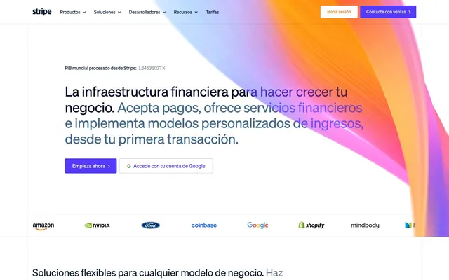
Stripe's design system evokes a digital command center on a clean canvas. It combines a serene white background with structured grid layouts and a single vibrant violet to highlight actions and key information. Subtle shadows provide soft elevation, preventing elements from feeling flat, while compact typography paired with highly descriptive gradients for hero sections and product showcases adds visual depth without clutter. The overall effect is one of quiet efficiency, where information is paramount, and interactions are clearly signposted.
The page primarily uses a max-width contained layout, though the hero section often employs full-bleed vibrant gradients to establish a dynamic visual anchor. Sections exhibit a comfortable vertical rhythm, with consistent spacing and a blend of centered content stacks and alternating text-left/image-right arrangements. Feature sets are often presented in multi-column card grids, supporting compact information delivery. Navigation is handled by a sticky top bar with clearly defined interactive elements.
The site uses a combination of abstract, vibrant gradients for hero sections and product showcases (e.g., radial-gradient using Deep Violet, pinks, and light blues), and clean, contained product screenshots that are often presented within device mockups. For illustrative purposes, icons are outlined or filled with brand colors, maintaining a minimal yet functional aesthetic. Imagery serves primarily as decorative atmosphere and product showcase, with a lesser emphasis on photography, emphasizing a more technical and abstract visual story.
Reminiscent of Linear, Figma, Vercel, Notion.
# Stripe — Style Reference
> Architectural blueprint on white marble.

**Theme:** light

**Site:** https://stripe.com

Stripe's design system evokes a digital command center on a clean canvas. It combines a serene white background with structured grid layouts and a single vibrant violet to highlight actions and key information. Subtle shadows provide soft elevation, preventing elements from feeling flat, while compact typography paired with highly descriptive gradients for hero sections and product showcases adds visual depth without clutter. The overall effect is one of quiet efficiency, where information is paramount, and interactions are clearly signposted.

## Tokens — Colors

| Name | Value | Token | Role |
|------|------|------|------|
| Deep Violet | `#533afd` | `--color-deep-violet` | Primary calls to action (buttons, links), active states, significant icons — establishes brand presence and emphasizes interaction |
| Washed Violet | `#b9b9f9` | `--color-washed-violet` | Border for ghost buttons, subtle accents |
| Soft Violet | `#8087ff` | `--color-soft-violet` | Decorative icons, gradient highlights, sub-brand accents |
| Accent Green | `#81b81a` | `--color-accent-green` | Green outline accent for tags, dividers, and focused UI edges |
| Vibrant Orange | `#ff6118` | `--color-vibrant-orange` | Orange outline accent for tags, dividers, and focused UI edges. |
| Sunburst Gradient | `#ffbb00` | `--color-sunburst-gradient` | Decorative gradients in hero sections and product showcases, adding a dynamic, abstract visual element |
| Dreamy Gradient | `#7f7dc8` | `--color-dreamy-gradient` | Abstract background graphics, product display panels, adding depth and a tech-centric feel |
| Fuchsia Glow Gradient | `#ff2ede` | `--color-fuchsia-glow-gradient` | Decorative illustration elements, feature highlights |
| Midnight Ink | `#061b31` | `--color-midnight-ink` | Primary text, critical headings, icons, primary button text for ghost buttons |
| Slate Blue | `#50617a` | `--color-slate-blue` | Secondary text, muted links, subtle borders, descriptive captions |
| Ghost Gray | `#64748d` | `--color-ghost-gray` | Tertiary text, placeholder text, inactive states, subtle dividers |
| Platinum White | `#ffffff` | `--color-platinum-white` | Page backgrounds, card surfaces, primary button text against dark backgrounds |
| Porcelain White | `#f8fafd` | `--color-porcelain-white` | Secondary card surfaces, subtle background variations |
| Powder Blue | `#e5edf5` | `--color-powder-blue` | Background for secondary sections, light card backgrounds |
| Stone Gray | `#d8d6df` | `--color-stone-gray` | Horizontal rules, subtle borders, graphical elements |

## Tokens — Typography

### sohne-var
- **Substitute:** system-ui, sans-serif
- **Weights:** 300, 400
- **Sizes:** 8px, 9px, 10px, 11px, 12px, 14px, 16px, 18px, 20px, 22px, 26px, 32px, 34px, 44px, 48px, 56px
- **Line height:** 0.8, 0.85, 1, 1.03, 1.07, 1.1, 1.12, 1.15, 1.2, 1.25, 1.3, 1.33, 1.4, 1.43, 1.45, 1.5
- **Letter spacing:** -0.0300em at 56px, -0.0250em at 48px, -0.0090em at 18px
- **Role:** The primary typeface for all content. Weight 300 is used for large, impactful headlines, creating a sense of understated authority rather than shouting. Weight 400 is standard for body text, ensuring clarity and readability. The 'ss01' feature provides alternative character forms, and 'tnum' ensures tabular figures align numerically.

## Tokens — Type Scale

Perfect Fourth (1.333) from 14px base.

| Role | Size | Line height | Letter spacing |
|------|------|------|------|
| caption | 11px | 1.45 | 0.03em |
| body | 14px | 1.4 | 0.003em |
| subheading | 18px | 1.25 | -0.009em |
| heading-sm | 22px | 1.2 | -0.01em |
| heading | 32px | 1.15 | -0.02em |
| heading-lg | 44px | 1.1 | -0.025em |
| display | 56px | 1.07 | -0.03em |

## Tokens — Spacing

- **Section gap:** 64px
- **Card padding:** 12px
- **Element gap:** 8px

## Tokens — Radius

- **Buttons:** 4px
- **Inputs:** 4px
- **Cards:** 6px
- **Images:** 4px
- **tags:** 4px

## Tokens — Elevation

- **Feature Card:** `rgba(0, 0, 0, 0.2) 0px 0px 32px 8px`
- **Hovered Card:** `rgba(50, 50, 93, 0.12) 0px 16px 32px 0px`

## Layout

The page primarily uses a max-width contained layout, though the hero section often employs full-bleed vibrant gradients to establish a dynamic visual anchor. Sections exhibit a comfortable vertical rhythm, with consistent spacing and a blend of centered content stacks and alternating text-left/image-right arrangements. Feature sets are often presented in multi-column card grids, supporting compact information delivery. Navigation is handled by a sticky top bar with clearly defined interactive elements.

## Imagery

The site uses a combination of abstract, vibrant gradients for hero sections and product showcases (e.g., radial-gradient using Deep Violet, pinks, and light blues), and clean, contained product screenshots that are often presented within device mockups. For illustrative purposes, icons are outlined or filled with brand colors, maintaining a minimal yet functional aesthetic. Imagery serves primarily as decorative atmosphere and product showcase, with a lesser emphasis on photography, emphasizing a more technical and abstract visual story.

## Components

### Primary Filled Button
*Main call to action.*

Background: Deep Violet (#533afd), Text: Platinum White (#ffffff), Border: 4px radius, Padding: 15.5px vertical, 24px horizontal. Sohne-var weight 400.

### Ghost Button
*Secondary action. Low visual hierarchy.*

Background: transparent, Text: Midnight Ink (#061b31), Border: 0px, Padding: 12px vertical, 0px horizontal. Sohne-var weight 400.

### Outlined Button
*Tertiary action.*

Background: transparent, Text: Deep Violet (#533afd), Border: Washed Violet (#b9b9f9), 4px radius, Padding: 14.5px vertical, 24px horizontal. Sohne-var weight 400.

### Default Card
*Content container for features and information.*

Background: Powder Blue (#e5edf5), Border: none, 6px radius, Padding: 12px.

### Feature Card
*Highlighting key features or product aspects.*

Background: Porcelain White (#f8fafd), Border: none, 6px radius, Box Shadow: rgba(0, 0, 0, 0.2) 0px 0px 32px 8px. Padding: 12px.

### Primary Navigation Link
*Top-level navigation item.*

Text: Midnight Ink (#061b31), Underline: none on hover, Padding: 0px.

## Guidelines

### Do

- Use Platinum White (#ffffff) as the default page background for most sections.
- Apply Deep Violet (#533afd) specifically for primary interactive elements, ensuring strong visual call to action.
- Employ sohne-var weight 300 for all display and large heading typography to maintain a refined, impactful presence.
- Keep card surfaces subtle, using Powder Blue (#e5edf5) or Porcelain White (#f8fafd) with soft 6px rounded corners.
- Utilize -0.0300em letter-spacing for large text (56px) to maintain a cohesive, modern typographic aesthetic.
- Implement radial and linear gradients for hero banners and product showcases to add dynamic visual interest without overwhelming the UI.
- Maintain a clear elementGap of 8px for logical grouping of related UI elements.

### Don't

- Do not use saturated colors for large areas or text unless they are part of a decorative gradient or a specific accent.
- Avoid using hard, sharp shadows; prefer soft, diffused shadows like rgba(0, 0, 0, 0.2) 0px 0px 32px 8px for elevation.
- Do not introduce new font families; sohne-var is the sole typeface for all typographic needs.
- Refrain from using border radii other than 4px and 6px for interactive components and cards, respectively.
- Do not use generic blue for links or buttons; Deep Violet (#533afd) is the designated action color.
- Avoid high-contrast, bold headlines; the system relies on lighter weights (300, 400) even for large text.
- Do not vary line heights significantly from the established typographic scale; ensure dense, compact text blocks for body copy and tighter leads for headlines.

## Agent Prompt Guide

Quick Color Reference:
text: #061b31
background: #ffffff
border: #e5edf5
accent: #8087ff
primary action: #533afd (filled action)

Example Component Prompts:
Create a hero section: radial-gradient(circle, rgb(247, 45, 243), rgb(83, 58, 253) 33%, rgb(229, 237, 245) 66%) background. Headline 'La infraestructura financiera' at 56px sohne-var weight 300, #061b31, letter-spacing -0.03em. Primary Filled Button 'Empieza ahora' with #533afd background, #ffffff text, 4px radius, 15.5px 24px padding.

Create a default card: #e5edf5 background, 6px radius, 12px padding. Title 'Acepta pagos' at 22px sohne-var weight 400, #061b31. Body text 'Ofrece servicios financieros' at 14px sohne-var weight 400, #50617a.

Create an outlined button: transparent background, #533afd text, #b9b9f9 border with 4px radius, 14.5px 24px padding. Label 'Accede con tu cuenta de Google'.
More like this








Keep what you find
A free account saves references to boards and can send you a weekly email of picks based on what you save.
To see every result, go Pro.