Preview image. Unlock full-res
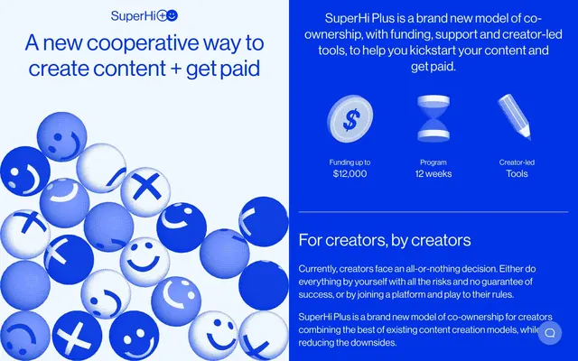
Electric Blue Canvas: crisp text, confident forms.
Color palette
Dominant background for sections and cards, primary interactive elements, highlights, and borders. This bold blue defines the brand's energetic tone
Hover or active states for buttons and interactive elements, a slightly lighter variant of the brand blue for subtle feedback
Primary text color against SuperHi Blue backgrounds, key card surfaces, and subtle borders. Provides stark contrast to the dominant blue
Body text and occasional icon fills against white surfaces. Used sparingly for maximum impact
Typography
- Weights
- 400
- Sizes
- 16px, 18px, 24px, 32px, 42px, 56px, 85px
- Line height
- 1.13, 1.14, 1.2, 1.25, 1.33, 1.5
- Letter spacing
- normal
- Fallback
- Inter
The singular typeface for all content, from headlines to body text. Its simplicity and compact letterforms contribute to the brand's direct and digital aesthetic. All text maintains a weight of 400, relying on size and color for hierarchy.
Spacing & shape
Components
Transparent background, Canvas White text and border. Used as a button in navigation for SuperHi Plus. No explicit padding provided in component data, implying content-based sizing.
Solid SuperHi Blue background, Canvas White text, 16px border-radius. Padding of 8px vertical and 24px horizontal. Appears for 'View calculator'.
Solid SuperHi Blue background, Canvas White text, 72px border-radius. Padding of 6.4-7.2px vertical and 24px horizontal.
Accent Highlight Blue background, white text (#FFFFFF), 120px border-radius. This variant is shown with no padding, suggesting a decorative purpose.
SuperHi Blue background, 16px border-radius, 24px padding on all sides. Used for sections highlighting aspects like Funding or Support.
Canvas White background, 16px border-radius, 24px padding on all sides. Used for sections detailing information or program specifics.
Canvas White background, 24px border-radius, with 22.4px top, 24px horizontal, and 32px bottom padding. Provides a slightly more emphasized presentation than the White Detail Card.
Transparent background, SuperHi Blue text and border, 2.4px border-radius. Padding is 3.2px vertical and 24px horizontal. Focus state includes inset border shadow.
Guidelines
- Use SuperHi Blue (#0033e5) as the primary background for content sections and cards to maintain brand identity.
- Utilize Canvas White (#f0f7ff) for all body text and informational elements on SuperHi Blue backgrounds to ensure high contrast and readability.
- Apply a 16px border-radius to all cards and primary buttons, transitioning to 72px for pill-shaped buttons to vary visual emphasis.
- Employ the Haas Grot Disp Web font at weight 400 for all text, relying on the type scale for hierarchy rather than varied weights.
- Maintain a comfortable density with element gaps ranging from 6px to 16px, and card/section padding around 22-24px.
- Use Accent Highlight Blue (#527ceb) specifically for interactive states like button hovers to provide clear feedback.
- Structure pages with alternating sections of SuperHi Blue and Canvas White to create a clear visual rhythm.
- Avoid using multiple font weights; stick exclusively to Haas Grot Disp Web weight 400 for consistency.
- Do not introduce drop shadows for elevation; rely on color and border treatments for component separation and visual surfacing.
- Refrain from using heavily saturated colors outside of the defined brand and accent blues.
- Do not use generic black (#000000) for text on blue backgrounds; always use Canvas White (#f0f7ff) for optimal contrast.
- Avoid large imagery that breaks the grid or draws focus from the core UI; keep visuals concise and contained.
- Do not use generic, unrounded rectangles; ensure all interactive elements and containers have a defined border-radius from the token system.
- Do not vary paragraph line-heights excessively; adhere to the defined line-height values appropriate for each text size.
About this system
ShowHide
SuperHi Plus employs a vibrant and high-contrast design language, built on a foundation of deep blue and crisp white. Surfaces are predominantly flat, with color providing separation and hierarchy rather than shadows or complex textures. Typography is compact and direct, ensuring quick communication, while generous spacing frames content with confidence. The overall impression is energetic, modern, and direct, using bold color as a primary structuring element.
The page primarily uses a split-screen layout or a max-width contained layout with heavy left/right visual segmentation. The hero section divides the screen horizontally, contrasting a Canvas White left panel with large, bold typography and a SuperHi Blue right panel for introductory text. Subsequent sections alternate between full-width SuperHi Blue and segmented SuperHi Blue panels, maintaining a consistent rhythm. Content is generally stacked vertically within these sections, with some instances of two-column layouts (text beside bulleted lists or features). The page has a fixed max-width for column content, but certain sections, like the hero, utilize a split, full-height design. A sticky header with branded logo appears at the top.
This site uses abstract, spherical 3D illustrations with varied emoji-like faces and symbols (X, checkmark) in shades of SuperHi Blue and Canvas White. These visuals are dense, creating a dynamic, almost playful atmosphere on the main blue canvas. Imagery is primarily decorative and atmospheric rather than explanatory. Icons are simple, outlined shapes (money, hourglass, pencil, arrow) for clear functional communication, colored in Canvas White against SuperHi Blue backgrounds. There's also a subtle 3D cylindrical illustration, suggesting product visualization.
Reminiscent of Figma, Webflow, Linear.
# SuperHi Plus — Style Reference
> Electric Blue Canvas: crisp text, confident forms.

**Theme:** dark

**Site:** https://superhi.plus

SuperHi Plus employs a vibrant and high-contrast design language, built on a foundation of deep blue and crisp white. Surfaces are predominantly flat, with color providing separation and hierarchy rather than shadows or complex textures. Typography is compact and direct, ensuring quick communication, while generous spacing frames content with confidence. The overall impression is energetic, modern, and direct, using bold color as a primary structuring element.

## Tokens — Colors

| Name | Value | Token | Role |
|------|------|------|------|
| SuperHi Blue | `#0033e5` | `--color-superhi-blue` | Dominant background for sections and cards, primary interactive elements, highlights, and borders. This bold blue defines the brand's energetic tone |
| Action Highlight Blue | `#527ceb` | `--color-action-highlight-blue` | Hover or active states for buttons and interactive elements, a slightly lighter variant of the brand blue for subtle feedback |
| Canvas White | `#f0f7ff` | `--color-canvas-white` | Primary text color against SuperHi Blue backgrounds, key card surfaces, and subtle borders. Provides stark contrast to the dominant blue |
| Text Black | `#000000` | `--color-text-black` | Body text and occasional icon fills against white surfaces. Used sparingly for maximum impact |

## Tokens — Typography

### Haas Grot Disp Web
- **Substitute:** Inter
- **Weights:** 400
- **Sizes:** 16px, 18px, 24px, 32px, 42px, 56px, 85px
- **Line height:** 1.13, 1.14, 1.2, 1.25, 1.33, 1.5
- **Letter spacing:** normal
- **Role:** The singular typeface for all content, from headlines to body text. Its simplicity and compact letterforms contribute to the brand's direct and digital aesthetic. All text maintains a weight of 400, relying on size and color for hierarchy.

## Tokens — Type Scale

Perfect Fourth (1.333) from 18px base.

| Role | Size | Line height | Letter spacing |
|------|------|------|------|
| body-sm | 16px | 1.5 | — |
| body | 18px | 1.33 | — |
| subheading | 24px | 1.25 | — |
| heading-sm | 32px | 1.25 | — |
| heading | 42px | 1.14 | — |
| heading-lg | 56px | 1.13 | — |
| display | 85px | 1.13 | — |

## Tokens — Spacing

- **Max width:** 60px
- **Section gap:** 24px
- **Card padding:** 22-24px
- **Element gap:** 6-16px

## Tokens — Radius

- **Buttons:** 16px
- **Inputs:** 2.4px
- **Cards:** 16px
- **largeElements:** 50px
- **pillButtons:** 72px

## Layout

The page primarily uses a split-screen layout or a max-width contained layout with heavy left/right visual segmentation. The hero section divides the screen horizontally, contrasting a Canvas White left panel with large, bold typography and a SuperHi Blue right panel for introductory text. Subsequent sections alternate between full-width SuperHi Blue and segmented SuperHi Blue panels, maintaining a consistent rhythm. Content is generally stacked vertically within these sections, with some instances of two-column layouts (text beside bulleted lists or features). The page has a fixed max-width for column content, but certain sections, like the hero, utilize a split, full-height design. A sticky header with branded logo appears at the top.

## Imagery

This site uses abstract, spherical 3D illustrations with varied emoji-like faces and symbols (X, checkmark) in shades of SuperHi Blue and Canvas White. These visuals are dense, creating a dynamic, almost playful atmosphere on the main blue canvas. Imagery is primarily decorative and atmospheric rather than explanatory. Icons are simple, outlined shapes (money, hourglass, pencil, arrow) for clear functional communication, colored in Canvas White against SuperHi Blue backgrounds. There's also a subtle 3D cylindrical illustration, suggesting product visualization.

## Components

### Ghost Navigation Button
*Navigation and secondary actions*

Transparent background, Canvas White text and border. Used as a button in navigation for SuperHi Plus. No explicit padding provided in component data, implying content-based sizing.

### Filled Primary Button
*Primary calls to action*

Solid SuperHi Blue background, Canvas White text, 16px border-radius. Padding of 8px vertical and 24px horizontal. Appears for 'View calculator'.

### Pill Primary Button
*Prominent, primary calls to action with extreme roundedness*

Solid SuperHi Blue background, Canvas White text, 72px border-radius. Padding of 6.4-7.2px vertical and 24px horizontal.

### Accent Filled Button (Inactive/Decorative)
*Decorative or inactive button style*

Accent Highlight Blue background, white text (#FFFFFF), 120px border-radius. This variant is shown with no padding, suggesting a decorative purpose.

### Blue Information Card
*Information display or feature highlights*

SuperHi Blue background, 16px border-radius, 24px padding on all sides. Used for sections highlighting aspects like Funding or Support.

### White Detail Card
*Detailed content display*

Canvas White background, 16px border-radius, 24px padding on all sides. Used for sections detailing information or program specifics.

### White Feature Card
*Prominent feature display*

Canvas White background, 24px border-radius, with 22.4px top, 24px horizontal, and 32px bottom padding. Provides a slightly more emphasized presentation than the White Detail Card.

### Outlined Text Input
*User input fields*

Transparent background, SuperHi Blue text and border, 2.4px border-radius. Padding is 3.2px vertical and 24px horizontal. Focus state includes inset border shadow.

## Guidelines

### Do

- Use SuperHi Blue (#0033e5) as the primary background for content sections and cards to maintain brand identity.
- Utilize Canvas White (#f0f7ff) for all body text and informational elements on SuperHi Blue backgrounds to ensure high contrast and readability.
- Apply a 16px border-radius to all cards and primary buttons, transitioning to 72px for pill-shaped buttons to vary visual emphasis.
- Employ the Haas Grot Disp Web font at weight 400 for all text, relying on the type scale for hierarchy rather than varied weights.
- Maintain a comfortable density with element gaps ranging from 6px to 16px, and card/section padding around 22-24px.
- Use Accent Highlight Blue (#527ceb) specifically for interactive states like button hovers to provide clear feedback.
- Structure pages with alternating sections of SuperHi Blue and Canvas White to create a clear visual rhythm.

### Don't

- Avoid using multiple font weights; stick exclusively to Haas Grot Disp Web weight 400 for consistency.
- Do not introduce drop shadows for elevation; rely on color and border treatments for component separation and visual surfacing.
- Refrain from using heavily saturated colors outside of the defined brand and accent blues.
- Do not use generic black (#000000) for text on blue backgrounds; always use Canvas White (#f0f7ff) for optimal contrast.
- Avoid large imagery that breaks the grid or draws focus from the core UI; keep visuals concise and contained.
- Do not use generic, unrounded rectangles; ensure all interactive elements and containers have a defined border-radius from the token system.
- Do not vary paragraph line-heights excessively; adhere to the defined line-height values appropriate for each text size.

## Agent Prompt Guide

Quick Color Reference:
text: #f0f7ff
background: #0033e5
border: #0033e5
accent: #527ceb
primary action: #0033e5 (filled action)

Example Component Prompts:
Create a hero section: left half is Canvas White (#f0f7ff) with a headline at 85px Haas Grot Disp Web weight 400 in Text Black (#000000), line-height 1.13. Right half is SuperHi Blue (#0033e5) with body text at 18px Haas Grot Disp Web weight 400 in Canvas White (#f0f7ff), line-height 1.33.

Create a Filled Primary Button: SuperHi Blue (#0033e5) background, Canvas White (#f0f7ff) text at 18px Haas Grot Disp Web weight 400, 16px border-radius, 8px vertical padding, 24px horizontal padding. On hover, background should transition to Action Highlight Blue (#527ceb).

Create a Blue Information Card: SuperHi Blue (#0033e5) background, 16px border-radius, 24px padding. Headline inside the card at 32px Haas Grot Disp Web weight 400 in Canvas White (#f0f7ff), line-height 1.25. Body text at 16px Haas Grot Disp Web weight 400 in Canvas White (#f0f7ff), line-height 1.5.

Create an Outlined Text Input: Transparent background, SuperHi Blue (#0033e5) 1px border, 2.4px border-radius. Placeholder text and user input in SuperHi Blue (#0033e5) at 16px Haas Grot Disp Web weight 400. Padding 3.2px vertical, 24px horizontal.
More like this








Keep what you find
A free account saves references to boards and can send you a weekly email of picks based on what you save.
To see every result, go Pro.