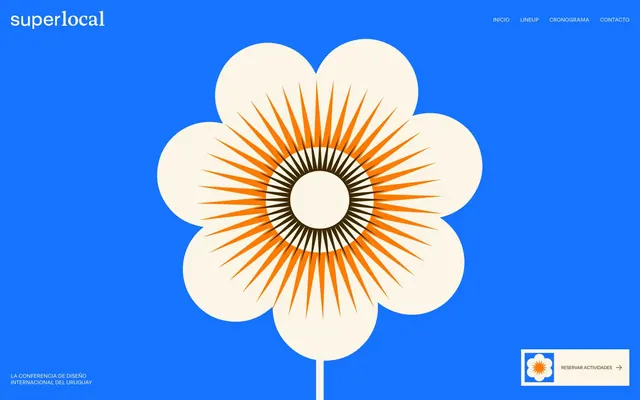
Preview image. Unlock full-res
Warm Ink on Aged Paper — a hand-crafted, tactile aesthetic for a design conference.
Color palette
Primary brand accent, main interactive element color, background for prominent sections — signals modernity and digital interaction within the otherwise earthy palette.
Dominant text color, primary UI elements, and a significant background color — acts as the main dark tone, offering high contrast against lighter neutrals.
Background for secondary action buttons — a slightly lighter, muted shade of 'Pueblo Spice' that provides visual hierarchy for non-primary actions.
Secondary accent for graphical elements and highlights — adds a jolt of energetic warmth, often appearing within illustrations or specific sections.
Tertiary accent, used for subtle highlights — a softer, lighter orange that complements 'Sunburst Orange' without competing.
Occasional, high-impact accent, likely for specific callouts or decorative elements — appears sparingly for maximal visual punch.
Primary surface color for page backgrounds and cards — a warm, off-white that contributes significantly to the aged paper aesthetic.
High-contrast text, borders, and icons — used sparingly for maximum impact or when absolute legibility is critical.
Occasional utility background or highlight, providing stark contrast against 'Parchment'.
Subtle borders and dividers, providing minimal visual separation without distracting.
Typography
- Weights
- 400
- Sizes
- 10px, 12px, 14px, 16px, 17px, 64px, 172px
- Line height
- 1, 1.2, 1.3, 1.41, 1.5, 2
- Letter spacing
- -0.06em at 172px, -0.05em at 64px, -0.04em at 17px, -0.02em at 16px, 0.022em at 14px, 0.05em at 10px
- Fallback
- IBM Plex Mono
Primary typeface for all headings and body copy, giving a distinctive, almost typewriter-esque or industrial-print feel. The varied letter-spacing across sizes is a key brand trait, suggesting precise typographic attention.
- Weights
- 400
- Sizes
- 16px
- Line height
- 1.6
- Letter spacing
- -0.02em
- Fallback
- Inter
Secondary typeface for specific body text, providing a highly legible, modern sans-serif. The font-feature-settings ensure stylistic consistency and legibility for nuanced text.
- Weights
- 400
- Sizes
- 12px
- Line height
- 1.2
Fallback or utility typeface for small incidental text elements where system-level efficiency is preferred, such as navigation links or minor annotations.
Spacing & shape
Components
Text uses system sans-serif (12px, 1.2lh, weight 400, black), on a transparent background.
Background 'Pueblo Spice' (#3d2800), text 'Onyx' (#000000). Border radius 99px, padding 10px vertical, 7px horizontal. Uses RST Reactor text.
Background 'Warm Button' (#604106), text 'Onyx' (#000000). Border radius 99px, padding 10px vertical, 7px horizontal. Uses RST Reactor text.
Transparent background, text 'Onyx' (#000000), border 1px solid 'Pueblo Spice' (#3d2800). Border radius 50px, padding 10px circular. Uses RST Reactor text.
Background 'Parchment' (#fbf5e7), with a 1px 'Pueblo Spice' (#3d2800) border. Border radius 30px. Padding variable based on content. No shadow.
Text 'Pueblo Spice' (#3d2800), 'RST Reactor' 12px (1.2lh, weight 400). Accompanied by an arrow icon. Border radius 9999px applied to containing element.
Guidelines
- Use 'Pueblo Spice' (#3d2800) for primary text and significant UI elements to maintain the aged paper aesthetic.
- Prioritize 'RST Reactor' for all headlines and most body text; leverage its precise letter-spacing rules including -0.06em at 172px and -0.05em at 64px.
- Apply a 99px border radius consistently to all primary and secondary action buttons, and 50px for ghost buttons.
- Use 'Parchment' (#fbf5e7) as the default background for all page sections and cards, creating a consistent warm base.
- Incorporate 'Electric Blue' (#1673ff) sparingly for interactive elements or prominent sections to create clear focal points.
- Maintain a clear visual hierarchy by contrasting 'Pueblo Spice' (#3d2800) for main actions with 'Warm Button' (#604106) for secondary actions.
- Avoid using stark white backgrounds directly adjacent to 'Pueblo Spice' unless for explicit high-contrast elements.
- Do not deviate from the specified letter-spacing for 'RST Reactor' typefaces; it's a critical branding element.
- Refrain from using generic box shadows; the design relies on flat layers and strong color contrasts for depth.
- Do not introduce new typefaces outside of 'RST Reactor', 'Inter', and system sans-serif.
- Avoid over-saturating the palette; restrict additional colors to the defined 'Sunburst Orange', 'Harvest Glow', and 'Fuchsia Flush' accents as per their established roles.
About this system
ShowHide
This design system evokes a sense of archival warmth meeting modern-day nostalgia, like hand-printed posters in an old design studio. The dominant 'Pueblo Spice' brown against near-white 'Parchment' creates a soft, inviting contrast, making the content feel discovered rather than presented. The extensive use of 'RST Reactor' font with its strong, almost monospaced character, lends an industrial, handcrafted feel, reinforced by the vibrant 'Electric Blue' and 'Sunburst Orange' accents that punctuate this subdued palette.
The layout primarily uses a contained, centered structure with significant margins, giving content room to breathe. The hero section is full-width, featuring a dominant graphic on an 'Electric Blue' background, immediately setting a unique and playful tone while the header remains a max-width centered element. Subsequent sections often feature alternating background colors (e.g., 'Parchment' then 'Pueblo Spice') creating a distinct rhythm. Content is arranged in stacked blocks or grid formations, such as the 3-column partner logo grid, with consistent vertical spacing between sections. Navigation is a minimalist top-right menu.
The site uses a highly stylized, brand-specific illustration style characterized by precise, geometric forms and vivid coloring. The dominant image is a large, flat flower illustration with concentric patterns, utilizing 'Parchment' for petals, 'Sunburst Orange' for inner radiating lines, and 'Pueblo Spice' for core details. This illustration style is decorative and creates a strong visual identity rather than conveying complex information. There's also a use of partner logos, rendered in monochrome (often 'Pueblo Spice' or 'Onyx') within 'Parchment' colored card grids, maintaining aesthetic consistency. Icons are minimalist and line-based, rendered in 'Onyx'.
Reminiscent of AIGA Design Conference, Offscreen Magazine, The Brand Identity, It's Nice That.
# Superlocal — Style Reference
> Warm Ink on Aged Paper — a hand-crafted, tactile aesthetic for a design conference.

**Theme:** light

**Site:** https://superlocaldesign.com

This design system evokes a sense of archival warmth meeting modern-day nostalgia, like hand-printed posters in an old design studio. The dominant 'Pueblo Spice' brown against near-white 'Parchment' creates a soft, inviting contrast, making the content feel discovered rather than presented. The extensive use of 'RST Reactor' font with its strong, almost monospaced character, lends an industrial, handcrafted feel, reinforced by the vibrant 'Electric Blue' and 'Sunburst Orange' accents that punctuate this subdued palette.

## Tokens — Colors

| Name | Value | Token | Role |
|------|------|------|------|
| Electric Blue | `#1673ff` | `--color-electric-blue` | Primary brand accent, main interactive element color, background for prominent sections — signals modernity and digital interaction within the otherwise earthy palette. |
| Pueblo Spice | `#3d2800` | `--color-pueblo-spice` | Dominant text color, primary UI elements, and a significant background color — acts as the main dark tone, offering high contrast against lighter neutrals. |
| Warm Button | `#604106` | `--color-warm-button` | Background for secondary action buttons — a slightly lighter, muted shade of 'Pueblo Spice' that provides visual hierarchy for non-primary actions. |
| Sunburst Orange | `#ff7b02` | `--color-sunburst-orange` | Secondary accent for graphical elements and highlights — adds a jolt of energetic warmth, often appearing within illustrations or specific sections. |
| Harvest Glow | `#ffae45` | `--color-harvest-glow` | Tertiary accent, used for subtle highlights — a softer, lighter orange that complements 'Sunburst Orange' without competing. |
| Fuchsia Flush | `#e045ff` | `--color-fuchsia-flush` | Occasional, high-impact accent, likely for specific callouts or decorative elements — appears sparingly for maximal visual punch. |
| Parchment | `#fbf5e7` | `--color-parchment` | Primary surface color for page backgrounds and cards — a warm, off-white that contributes significantly to the aged paper aesthetic. |
| Onyx | `#000000` | `--color-onyx` | High-contrast text, borders, and icons — used sparingly for maximum impact or when absolute legibility is critical. |
| Canvas White | `#ffffff` | `--color-canvas-white` | Occasional utility background or highlight, providing stark contrast against 'Parchment'. |
| Light Gray Divider | `#c4c4c4` | `--color-light-gray-divider` | Subtle borders and dividers, providing minimal visual separation without distracting. |

## Tokens — Typography

### RST Reactor
- **Substitute:** IBM Plex Mono
- **Weights:** 400
- **Sizes:** 10px, 12px, 14px, 16px, 17px, 64px, 172px
- **Line height:** 1, 1.2, 1.3, 1.41, 1.5, 2
- **Letter spacing:** -0.06em at 172px, -0.05em at 64px, -0.04em at 17px, -0.02em at 16px, 0.022em at 14px, 0.05em at 10px
- **Role:** Primary typeface for all headings and body copy, giving a distinctive, almost typewriter-esque or industrial-print feel. The varied letter-spacing across sizes is a key brand trait, suggesting precise typographic attention.

### Inter
- **Substitute:** Inter
- **Weights:** 400
- **Sizes:** 16px
- **Line height:** 1.6
- **Letter spacing:** -0.02em
- **Role:** Secondary typeface for specific body text, providing a highly legible, modern sans-serif. The font-feature-settings ensure stylistic consistency and legibility for nuanced text.

### system sans-serif
- **Weights:** 400
- **Sizes:** 12px
- **Line height:** 1.2
- **Role:** Fallback or utility typeface for small incidental text elements where system-level efficiency is preferred, such as navigation links or minor annotations.

## Tokens — Type Scale

| Role | Size | Line height | Letter spacing |
|------|------|------|------|
| caption | 10px | 2 | 0.5px |
| heading | 64px | 0.9 | -3.2px |
| display | 172px | 1 | -10.32px |

## Tokens — Spacing

- **Section gap:** 48-78px
- **Card padding:** 8px
- **Element gap:** 10-24px

## Tokens — Radius

- **Buttons:** 99px
- **Cards:** 30px
- **pillForms:** 9999px

## Layout

The layout primarily uses a contained, centered structure with significant margins, giving content room to breathe. The hero section is full-width, featuring a dominant graphic on an 'Electric Blue' background, immediately setting a unique and playful tone while the header remains a max-width centered element. Subsequent sections often feature alternating background colors (e.g., 'Parchment' then 'Pueblo Spice') creating a distinct rhythm. Content is arranged in stacked blocks or grid formations, such as the 3-column partner logo grid, with consistent vertical spacing between sections. Navigation is a minimalist top-right menu.

## Imagery

The site uses a highly stylized, brand-specific illustration style characterized by precise, geometric forms and vivid coloring. The dominant image is a large, flat flower illustration with concentric patterns, utilizing 'Parchment' for petals, 'Sunburst Orange' for inner radiating lines, and 'Pueblo Spice' for core details. This illustration style is decorative and creates a strong visual identity rather than conveying complex information. There's also a use of partner logos, rendered in monochrome (often 'Pueblo Spice' or 'Onyx') within 'Parchment' colored card grids, maintaining aesthetic consistency. Icons are minimalist and line-based, rendered in 'Onyx'.

## Components

### CTA Banner with Reserve Button

### Cronograma Section Header

### Partner Card Grid

### Primary Navigation Link
*Top navigation items*

Text uses system sans-serif (12px, 1.2lh, weight 400, black), on a transparent background.

### Pueblo Spice Pill Button
*Call to action button*

Background 'Pueblo Spice' (#3d2800), text 'Onyx' (#000000). Border radius 99px, padding 10px vertical, 7px horizontal. Uses RST Reactor text.

### Warm Button Pill Button
*Secondary action button*

Background 'Warm Button' (#604106), text 'Onyx' (#000000). Border radius 99px, padding 10px vertical, 7px horizontal. Uses RST Reactor text.

### Outline Pill Button
*Ghost button with rounded corners*

Transparent background, text 'Onyx' (#000000), border 1px solid 'Pueblo Spice' (#3d2800). Border radius 50px, padding 10px circular. Uses RST Reactor text.

### Card Grid Item
*Partner/logo display*

Background 'Parchment' (#fbf5e7), with a 1px 'Pueblo Spice' (#3d2800) border. Border radius 30px. Padding variable based on content. No shadow.

### Footer Link with Arrow
*Call to action link in footer*

Text 'Pueblo Spice' (#3d2800), 'RST Reactor' 12px (1.2lh, weight 400). Accompanied by an arrow icon. Border radius 9999px applied to containing element.

## Guidelines

### Do

- Use 'Pueblo Spice' (#3d2800) for primary text and significant UI elements to maintain the aged paper aesthetic.
- Prioritize 'RST Reactor' for all headlines and most body text; leverage its precise letter-spacing rules including -0.06em at 172px and -0.05em at 64px.
- Apply a 99px border radius consistently to all primary and secondary action buttons, and 50px for ghost buttons.
- Use 'Parchment' (#fbf5e7) as the default background for all page sections and cards, creating a consistent warm base.
- Incorporate 'Electric Blue' (#1673ff) sparingly for interactive elements or prominent sections to create clear focal points.
- Maintain a clear visual hierarchy by contrasting 'Pueblo Spice' (#3d2800) for main actions with 'Warm Button' (#604106) for secondary actions.

### Don't

- Avoid using stark white backgrounds directly adjacent to 'Pueblo Spice' unless for explicit high-contrast elements.
- Do not deviate from the specified letter-spacing for 'RST Reactor' typefaces; it's a critical branding element.
- Refrain from using generic box shadows; the design relies on flat layers and strong color contrasts for depth.
- Do not introduce new typefaces outside of 'RST Reactor', 'Inter', and system sans-serif.
- Avoid over-saturating the palette; restrict additional colors to the defined 'Sunburst Orange', 'Harvest Glow', and 'Fuchsia Flush' accents as per their established roles.

## Agent Prompt Guide

**Quick Color Reference:**
- Text: #3d2800 (Pueblo Spice)
- Background: #fbf5e7 (Parchment)
- CTA Button: #3d2800 (Pueblo Spice)
- Accent: #1673ff (Electric Blue)

**Example Component Prompts:**
1. Create a primary navigation bar: 'Electric Blue' (#1673ff) background, with 'Onyx' (#000000) text. Nav links use system sans-serif at 12px (400 weight, 1.2 line-height).
2. Create a 'Pueblo Spice Pill Button': background #3d2800, text #000000. Border radius 99px, padding 10px 7px. Text using RST Reactor 16px (400 weight, 1.3 line-height, -0.02em letter-spacing).
3. Create a section with a 'Parchment' (#fbf5e7) background, featuring a headline: RST Reactor 64px (400 weight, 0.9 line-height, -0.05em letter-spacing) in 'Pueblo Spice' (#3d2800). Below that, a list of partner logos within Card Grid Items.
4. Design a 'Card Grid Item': 'Parchment' (#fbf5e7) background, 30px border radius, 1px solid 'Pueblo Spice' (#3d2800) border, 8px padding. Center a monochrome logo image.
More like this









Keep what you find
A free account saves references to boards and can send you a weekly email of picks based on what you save.
To see every result, go Pro.