Preview image. Unlock full-res
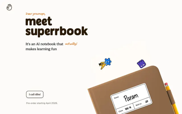
Child's Animated Sketchbook. This system feels like looking into a favorite, well-loved school notebook where every element has personality.
Color palette
Decorative background accents, footer background — a bold, energetic burst
Highlight text, decorative borders – adding a vibrant, attention-grabbing spark
Highlight text, decorative borders – a bright, clear accent color evoking creativity
Highlight text, decorative borders – lending a whimsical, friendly touch
Highlight text, decorative borders – a fresh, positive accent
Page background, primary surface for cards and buttons, providing a warm, inviting canvas
Primary text, button borders, and accent strokes – forming the core dark contrast against the light canvas
Secondary text, muted headings, and subtle borders, slightly softer than Deep Graphite
Boldest headings and critical text elements, used sparingly for absolute contrast
Supporting neutral for secondary UI, dividers, and muted labels. Do not promote it to the primary CTA color
Typography
- Weights
- 400, 500, 600
- Sizes
- 16px, 20px, 24px, 28px, 32px, 36px, 40px, 46px, 104px
- Line height
- 1.08, 1.2, 1.4, 1.5
- Letter spacing
- normal
- Fallback
- Comic Sans MS (as a last resort), or a custom script font like 'Caveat' or 'Gochi Hand' if 'gelica' is unavailable.
Primary display font, used for all headings, prominent calls to action, and any text needing a distinct, hand-drawn character. Its slightly uneven baseline and friendly weight convey a youthful, non-corporate voice.
- Weights
- 400, 500
- Sizes
- 18px, 20px, 32px
- Line height
- 1.5
- Letter spacing
- normal
- Fallback
- Inter, Figtree, or General Sans.
Functional text, used for body copy, navigation, and secondary information. This modern sans-serif provides clarity and legibility, grounding the playful display font with professional readability.
Spacing & shape
Components
Text-only button for secondary actions or links that require less emphasis. No background color, Deep Graphite text, and a bottom border in Deep Graphite. Padding is minimal (4px top/bottom, 4px right/left). Uses gelica font, 20px, weight 400.
Primary call to action button, appearing as a pill-shaped outline. Canvas Parchment background with Deep Graphite text. Border is a 1px solid Deep Graphite. Rounded with a 20px radius. Has a subtle shadow rgba(0,0,0,0.25) 0px 1px 2px 0px. Uses 4px vertical and 28px horizontal padding, with gelica font, 20px, weight 400.
Used for grouping related content, such as features or testimonials. Canvas Parchment background with 12px border radius. Features a soft, distant shadow: rgba(0, 0, 0, 0.06) 0px 2px 20px 0px. Internal padding is 24px top, 0px horizontal, 16px bottom.
Links within the header or footer navigation. Uses Geist font at 18px, weight 400, in Deep Graphite. Underlined on hover or active state with a 1px Canvas Parchment border top, and a 2px Deep Graphite border bottom when hover/active. Minimal padding.
Guidelines
- Use Canvas Parchment (#fdfbf9) as the dominant background color for all page sections and elevated surfaces.
- Apply the gelica font for all headings and prominent UI text (e.g., call to action buttons), embracing its playful, handwritten character.
- Employ rounded corners with a 12px radius for cards and containers, and a 20px radius for interactive elements like buttons.
- Introduce color selectively for emphasis, using Playful Red (#ce500a), Sky Blue (#3b82f6), Bubblegum Pink (#ff66cf), or Grass Green (#22c55e) for highlight text or decorative borders, never as primary backgrounds.
- Maintain comfortable spacing: 12px for small element gaps, 32px for card padding, and 64px for vertical section separation.
- Use a subtle soft shadow (rgba(0,0,0,0.06) 0px 2px 20px 0px) to give cards a gentle lift, avoiding heavy or stark elevation.
- For primary calls to action, use the Pill Ghost Button style with a Deep Graphite (#171717) stroke and text on the Canvas Parchment background.
- Avoid using highly saturated brand colors as large background fills; they are intended for accents and highlights.
- Do not use sharp 0px corners on any UI elements; all corners should have some degree of rounding (minimum 2px).
- Refrain from heavy, multi-layered shadows; the design embraces a light, gentle elevation with a single, soft shadow.
- Do not use generic system fonts; always prioritize gelica for display and Geist for functional text.
- Avoid dense, information-heavy layouts; maintain ample white space and comfortable element spacing.
- Do not introduce strong, solid border colors unless they are part of a deliberate accent or interactive state (e.g. outline buttons).
About this system
ShowHide
Superr opts for a youthful, playful aesthetic, resembling a child's notebook brought to life. A warm, off-white canvas sets a friendly, approachable tone, punctuated by vibrant, primary-school-inspired colors for text highlights and playful borders. Typography leans into a handwritten, slightly uneven feel for headings, offset by a clean sans-serif for body copy. Components are light, favoring subtle shadows and rounded corners to maintain a soft, tactile presence, echoing the physical world of a notebook.
The page uses a full-bleed layout, allowing elements to span the entire viewport width, but content is often contained within an implicit central column, especially for text blocks. The hero section features a large, product illustration on the right, balanced by a significant headline and subtext on the left, creating an asymmetric but balanced composition. Sections follow a consistent vertical rhythm, often alternating between a main content block and a full-bleed decorative element (like the notebooks). Content is typically arranged in left-aligned stacks or two-column text-left/image-right patterns. There is no explicit grid for cards on the initial screen, but subsequent sections imply a flexible grid for features. Navigation is a minimal top-bar, sticky header design with a single interactive icon and a ghost button.
Imagery primarily features stylized 3D product renders of SuperrBook notebooks with playful, illustrated stickers. The product shots are often cropped tightly or presented from an angle, showcasing the physical object with a sense of tactility. Illustrations are flat, geometric, and brand-colored, often appearing as small, whimsical floating elements or in sticker form on the product. Icons are mostly outlined, with a moderate stroke weight, carrying the brand's cheerful persona. The overall role of imagery is to be decorative and atmospheric, highlighting the product in an imaginative, content-rich way without overwhelming the UI, maintaining a text-dominant density.
Reminiscent of Notion, Basecamp, Paper by FiftyThree (old branding).
# Superr — Style Reference
> Child's Animated Sketchbook. This system feels like looking into a favorite, well-loved school notebook where every element has personality.

**Theme:** light

**Site:** https://www.superr.ai

Superr opts for a youthful, playful aesthetic, resembling a child's notebook brought to life. A warm, off-white canvas sets a friendly, approachable tone, punctuated by vibrant, primary-school-inspired colors for text highlights and playful borders. Typography leans into a handwritten, slightly uneven feel for headings, offset by a clean sans-serif for body copy. Components are light, favoring subtle shadows and rounded corners to maintain a soft, tactile presence, echoing the physical world of a notebook.

## Tokens — Colors

| Name | Value | Token | Role |
|------|------|------|------|
| Cheeky Orange | `#ff6f1e` | `--color-cheeky-orange` | Decorative background accents, footer background — a bold, energetic burst |
| Playful Red | `#ce500a` | `--color-playful-red` | Highlight text, decorative borders – adding a vibrant, attention-grabbing spark |
| Sky Blue | `#3b82f6` | `--color-sky-blue` | Highlight text, decorative borders – a bright, clear accent color evoking creativity |
| Bubblegum Pink | `#ff66cf` | `--color-bubblegum-pink` | Highlight text, decorative borders – lending a whimsical, friendly touch |
| Grass Green | `#22c55e` | `--color-grass-green` | Highlight text, decorative borders – a fresh, positive accent |
| Canvas Parchment | `#fdfbf9` | `--color-canvas-parchment` | Page background, primary surface for cards and buttons, providing a warm, inviting canvas |
| Deep Graphite | `#171717` | `--color-deep-graphite` | Primary text, button borders, and accent strokes – forming the core dark contrast against the light canvas |
| Soft Black | `#2b1a07` | `--color-soft-black` | Secondary text, muted headings, and subtle borders, slightly softer than Deep Graphite |
| Jet Black | `#000000` | `--color-jet-black` | Boldest headings and critical text elements, used sparingly for absolute contrast |
| Warm Gray Shadow | `#bebcbb` | `--color-warm-gray-shadow` | Supporting neutral for secondary UI, dividers, and muted labels. Do not promote it to the primary CTA color |

## Tokens — Typography

### gelica
- **Substitute:** Comic Sans MS (as a last resort), or a custom script font like 'Caveat' or 'Gochi Hand' if 'gelica' is unavailable.
- **Weights:** 400, 500, 600
- **Sizes:** 16px, 20px, 24px, 28px, 32px, 36px, 40px, 46px, 104px
- **Line height:** 1.08, 1.2, 1.4, 1.5
- **Letter spacing:** normal
- **Role:** Primary display font, used for all headings, prominent calls to action, and any text needing a distinct, hand-drawn character. Its slightly uneven baseline and friendly weight convey a youthful, non-corporate voice.

### Geist
- **Substitute:** Inter, Figtree, or General Sans.
- **Weights:** 400, 500
- **Sizes:** 18px, 20px, 32px
- **Line height:** 1.5
- **Letter spacing:** normal
- **Role:** Functional text, used for body copy, navigation, and secondary information. This modern sans-serif provides clarity and legibility, grounding the playful display font with professional readability.

## Tokens — Type Scale

| Role | Size | Line height | Letter spacing |
|------|------|------|------|
| caption | 16px | 1.5 | — |
| body | 18px | 1.5 | — |
| subheading | 20px | 1.5 | — |
| heading-sm | 32px | 1.2 | — |
| heading | 46px | 1.2 | — |
| display | 104px | 1.08 | — |

## Tokens — Spacing

- **Section gap:** 64px
- **Card padding:** 32px
- **Element gap:** 12px

## Tokens — Radius

- **Default:** 8px
- **Buttons:** 20px
- **Cards:** 12px
- **avatar:** 9999px
- **fields:** 8px
- **tags:** 56px

## Layout

The page uses a full-bleed layout, allowing elements to span the entire viewport width, but content is often contained within an implicit central column, especially for text blocks. The hero section features a large, product illustration on the right, balanced by a significant headline and subtext on the left, creating an asymmetric but balanced composition. Sections follow a consistent vertical rhythm, often alternating between a main content block and a full-bleed decorative element (like the notebooks). Content is typically arranged in left-aligned stacks or two-column text-left/image-right patterns. There is no explicit grid for cards on the initial screen, but subsequent sections imply a flexible grid for features. Navigation is a minimal top-bar, sticky header design with a single interactive icon and a ghost button.

## Imagery

Imagery primarily features stylized 3D product renders of SuperrBook notebooks with playful, illustrated stickers. The product shots are often cropped tightly or presented from an angle, showcasing the physical object with a sense of tactility. Illustrations are flat, geometric, and brand-colored, often appearing as small, whimsical floating elements or in sticker form on the product. Icons are mostly outlined, with a moderate stroke weight, carrying the brand's cheerful persona. The overall role of imagery is to be decorative and atmospheric, highlighting the product in an imaginative, content-rich way without overwhelming the UI, maintaining a text-dominant density.

## Components

### Ghost Button
*Interactive element, secondary action*

Text-only button for secondary actions or links that require less emphasis. No background color, Deep Graphite text, and a bottom border in Deep Graphite. Padding is minimal (4px top/bottom, 4px right/left). Uses gelica font, 20px, weight 400.

### Pill Ghost Button
*Call to action, primary interaction*

Primary call to action button, appearing as a pill-shaped outline. Canvas Parchment background with Deep Graphite text. Border is a 1px solid Deep Graphite. Rounded with a 20px radius. Has a subtle shadow rgba(0,0,0,0.25) 0px 1px 2px 0px. Uses 4px vertical and 28px horizontal padding, with gelica font, 20px, weight 400.

### Elevated Card
*Content container, feature display*

Used for grouping related content, such as features or testimonials. Canvas Parchment background with 12px border radius. Features a soft, distant shadow: rgba(0, 0, 0, 0.06) 0px 2px 20px 0px. Internal padding is 24px top, 0px horizontal, 16px bottom.

### Navigation Link
*Primary navigation item*

Links within the header or footer navigation. Uses Geist font at 18px, weight 400, in Deep Graphite. Underlined on hover or active state with a 1px Canvas Parchment border top, and a 2px Deep Graphite border bottom when hover/active. Minimal padding.

## Guidelines

### Do

- Use Canvas Parchment (#fdfbf9) as the dominant background color for all page sections and elevated surfaces.
- Apply the gelica font for all headings and prominent UI text (e.g., call to action buttons), embracing its playful, handwritten character.
- Employ rounded corners with a 12px radius for cards and containers, and a 20px radius for interactive elements like buttons.
- Introduce color selectively for emphasis, using Playful Red (#ce500a), Sky Blue (#3b82f6), Bubblegum Pink (#ff66cf), or Grass Green (#22c55e) for highlight text or decorative borders, never as primary backgrounds.
- Maintain comfortable spacing: 12px for small element gaps, 32px for card padding, and 64px for vertical section separation.
- Use a subtle soft shadow (rgba(0,0,0,0.06) 0px 2px 20px 0px) to give cards a gentle lift, avoiding heavy or stark elevation.
- For primary calls to action, use the Pill Ghost Button style with a Deep Graphite (#171717) stroke and text on the Canvas Parchment background.

### Don't

- Avoid using highly saturated brand colors as large background fills; they are intended for accents and highlights.
- Do not use sharp 0px corners on any UI elements; all corners should have some degree of rounding (minimum 2px).
- Refrain from heavy, multi-layered shadows; the design embraces a light, gentle elevation with a single, soft shadow.
- Do not use generic system fonts; always prioritize gelica for display and Geist for functional text.
- Avoid dense, information-heavy layouts; maintain ample white space and comfortable element spacing.
- Do not introduce strong, solid border colors unless they are part of a deliberate accent or interactive state (e.g. outline buttons).

## Agent Prompt Guide

Quick Color Reference:
text: #171717
background: #fdfbf9
border: #171717
accent: #ff6f1e
primary action: no distinct CTA color

Example Component Prompts:
Create a hero section: Canvas Parchment background. Headline 'meet superrbook' with gelica 104px weight 600, Jet Black (#000000). Subtext 'It's an AI notebook that actually makes learning fun' with gelica 46px weight 400, Jet Black (#000000), with the word 'actually!' in Playful Red (#ce500a). Include a Pill Ghost Button 'I call dibs!' with a Deep Graphite (#171717) stroke, 20px radius, gelica 20px font.

Create a feature card: Elevated Card with Canvas Parchment background, 12px radius, soft shadow rgba(0,0,0,0.06) 0px 2px 20px 0px. Inside, use Geist 20px weight 500 for the title 'A library that grows with you' in Deep Graphite (#171717).

Create a secondary link: Ghost Button with text 'Read Letter' in Deep Graphite (#171717), gelica 20px font, with a bottom border of Deep Graphite.
More like this








Keep what you find
A free account saves references to boards and can send you a weekly email of picks based on what you save.
To see every result, go Pro.