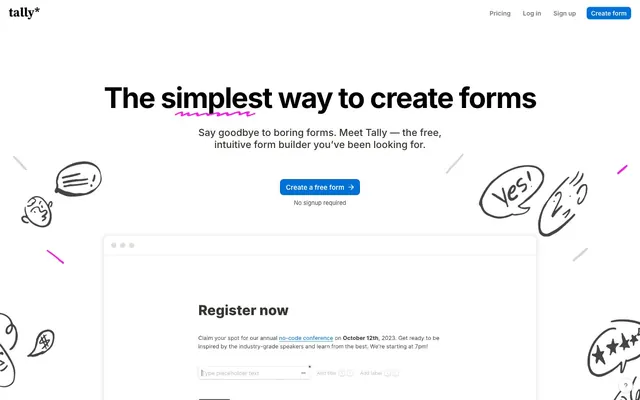
Preview image. Unlock full-res
white canvas, playful ink sketches
Color palette
Primary action button backgrounds, active states, key interactive indicators — a beacon of interaction in an otherwise monochrome UI
Accent for hand-drawn annotations, decorative icons, highlighted card borders — adds a flash of playful energy
Subtle glow for card shadows, accent for background illustration details
Decorative background accents, occasional illustrative elements — a vibrant, shifting focal point
Primary text, prominent borders, strong icons
Hairline borders, dividers, input outlines, and card edges on light surfaces. Do not promote it to the primary CTA color
Subtle background washes, light card shadows
Muted text, secondary borders, helper text
Link text, medium contrast text, less prominent borders
Heading text, button text on light backgrounds, strong borders
Secondary link text, subtle icon fills, footer text
Typography
- Weights
- 400, 500, 600, 700, 800
- Sizes
- 13px, 14px, 15px, 16px, 18px, 22px, 26px, 30px, 36px, 64px
- Line height
- 1, 1.15, 1.25, 1.5, 1.8
- Letter spacing
- -0.0310em
- Fallback
- system-ui, sans-serif
The primary typeface for all text content, from headings to body, links and buttons. Its clean, modern character supports both clarity and approachability across the product.
Spacing & shape
Elevation
Components
Solid filled button for primary calls to action. Uses Tally Blue background with Jet Black text. Rounded corners. Padding adjusts based on context for a compact feel. Example: 'Create a free form'.
Transparent background with Jet Black text and borders for navigation and secondary actions. Features an 8px border-radius. Example: 'Log In'.
Prominent surface for containing content. White Canvas background with a subtle multi-layered shadow for depth instead of strong borders. 10px border-radius. Padding based on content, but a general 16px around content.
Similar to Standard Card but with a more pronounced shadow. White Canvas background, 10px border-radius, and rgba(0, 0, 0, 0.09) 0px 3px 12px 0px shadow for distinct visual separation.
Card with a distinctive Sketch Pink inline border and subtle complementary glow. White Canvas background, 10px border-radius, rgb(248, 28, 229) 0px 0px 0px 2px, rgba(248, 28, 229, 0.36) 0px 0px 0px 4px shadow, drawing attention to featured content.
Standard text input field with lightly rounded corners (7px). Implicit border for structure and a focus style that likely interacts with brand colors.
Product Hunt badge, featuring a black background and golden kitty icon. Slightly rounded with 8px radius. Text is likely inverse to background.
Guidelines
- Prioritize 'Tally Blue' #0070d7 for all primary interactive elements, ensuring strong visual hierarchy for actions.
- Use a 10px border-radius for all cards and container elements to maintain a consistent soft geometric aesthetic.
- Employ the multi-layered shadow rgba(0, 0, 0, 0.12) 0px 1px 1px 0px, rgba(61, 59, 53, 0.16) 0px 0px 0px 1px, rgba(61, 59, 53, 0.08) 0px 3px 9px 0px, rgba(61, 59, 53, 0.08) 0px 2px 5px 0px for elevated cards.
- Maintain 'White Canvas' #ffffff as the dominant background for all content areas, providing a clean foundation.
- Apply 'Inter' font with appropriate weights and sizes from the scale, ensuring text clarity and consistent letter-spacing of -0.0310em.
- Integrate playful Sketch Pink #f81ce5 for decorative accents, illustrations, or subtle highlights, contrasting with the neutral UI.
- Utilize 8px for most element gaps and element block padding around interactive controls for a comfortable density.
- Avoid using multiple chromatic colors for primary actions; reserve 'Tally Blue' #0070d7 for this role.
- Do not introduce strong, hard-edged shadows; maintain the soft, layered elevation style.
- Refrain from using sharp corners on interactive elements or cards; always apply a border-radius of 7px or 10px.
- Do not deviate from the Inter typeface; it is fundamental to the brand's typographic identity.
- Avoid excessive use of vivid accent colors; they should act as punctuation, not dominate the visual field.
- Do not use high-contrast borders on cards; elevation should primarily be conveyed through subtle box-shadows.
- Do not use generic or default system shadows; always apply the specified multi-layered shadows for cards.
About this system
ShowHide
Tally Forms presents a lighthearted, yet highly functional workspace. Its design language blends clean, achromatic UI elements with playful, hand-drawn illustrations and a singular vibrant blue accent for primary actions. Surfaces are layered subtly with soft shadows, creating depth without heaviness. Typography is crisp and purposeful, maintaining readability amidst the visual whimsy. The overall experience is one of approachable productivity.
The page structure is primarily max-width contained with content centered. The hero section features a large, centered headline over a white background, implicitly full-bleed via background-color, with playful illustrations around it. Vertical rhythm is established by consistent section gaps, although some sections are visually connected. Content is arranged using alternating text-left/image-right or centered stacks, sometimes employing a two-column grid for feature comparisons or information blocks. Cards are often arranged in grids. The layout is spacious, allowing elements to breathe. Navigation is a sticky top bar.
The site uses a combination of playful, hand-drawn vector illustrations and product screenshots. Illustrations are organic and 'sketchy,' using a mix of Sketch Pink, Gradient Aura, and desaturated grays like Ash Gray for outlines and fills, adding a whimsical touch. These are often scattered around the page, sometimes overlapping. Product screenshots are typically clean, direct, and contained within card components, focusing on the interface itself with minimal context. Icons are primarily outlined or solid, matching the sketch aesthetic or functional branding.
Reminiscent of Notion, Typeform, Linear, Gusto.
# Tally Forms — Style Reference
> white canvas, playful ink sketches

**Theme:** light

**Site:** https://tally.so

Tally Forms presents a lighthearted, yet highly functional workspace. Its design language blends clean, achromatic UI elements with playful, hand-drawn illustrations and a singular vibrant blue accent for primary actions. Surfaces are layered subtly with soft shadows, creating depth without heaviness. Typography is crisp and purposeful, maintaining readability amidst the visual whimsy. The overall experience is one of approachable productivity.

## Tokens — Colors

| Name | Value | Token | Role |
|------|------|------|------|
| Tally Blue | `#0070d7` | `--color-tally-blue` | Primary action button backgrounds, active states, key interactive indicators — a beacon of interaction in an otherwise monochrome UI |
| Sketch Pink | `#f81ce5` | `--color-sketch-pink` | Accent for hand-drawn annotations, decorative icons, highlighted card borders — adds a flash of playful energy |
| Soft Sketch Pink | `#fcadf6` | `--color-soft-sketch-pink` | Subtle glow for card shadows, accent for background illustration details |
| Gradient Aura | `#8a46ff` | `--color-gradient-aura` | Decorative background accents, occasional illustrative elements — a vibrant, shifting focal point |
| Midnight Charcoal | `#37352f` | `--color-midnight-charcoal` | Primary text, prominent borders, strong icons |
| White Canvas | `#ffffff` | `--color-white-canvas` | Hairline borders, dividers, input outlines, and card edges on light surfaces. Do not promote it to the primary CTA color |
| Soft Mist | `#e0e0df` | `--color-soft-mist` | Subtle background washes, light card shadows |
| Ash Gray | `#898884` | `--color-ash-gray` | Muted text, secondary borders, helper text |
| Steel Gray | `#777672` | `--color-steel-gray` | Link text, medium contrast text, less prominent borders |
| Jet Black | `#000000` | `--color-jet-black` | Heading text, button text on light backgrounds, strong borders |
| Faded Ink | `#45433e` | `--color-faded-ink` | Secondary link text, subtle icon fills, footer text |

## Tokens — Typography

### Inter
- **Substitute:** system-ui, sans-serif
- **Weights:** 400, 500, 600, 700, 800
- **Sizes:** 13px, 14px, 15px, 16px, 18px, 22px, 26px, 30px, 36px, 64px
- **Line height:** 1, 1.15, 1.25, 1.5, 1.8
- **Letter spacing:** -0.0310em
- **Role:** The primary typeface for all text content, from headings to body, links and buttons. Its clean, modern character supports both clarity and approachability across the product.

## Tokens — Type Scale

Perfect Fourth (1.333) from 15px base.

| Role | Size | Line height | Letter spacing |
|------|------|------|------|
| caption | 13px | 1.5 | -0.403px |
| body | 15px | 1.5 | -0.465px |
| subheading | 18px | 1.25 | -0.558px |
| heading-sm | 22px | 1.25 | -0.682px |
| heading | 26px | 1.25 | -0.806px |
| heading-lg | 36px | 1.15 | -1.116px |
| display | 64px | 1 | -1.984px |

## Tokens — Spacing

- **Section gap:** 30px
- **Card padding:** 16px
- **Element gap:** 8px

## Tokens — Radius

- **Buttons:** 8px
- **Cards:** 10px
- **input:** 7px

## Tokens — Elevation

- **Standard Card:** `rgba(0, 0, 0, 0.12) 0px 1px 1px 0px, rgba(61, 59, 53, 0.16) 0px 0px 0px 1px, rgba(61, 59, 53, 0.08) 0px 3px 9px 0px, rgba(61, 59, 53, 0.08) 0px 2px 5px 0px`
- **Elevated Feature Card:** `rgba(0, 0, 0, 0.09) 0px 3px 12px 0px`
- **Accent Border Card:** `rgb(248, 28, 229) 0px 0px 0px 2px, rgba(248, 28, 229, 0.36) 0px 0px 0px 4px`

## Layout

The page structure is primarily max-width contained with content centered. The hero section features a large, centered headline over a white background, implicitly full-bleed via background-color, with playful illustrations around it. Vertical rhythm is established by consistent section gaps, although some sections are visually connected. Content is arranged using alternating text-left/image-right or centered stacks, sometimes employing a two-column grid for feature comparisons or information blocks. Cards are often arranged in grids. The layout is spacious, allowing elements to breathe. Navigation is a sticky top bar.

## Imagery

The site uses a combination of playful, hand-drawn vector illustrations and product screenshots. Illustrations are organic and 'sketchy,' using a mix of Sketch Pink, Gradient Aura, and desaturated grays like Ash Gray for outlines and fills, adding a whimsical touch. These are often scattered around the page, sometimes overlapping. Product screenshots are typically clean, direct, and contained within card components, focusing on the interface itself with minimal context. Icons are primarily outlined or solid, matching the sketch aesthetic or functional branding.

## Components

### Primary Action Button
*Button*

Solid filled button for primary calls to action. Uses Tally Blue background with Jet Black text. Rounded corners. Padding adjusts based on context for a compact feel. Example: 'Create a free form'.

### Ghost Navigation Button
*Button*

Transparent background with Jet Black text and borders for navigation and secondary actions. Features an 8px border-radius. Example: 'Log In'.

### Standard Card
*Card*

Prominent surface for containing content. White Canvas background with a subtle multi-layered shadow for depth instead of strong borders. 10px border-radius. Padding based on content, but a general 16px around content.

### Elevated Feature Card
*Card*

Similar to Standard Card but with a more pronounced shadow. White Canvas background, 10px border-radius, and rgba(0, 0, 0, 0.09) 0px 3px 12px 0px shadow for distinct visual separation.

### Accent Border Card
*Card*

Card with a distinctive Sketch Pink inline border and subtle complementary glow. White Canvas background, 10px border-radius, rgb(248, 28, 229) 0px 0px 0px 2px, rgba(248, 28, 229, 0.36) 0px 0px 0px 4px shadow, drawing attention to featured content.

### Input Field
*Form Element*

Standard text input field with lightly rounded corners (7px). Implicit border for structure and a focus style that likely interacts with brand colors.

### Product Hunt Award Badge
*Badge*

Product Hunt badge, featuring a black background and golden kitty icon. Slightly rounded with 8px radius. Text is likely inverse to background.

## Guidelines

### Do

- Prioritize 'Tally Blue' #0070d7 for all primary interactive elements, ensuring strong visual hierarchy for actions.
- Use a 10px border-radius for all cards and container elements to maintain a consistent soft geometric aesthetic.
- Employ the multi-layered shadow rgba(0, 0, 0, 0.12) 0px 1px 1px 0px, rgba(61, 59, 53, 0.16) 0px 0px 0px 1px, rgba(61, 59, 53, 0.08) 0px 3px 9px 0px, rgba(61, 59, 53, 0.08) 0px 2px 5px 0px for elevated cards.
- Maintain 'White Canvas' #ffffff as the dominant background for all content areas, providing a clean foundation.
- Apply 'Inter' font with appropriate weights and sizes from the scale, ensuring text clarity and consistent letter-spacing of -0.0310em.
- Integrate playful Sketch Pink #f81ce5 for decorative accents, illustrations, or subtle highlights, contrasting with the neutral UI.
- Utilize 8px for most element gaps and element block padding around interactive controls for a comfortable density.

### Don't

- Avoid using multiple chromatic colors for primary actions; reserve 'Tally Blue' #0070d7 for this role.
- Do not introduce strong, hard-edged shadows; maintain the soft, layered elevation style.
- Refrain from using sharp corners on interactive elements or cards; always apply a border-radius of 7px or 10px.
- Do not deviate from the Inter typeface; it is fundamental to the brand's typographic identity.
- Avoid excessive use of vivid accent colors; they should act as punctuation, not dominate the visual field.
- Do not use high-contrast borders on cards; elevation should primarily be conveyed through subtle box-shadows.
- Do not use generic or default system shadows; always apply the specified multi-layered shadows for cards.

## Agent Prompt Guide

Quick Color Reference:
text: #37352f
background: #ffffff
border: #e0e0df
accent: #f81ce5
primary action: #0070d7 (filled action)

Example Component Prompts:
1. Create a Primary Action Button: #0070d7 background, #ffffff text, 9999px radius, compact pill padding. Use this filled treatment for the main CTA.
2. Create a standard content card: White Canvas #ffffff background, 10px border-radius, shadow: rgba(0, 0, 0, 0.12) 0px 1px 1px 0px, rgba(61, 59, 53, 0.16) 0px 0px 0px 1px, rgba(61, 59, 53, 0.08) 0px 3px 9px 0px, rgba(61, 59, 53, 0.08) 0px 2px 5px 0px.
3. Create a main heading: Jet Black #000000 text, Inter font weight 800, size 64px, line-height 1.0, letter-spacing -1.984px.
4. Create a muted helper text line: Ash Gray #898884 text, Inter font weight 400, size 13px, line-height 1.5, letter-spacing -0.403px.
More like this









Keep what you find
A free account saves references to boards and can send you a weekly email of picks based on what you save.
To see every result, go Pro.