Preview image. Unlock full-res
Digital Newsprint, Laser-Etched Text. A dark, information-dense canvas with sharp typographic contrasts and electric accents.
Color palette
Interactive elements like primary links, active navigation tabs, selected buttons. Its vividness provides an instant focal point against the dark neutrals.
Special content blocks, featured categories, or distinctive callouts. Highly saturated for high impact, used sparingly.
Call-to-action buttons in specific contexts, badges, or error states. Demands attention without being aggressive.
Page backgrounds, major text color for light elements, default borders. The foundational dark canvas of the system.
Card backgrounds, secondary container fills, subtle dividers. Provides a slight visual lift from the deepest background.
Tertiary backgrounds, subtle shadows, image placeholders. Slightly lighter than Deep Graphite for further distinction without losing coherence.
Primary text on dark backgrounds, key icons, essential outlines. High contrast for maximum readability against the dark canvas.
Secondary text on dark backgrounds, active states for subtle elements. A slightly softer white for less emphasis.
Tertiary text, metadata, disabled states. Reduced prominence for supporting information.
Typography
- Weights
- 300, 400, 500, 700
- Sizes
- 10px, 11px, 12px, 13px, 15px, 16px, 18px, 19px, 20px, 24px, 34px
- Line height
- 1, 1.1, 1.2, 1.3, 1.4, 1.5, 1.6
- Letter spacing
- 0.0200em, 0.0600em, 0.1000em, 0.1500em
- Fallback
- Inter
Primary text across the site; a condensed sans-serif that balances information density with modern readability. Used for body copy, subheadings, and navigation items, its tighter letter spacing at larger sizes contributes to the 'laser-etched' feel.
- Weights
- 900
- Sizes
- 60px, 90px, 107px
- Line height
- 0.8
- Letter spacing
- 0.0100em
- Fallback
- Playfair Display
Display headlines and hero text. This ultra-bold, high-contrast serif typeface is specifically chosen for its dramatic visual impact, carving out a bold, editorial presence on the dark background.
- Weights
- 400
- Sizes
- 16px, 20px, 24px
- Line height
- 1.2, 1.3
- Letter spacing
- -0.0100em
- Fallback
- Libre Baskerville
Editorial body copy and article titles. A traditional serif with slight negative letter spacing, this font provides a classic, authoritative voice for longer-form content, contrasting with the modern sans-serifs.
- Weights
- 400, 500, 600, 700
- Sizes
- 11px, 12px
- Line height
- 1.18, 1.2, 1.3, 2
- Letter spacing
- 0.1000em, 0.1250em
- Fallback
- Space Mono
Metadata, timestamps, and compact informational tags. The monospaced nature and wide letter spacing give these elements a technical, almost code-like feel, reinforcing the tech focus of the brand.
- Weights
- 400
- Sizes
- 16px
- Line height
- 1.1, 1.2, 1.3, 1.5
- Letter spacing
- normal
- Fallback
- System Sans-serif
Fallback and utility text. Used for less prominent UI elements, ensuring basic readability where custom fonts are not critical.
Spacing & shape
Components
Ghost White text on Ink Black background, using Poly Sans at various weights and sizes. Hover state might introduce an underline or a subtle background shift, but no explicit hover color detected.
Filled button with Voltage Teal background and Ink Black text. Has a 24px border-radius, giving it a pill shape, and 10px vertical, 24px horizontal padding. Uses Poly Sans font.
Filled button with Deep Graphite background and Silver Mist text. Has a 24px border-radius, pill shape, with 10px vertical, 24px horizontal padding. Uses Poly Sans font.
Transparent background, Ghost White icon/text, 0px border-radius and padding. Designed to be unobtrusive until activated, signaling it's a clickable area primarily by its content and typical placement.
Transparent background (inherits page background), 0px border-radius, no box-shadow. Relies on negative space and typography for structure. Padding of 0px top/bottom, 40px right, 0px left.
Ghost White text, rotated 90 degrees. Uses Manuka font 900 weight at 107px with a negative letter-spacing for a bold, distinctive side-pylon effect.
Deep Graphite background for the container, with Neon Violet background for the individual list items, contrasting sharply. Ghost White text for titles, Faded Steel for metadata. Utilizes Poly Sans for text. Each item has generous vertical spacing.
Ghost White text utilizing the Manuka font at a large size (60px) and ultra-bold weight (900), setting a strong editorial tone with tight line-height (0.8) for power.
Guidelines
- Use Ink Black (#000000) for the primary page background.
- Apply Deep Graphite (#131313) for card and content block backgrounds to establish clear hierarchy.
- Style interactive elements and primary links with Voltage Teal (#3cffd0) for high visibility.
- Always use 'Manuka' font (or substitute) at 900 weight for display headlines to create a dramatic impact, setting lineHeight to 0.8.
- Implement 24px border-radius for all primary and secondary buttons for a pill-shaped aesthetic.
- Utilize Poly Sans Mono with wide letter spacing (0.1000em or 0.1250em) for all metadata and timestamps.
- Maintain a default border-radius of 0px for most elements to reinforce the sharp, industrial aesthetic.
- Do not use subtle shadows or gradients for elevation; distinguish surfaces primarily through color changes from Ink Black (#000000) to Deep Graphite (#131313) and Light Ash (#313131).
- Avoid generic 'modern sans-serif' for headlines; the distinctive display typefaces like Manuka and Fk Roman Standard are key to the brand.
- Do not introduce additional accent colors, as Voltage Teal, Neon Violet, and Blaze Orange are carefully deployed and highly impactful.
- Never use `ui-sans-serif` system font for prominent text or headlines; it's reserved for utility and fallback only.
- Do not apply padding or borders to article cards; their structure is defined by typography and background colors.
- Do not use soft, organic shapes; stick to the hard edges and specific rounded radii (3px or 24px) for distinct elements.
About this system
ShowHide
This design system evokes a 'digital newsprint' feel, balancing raw information density with striking, almost industrial accentuation. A deep, near-black background provides a stark canvas for crisp, often condensed typography and the electrifying 'Voltage Teal' accent. The unusual mix of a narrow sans-serif, a classic display serif, and a monospaced font creates a unique typographic voice that is both modern and slightly nostalgic, preventing the dark theme from becoming generic.
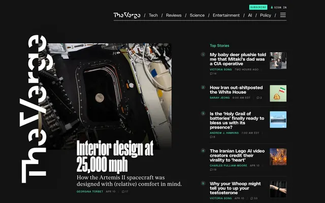
The page primarily uses a max-width contained model for readability, with main content centered. The hero section often features a large image with a bold, Manuka font headline overlaid. Sections flow largely vertically with consistent spacing. Content arrangement often employs a two-column primary layout for feature stories (large image with adjacent text block) and a sidebar for 'Top Stories' or 'Most Popular' lists. There is a strong use of a grid for presenting article snippets and card-like elements. Navigation is a prominent top bar, typically using Ghost White text on an Ink Black background, with a distinctive vertical 'The Verge' wordmark pylon on the left side, slightly overlapping the content.
This site utilizes a mixed visual language heavily dependent on photography and product screenshots. Photography includes tight, often abstract crops of technology and scientific subjects, sometimes with a raw, documentary feel, or product shots on clean backgrounds. Images are typically contained within rectangular bounds, often with a subtle 3px border-radius or no radius. They serve both decorative atmosphere and explanatory content, integrated directly into article layouts. The density is high, with images being integral to breaking up dense text blocks, often full-bleed within their content containers.
Reminiscent of Wired, Ars Technica, Engadget.
# The Verge — Style Reference
> Digital Newsprint, Laser-Etched Text. A dark, information-dense canvas with sharp typographic contrasts and electric accents.

**Theme:** dark

**Site:** https://theverge.com

This design system evokes a 'digital newsprint' feel, balancing raw information density with striking, almost industrial accentuation. A deep, near-black background provides a stark canvas for crisp, often condensed typography and the electrifying 'Voltage Teal' accent. The unusual mix of a narrow sans-serif, a classic display serif, and a monospaced font creates a unique typographic voice that is both modern and slightly nostalgic, preventing the dark theme from becoming generic.

## Tokens — Colors

| Name | Value | Token | Role |
|------|------|------|------|
| Voltage Teal | `#3cffd0` | `--color-voltage-teal` | Interactive elements like primary links, active navigation tabs, selected buttons. Its vividness provides an instant focal point against the dark neutrals. |
| Neon Violet | `#5200ff` | `--color-neon-violet` | Special content blocks, featured categories, or distinctive callouts. Highly saturated for high impact, used sparingly. |
| Blaze Orange | `#ff3d00` | `--color-blaze-orange` | Call-to-action buttons in specific contexts, badges, or error states. Demands attention without being aggressive. |
| Ink Black | `#000000` | `--color-ink-black` | Page backgrounds, major text color for light elements, default borders. The foundational dark canvas of the system. |
| Deep Graphite | `#131313` | `--color-deep-graphite` | Card backgrounds, secondary container fills, subtle dividers. Provides a slight visual lift from the deepest background. |
| Light Ash | `#313131` | `--color-light-ash` | Tertiary backgrounds, subtle shadows, image placeholders. Slightly lighter than Deep Graphite for further distinction without losing coherence. |
| Ghost White | `#ffffff` | `--color-ghost-white` | Primary text on dark backgrounds, key icons, essential outlines. High contrast for maximum readability against the dark canvas. |
| Silver Mist | `#e9e9e9` | `--color-silver-mist` | Secondary text on dark backgrounds, active states for subtle elements. A slightly softer white for less emphasis. |
| Faded Steel | `#949494` | `--color-faded-steel` | Tertiary text, metadata, disabled states. Reduced prominence for supporting information. |

## Tokens — Typography

### Poly Sans
- **Substitute:** Inter
- **Weights:** 300, 400, 500, 700
- **Sizes:** 10px, 11px, 12px, 13px, 15px, 16px, 18px, 19px, 20px, 24px, 34px
- **Line height:** 1, 1.1, 1.2, 1.3, 1.4, 1.5, 1.6
- **Letter spacing:** 0.0200em, 0.0600em, 0.1000em, 0.1500em
- **Role:** Primary text across the site; a condensed sans-serif that balances information density with modern readability. Used for body copy, subheadings, and navigation items, its tighter letter spacing at larger sizes contributes to the 'laser-etched' feel.

### Manuka
- **Substitute:** Playfair Display
- **Weights:** 900
- **Sizes:** 60px, 90px, 107px
- **Line height:** 0.8
- **Letter spacing:** 0.0100em
- **Role:** Display headlines and hero text. This ultra-bold, high-contrast serif typeface is specifically chosen for its dramatic visual impact, carving out a bold, editorial presence on the dark background.

### Fk Roman Standard
- **Substitute:** Libre Baskerville
- **Weights:** 400
- **Sizes:** 16px, 20px, 24px
- **Line height:** 1.2, 1.3
- **Letter spacing:** -0.0100em
- **Role:** Editorial body copy and article titles. A traditional serif with slight negative letter spacing, this font provides a classic, authoritative voice for longer-form content, contrasting with the modern sans-serifs.

### Poly Sans Mono
- **Substitute:** Space Mono
- **Weights:** 400, 500, 600, 700
- **Sizes:** 11px, 12px
- **Line height:** 1.18, 1.2, 1.3, 2
- **Letter spacing:** 0.1000em, 0.1250em
- **Role:** Metadata, timestamps, and compact informational tags. The monospaced nature and wide letter spacing give these elements a technical, almost code-like feel, reinforcing the tech focus of the brand.

### ui-sans-serif
- **Substitute:** System Sans-serif
- **Weights:** 400
- **Sizes:** 16px
- **Line height:** 1.1, 1.2, 1.3, 1.5
- **Letter spacing:** normal
- **Role:** Fallback and utility text. Used for less prominent UI elements, ensuring basic readability where custom fonts are not critical.

## Tokens — Type Scale

Perfect Fifth (1.5) from 16px base.

| Role | Size | Line height | Letter spacing |
|------|------|------|------|
| caption | 10px | 1.4 | — |
| body | 16px | 1.5 | — |
| subheading | 19px | 1.2 | — |
| heading | 24px | 1.2 | 0.48px |
| heading-lg | 34px | 1 | 0.68px |
| display-sm | 60px | 0.8 | 0.6px |
| display-lg | 107px | 0.8 | 1.07px |

## Tokens — Spacing

- **Section gap:** 40px
- **Card padding:** 20px
- **Element gap:** 10px

## Tokens — Radius

- **Default:** 0px
- **Buttons:** 24px
- **card_image_corners:** 3px

## Layout

The page primarily uses a max-width contained model for readability, with main content centered. The hero section often features a large image with a bold, Manuka font headline overlaid. Sections flow largely vertically with consistent spacing. Content arrangement often employs a two-column primary layout for feature stories (large image with adjacent text block) and a sidebar for 'Top Stories' or 'Most Popular' lists. There is a strong use of a grid for presenting article snippets and card-like elements. Navigation is a prominent top bar, typically using Ghost White text on an Ink Black background, with a distinctive vertical 'The Verge' wordmark pylon on the left side, slightly overlapping the content.

## Imagery

This site utilizes a mixed visual language heavily dependent on photography and product screenshots. Photography includes tight, often abstract crops of technology and scientific subjects, sometimes with a raw, documentary feel, or product shots on clean backgrounds. Images are typically contained within rectangular bounds, often with a subtle 3px border-radius or no radius. They serve both decorative atmosphere and explanatory content, integrated directly into article layouts. The density is high, with images being integral to breaking up dense text blocks, often full-bleed within their content containers.

## Components

### Top Stories List

### Today's Stream Tab Bar + Feed Item

### Podcasts Most Popular Block

### Navigation Link
*Primary navigation elements*

Ghost White text on Ink Black background, using Poly Sans at various weights and sizes. Hover state might introduce an underline or a subtle background shift, but no explicit hover color detected.

### Primary Action Button
*Call To Action*

Filled button with Voltage Teal background and Ink Black text. Has a 24px border-radius, giving it a pill shape, and 10px vertical, 24px horizontal padding. Uses Poly Sans font.

### Secondary Action Button
*Alternative Call To Action*

Filled button with Deep Graphite background and Silver Mist text. Has a 24px border-radius, pill shape, with 10px vertical, 24px horizontal padding. Uses Poly Sans font.

### Hamburger Navigation Button (Invisible)
*Menu toggle*

Transparent background, Ghost White icon/text, 0px border-radius and padding. Designed to be unobtrusive until activated, signaling it's a clickable area primarily by its content and typical placement.

### Article Card
*Content previews*

Transparent background (inherits page background), 0px border-radius, no box-shadow. Relies on negative space and typography for structure. Padding of 0px top/bottom, 40px right, 0px left.

### The Verge Wordmark
*Site Identity*

Ghost White text, rotated 90 degrees. Uses Manuka font 900 weight at 107px with a negative letter-spacing for a bold, distinctive side-pylon effect.

### Trending List Item
*Highlights popular content*

Deep Graphite background for the container, with Neon Violet background for the individual list items, contrasting sharply. Ghost White text for titles, Faded Steel for metadata. Utilizes Poly Sans for text. Each item has generous vertical spacing.

### Hero Headline
*Main feature story title*

Ghost White text utilizing the Manuka font at a large size (60px) and ultra-bold weight (900), setting a strong editorial tone with tight line-height (0.8) for power.

## Guidelines

### Do

- Use Ink Black (#000000) for the primary page background.
- Apply Deep Graphite (#131313) for card and content block backgrounds to establish clear hierarchy.
- Style interactive elements and primary links with Voltage Teal (#3cffd0) for high visibility.
- Always use 'Manuka' font (or substitute) at 900 weight for display headlines to create a dramatic impact, setting lineHeight to 0.8.
- Implement 24px border-radius for all primary and secondary buttons for a pill-shaped aesthetic.
- Utilize Poly Sans Mono with wide letter spacing (0.1000em or 0.1250em) for all metadata and timestamps.
- Maintain a default border-radius of 0px for most elements to reinforce the sharp, industrial aesthetic.

### Don't

- Do not use subtle shadows or gradients for elevation; distinguish surfaces primarily through color changes from Ink Black (#000000) to Deep Graphite (#131313) and Light Ash (#313131).
- Avoid generic 'modern sans-serif' for headlines; the distinctive display typefaces like Manuka and Fk Roman Standard are key to the brand.
- Do not introduce additional accent colors, as Voltage Teal, Neon Violet, and Blaze Orange are carefully deployed and highly impactful.
- Never use `ui-sans-serif` system font for prominent text or headlines; it's reserved for utility and fallback only.
- Do not apply padding or borders to article cards; their structure is defined by typography and background colors.
- Do not use soft, organic shapes; stick to the hard edges and specific rounded radii (3px or 24px) for distinct elements.

## Agent Prompt Guide

### Quick Color Reference
- **Text:** #ffffff (Ghost White)
- **Background:** #000000 (Ink Black)
- **CTA:** #3cffd0 (Voltage Teal)
- **Card Background:** #131313 (Deep Graphite)
- **Secondary Text:** #e9e9e9 (Silver Mist)

### 3-5 Example Component Prompts
1. **Create a Hero Section:** Full-width Ink Black background. Overlay a 600px wide image of a high-tech interior. Below the image, place a headline 'Interior design at 25,000 mph' using Manuka font, 900 weight, size 60px, lineHeight 0.8, letterSpacing 0.6px, color Ghost White. Below, add a subtext 'How the Artemis II spacecraft was designed with (relative) comfort in mind.' using Fk Roman Standard, 400 weight, size 24px, lineHeight 1.2, letterSpacing -0.24px, color Ghost White.
2. **Generate a Primary Action Button:** Text 'Subscribe'. Background Voltage Teal (#3cffd0), text color Ink Black (#000000). Border radius 24px. Padding 10px vertical, 24px horizontal. Font Poly Sans, 500 weight, size 16px, letterSpacing 0.32px.
3. **Design a 'Top Stories' Card:** Background Deep Graphite (#131313) with 0px radius. Inside, arrange a list of articles. Each article title should use Poly Sans, 500 weight, size 18px, lineHeight 1.2, color Ghost White. Metadata (e.g., author, time) should use Poly Sans Mono, 400 weight, size 11px, lineHeight 1.18, letterSpacing 1.1px, color Faded Steel (#949494).
4. **Create a 'Most Popular' Block:** Container with Neon Violet (#5200ff) background, 0px radius. Inside, list popular articles. Article titles styled with Poly Sans, 700 weight, size 20px, lineHeight 1.2, color Ghost White. Metadata uses Poly Sans Mono, 400 weight, size 12px, lineHeight 1.2, letterSpacing 1.5px, color Faded Steel (#949494).
5. **Build a Secondary Action Button:** Text 'Following'. Background Deep Graphite (#131313), text color Silver Mist (#e9e9e9). Border radius 24px. Padding 10px vertical, 24px horizontal. Font Poly Sans, 500 weight, size 16px, letterSpacing 0.32px.
More like this







Keep what you find
A free account saves references to boards and can send you a weekly email of picks based on what you save.
To see every result, go Pro.