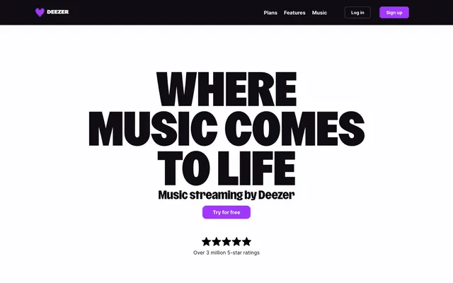
Preview image. Unlock full-res
Electric Violet Nightclub – a bold, high-contrast digital space pulsates with vibrant purple against a deep, dark backdrop.
Color palette
Primary interactive elements like CTA buttons and active navigation items — providing focus and urgency against the dark theme.
Subtle visual highlights, secondary interactive elements, or thematic details.
Primary background, deep sections, dark text on light elements.
Primary text, contrasting backgrounds for nested elements, card surfaces.
Secondary text, disabled states, subtle borders. A desaturated shadow of the primary text.
Tertiary text, subtle separators, less prominent information. Acts as a light gray against the dark background.
Typography
- Weights
- 700, 800
- Sizes
- 18px, 19px, 24px, 35px, 46px, 56px, 120px, 140px
- Line height
- 0.71, 0.9, 1, 1.04, 1.2
- Letter spacing
- 0.002, 0.004, 0.005, 0.013
- Fallback
- Montserrat Black
Display headlines and prominent calls-to-action. The extremely tight line height and bold weight create an aggressive, confident statement.
- Weights
- 400, 500, 600, 700
- Sizes
- 12px, 14px, 16px, 20px
- Line height
- 1, 1.2, 1.33, 1.38, 1.5, 1.56, 1.75, 1.79
- Letter spacing
- normal
- Fallback
- Inter
Body copy, navigation links, button labels, and secondary information. Its clean legibility provides a functional contrast to the expressive display font.
Spacing & shape
Components
Ghost White (#fdfcfe) background, Midnight Void (#191922) text, 12px border-radius, 8px vertical padding, 32px horizontal padding. Used for less prominent actions.
Midnight Void (#121216 - derived from component), Ghost White (#fdfcfe) text, 8px border-radius, 4px vertical padding, 16px horizontal padding. For minor actions or within darker sections.
Ghost White (#fdfcfe) background, 8px border-radius, 24px padding on all sides. Used for presenting information blocks on a light surface.
Inter font, 16px, 400 weight, Midnight Void (#0f0d13) color on light background or Ghost White (#fdfcfe) on dark background. No explicit background/border, interaction is text color change.
Guidelines
- Prioritize Deep Violet (#a238ff) for all primary interactive elements to maintain energetic brand presence.
- Use Deezer Brand font exclusively for display headings (35px and above) and critical calls to action, leveraging weights 700 and 800 for maximum impact.
- Maintain a clear high-contrast hierarchy with Midnight Void (#0f0d13) and Ghost White (#fdfcfe) as primary text/background pairing.
- Apply 12px border-radius for primary buttons and 8px for cards and secondary buttons to establish a consistent softness.
- Ensure generous vertical spacing between sections (90-140px) to provide clear visual breaks and comfortable density.
- Utilize Inter font for all body copy, navigation, and detailed information, at weights 400-600 for optimal legibility.
- Avoid using gray tones for primary interactive elements; reserve Deep Violet (#a238ff) for key actions.
- Do not use Deezer Brand font for body text or small labels; its scale and letter spacing are designed for display.
- Refrain from introducing additional saturated colors beyond the established violet palette, as it dilutes the brand's energetic focus.
- Do not use soft shadows for elevation; rely on background color shifts between Midnight Void (#0f0d13) and Ghost White (#fdfcfe) for depth.
- Avoid mixed border-radii within the same component type; stick to 12px for prominent buttons and 8px for cards.
- Do not introduce tight letter spacing on Inter font family smaller than 16px; it should remain 'normal' for readability.
About this system
ShowHide
This design system evokes a 'Digital Nightclub' vibe, pairing a dark, almost black background with vibrant, single-hue accents. Prominent high-contrast typography, especially the massive, weighty headlines, grabs immediate attention. The liberal use of a vivid violet for interactive elements and highlights creates an energetic pulse against the deep neutrals, reminiscent of neon lighting in a dim space. Sharp corners on most elements are softened by a few key rounded components, adding subtle visual dynamism.
Reminiscent of Spotify, Apple Music, Tidal, SoundCloud.
# Deezer — Style Reference
> Electric Violet Nightclub – a bold, high-contrast digital space pulsates with vibrant purple against a deep, dark backdrop.

**Theme:** dark

**Site:** https://deezer.com

This design system evokes a 'Digital Nightclub' vibe, pairing a dark, almost black background with vibrant, single-hue accents. Prominent high-contrast typography, especially the massive, weighty headlines, grabs immediate attention. The liberal use of a vivid violet for interactive elements and highlights creates an energetic pulse against the deep neutrals, reminiscent of neon lighting in a dim space. Sharp corners on most elements are softened by a few key rounded components, adding subtle visual dynamism.

## Tokens — Colors

| Name | Value | Token | Role |
|------|------|------|------|
| Deep Violet | `#a238ff` | `--color-deep-violet` | Primary interactive elements like CTA buttons and active navigation items — providing focus and urgency against the dark theme. |
| Lavender Haze | `#d09aff` | `--color-lavender-haze` | Subtle visual highlights, secondary interactive elements, or thematic details. |
| Midnight Void | `#0f0d13` | `--color-midnight-void` | Primary background, deep sections, dark text on light elements. |
| Ghost White | `#fdfcfe` | `--color-ghost-white` | Primary text, contrasting backgrounds for nested elements, card surfaces. |
| Slate Echo | `#555257` | `--color-slate-echo` | Secondary text, disabled states, subtle borders. A desaturated shadow of the primary text. |
| Ash Whisper | `#a9a6aa` | `--color-ash-whisper` | Tertiary text, subtle separators, less prominent information. Acts as a light gray against the dark background. |

## Tokens — Typography

### Deezer Brand
- **Substitute:** Montserrat Black
- **Weights:** 700, 800
- **Sizes:** 18px, 19px, 24px, 35px, 46px, 56px, 120px, 140px
- **Line height:** 0.71, 0.9, 1, 1.04, 1.2
- **Letter spacing:** 0.002, 0.004, 0.005, 0.013
- **Role:** Display headlines and prominent calls-to-action. The extremely tight line height and bold weight create an aggressive, confident statement.

### Inter
- **Substitute:** Inter
- **Weights:** 400, 500, 600, 700
- **Sizes:** 12px, 14px, 16px, 20px
- **Line height:** 1, 1.2, 1.33, 1.38, 1.5, 1.56, 1.75, 1.79
- **Letter spacing:** normal
- **Role:** Body copy, navigation links, button labels, and secondary information. Its clean legibility provides a functional contrast to the expressive display font.

## Tokens — Type Scale

Perfect Fourth (1.333) from 16px base.

| Role | Size | Line height | Letter spacing |
|------|------|------|------|
| caption | 12px | 1.5 | — |
| body-sm | 14px | 1.56 | — |
| body | 16px | 1.5 | — |
| subheading | 18px | 1.2 | 0.005em |
| heading-sm | 20px | 1.33 | — |
| heading | 24px | 1 | 0.004em |
| heading-lg | 35px | 1.04 | 0.002em |
| display | 56px | 0.9 | 0.013em |
| display-xl | 120px | 0.71 | 0.013em |

## Tokens — Spacing

- **Section gap:** 90-140px
- **Card padding:** 24px
- **Element gap:** 8px

## Tokens — Radius

- **General:** 8px
- **Buttons:** 12px
- **Cards:** 8px
- **badges:** 9px / 75%

## Components

### Pricing Card — Premium 1 Month Free

### FAQ Accordion

### CTA Banner — Live the Music with Deezer

### Secondary Ghost Button
*Action*

Ghost White (#fdfcfe) background, Midnight Void (#191922) text, 12px border-radius, 8px vertical padding, 32px horizontal padding. Used for less prominent actions.

### Tertiary Dark Button
*Action*

Midnight Void (#121216 - derived from component), Ghost White (#fdfcfe) text, 8px border-radius, 4px vertical padding, 16px horizontal padding. For minor actions or within darker sections.

### Feature Card
*Content container*

Ghost White (#fdfcfe) background, 8px border-radius, 24px padding on all sides. Used for presenting information blocks on a light surface.

### Navigation Link
*Navigation*

Inter font, 16px, 400 weight, Midnight Void (#0f0d13) color on light background or Ghost White (#fdfcfe) on dark background. No explicit background/border, interaction is text color change.

## Guidelines

### Do

- Prioritize Deep Violet (#a238ff) for all primary interactive elements to maintain energetic brand presence.
- Use Deezer Brand font exclusively for display headings (35px and above) and critical calls to action, leveraging weights 700 and 800 for maximum impact.
- Maintain a clear high-contrast hierarchy with Midnight Void (#0f0d13) and Ghost White (#fdfcfe) as primary text/background pairing.
- Apply 12px border-radius for primary buttons and 8px for cards and secondary buttons to establish a consistent softness.
- Ensure generous vertical spacing between sections (90-140px) to provide clear visual breaks and comfortable density.
- Utilize Inter font for all body copy, navigation, and detailed information, at weights 400-600 for optimal legibility.

### Don't

- Avoid using gray tones for primary interactive elements; reserve Deep Violet (#a238ff) for key actions.
- Do not use Deezer Brand font for body text or small labels; its scale and letter spacing are designed for display.
- Refrain from introducing additional saturated colors beyond the established violet palette, as it dilutes the brand's energetic focus.
- Do not use soft shadows for elevation; rely on background color shifts between Midnight Void (#0f0d13) and Ghost White (#fdfcfe) for depth.
- Avoid mixed border-radii within the same component type; stick to 12px for prominent buttons and 8px for cards.
- Do not introduce tight letter spacing on Inter font family smaller than 16px; it should remain 'normal' for readability.

## Agent Prompt Guide

### Quick Color Reference
- Text (dark background): #fdfcfe (Ghost White)
- Text (light background): #0f0d13 (Midnight Void)
- Primary Background: #0f0d13 (Midnight Void)
- Call-to-Action: #a238ff (Deep Violet)
- Border/Divider (subtle): #a9a6aa (Ash Whisper)

### Example Component Prompts
1. Create a Hero Section: full-width Midnight Void (#0f0d13) background. Centered headline 'YOUR MUSIC, ELEVATED' in Deezer Brand font, 120px, weight 800, #fdfcfe color, line-height 0.9. Below, a subtitle 'Stream millions of songs' in Inter font, 20px, weight 400, #a9a6aa color. Beneath that, a Primary CTA Button 'Start Free Trial'.
2. Create a Feature Card: Ghost White (#fdfcfe) background, 8px border-radius, 24px padding. Inside, 'Enhanced Quality' heading in Inter font, 20px, weight 700, #0f0d13 color. Below, body text 'Experience crystal-clear audio playback.' in Inter font, 16px, weight 400, #555257 color. Add a small filled icon (Ghost White on Deep Violet background) at the top-left.
3. Create a Navigation Bar: Midnight Void (#0f0d13) background, 80px height. On the left, 'Deezer' logo in #fdfcfe. On the right, a series of light text links 'Plans', 'Features', 'Music' in Inter font, 16px, weight 400, #fdfcfe. End with a 'Log In' text link and a Primary CTA Button 'Sign Up'.
4. Create an 'Offer Details' List Item: Ghost White (#fdfcfe) background. Use Inter font, 16px, weight 400, #0f0d13 color. Prepend with a small checkmark icon in Deep Violet (#a238ff). Example text: 'Over 120 million songs'.
More like this





Keep what you find
A free account saves references to boards and can send you a weekly email of picks based on what you save.
To see every result, go Pro.