Preview image. Unlock full-res
Warm earth-tones, artisan typography
Color palette
Dark borders and separators for elevated surfaces and inverted UI. Do not promote it to the primary CTA color
Primary section background, conveying warmth and natural material
Tertiary section background, a deep, muted green for variety
Accent background, a cool, muted blue-gray
Accent background, a soft, desaturated purple for visual segmentation
Primary text, general borders, link text
Secondary background, ghost button background, footer background, provides a soft, warm white base
Filled button background, providing a subtle, muted interactive state
Component backgrounds, button text, subtle borders, maintaining a clean contrast
Card backgrounds, section separators, a very light, warm neutral surface
Muted helper text, secondary information
Typography
- Weights
- 400, 500
- Sizes
- 16px, 20px, 24px, 26px, 30px, 36px, 40px
- Line height
- 1, 1.2, 1.5
ModernEra-Regular — detected in extracted data but not described by AI
- Weights
- 400
- Sizes
- 16px
- Line height
- 1.5
- Letter spacing
- normal
- Fallback
- Playfair Display
Headlines, main body text components. The varied weights handle hierarchy with a consistent, classic serif feel, preventing overly bold elements.
- Weights
- 400
- Sizes
- 14px, 16px
- Line height
- 1.43, 1.5
- Letter spacing
- -0.0070em
- Fallback
- IBM Plex Mono
Subheadings, captions, secondary labels, and functional text like navigation. The monospace quality adds a technical, precise counterpoint to the main serif font, with tight tracking enhancing its crispness.
Spacing & shape
Elevation
Components
Text in Charcoal Black (#272729), no background, no border, with 14px padding. Utilizes ModernEra Mono weight 400 for a crisp, functional feel.
Background Almond Canvas (#fdfcf2), text Mahogany Wood (#413128), and a 1px solid Mahogany Wood (#413128) border. Zero border-radius and 14px vertical, 22px horizontal padding. Uses ModernEra weight 400.
Background Stonewash Gray (#cfcfcf), text Pure White (#ffffff). Zero border-radius and 14px vertical, 22px horizontal padding. Uses ModernEra weight 400.
Background Pale Sand (#f2ede1), with 20px padding. Zero border-radius, no visible border or shadow by default. Content typically centered and structured within this container.
Background Pure White (#ffffff), with a 1px solid Charcoal Black (#272729) border. Zero border-radius, 15px vertical padding and 20px horizontal padding. Uses ModernEra Mono for input text.
Guidelines
- Prioritize a maximalist approach to imagery, letting the visual assets command attention.
- Maintain zero border-radius on all interactive elements and content containers for a sharp, architectural feel.
- Use Almond Canvas (#fdfcf2) as the default background for interactive components to provide a soft contrast.
- Employ the ModernEra Mono font for all secondary and functional text elements, utilizing its tight -0.0070em letter-spacing.
- Structure page sections with distinct background colors like Desert Clay (#d6926b) and Pale Sand (#f2ede1) to create visual rhythm.
- Use Charcoal Black (#272729) for primary text and border outlines to maintain strong contrast and definition.
- Ensure generous top and bottom padding of 180px for major sections to create breathing room and gravitas.
- Avoid using drop shadows for elevation; instead, use subtle background color changes or inset shadows for depth.
- Do not introduce rounded corners on any UI elements; the system explicitly uses sharp 0px radii.
- Refrain from using strong, vivid primary colors for backgrounds; the palette relies on muted, earthy tones.
- Do not deviate from the ModernEra and ModernEra Mono font families; there are no other approved typefaces.
- Avoid dense, clustered layouts; content should feel spacious with ample negative space around elements.
- Do not use generic system UI elements; components must reflect the custom, minimalist styling with specific colors and radii.
- Do not apply `normal` letter-spacing to ModernEra Mono font; it should always carry the defined negative tracking.
About this system
ShowHide
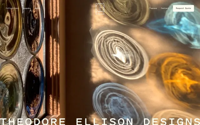
Theodore Ellison Designs evokes a historical, handcrafted luxury. Its visual style combines the warmth of natural materials with a sparse, deliberate layout. Typography utilizes a bespoke font with subtle letter-spacing for headlines and body text, maintaining an airy, refined feel. A muted chromatic palette, anchored by deep, earthy tones, defines backgrounds and highlights, allowing glass and light to become the true focal points. Components are minimal, often border-only or filled with soft, desaturated colors, emphasizing texture and form over bold graphics.
The page primarily uses a contained layout with some full-bleed sections. The hero section can be full-bleed with a prominent visual that takes up the entire viewport, featuring centered branding. Subsequent sections alternate between full-width color blocks and content blocks limited by an implicit max-width, maintaining comfortable internal padding. Content often arranges in dual-column structures (text-left/image-right or vice versa) or centered stacks. Vertical rhythm is established through generous and consistent section gaps of 180px between major blocks, creating a spacious and unhurried browsing experience. The navigation is a minimal top bar, with prominent branding and subtle ghost buttons on the right.
Photography is paramount, often showcasing glasswork and interiors. Images tend to be full-bleed or large, emphasizing texture and light interaction as they would 'in situ'. There's a mix of detailed product shots and atmospheric context shots that capture mood and environment. Photography for products is direct and bright, highlighting the material. Illustrations are minimalist line-art for logos and icons, providing a clean, geometric contrast to the organic nature of the glass. Icons (visible in the header logo) are outlined with a fine stroke weight, maintaining a delicate, architectural feel. Imagery primarily serves to showcase the product and evoke a sense of crafted quality, occupying significant visual space.
Reminiscent of Ferm Living, Aesop, Carl Hansen & Søn, The Future Kept.
# Theodore Ellison Designs — Style Reference
> Warm earth-tones, artisan typography

**Theme:** light

**Site:** https://theodoreellison.com

Theodore Ellison Designs evokes a historical, handcrafted luxury. Its visual style combines the warmth of natural materials with a sparse, deliberate layout. Typography utilizes a bespoke font with subtle letter-spacing for headlines and body text, maintaining an airy, refined feel. A muted chromatic palette, anchored by deep, earthy tones, defines backgrounds and highlights, allowing glass and light to become the true focal points. Components are minimal, often border-only or filled with soft, desaturated colors, emphasizing texture and form over bold graphics.

## Tokens — Colors

| Name | Value | Token | Role |
|------|------|------|------|
| Mahogany Wood | `#413128` | `--color-mahogany-wood` | Dark borders and separators for elevated surfaces and inverted UI. Do not promote it to the primary CTA color |
| Desert Clay | `#d6926b` | `--color-desert-clay` | Primary section background, conveying warmth and natural material |
| Forest Moss | `#3c4531` | `--color-forest-moss` | Tertiary section background, a deep, muted green for variety |
| Ocean Slate | `#38506c` | `--color-ocean-slate` | Accent background, a cool, muted blue-gray |
| Lavender Mist | `#afa5b4` | `--color-lavender-mist` | Accent background, a soft, desaturated purple for visual segmentation |
| Charcoal Black | `#272729` | `--color-charcoal-black` | Primary text, general borders, link text |
| Almond Canvas | `#fdfcf2` | `--color-almond-canvas` | Secondary background, ghost button background, footer background, provides a soft, warm white base |
| Stonewash Gray | `#cfcfcf` | `--color-stonewash-gray` | Filled button background, providing a subtle, muted interactive state |
| Pure White | `#ffffff` | `--color-pure-white` | Component backgrounds, button text, subtle borders, maintaining a clean contrast |
| Pale Sand | `#f2ede1` | `--color-pale-sand` | Card backgrounds, section separators, a very light, warm neutral surface |
| Muted Text | `#777777` | `--color-muted-text` | Muted helper text, secondary information |

## Tokens — Typography

### ModernEra-Regular
- **Weights:** 400, 500
- **Sizes:** 16px, 20px, 24px, 26px, 30px, 36px, 40px
- **Line height:** 1, 1.2, 1.5
- **Role:** ModernEra-Regular — detected in extracted data but not described by AI

### ModernEra
- **Substitute:** Playfair Display
- **Weights:** 400
- **Sizes:** 16px
- **Line height:** 1.5
- **Letter spacing:** normal
- **Role:** Headlines, main body text components. The varied weights handle hierarchy with a consistent, classic serif feel, preventing overly bold elements.

### ModernEra Mono
- **Substitute:** IBM Plex Mono
- **Weights:** 400
- **Sizes:** 14px, 16px
- **Line height:** 1.43, 1.5
- **Letter spacing:** -0.0070em
- **Role:** Subheadings, captions, secondary labels, and functional text like navigation. The monospace quality adds a technical, precise counterpoint to the main serif font, with tight tracking enhancing its crispness.

## Tokens — Type Scale

| Role | Size | Line height | Letter spacing |
|------|------|------|------|
| caption | 16px | 1.2 | — |
| body-sm | 20px | 1.2 | — |
| body | 24px | 1.2 | — |
| body-lg | 26px | 1.2 | — |
| heading-sm | 30px | 1.2 | — |
| heading | 36px | 1.2 | — |
| heading-lg | 40px | 1.2 | — |

## Tokens — Spacing

- **Section gap:** 180px
- **Card padding:** 20px
- **Element gap:** 20px

## Tokens — Radius

- **Buttons:** 0px
- **Cards:** 0px
- **textInputs:** 0px

## Tokens — Elevation

- **Gallery Image Modal:** `inset rgba(0, 0, 0, 0.25) 0px 0px 100px 0px`

## Layout

The page primarily uses a contained layout with some full-bleed sections. The hero section can be full-bleed with a prominent visual that takes up the entire viewport, featuring centered branding. Subsequent sections alternate between full-width color blocks and content blocks limited by an implicit max-width, maintaining comfortable internal padding. Content often arranges in dual-column structures (text-left/image-right or vice versa) or centered stacks. Vertical rhythm is established through generous and consistent section gaps of 180px between major blocks, creating a spacious and unhurried browsing experience. The navigation is a minimal top bar, with prominent branding and subtle ghost buttons on the right.

## Imagery

Photography is paramount, often showcasing glasswork and interiors. Images tend to be full-bleed or large, emphasizing texture and light interaction as they would 'in situ'. There's a mix of detailed product shots and atmospheric context shots that capture mood and environment. Photography for products is direct and bright, highlighting the material. Illustrations are minimalist line-art for logos and icons, providing a clean, geometric contrast to the organic nature of the glass. Icons (visible in the header logo) are outlined with a fine stroke weight, maintaining a delicate, architectural feel. Imagery primarily serves to showcase the product and evoke a sense of crafted quality, occupying significant visual space.

## Components

### Ghost Navigation Button
*Primary navigation links and interactive elements within headers/footers.*

Text in Charcoal Black (#272729), no background, no border, with 14px padding. Utilizes ModernEra Mono weight 400 for a crisp, functional feel.

### Outlined Call-to-Action Button
*Prominent calls to action, drawing attention through contrast.*

Background Almond Canvas (#fdfcf2), text Mahogany Wood (#413128), and a 1px solid Mahogany Wood (#413128) border. Zero border-radius and 14px vertical, 22px horizontal padding. Uses ModernEra weight 400.

### Filled Neutral Button
*Secondary actions or less prominent interactive elements.*

Background Stonewash Gray (#cfcfcf), text Pure White (#ffffff). Zero border-radius and 14px vertical, 22px horizontal padding. Uses ModernEra weight 400.

### Section Divider Card
*Modular content blocks that visually separate information.*

Background Pale Sand (#f2ede1), with 20px padding. Zero border-radius, no visible border or shadow by default. Content typically centered and structured within this container.

### Text Input (Outlined)
*Form fields for user data entry.*

Background Pure White (#ffffff), with a 1px solid Charcoal Black (#272729) border. Zero border-radius, 15px vertical padding and 20px horizontal padding. Uses ModernEra Mono for input text.

## Guidelines

### Do

- Prioritize a maximalist approach to imagery, letting the visual assets command attention.
- Maintain zero border-radius on all interactive elements and content containers for a sharp, architectural feel.
- Use Almond Canvas (#fdfcf2) as the default background for interactive components to provide a soft contrast.
- Employ the ModernEra Mono font for all secondary and functional text elements, utilizing its tight -0.0070em letter-spacing.
- Structure page sections with distinct background colors like Desert Clay (#d6926b) and Pale Sand (#f2ede1) to create visual rhythm.
- Use Charcoal Black (#272729) for primary text and border outlines to maintain strong contrast and definition.
- Ensure generous top and bottom padding of 180px for major sections to create breathing room and gravitas.

### Don't

- Avoid using drop shadows for elevation; instead, use subtle background color changes or inset shadows for depth.
- Do not introduce rounded corners on any UI elements; the system explicitly uses sharp 0px radii.
- Refrain from using strong, vivid primary colors for backgrounds; the palette relies on muted, earthy tones.
- Do not deviate from the ModernEra and ModernEra Mono font families; there are no other approved typefaces.
- Avoid dense, clustered layouts; content should feel spacious with ample negative space around elements.
- Do not use generic system UI elements; components must reflect the custom, minimalist styling with specific colors and radii.
- Do not apply `normal` letter-spacing to ModernEra Mono font; it should always carry the defined negative tracking.

## Agent Prompt Guide

Quick Color Reference:
text: #272729
background: #d6926b
border: #413128
accent: #a8a0ae
primary action: no distinct CTA color

Example Component Prompts:
1. Create an outlined button for 'View Collection': Almond Canvas background (#fdfcf2), Mahogany Wood text (#413128), and a 1px solid Mahogany Wood (#413128) border. Use ModernEra font, weight 400, 14px vertical padding, 22px horizontal padding, 0px border-radius.
2. Design a minimalist text input: Pure White background (#ffffff), 1px solid Charcoal Black (#272729) border. Use ModernEra Mono font, weight 400, for input text. Ensure 15px vertical and 20px horizontal padding, 0px border-radius.
3. Create a secondary navigation link: text Charcoal Black (#272729), no background, no border. Use ModernEra Mono font, weight 400, 14px font size, -0.0070em letter-spacing.
More like this










Keep what you find
A free account saves references to boards and can send you a weekly email of picks based on what you save.
To see every result, go Pro.