Preview image. Unlock full-res
Playful violet canvas, pastel cards
Color palette
Primary background for sections and components, button filled primary action backgrounds, critical text elements like headings
Hover states for primary interactive elements, borders on focused input fields, secondary section backgrounds
Footer background, decorative element fills, subtle card backgrounds
Decorative card borders and outlines, secondary link borders
Subtle section backgrounds, outlined button strokes, secondary link backgrounds
Table borders, light background fills for interactive elements
Iconic accent color for illustrations and call-out text
Iconic accent color for illustrations and distinct highlight elements
Green outline accent for tags, dividers, and focused UI edges
Iconic accent color for illustrations, card text, and occasional borders
Decorative borders for interactive elements and small accents
Text color for certain interactive elements and specific card content
Accent background for primary interactive buttons within certain sections
Card background for visual differentiation in multi-color grids
Card background for visual differentiation in multi-color grids
Card background for visual differentiation in multi-color grids
Card background for visual differentiation in multi-color grids
Card background for visual differentiation in multi-color grids
Text color for certain colorful cards or elements from the orange palette
Hairline borders, dividers, input outlines, and card edges on light surfaces. Do not promote it to the primary CTA color
Subtle panel backgrounds, secondary content areas contrasting with the pure canvas
Lightest card background, contributing to the pastel card palette
Additional very light background tint for content areas
Background for specific body sections and content cards
Background for specific body sections and content cards
Darkest background for global navigation, creating depth and contrast
Typography
- Weights
- 400, 500, 600, 700, 900
- Sizes
- 10px, 11px, 12px, 13px, 14px, 16px, 18px
- Line height
- 1, 1.15, 1.2, 1.25, 1.4
- Letter spacing
- 0.007em at 18px down to 0.100em at 10px
- Fallback
- system-ui
Primary sans-serif for all body text, navigational elements, and most UI components. Its geometric neutrality balances the more expressive display font.
- Weights
- 300, 400, 500, 600, 700
- Sizes
- 20px, 22px, 24px, 26px, 28px, 46px, 52px, 64px, 72px
- Line height
- 0.9, 0.98, 1, 1.05, 1.1, 1.2, 1.4
- Letter spacing
- -0.030em at 72px down to -0.007em at 20px
- Fallback
- serif
Display serif font for all primary headlines and marketing copy. Its subtle elegance provides a distinctive character, contrasting with the utilitarian sans-serif. The negative letter-spacing for large sizes creates a tight, considered appearance.
Spacing & shape
Components
Background: Tines Violet (#4d3e78), Text: Alabaster (#ffffff), Border: 1px solid Tines Violet (#4d3e78), Border-radius: 14px, Padding: 30px.
Background: transparent (rgba(0,0,0,0)), Text: Alabaster (#ffffff), Border: 1px solid Alabaster (#ffffff) for primary usage; can adapt accent colors like Light Orchid (#c2aafa) for contextual use. Border-radius: 0px or 14px, depending on context.
Background: Deep Sea Violet (#6956a8) at 70% opacity, Text: Alabaster (#ffffff), Border: 1px solid Alabaster (#ffffff), Border-radius: 50% (circular), Padding: 1px vertical, 6px horizontal.
Background: Varies among Card Lavender (#e1d2f9), Card Blue (#ccdcf8), Card Peach (#ffdcb6), Card Pink (#ffcee2), Card Sage (#c4e7cb). Text color varies by background for legibility (e.g., Deep Orange Text #803218 on peach cards). Border-radius: 14px, Padding: 24px, no direct box-shadow.
Text: Alabaster (#ffffff), often with no explicit background. Underline on hover or focus.
Background: Tines Violet (#4d3e78), Text: Alabaster (#ffffff). Contained button accent: Deep Sea Violet (#6956a8) at 70% opacity. Border-radius: 0, full width.
Background: transparent, Border: various accent colors like Light Orchid (#c2aafa) for active/highlight states, Border-radius: 50%.
Background: Alabaster (#ffffff) or Vanilla Cream (#fcf9f5), Border: 1px solid subtle gray (no exact hex provided, infer from near-gray colors #feede0 or #eadff8), Box-shadow present (no exact CSS provided – will need to be inferred for elevation), Border-radius: 14px.
Guidelines
- Prioritize Tines Violet (#4d3e78) as the primary background for sections and main call-to-action buttons.
- Use Alabaster (#ffffff) for all primary text on darker backgrounds and as button text, ensuring high contrast.
- Apply Reckless font for headlines at larger sizes (e.g., 52px, 64px) with negative letter-spacing (e.g., -0.020em) to create a distinct, impactful display.
- Utilize Roobert font for all body text and UI elements, opting for weights 400 and 500 for readability.
- Construct multi-color card layouts using the pastel range of Card Lavender (#e1d2f9), Card Blue (#ccdcf8), Card Peach (#ffdcb6), Card Pink (#ffcee2), and Card Sage (#c4e7cb) to add visual interest and segmentation.
- Maintain a generous border-radius of 14px for all cards and primary buttons to ensure a consistent soft, approachable shape.
- Use 24px as the standard internal padding for cards and primary content blocks to provide ample breathing room.
- Avoid using flat black text (#000000) on white backgrounds; instead, use slightly desaturated dark grays if a darker text is needed on light surfaces.
- Do not introduce strong, saturated accent colors that deviate from the established violet, orange, green, and blue pastel palette.
- Refrain from heavy, dark drop shadows; prefer subtle elevation via borders and slight background shifts.
- Do not use generic sans-serif fonts for headlines; always use Reckless to preserve the brand's unique typographic voice.
- Avoid tight letter-spacing for body text; Roobert should generally use positive or normal letter-spacing, unlike the display font.
- Do not break the 14px border-radius standard for cards and main buttons, unless specifically designing a micro-component with a 7px radius.
About this system
ShowHide
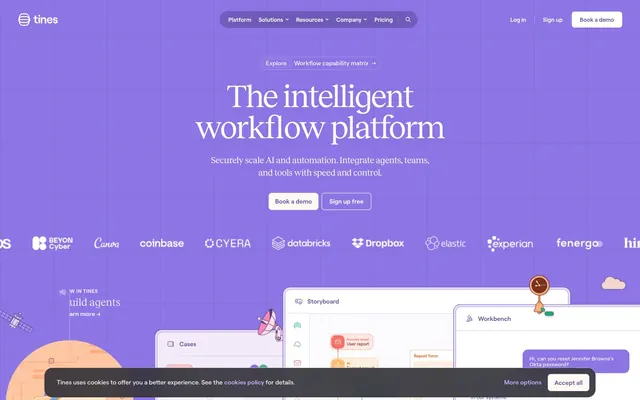
Tines uses a playful, vibrant UI that combines a dominant violet backdrop with a spectrum of soft, pastel-colored cards and a handful of vivid accent colors. Typography mixes a quirky geometric sans-serif for body text with a serif display font for headlines, creating an unexpected but engaging contrast. The system emphasizes clear information hierarchy through distinct, colorful card surfaces, thin borders, and ample internal padding, all within a spacious, contained layout that feels organized yet energetic.
The page primarily uses a max-width 1200px centered content container. The hero section is full-bleed across the viewport, featuring a large centered headline against a Tines Violet background with subtle abstract overlay graphics. Sections alternate with consistent vertical spacing, often showcasing two-column layouts with text on one side and an illustrative graphic or product screenshot on the other. Feature grids are prominent, using multiple pastel-colored cards arranged in responsive columns. Navigation is a sticky top bar with a deep plum background, containing brand logo, menu items, and primary action buttons.
The visual language for imagery is characterized by highly stylized, abstract illustrations with a 3D isometric perspective, using a vibrant brand-aligned color palette (Bubblegum Pink, Sunset Orange, Forest Green). Icons are simple, outlined, and monochromatic, often using accent colors like Periwinkle Accent. Product screenshots are a core component, showing complex nodal workflows and UI elements, frequently presented as floating or layered panels against the brand's violet backgrounds. Imagery serves both decorative atmosphere and explanatory content, emphasizing the platform's intelligent automation capabilities. The density is image-heavy, with illustrations and product UI mockups occupying significant visual space.
Reminiscent of Airtable, Notion, Zapier, Linear.
# Tines — Style Reference
> Playful violet canvas, pastel cards

**Theme:** light

**Site:** https://www.tines.com

Tines uses a playful, vibrant UI that combines a dominant violet backdrop with a spectrum of soft, pastel-colored cards and a handful of vivid accent colors. Typography mixes a quirky geometric sans-serif for body text with a serif display font for headlines, creating an unexpected but engaging contrast. The system emphasizes clear information hierarchy through distinct, colorful card surfaces, thin borders, and ample internal padding, all within a spacious, contained layout that feels organized yet energetic.

## Tokens — Colors

| Name | Value | Token | Role |
|------|------|------|------|
| Tines Violet | `#4d3e78` | `--color-tines-violet` | Primary background for sections and components, button filled primary action backgrounds, critical text elements like headings |
| Deep Sea Violet | `#6956a8` | `--color-deep-sea-violet` | Hover states for primary interactive elements, borders on focused input fields, secondary section backgrounds |
| Lavender Mist | `#7f69ce` | `--color-lavender-mist` | Footer background, decorative element fills, subtle card backgrounds |
| Periwinkle Accent | `#a990f5` | `--color-periwinkle-accent` | Decorative card borders and outlines, secondary link borders |
| Light Orchid | `#c2aafa` | `--color-light-orchid` | Subtle section backgrounds, outlined button strokes, secondary link backgrounds |
| Powder Violet | `#d7c4fa` | `--color-powder-violet` | Table borders, light background fills for interactive elements |
| Bubblegum Pink | `#a54b7a` | `--color-bubblegum-pink` | Iconic accent color for illustrations and call-out text |
| Sunset Orange | `#b74d1a` | `--color-sunset-orange` | Iconic accent color for illustrations and distinct highlight elements |
| Forest Green | `#1f7a57` | `--color-forest-green` | Green outline accent for tags, dividers, and focused UI edges |
| Sky Blue | `#3c699b` | `--color-sky-blue` | Iconic accent color for illustrations, card text, and occasional borders |
| Peach Zest | `#fd975d` | `--color-peach-zest` | Decorative borders for interactive elements and small accents |
| Pine Green | `#195642` | `--color-pine-green` | Text color for certain interactive elements and specific card content |
| Action Violet | `#745fbb` | `--color-action-violet` | Accent background for primary interactive buttons within certain sections |
| Card Lavender | `#e1d2f9` | `--color-card-lavender` | Card background for visual differentiation in multi-color grids |
| Card Blue | `#ccdcf8` | `--color-card-blue` | Card background for visual differentiation in multi-color grids |
| Card Peach | `#ffdcb6` | `--color-card-peach` | Card background for visual differentiation in multi-color grids |
| Card Pink | `#ffcee2` | `--color-card-pink` | Card background for visual differentiation in multi-color grids |
| Card Sage | `#c4e7cb` | `--color-card-sage` | Card background for visual differentiation in multi-color grids |
| Deep Orange Text | `#803218` | `--color-deep-orange-text` | Text color for certain colorful cards or elements from the orange palette |
| Alabaster | `#ffffff` | `--color-alabaster` | Hairline borders, dividers, input outlines, and card edges on light surfaces. Do not promote it to the primary CTA color |
| Vanilla Cream | `#fcf9f5` | `--color-vanilla-cream` | Subtle panel backgrounds, secondary content areas contrasting with the pure canvas |
| Light Lilac | `#f3ecf7` | `--color-light-lilac` | Lightest card background, contributing to the pastel card palette |
| Pale Mint | `#e9f3e7` | `--color-pale-mint` | Additional very light background tint for content areas |
| Warm Beige | `#ffe0cc` | `--color-warm-beige` | Background for specific body sections and content cards |
| Soft Pistachio | `#d6edd9` | `--color-soft-pistachio` | Background for specific body sections and content cards |
| Deep Plum | `#32274b` | `--color-deep-plum` | Darkest background for global navigation, creating depth and contrast |

## Tokens — Typography

### Roobert
- **Substitute:** system-ui
- **Weights:** 400, 500, 600, 700, 900
- **Sizes:** 10px, 11px, 12px, 13px, 14px, 16px, 18px
- **Line height:** 1, 1.15, 1.2, 1.25, 1.4
- **Letter spacing:** 0.007em at 18px down to 0.100em at 10px
- **Role:** Primary sans-serif for all body text, navigational elements, and most UI components. Its geometric neutrality balances the more expressive display font.

### Reckless
- **Substitute:** serif
- **Weights:** 300, 400, 500, 600, 700
- **Sizes:** 20px, 22px, 24px, 26px, 28px, 46px, 52px, 64px, 72px
- **Line height:** 0.9, 0.98, 1, 1.05, 1.1, 1.2, 1.4
- **Letter spacing:** -0.030em at 72px down to -0.007em at 20px
- **Role:** Display serif font for all primary headlines and marketing copy. Its subtle elegance provides a distinctive character, contrasting with the utilitarian sans-serif. The negative letter-spacing for large sizes creates a tight, considered appearance.

## Tokens — Type Scale

Major Second (1.125) from 12px base.

| Role | Size | Line height | Letter spacing |
|------|------|------|------|
| caption | 10px | 1.2 | — |
| body-sm | 11px | 1.2 | — |
| body | 12px | 1.2 | — |
| body-lg | 13px | 1.2 | — |
| heading-sm | 14px | 1.2 | — |
| heading | 16px | 1.2 | — |
| heading-lg | 18px | 1.2 | — |

## Tokens — Spacing

- **Max width:** 1200px
- **Section gap:** 42-64px
- **Card padding:** 24px
- **Element gap:** 12px

## Tokens — Radius

- **Buttons:** 14px
- **Inputs:** 7px
- **Cards:** 14px
- **largeFeatures:** 24px
- **tags:** 7px

## Layout

The page primarily uses a max-width 1200px centered content container. The hero section is full-bleed across the viewport, featuring a large centered headline against a Tines Violet background with subtle abstract overlay graphics. Sections alternate with consistent vertical spacing, often showcasing two-column layouts with text on one side and an illustrative graphic or product screenshot on the other. Feature grids are prominent, using multiple pastel-colored cards arranged in responsive columns. Navigation is a sticky top bar with a deep plum background, containing brand logo, menu items, and primary action buttons.

## Imagery

The visual language for imagery is characterized by highly stylized, abstract illustrations with a 3D isometric perspective, using a vibrant brand-aligned color palette (Bubblegum Pink, Sunset Orange, Forest Green). Icons are simple, outlined, and monochromatic, often using accent colors like Periwinkle Accent. Product screenshots are a core component, showing complex nodal workflows and UI elements, frequently presented as floating or layered panels against the brand's violet backgrounds. Imagery serves both decorative atmosphere and explanatory content, emphasizing the platform's intelligent automation capabilities. The density is image-heavy, with illustrations and product UI mockups occupying significant visual space.

## Components

### Primary Filled Button
*Main call-to-action button, solid background.*

Background: Tines Violet (#4d3e78), Text: Alabaster (#ffffff), Border: 1px solid Tines Violet (#4d3e78), Border-radius: 14px, Padding: 30px.

### Outline Ghost Button
*Secondary action or navigational link with minimal visual weight.*

Background: transparent (rgba(0,0,0,0)), Text: Alabaster (#ffffff), Border: 1px solid Alabaster (#ffffff) for primary usage; can adapt accent colors like Light Orchid (#c2aafa) for contextual use. Border-radius: 0px or 14px, depending on context.

### Circular Dot Button
*Small interactive elements or highlights, often containing iconography.*

Background: Deep Sea Violet (#6956a8) at 70% opacity, Text: Alabaster (#ffffff), Border: 1px solid Alabaster (#ffffff), Border-radius: 50% (circular), Padding: 1px vertical, 6px horizontal.

### Colorful Testimonial Card
*Highlights customer testimonials or key statistics with a distinct background hue.*

Background: Varies among Card Lavender (#e1d2f9), Card Blue (#ccdcf8), Card Peach (#ffdcb6), Card Pink (#ffcee2), Card Sage (#c4e7cb). Text color varies by background for legibility (e.g., Deep Orange Text #803218 on peach cards). Border-radius: 14px, Padding: 24px, no direct box-shadow.

### Navigation Link
*Main navigation items and inline links.*

Text: Alabaster (#ffffff), often with no explicit background. Underline on hover or focus.

### Cookie Consent Banner
*Persistent notification at the bottom of the screen.*

Background: Tines Violet (#4d3e78), Text: Alabaster (#ffffff). Contained button accent: Deep Sea Violet (#6956a8) at 70% opacity. Border-radius: 0, full width.

### Small Round Icon Button
*Compact interactive icon, often used in product UIs or feature lists.*

Background: transparent, Border: various accent colors like Light Orchid (#c2aafa) for active/highlight states, Border-radius: 50%.

### Product Snapshot Panel
*Detailed product UI elements shown in screenshots.*

Background: Alabaster (#ffffff) or Vanilla Cream (#fcf9f5), Border: 1px solid subtle gray (no exact hex provided, infer from near-gray colors #feede0 or #eadff8), Box-shadow present (no exact CSS provided – will need to be inferred for elevation), Border-radius: 14px.

## Guidelines

### Do

- Prioritize Tines Violet (#4d3e78) as the primary background for sections and main call-to-action buttons.
- Use Alabaster (#ffffff) for all primary text on darker backgrounds and as button text, ensuring high contrast.
- Apply Reckless font for headlines at larger sizes (e.g., 52px, 64px) with negative letter-spacing (e.g., -0.020em) to create a distinct, impactful display.
- Utilize Roobert font for all body text and UI elements, opting for weights 400 and 500 for readability.
- Construct multi-color card layouts using the pastel range of Card Lavender (#e1d2f9), Card Blue (#ccdcf8), Card Peach (#ffdcb6), Card Pink (#ffcee2), and Card Sage (#c4e7cb) to add visual interest and segmentation.
- Maintain a generous border-radius of 14px for all cards and primary buttons to ensure a consistent soft, approachable shape.
- Use 24px as the standard internal padding for cards and primary content blocks to provide ample breathing room.

### Don't

- Avoid using flat black text (#000000) on white backgrounds; instead, use slightly desaturated dark grays if a darker text is needed on light surfaces.
- Do not introduce strong, saturated accent colors that deviate from the established violet, orange, green, and blue pastel palette.
- Refrain from heavy, dark drop shadows; prefer subtle elevation via borders and slight background shifts.
- Do not use generic sans-serif fonts for headlines; always use Reckless to preserve the brand's unique typographic voice.
- Avoid tight letter-spacing for body text; Roobert should generally use positive or normal letter-spacing, unlike the display font.
- Do not break the 14px border-radius standard for cards and main buttons, unless specifically designing a micro-component with a 7px radius.

## Agent Prompt Guide

Quick Color Reference:
text: #ffffff
background: #4d3e78
border: #d7c4fa
accent: #a990f5
primary action: #745fbb (filled action)

Example Component Prompts:
1. Create a hero section: Tines Violet (#4d3e78) background with subtle abstract graphics. Headline: 'The intelligent workflow platform' using Reckless font size 64px, weight 700, Alabaster (#ffffff) color, letter-spacing -0.02em. Subtext: Roobert font size 18px, weight 400, Alabaster (#ffffff) color, line-height 1.25. Include a Primary Filled Button: Action Violet (#745fbb) background, Alabaster (#ffffff) text, 14px radius, 30px padding.
2. Design a Testimonial Card featuring a quote: Card Peach (#ffdcb6) background, 14px radius, 24px padding. Quote text: Reckless font size 20px, weight 500, Deep Orange Text (#803218) color. Author text: Roobert font size 14px, weight 400, Deep Orange Text (#803218) color.
3. Build a Navigation Bar item: Background Deep Plum (#32274b), text Alabaster (#ffffff), Roobert font size 16px, weight 400. On hover, use Deep Sea Violet (#6956a8) as background with a 7px border-radius.
More like this








Keep what you find
A free account saves references to boards and can send you a weekly email of picks based on what you save.
To see every result, go Pro.