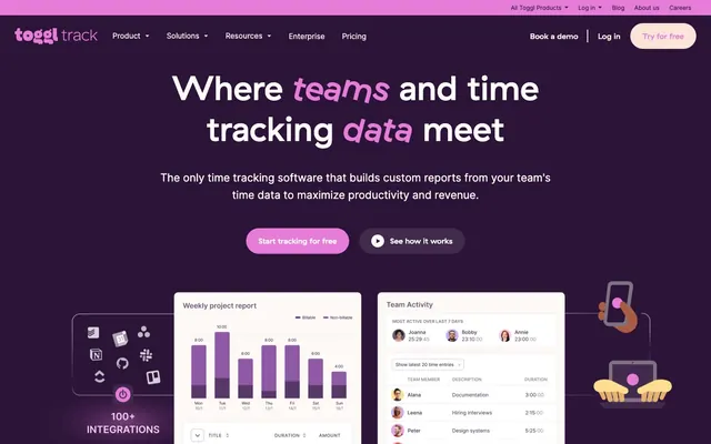
Preview image. Unlock full-res
Orchid Bloom Productivity Canvas
Color palette
Primary surface background, dark text on light backgrounds, hero background, accent text
Deep background for hero sections and footers; strong contrast text/borders
Primary action buttons, prominent icons, active states, and decorative heading accents
Yellow action color for filled buttons, selected navigation states, and focused conversion moments
Muted body text, secondary links, and subtle icon detailing against light surfaces
Supporting text, minor borders, and list item separators
Ghost button borders and text, subtle body text for less emphasis
Hairline borders, dividers, input outlines, and card edges on light surfaces. Do not promote it to the primary CTA color
Secondary card backgrounds, subtle distinction from primary canvas
Tertiary card backgrounds, internal container fills, offers slight tint
Subtle card backgrounds to suggest hierarchy, used sparingly
Decorative accents or very light background fills
Primary text color, strong borders, and contrast elements
Divider lines, subtle borders, and placeholder text
Very subtle borders and dividers, indicating a soft separation
Typography
- Weights
- 400, 700
- Sizes
- 16px, 18px, 19px, 20px, 22px, 32px, 43px, 60px, 69px
- Line height
- 1.1, 1.15, 1.2, 1.25, 1.3, 1.35, 1.5, 1.6
- Letter spacing
- normal
Distinctive headlines and subheadings, brand emphasis. Its heavier weight provides immediate visual presence.
- Weights
- 400
- Sizes
- 43px, 60px, 69px
- Line height
- 1.1, 1.2, 1.25
- Letter spacing
- normal
Accentuated words within headlines, creating a unique visual rhythm and drawing attention to key terms.
- Weights
- 400, 500, 700, 800
- Sizes
- 12px, 13px, 14px, 15px, 16px, 18px, 22px, 24px, 32px, 43px
- Line height
- 1.15, 1.25, 1.3, 1.35, 1.4, 1.5, 1.55, 1.6, 1.7
- Letter spacing
- normal
- Fallback
- system-ui
Primary typeface for body text, links, buttons, and all functional UI elements. Its clean, utilitarian nature supports readability across all sizes and contexts.
Spacing & shape
Components
Filled with Orchid Bloom (#e57cd8), white text, 26px border-radius, 14px vertical padding and 25px horizontal padding. Font: Inter Bold.
Transparent background, Pebble Gray (#817187) text and 1px border, 200px border-radius, 9-12px vertical padding and 18px horizontal padding. Font: Inter Regular.
Transparent background, Pebble Gray (#817187) text and 1px border, 26px border-radius, 12px vertical padding and 18px horizontal padding. Font: Inter Regular.
Transparent background, White Canvas (#fefbfa) text, no border or explicit padding beyond text flow. Used on darker backgrounds.
White Canvas (#fefbfa) background, 15px border-radius, 15px internal padding. No shadow.
Frost Haze (#fcf1f8) background, 10px border-radius, 35px top padding, 30px other padding. No shadow.
Lilac Mist (#fdeae2) background, 14px border-radius, 20px vertical padding, 30px horizontal padding. No shadow.
Lavender Whisper (#fae5f7) background, 12px border-radius, 30px top padding, 30px horizontal padding, 35px bottom padding. No shadow.
Guidelines
- Prioritize Orchid Bloom (#e57cd8) for primary calls to action, active states, and elements requiring significant visual emphasis.
- Use Midnight Plum (#412a4c) for major text elements, hero section backgrounds, and defining container fills.
- Employ GT Haptik Medium for all headlines, using GT Haptik Medium Rotalic for emphasis on key words within headings.
- Maintain a default border-radius of 10px for cards and general containers, extending to 26px for most buttons and 200px for fully rounded buttons.
- Separate content sections with White Canvas (#fefbfa) and Frost Haze (#fcf1f8) backgrounds to create visual breaks without hard lines.
- Utilize Inter for all body copy, links, and functional UI elements to ensure consistent readability.
- Ensure generous internal padding for all cards, standardizing around 15px to 30px depending on prominence, and a default element gap of 10px.
- Avoid using multiple accent colors; confine strong saturation to Orchid Bloom (#e57cd8) to maintain visual hierarchy.
- Do not introduce heavy drop shadows or excessive elevation; rely on varied background colors and subtle borders for surface distinction.
- Do not deviate from the specified GT Haptik fonts for headlines; generic sans-serif alternatives will compromise brand identity.
- Do not use highly saturated colors for large text blocks; reserve them for accents and calls to action.
- Avoid tight spacing in cards and between elements; maintain a comfortable density for an approachable feel.
- Do not use dark backgrounds without providing sufficient contrast for text and interactive elements; ensure readability against deeper tones like Regal Violet (#2c1338).
- Do not use square corners; ensure all interactive elements and content containers have a degree of roundedness, with a minimum of 8px for small elements.
About this system
ShowHide
Toggl Track employs a playful yet professional aesthetic, characterized by a predominantly light theme with deep violet accents for structure and emphasis. Interactive elements pop with a vibrant 'Orchid Bloom' color, lending a dynamic and engaging feel to the user interface. Typography balances crisp readability with distinct, branded headlines, while generous internal padding and rounded corners contribute to a soft, approachable component style. The system leverages subtle surface variations to define hierarchy rather than heavy shadows.
The page uses a contained layout with no explicit global max-width, allowing content to stretch broader than typical. The hero section is full-bleed with a deep Regal Violet (#2c1338) background, featuring a large, centered headline and primary actions. Subsequent sections generally alternate between White Canvas (#fefbfa) and Frost Haze (#fcf1f8) backgrounds, creating a clear vertical rhythm. Content is arranged in alternating text-left/image-right and image-left/text-right patterns, often using two-column structures. Card grids are prevalent, displaying features and integrations in a flexible layout. Navigation is a sticky top bar with a primary 'Try for free' button and secondary links.
The site primarily uses abstract, simplified 2D illustrations with a strong focus on product UI elements and data visualization examples. Illustrations are geometric, outlined in various shades of the brand's violet tones, and often feature small product screenshots or abstract representations of devices. Iconography is filled or outlined with medium stroke weight, in monochromatic or subtly tinted violet. Imagery serves an explanatory and atmospheric role, showcasing product functionality in context without relying on photography or complex 3D renders. Density is moderate, balancing text-heavy sections with illustrative accents.
Reminiscent of Clockify, Asana, Notion, Superhuman.
# Toggl Track — Style Reference
> Orchid Bloom Productivity Canvas

**Theme:** light

**Site:** https://toggl.com

Toggl Track employs a playful yet professional aesthetic, characterized by a predominantly light theme with deep violet accents for structure and emphasis. Interactive elements pop with a vibrant 'Orchid Bloom' color, lending a dynamic and engaging feel to the user interface. Typography balances crisp readability with distinct, branded headlines, while generous internal padding and rounded corners contribute to a soft, approachable component style. The system leverages subtle surface variations to define hierarchy rather than heavy shadows.

## Tokens — Colors

| Name | Value | Token | Role |
|------|------|------|------|
| Midnight Plum | `#412a4c` | `--color-midnight-plum` | Primary surface background, dark text on light backgrounds, hero background, accent text |
| Regal Violet | `#2c1338` | `--color-regal-violet` | Deep background for hero sections and footers; strong contrast text/borders |
| Orchid Bloom | `#e57cd8` | `--color-orchid-bloom` | Primary action buttons, prominent icons, active states, and decorative heading accents |
| Sunbeam Yellow | `#ffde91` | `--color-sunbeam-yellow` | Yellow action color for filled buttons, selected navigation states, and focused conversion moments |
| Misty Mauve | `#564260` | `--color-misty-mauve` | Muted body text, secondary links, and subtle icon detailing against light surfaces |
| Slate Echo | `#6b5a74` | `--color-slate-echo` | Supporting text, minor borders, and list item separators |
| Pebble Gray | `#817187` | `--color-pebble-gray` | Ghost button borders and text, subtle body text for less emphasis |
| White Canvas | `#fefbfa` | `--color-white-canvas` | Hairline borders, dividers, input outlines, and card edges on light surfaces. Do not promote it to the primary CTA color |
| Frost Haze | `#fcf1f8` | `--color-frost-haze` | Secondary card backgrounds, subtle distinction from primary canvas |
| Lilac Mist | `#fdeae2` | `--color-lilac-mist` | Tertiary card backgrounds, internal container fills, offers slight tint |
| Lavender Whisper | `#fae5f7` | `--color-lavender-whisper` | Subtle card backgrounds to suggest hierarchy, used sparingly |
| Powder Pink | `#f7d8f3` | `--color-powder-pink` | Decorative accents or very light background fills |
| Onyx | `#000000` | `--color-onyx` | Primary text color, strong borders, and contrast elements |
| Cloud Burst | `#d5d0d7` | `--color-cloud-burst` | Divider lines, subtle borders, and placeholder text |
| Soft Stone | `#c0b8c3` | `--color-soft-stone` | Very subtle borders and dividers, indicating a soft separation |

## Tokens — Typography

### GT Haptik Medium
- **Weights:** 400, 700
- **Sizes:** 16px, 18px, 19px, 20px, 22px, 32px, 43px, 60px, 69px
- **Line height:** 1.1, 1.15, 1.2, 1.25, 1.3, 1.35, 1.5, 1.6
- **Letter spacing:** normal
- **Role:** Distinctive headlines and subheadings, brand emphasis. Its heavier weight provides immediate visual presence.

### GT Haptik Medium Rotalic
- **Weights:** 400
- **Sizes:** 43px, 60px, 69px
- **Line height:** 1.1, 1.2, 1.25
- **Letter spacing:** normal
- **Role:** Accentuated words within headlines, creating a unique visual rhythm and drawing attention to key terms.

### Inter
- **Substitute:** system-ui
- **Weights:** 400, 500, 700, 800
- **Sizes:** 12px, 13px, 14px, 15px, 16px, 18px, 22px, 24px, 32px, 43px
- **Line height:** 1.15, 1.25, 1.3, 1.35, 1.4, 1.5, 1.55, 1.6, 1.7
- **Letter spacing:** normal
- **Role:** Primary typeface for body text, links, buttons, and all functional UI elements. Its clean, utilitarian nature supports readability across all sizes and contexts.

## Tokens — Type Scale

Major Third (1.25) from 14px base.

| Role | Size | Line height | Letter spacing |
|------|------|------|------|
| caption | 12px | 1.5 | — |
| body | 14px | 1.6 | — |
| body-lg | 16px | 1.6 | — |
| subheading | 18px | 1.5 | — |
| heading-sm | 22px | 1.35 | — |
| heading | 32px | 1.25 | — |
| heading-lg | 43px | 1.2 | — |
| display | 60px | 1.15 | — |
| display-lg | 69px | 1.1 | — |

## Tokens — Spacing

- **Section gap:** 75px
- **Card padding:** 30px
- **Element gap:** 10px

## Tokens — Radius

- **Default:** 10px
- **Buttons:** 26px
- **Cards:** 14px
- **roundButtons:** 200px

## Layout

The page uses a contained layout with no explicit global max-width, allowing content to stretch broader than typical. The hero section is full-bleed with a deep Regal Violet (#2c1338) background, featuring a large, centered headline and primary actions. Subsequent sections generally alternate between White Canvas (#fefbfa) and Frost Haze (#fcf1f8) backgrounds, creating a clear vertical rhythm. Content is arranged in alternating text-left/image-right and image-left/text-right patterns, often using two-column structures. Card grids are prevalent, displaying features and integrations in a flexible layout. Navigation is a sticky top bar with a primary 'Try for free' button and secondary links.

## Imagery

The site primarily uses abstract, simplified 2D illustrations with a strong focus on product UI elements and data visualization examples. Illustrations are geometric, outlined in various shades of the brand's violet tones, and often feature small product screenshots or abstract representations of devices. Iconography is filled or outlined with medium stroke weight, in monochromatic or subtly tinted violet. Imagery serves an explanatory and atmospheric role, showcasing product functionality in context without relying on photography or complex 3D renders. Density is moderate, balancing text-heavy sections with illustrative accents.

## Components

### Primary Action Button
*Calls to action, emphasizing core user journeys.*

Filled with Orchid Bloom (#e57cd8), white text, 26px border-radius, 14px vertical padding and 25px horizontal padding. Font: Inter Bold.

### Ghost Action Button
*Secondary actions that should not compete with the primary call to action.*

Transparent background, Pebble Gray (#817187) text and 1px border, 200px border-radius, 9-12px vertical padding and 18px horizontal padding. Font: Inter Regular.

### Navigation Link Button
*Navigation items within the primary header, appearing as a ghost button.*

Transparent background, Pebble Gray (#817187) text and 1px border, 26px border-radius, 12px vertical padding and 18px horizontal padding. Font: Inter Regular.

### Inline Text Link
*Navigational links embedded within body text or footer, designed to be understated.*

Transparent background, White Canvas (#fefbfa) text, no border or explicit padding beyond text flow. Used on darker backgrounds.

### Default Card
*Containers for features, info blocks, and grouped content.*

White Canvas (#fefbfa) background, 15px border-radius, 15px internal padding. No shadow.

### Elevated Feature Card
*Prominent information blocks, drawing more attention than default cards.*

Frost Haze (#fcf1f8) background, 10px border-radius, 35px top padding, 30px other padding. No shadow.

### Accent Card
*Cards for special content or promotions, using a subtle background tint.*

Lilac Mist (#fdeae2) background, 14px border-radius, 20px vertical padding, 30px horizontal padding. No shadow.

### Promotional Card
*Higher emphasis promotional content, using a slightly deeper background tint.*

Lavender Whisper (#fae5f7) background, 12px border-radius, 30px top padding, 30px horizontal padding, 35px bottom padding. No shadow.

## Guidelines

### Do

- Prioritize Orchid Bloom (#e57cd8) for primary calls to action, active states, and elements requiring significant visual emphasis.
- Use Midnight Plum (#412a4c) for major text elements, hero section backgrounds, and defining container fills.
- Employ GT Haptik Medium for all headlines, using GT Haptik Medium Rotalic for emphasis on key words within headings.
- Maintain a default border-radius of 10px for cards and general containers, extending to 26px for most buttons and 200px for fully rounded buttons.
- Separate content sections with White Canvas (#fefbfa) and Frost Haze (#fcf1f8) backgrounds to create visual breaks without hard lines.
- Utilize Inter for all body copy, links, and functional UI elements to ensure consistent readability.
- Ensure generous internal padding for all cards, standardizing around 15px to 30px depending on prominence, and a default element gap of 10px.

### Don't

- Avoid using multiple accent colors; confine strong saturation to Orchid Bloom (#e57cd8) to maintain visual hierarchy.
- Do not introduce heavy drop shadows or excessive elevation; rely on varied background colors and subtle borders for surface distinction.
- Do not deviate from the specified GT Haptik fonts for headlines; generic sans-serif alternatives will compromise brand identity.
- Do not use highly saturated colors for large text blocks; reserve them for accents and calls to action.
- Avoid tight spacing in cards and between elements; maintain a comfortable density for an approachable feel.
- Do not use dark backgrounds without providing sufficient contrast for text and interactive elements; ensure readability against deeper tones like Regal Violet (#2c1338).
- Do not use square corners; ensure all interactive elements and content containers have a degree of roundedness, with a minimum of 8px for small elements.

## Agent Prompt Guide

Quick Color Reference:
- text: #000000
- background: #fefbfa
- border: #d5d0d7
- accent: #e57cd8
- primary action: #e57cd8 (filled action)

Example Component Prompts:
- Create a Primary Action Button: #e57cd8 background, #000000 text, 9999px radius, compact pill padding. Use this filled treatment for the main CTA.
- Design a feature card: Frost Haze background (#fcf1f8), 10px radius, 35px top padding, 30px other padding. Use Inter Semibold 18px for the title and Inter Regular 14px for description text, both in Midnight Plum (#412a4c).
- Construct a footer section: Regal Violet background (#2c1338), text links in White Canvas (#fefbfa) using Inter Regular 14px, with 10px element gap between links.
More like this
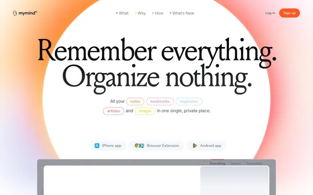









Keep what you find
A free account saves references to boards and can send you a weekly email of picks based on what you save.
To see every result, go Pro.