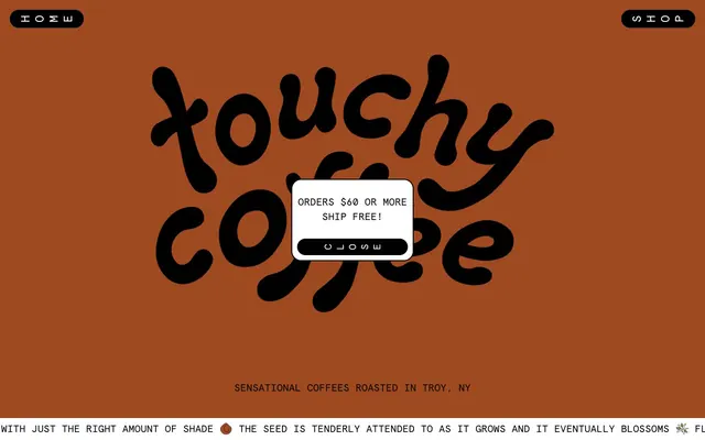
Preview image. Unlock full-res
whimsical indie zine
Color palette
Brand accent in text, borders, and decorative elements — adds warmth and a handcrafted touch
Green accent for outlined action borders, linked labels, and lightweight interactive emphasis
Violet outline accent for tags, dividers, and focused UI edges
Primary text, icon fill, and strong borders. Provides high contrast against lighter backgrounds
Card backgrounds, secondary text, and borders against darker surfaces. Functions as a clean base
Dominant page background, secondary text, and subtle borders — establishes the overall calm, earthy tone
Typography
- Weights
- 400
- Sizes
- 20px, 24px, 50px
- Line height
- 1.2, 1.5
- Letter spacing
- normal
- Fallback
- Space Mono
Primary UI text for body copy, labels, links, and various component texts. Its monospaced nature delivers a retro, mechanical feel that contrasts with the organic brandmark.
- Weights
- 700
- Sizes
- 20px
- Line height
- 1.2
- Letter spacing
- normal
- Fallback
- Space Mono Bold
Used for emphasized text, input labels, and interactive button elements to provide hierarchy within the monospaced aesthetic.
Spacing & shape
Components
Text-only button for navigation, using Apercu Mono with Muted Sage for text and border. No background, 0px padding and radius emphasizes its ghost state. Example: 'H O M E'.
Solid Graphite background with Canvas White text, featuring a 100px border-radius. Uses Apercu Mono Bold 700 at 20px, with 10px vertical and 20px horizontal padding. Example: 'ADD'.
Solid Forest Green background with Canvas White text, 100px border-radius. Uses Apercu Mono Bold 700 at 20px, with 15px vertical and 20px horizontal padding.
Canvas White background with 20px border-radius, 10px padding on all sides. No shadow, maintaining a flat aesthetic. Houses product name, image, and price/quantity controls.
Canvas White background with 20px border-radius, no shadow. Contains text styled with Graphite using Apercu Mono, often paired with a Ghost Header Button for closing.
Transparent background with a Muted Sage border. Text uses Apercu Mono at 20px with Muted Sage color. Example: 'YOUR EMAIL'.
Consists of a Muted Sage pipe element, often with a finger icon, followed by a Periwinkle Mist filled gradient track. Purely visual, no direct interactivity.
Distinct background colors (Forest Green, Burnt Sienna) with 20px border-radius. Inner padding is 10px. Features rating stars and body text in Apercu Mono.
Muted violet background with 20px border-radius and 10px padding on all sides. Contains a text input and a small 'X' close button.
Guidelines
- Prioritize Apercu Mono for almost all text elements, relying on weight 400 for body and weight 700 for emphasis, always with 'normal' letter spacing.
- Utilize Muted Sage (#788c8c) as the primary canvas color for large background areas, establishing a subdued base.
- Apply 100px border-radius to all interactive buttons and small tags for a soft, friendly pill shape.
- Use 20px border-radius on cards, images, and larger container elements to maintain consistent rounded corners.
- Employ Graphite (#000000) for all primary body text and strong outlines against lighter backgrounds.
- Incorporate Burnt Sienna (#9f4920) or Forest Green (#5b9133) as vivid accent colors for decorative details, specific statuses, or when a strong, yet warm, visual pop is needed.
- Maintain a clear visual hierarchy by limiting shadows and keeping component surfaces flat or outlined.
- Avoid using highly saturated, primary colors outside of the defined accent palette (Burnt Sienna, Forest Green, Periwinkle Mist).
- Do not introduce sharp corners or square elements for interactive components or cards; leverage the curved radii consistently.
- Refrain from using complex gradients or drop shadows, as the system emphasizes flat surfaces and outlines.
- Do not deviate from Apercu Mono; introducing other typefaces would break the distinctive brand voice.
- Avoid dense, compact layouts. Strive for comfortable density with 20px element spacing and 80px section gaps.
- Don't add custom padding to buttons; adhere to the 10px/20px or 15px/20px padding specifications for consistent sizing.
- Never use blue for links outside of the Periwinkle Mist accent; all link text should be Graphite or White as context dictates.
About this system
ShowHide
Touchy Coffee's design system evokes the feeling of a friendly, DIY publication with a strong personality. It uses a limited, somewhat desaturated color palette with a vivid accent program and a striking, custom logotype that's soft and rounded. The layout is structured but playful, featuring hand-drawn elements and a slightly retro, analog feel. Typography relies on a monospaced sans-serif for high legibility and a distinct voice.
The page uses a maximum-width contained layout, with content centered. The hero section features a large, custom logotype centered over a solid Muted Sage background with minimal overlaying text. Sections alternate between Muted Sage, Periwinkle Mist, and even an all-white background. Content arrangement often utilizes a grid for product display (e.g., 3-column) or a two-column side-by-side layout for text blocks and a central image. Vertical spacing between sections is generous, using 80px gaps. Navigation is minimal, with 'HOME' and 'SHOP' as ghost buttons positioned at the top corners.
The site uses a mix of product photography (muted, neutral tones for coffee bags that serve as a canvas for colorful product names), abstract graphics (finger pointer icon), and line-art elements. Photography is typically studio-style, product-focused. Icons are minimal, outlined, and monochromatic, often using Muted Sage. Imagery serves primarily to showcase products or add a touch of whimsy and brand personality rather than being purely decorative.
Reminiscent of Oatly, Ghia, Are.na, Baggu.
# Touchy Coffee — Style Reference
> whimsical indie zine

**Theme:** light

**Site:** https://touchycoffee.com

Touchy Coffee's design system evokes the feeling of a friendly, DIY publication with a strong personality. It uses a limited, somewhat desaturated color palette with a vivid accent program and a striking, custom logotype that's soft and rounded. The layout is structured but playful, featuring hand-drawn elements and a slightly retro, analog feel. Typography relies on a monospaced sans-serif for high legibility and a distinct voice.

## Tokens — Colors

| Name | Value | Token | Role |
|------|------|------|------|
| Burnt Sienna | `#9f4920` | `--color-burnt-sienna` | Brand accent in text, borders, and decorative elements — adds warmth and a handcrafted touch |
| Forest Green | `#5b9133` | `--color-forest-green` | Green accent for outlined action borders, linked labels, and lightweight interactive emphasis |
| Periwinkle Mist | `#a697c6` | `--color-periwinkle-mist` | Violet outline accent for tags, dividers, and focused UI edges |
| Graphite | `#000000` | `--color-graphite` | Primary text, icon fill, and strong borders. Provides high contrast against lighter backgrounds |
| Canvas White | `#ffffff` | `--color-canvas-white` | Card backgrounds, secondary text, and borders against darker surfaces. Functions as a clean base |
| Muted Sage | `#788c8c` | `--color-muted-sage` | Dominant page background, secondary text, and subtle borders — establishes the overall calm, earthy tone |

## Tokens — Typography

### Apercu Mono
- **Substitute:** Space Mono
- **Weights:** 400
- **Sizes:** 20px, 24px, 50px
- **Line height:** 1.2, 1.5
- **Letter spacing:** normal
- **Role:** Primary UI text for body copy, labels, links, and various component texts. Its monospaced nature delivers a retro, mechanical feel that contrasts with the organic brandmark.

### Apercu Mono Bold
- **Substitute:** Space Mono Bold
- **Weights:** 700
- **Sizes:** 20px
- **Line height:** 1.2
- **Letter spacing:** normal
- **Role:** Used for emphasized text, input labels, and interactive button elements to provide hierarchy within the monospaced aesthetic.

## Tokens — Type Scale

Golden Ratio (1.618) from 20px base.

| Role | Size | Line height | Letter spacing |
|------|------|------|------|
| body | 20px | 1.2 | — |
| subheading | 24px | 1.5 | — |
| heading | 50px | 1.2 | — |

## Tokens — Spacing

- **Section gap:** 80px
- **Card padding:** 10px
- **Element gap:** 20px

## Tokens — Radius

- **Buttons:** 100px
- **Cards:** 20px
- **other:** 100px

## Layout

The page uses a maximum-width contained layout, with content centered. The hero section features a large, custom logotype centered over a solid Muted Sage background with minimal overlaying text. Sections alternate between Muted Sage, Periwinkle Mist, and even an all-white background. Content arrangement often utilizes a grid for product display (e.g., 3-column) or a two-column side-by-side layout for text blocks and a central image. Vertical spacing between sections is generous, using 80px gaps. Navigation is minimal, with 'HOME' and 'SHOP' as ghost buttons positioned at the top corners.

## Imagery

The site uses a mix of product photography (muted, neutral tones for coffee bags that serve as a canvas for colorful product names), abstract graphics (finger pointer icon), and line-art elements. Photography is typically studio-style, product-focused. Icons are minimal, outlined, and monochromatic, often using Muted Sage. Imagery serves primarily to showcase products or add a touch of whimsy and brand personality rather than being purely decorative.

## Components

### Ghost Header Button
*Navigation and utility actions*

Text-only button for navigation, using Apercu Mono with Muted Sage for text and border. No background, 0px padding and radius emphasizes its ghost state. Example: 'H O M E'.

### Filled Primary Button
*Key interactions and calls to action*

Solid Graphite background with Canvas White text, featuring a 100px border-radius. Uses Apercu Mono Bold 700 at 20px, with 10px vertical and 20px horizontal padding. Example: 'ADD'.

### Filled Forest Green Button
*Secondary calls to action or context-specific actions*

Solid Forest Green background with Canvas White text, 100px border-radius. Uses Apercu Mono Bold 700 at 20px, with 15px vertical and 20px horizontal padding.

### Product Card
*Displaying individual product items*

Canvas White background with 20px border-radius, 10px padding on all sides. No shadow, maintaining a flat aesthetic. Houses product name, image, and price/quantity controls.

### Promotional Modal
*Temporary messages or offers*

Canvas White background with 20px border-radius, no shadow. Contains text styled with Graphite using Apercu Mono, often paired with a Ghost Header Button for closing.

### Text Input (with border)
*Forms and data entry*

Transparent background with a Muted Sage border. Text uses Apercu Mono at 20px with Muted Sage color. Example: 'YOUR EMAIL'.

### Decorative Slider Placeholder
*Visual indicator of horizontal scrollable content*

Consists of a Muted Sage pipe element, often with a finger icon, followed by a Periwinkle Mist filled gradient track. Purely visual, no direct interactivity.

### Review Card
*Displaying customer testimonials*

Distinct background colors (Forest Green, Burnt Sienna) with 20px border-radius. Inner padding is 10px. Features rating stars and body text in Apercu Mono.

### Newsletter Card
*Subscription call to action*

Muted violet background with 20px border-radius and 10px padding on all sides. Contains a text input and a small 'X' close button.

## Guidelines

### Do

- Prioritize Apercu Mono for almost all text elements, relying on weight 400 for body and weight 700 for emphasis, always with 'normal' letter spacing.
- Utilize Muted Sage (#788c8c) as the primary canvas color for large background areas, establishing a subdued base.
- Apply 100px border-radius to all interactive buttons and small tags for a soft, friendly pill shape.
- Use 20px border-radius on cards, images, and larger container elements to maintain consistent rounded corners.
- Employ Graphite (#000000) for all primary body text and strong outlines against lighter backgrounds.
- Incorporate Burnt Sienna (#9f4920) or Forest Green (#5b9133) as vivid accent colors for decorative details, specific statuses, or when a strong, yet warm, visual pop is needed.
- Maintain a clear visual hierarchy by limiting shadows and keeping component surfaces flat or outlined.

### Don't

- Avoid using highly saturated, primary colors outside of the defined accent palette (Burnt Sienna, Forest Green, Periwinkle Mist).
- Do not introduce sharp corners or square elements for interactive components or cards; leverage the curved radii consistently.
- Refrain from using complex gradients or drop shadows, as the system emphasizes flat surfaces and outlines.
- Do not deviate from Apercu Mono; introducing other typefaces would break the distinctive brand voice.
- Avoid dense, compact layouts. Strive for comfortable density with 20px element spacing and 80px section gaps.
- Don't add custom padding to buttons; adhere to the 10px/20px or 15px/20px padding specifications for consistent sizing.
- Never use blue for links outside of the Periwinkle Mist accent; all link text should be Graphite or White as context dictates.

## Agent Prompt Guide

Quick Color Reference:
text: #000000
background: #788c8c
border: #788c8c
accent: #a697c6
primary action: #000000 (filled action)

Example Component Prompts:
1. Create a Primary Action Button: #000000 background, #ffffff text, 9999px radius, compact pill padding. Use this filled treatment for the main CTA.
2. Create a product card: background Canvas White #ffffff, border-radius 20px, padding 10px. Inside, use Apercu Mono text, weight 400, size 20px, color Graphite #000000. Include 'ADD' button: background Graphite #000000, text Canvas White #ffffff, border-radius 100px, padding 10px 20px.
3. Create a review card: background Forest Green #5b9133, border-radius 20px, padding 10px. Testimonial header in Apercu Mono Bold, weight 700, size 20px, color Canvas White #ffffff. Body text in Apercu Mono, weight 400, size 20px, color Canvas White #ffffff.
5. Create a promotional modal centered on the screen saying 'ORDERS $60 OR MORE SHIP FREE!': background Canvas White #ffffff, border-radius 20px. Use Apercu Mono Bold, weight 700, size 20px, color Graphite #000000 for the main message. Add a 'CLOSE' ghost button with transparent background, text color Muted Sage #788c8c, Apercu Mono, weight 400, size 20px, padding 0px, border-radius 0px.
More like this









Keep what you find
A free account saves references to boards and can send you a weekly email of picks based on what you save.
To see every result, go Pro.