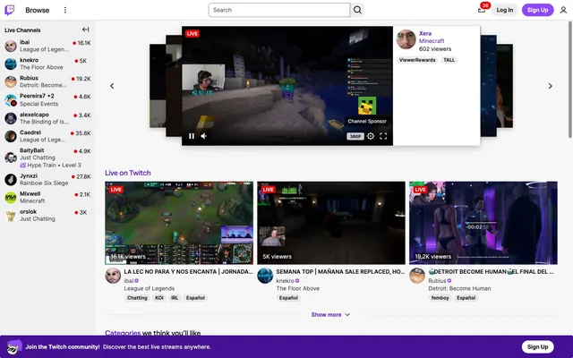
Preview image. Unlock full-res
Gaming stage in neon light - white-grey backdrop bathed in purple glow, with urgent red accents.
Color palette
Main accent color for active navigation states, primary call-to-action buttons, and interactive elements. Its vividness drives user engagement.
Backgrounds for specific highlighted cards or featured sections, providing visual weight.
Used for 'Sign Up' buttons and other prominent interactive elements, a brighter variant of the brand purple.
Occasional background for special badges or highly emphasized text, adding vibrant flair.
Secondary accent for occasional highlights or decorative elements.
Page backgrounds, subtle surface variations, muted navigation backgrounds.
Primary surface for cards, modals, interactive element backgrounds.
Primary text, headings, strong interactive elements. Establishes core legibility against light backgrounds.
Secondary text, muted links, subtle borders.
Tertiary text, less prominent icons, background for content overlays.
Subtle borders and dividers for interactive elements and structural separation.
Iconography, strong dividers, rare high-contrast backgrounds, for text on specific interactive elements.
Urgent status indicator for live streams and critical alerts. Its high contrast demands immediate attention.
Typography
- Weights
- 400, 600
- Sizes
- 11px, 12px, 14px
- Line height
- 1, 1.1, 1.2, 1.4, 1.5, 1.6
- Fallback
- system-ui
General body text, navigation items, badges, captions, and most UI elements. Its neutrality allows content to dominate.
- Weights
- 400, 500, 600
- Sizes
- 14px, 18px
- Line height
- 1.1, 1.4
- Letter spacing
- -0.01
- Fallback
- system-ui
For key headings and prominent links, where a slightly more custom, structured feel is desired. The moderate letter-spacing creates a compact, modern appearance.
Spacing & shape
Elevation
Components
Text in Nightfall Text (#0e0e10), defaulting to Ghost White (#ffffff) background. Active state uses Twitch Purple (#5c16c5) for text/icon, or a subtle background highlight of Cloud Canvas (#efeff1). No explicit padding when embedded in a nav bar.
Background is transparent (rgba(0,0,0,0)), text is Nightfall Text (#0e0e10). Rounded corners at 9000px. Used for contextual actions within larger blocks.
Background is transparent (rgba(0,0,0,0)). Text color is Ghost White (#ffffff). Rounded corners at 9000px. Used for 'Sign Up' against a purple background.
Background is a muted rgba(173,173,184,0.22). Text color is Nightfall Text (#0e0e10). Rounded corners at 9000px. Used for less emphasized actions.
Background is transparent (rgba(0,0,0,0)), no border radius or shadow by default. Displays video thumbnail with overlaid information.
Background is muted rgba(173,173,184,0.22), no explicit radius or shadow. Contains the primary video player.
Small, dark overlay with a background of rgba(0,0,0,0.6) and a 2px border-radius. Text in Ghost White (#ffffff). Used for 'LIVE' or viewer counts on video thumbnails, with 4px horizontal padding.
Circular image container with 9000px border-radius, often containing a user's profile picture or channel icon. Background is transparent.
Small, rectangular badge with a Live Red (#eb0400) background. Text is Ghost White (#ffffff), often paired with 'LIVE' text to denote active streams. No explicit radius, appears as sharp corners.
Ghost White (#ffffff) background with a 1px Iron Border (#dddde2). Placeholder text is Slate Echo (#3b3b44) in Inter 14px. No explicit border radius, appears with sharp corners.
Full-width background of Twitch Purple (#5c16c5) or a darker Deep Twitch Purple (#330c6e). Contains Ghost White (#ffffff) text and a 'Sign Up' button variant.
Guidelines
- Use Nightfall Text (#0e0e10) for all primary text elements on Cloud Canvas (#efeff1) or Ghost White (#ffffff) backgrounds.
- Apply Twitch Purple (#5c16c5) or Call-to-Action Purple (#9147ff) exclusively to primary interactive elements, active states, and brand signifiers.
- Employ the 9000px border-radius for all interactive buttons, user avatars, and categorical tags to create a consistent soft, approachable feel.
- Use a Live Red (#eb0400) background combined with Ghost White (#ffffff) text for any 'LIVE' status indicators to ensure immediate visual recognition.
- Maintain a default elementGap of 8px (or multiples thereof like 16px) for consistent vertical and horizontal spacing between discrete UI elements.
- Utilize Roobert font with -0.01em letter-spacing for prominent headings and key links to leverage its distinct, compact character.
- Structure information using a subtle Ghost White (#ffffff) background for primary content cards and Cloud Canvas (#efeff1) for general page areas to create clear visual separation.
- Do not use highly saturated colors for large background areas or extensive text blocks, except for designated brand banners.
- Avoid using drop shadows on most UI elements; instead, rely on variations in background color for surface differentiation.
- Do not introduce additional font families or weights beyond Inter (400, 600) and Roobert (400, 500, 600) to maintain typographic consistency.
- Never apply a border-radius of less than 4px, except for the 2px on specific video overlay labels, as most UI elements use 4px or 9000px.
- Do not use red or other semantic colors for primary CTA buttons, as this is exclusively reserved for the Live Red status indicator.
- Avoid large, impactful hero sections that dominate the viewport; prioritize content visibility through dense, card-based layouts.
- Do not use dark backgrounds for the main canvas; the design system operates predominantly on a light theme with specific dark content sections.
About this system
ShowHide
Twitch presents a vibrant, high-energy streaming platform built on a light canvas. Its visual identity balances functional clarity with dynamic accents. The dominant bright purple, used for primary CTAs and key highlights, injects brand personality into an otherwise neutral interface. A subtle use of layered grays and crisp typography ensures content remains the focal point, while bold status indicators ('LIVE' badge) cut through the visual noise.
The page uses a maximum content width for its central content, flanked by a fixed-width left sidebar (`Live Channels`) and dynamic main content. The hero section is characterized by a central, elevated video player with supporting contextual information, visually stacked on top of other content. Main content sections ('Live on Twitch') are arranged in a multi-column grid of video cards. Vertical rhythm is established by consistent section gaps. Navigation is a persistent top bar and a fixed sidebar. The overall layout is dense with information, prioritizing content display through a clear grid structure and minimal whitespace between content blocks.
The site primarily uses product screenshots (video thumbnails) and user avatars. Video thumbnails are presented as raw, unmasked rectangles, often with semi-transparent overlays for 'LIVE' indicators or viewer counts. User avatars are uniformly circular. There's minimal decorative imagery beyond these content-driven visuals. Icons are outlined, monochromatic, and typically a single weight, using Nightfall Text (#0e0e10) unless interactive, where they adopt Twitch Purple (#5c16c5). The density is image-heavy due to video content being central, but the imagery serves an explanatory and content-showcasing role rather than purely decorative.
Reminiscent of YouTube, Discord, Riot Games.
# Twitch — Style Reference
> Gaming stage in neon light - white-grey backdrop bathed in purple glow, with urgent red accents.

**Theme:** light

**Site:** https://twitch.tv

Twitch presents a vibrant, high-energy streaming platform built on a light canvas. Its visual identity balances functional clarity with dynamic accents. The dominant bright purple, used for primary CTAs and key highlights, injects brand personality into an otherwise neutral interface. A subtle use of layered grays and crisp typography ensures content remains the focal point, while bold status indicators ('LIVE' badge) cut through the visual noise.

## Tokens — Colors

| Name | Value | Token | Role |
|------|------|------|------|
| Twitch Purple | `#5c16c5` | `--color-twitch-purple` | Main accent color for active navigation states, primary call-to-action buttons, and interactive elements. Its vividness drives user engagement. |
| Rich Twitch Purple | `#451093` | `--color-rich-twitch-purple` | Backgrounds for specific highlighted cards or featured sections, providing visual weight. |
| Call-to-Action Purple | `#9147ff` | `--color-call-to-action-purple` | Used for 'Sign Up' buttons and other prominent interactive elements, a brighter variant of the brand purple. |
| Highlight Pink | `#ff75e6` | `--color-highlight-pink` | Occasional background for special badges or highly emphasized text, adding vibrant flair. |
| Stream Yellow | `#ffd000` | `--color-stream-yellow` | Secondary accent for occasional highlights or decorative elements. |
| Cloud Canvas | `#efeff1` | `--color-cloud-canvas` | Page backgrounds, subtle surface variations, muted navigation backgrounds. |
| Ghost White | `#ffffff` | `--color-ghost-white` | Primary surface for cards, modals, interactive element backgrounds. |
| Nightfall Text | `#0e0e10` | `--color-nightfall-text` | Primary text, headings, strong interactive elements. Establishes core legibility against light backgrounds. |
| Slate Echo | `#3b3b44` | `--color-slate-echo` | Secondary text, muted links, subtle borders. |
| Ash Gray | `#636363` | `--color-ash-gray` | Tertiary text, less prominent icons, background for content overlays. |
| Iron Border | `#dddde2` | `--color-iron-border` | Subtle borders and dividers for interactive elements and structural separation. |
| Airtight Black | `#000000` | `--color-airtight-black` | Iconography, strong dividers, rare high-contrast backgrounds, for text on specific interactive elements. |
| Live Red | `#eb0400` | `--color-live-red` | Urgent status indicator for live streams and critical alerts. Its high contrast demands immediate attention. |

## Tokens — Typography

### Inter
- **Substitute:** system-ui
- **Weights:** 400, 600
- **Sizes:** 11px, 12px, 14px
- **Line height:** 1, 1.1, 1.2, 1.4, 1.5, 1.6
- **Role:** General body text, navigation items, badges, captions, and most UI elements. Its neutrality allows content to dominate.

### Roobert
- **Substitute:** system-ui
- **Weights:** 400, 500, 600
- **Sizes:** 14px, 18px
- **Line height:** 1.1, 1.4
- **Letter spacing:** -0.01
- **Role:** For key headings and prominent links, where a slightly more custom, structured feel is desired. The moderate letter-spacing creates a compact, modern appearance.

## Tokens — Type Scale

Major Second (1.125) from 14px base.

| Role | Size | Line height | Letter spacing |
|------|------|------|------|
| caption | 11px | 1.4 | — |
| body-sm | 12px | 1.4 | — |
| body | 14px | 1.4 | — |

## Tokens — Spacing

- **Section gap:** 40px
- **Card padding:** 16px
- **Element gap:** 8px

## Tokens — Radius

- **Buttons:** 9000px
- **Cards:** 4px
- **avatars:** 9000px
- **input:** 4px
- **liveBadge:** 2px
- **tags:** 9000px

## Tokens — Elevation

- **Card Shadow High:** `rgba(0, 0, 0, 0.22) 0px 6px 16px 0px, rgba(0, 0, 0, 0.08) 0px 0px 4px 0px`
- **Card Shadow Low:** `rgba(0, 0, 0, 0.13) 0px 1px 2px 0px, rgba(0, 0, 0, 0.08) 0px 0px 2px 0px`
- **Input Focus Inset:** `rgba(50, 50, 57, 0.62) 0px 0px 0px 1px inset`

## Layout

The page uses a maximum content width for its central content, flanked by a fixed-width left sidebar (`Live Channels`) and dynamic main content. The hero section is characterized by a central, elevated video player with supporting contextual information, visually stacked on top of other content. Main content sections ('Live on Twitch') are arranged in a multi-column grid of video cards. Vertical rhythm is established by consistent section gaps. Navigation is a persistent top bar and a fixed sidebar. The overall layout is dense with information, prioritizing content display through a clear grid structure and minimal whitespace between content blocks.

## Imagery

The site primarily uses product screenshots (video thumbnails) and user avatars. Video thumbnails are presented as raw, unmasked rectangles, often with semi-transparent overlays for 'LIVE' indicators or viewer counts. User avatars are uniformly circular. There's minimal decorative imagery beyond these content-driven visuals. Icons are outlined, monochromatic, and typically a single weight, using Nightfall Text (#0e0e10) unless interactive, where they adopt Twitch Purple (#5c16c5). The density is image-heavy due to video content being central, but the imagery serves an explanatory and content-showcasing role rather than purely decorative.

## Components

### Primary Navigation Link
*Interactive element*

Text in Nightfall Text (#0e0e10), defaulting to Ghost White (#ffffff) background. Active state uses Twitch Purple (#5c16c5) for text/icon, or a subtle background highlight of Cloud Canvas (#efeff1). No explicit padding when embedded in a nav bar.

### Pill Button (Text Only)
*Secondary action button*

Background is transparent (rgba(0,0,0,0)), text is Nightfall Text (#0e0e10). Rounded corners at 9000px. Used for contextual actions within larger blocks.

### Pill Button (Ghost White Text)
*Prominent action button on dark backgrounds*

Background is transparent (rgba(0,0,0,0)). Text color is Ghost White (#ffffff). Rounded corners at 9000px. Used for 'Sign Up' against a purple background.

### Pill Button (Muted Background)
*Subtle action button*

Background is a muted rgba(173,173,184,0.22). Text color is Nightfall Text (#0e0e10). Rounded corners at 9000px. Used for less emphasized actions.

### Video Preview Card
*Content display*

Background is transparent (rgba(0,0,0,0)), no border radius or shadow by default. Displays video thumbnail with overlaid information.

### Video Player Card
*Interactive content display*

Background is muted rgba(173,173,184,0.22), no explicit radius or shadow. Contains the primary video player.

### Video Overlay Label
*Informative overlay*

Small, dark overlay with a background of rgba(0,0,0,0.6) and a 2px border-radius. Text in Ghost White (#ffffff). Used for 'LIVE' or viewer counts on video thumbnails, with 4px horizontal padding.

### Channel Avatar (Circular)
*User identification*

Circular image container with 9000px border-radius, often containing a user's profile picture or channel icon. Background is transparent.

### Live Indicator Badge
*Status indicator*

Small, rectangular badge with a Live Red (#eb0400) background. Text is Ghost White (#ffffff), often paired with 'LIVE' text to denote active streams. No explicit radius, appears as sharp corners.

### Search Input Field
*User input*

Ghost White (#ffffff) background with a 1px Iron Border (#dddde2). Placeholder text is Slate Echo (#3b3b44) in Inter 14px. No explicit border radius, appears with sharp corners.

### Promotional Footer Banner
*Marketing banner*

Full-width background of Twitch Purple (#5c16c5) or a darker Deep Twitch Purple (#330c6e). Contains Ghost White (#ffffff) text and a 'Sign Up' button variant.

## Guidelines

### Do

- Use Nightfall Text (#0e0e10) for all primary text elements on Cloud Canvas (#efeff1) or Ghost White (#ffffff) backgrounds.
- Apply Twitch Purple (#5c16c5) or Call-to-Action Purple (#9147ff) exclusively to primary interactive elements, active states, and brand signifiers.
- Employ the 9000px border-radius for all interactive buttons, user avatars, and categorical tags to create a consistent soft, approachable feel.
- Use a Live Red (#eb0400) background combined with Ghost White (#ffffff) text for any 'LIVE' status indicators to ensure immediate visual recognition.
- Maintain a default elementGap of 8px (or multiples thereof like 16px) for consistent vertical and horizontal spacing between discrete UI elements.
- Utilize Roobert font with -0.01em letter-spacing for prominent headings and key links to leverage its distinct, compact character.
- Structure information using a subtle Ghost White (#ffffff) background for primary content cards and Cloud Canvas (#efeff1) for general page areas to create clear visual separation.

### Don't

- Do not use highly saturated colors for large background areas or extensive text blocks, except for designated brand banners.
- Avoid using drop shadows on most UI elements; instead, rely on variations in background color for surface differentiation.
- Do not introduce additional font families or weights beyond Inter (400, 600) and Roobert (400, 500, 600) to maintain typographic consistency.
- Never apply a border-radius of less than 4px, except for the 2px on specific video overlay labels, as most UI elements use 4px or 9000px.
- Do not use red or other semantic colors for primary CTA buttons, as this is exclusively reserved for the Live Red status indicator.
- Avoid large, impactful hero sections that dominate the viewport; prioritize content visibility through dense, card-based layouts.
- Do not use dark backgrounds for the main canvas; the design system operates predominantly on a light theme with specific dark content sections.

## Agent Prompt Guide

### Quick Color Reference
- **Primary Text:** #0e0e10 (Nightfall Text)
- **Page Background:** #efeff1 (Cloud Canvas)
- **Interactive Accent:** #5c16c5 (Twitch Purple)
- **Live Status:** #eb0400 (Live Red)
- **Card Background:** #ffffff (Ghost White)
- **Border/Divider:** #dddde2 (Iron Border)

### 3-5 Example Component Prompts
1. **Create a primary navigation item:** Text 'Browse' in Nightfall Text (#0e0e10), Inter 14px weight 400. On hover, change text color to Twitch Purple (#5c16c5).
2. **Generate a 'Sign Up' button:** Background Call-to-Action Purple (#9147ff), text Ghost White (#ffffff), Roobert 14px weight 600, border-radius 9000px, 8px padding on all sides.
3. **Design a live stream video card:** Use transparent background (rgba(0,0,0,0)). Display a video thumbnail, overlay with 'LIVE' badge (Live Red #eb0400 background, Ghost White #ffffff text, Inter 11px weight 600) in the top left. Below, include channel name in Nightfall Text (#0e0e10) Roobert 14px weight 500, and game title in Slate Echo (#3b3b44) Inter 12px weight 400.
4. **Create a search input field:** Ghost White (#ffffff) background, 1px solid Iron Border (#dddde2). Placeholder text 'Search' in Slate Echo (#3b3b44), Inter 14px weight 400. No border-radius.
5. **Build a user sidebar entry:** Channel avatar (9000px radius), followed by channel name in Nightfall Text (#0e0e10) Inter 14px weight 400. Stream viewer count in Live Red (#eb0400) Inter 11px weight 600.
More like this







Keep what you find
A free account saves references to boards and can send you a weekly email of picks based on what you save.
To see every result, go Pro.