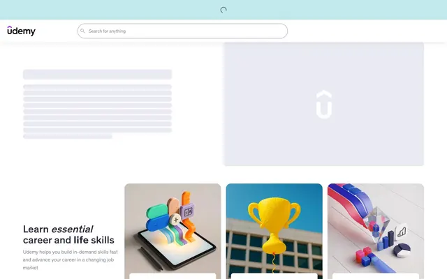
Preview image. Unlock full-res
Ordered campus noticeboard.
Color palette
Interactive elements, primary links, active states, and decorative brand accents. Creates a sense of focus and action
Orange accent for outlined action borders, linked labels, and lightweight interactive emphasis. Use as a supporting accent, not as a status color
Light mode links or secondary interactive text, providing a less assertive interactive cue
Page backgrounds and secondary surface fills, providing a subtle off-white base
Primary card backgrounds, prominent content blocks, and interactive element fills
Primary text, headings, icons, and strong borders – the core dark color for content
Background for elevated content sections, often paired with light text for contrast
Muted text, subheadings, and secondary icons, providing a softer alternative to Deep Graphite
Hairline borders, dividers, and ghost element outlines
Background for subtle elevated cards or content groupings
Descriptive text and card body text
Background for large content sections, creating visual segmentation
Border color for placeholder loading states
Typography
- Weights
- 300, 400, 500, 700
- Sizes
- 12px, 14px, 16px, 18px, 24px, 32px
- Line height
- 1.1, 1.2, 1.4, 1.5, 1.6
- Fallback
- system-ui
The primary typeface for all text content, from headings to body text. Its subtle variations in weight and size provide clear hierarchy while maintaining a consistent brand voice. Weights 300 (light) and 400 (regular) are commonly used for body copy and UI elements, while 500 (medium) and 700 (bold) are reserved for headings and emphasized text.
Spacing & shape
Elevation
Components
Background: Canvas Background (#e9eaf2), Text/Border: Regal Violet (#6d28d2). Rounded corners at 16px. Padding 16px all sides. Emphasizes active selection or categorisation.
Background: Surface White (#ffffff), Text/Border: Deep Graphite (#2a2b3f). Fully rounded corners at 1000px radius. Minimal vertical padding and 10px horizontal padding. Promotes a compact, selectable field.
Background: transparent, Text/Border: Success Orange (#c4710d). Rounded corners at 8px. Minimal padding at 12px horizontal. Used for less prominent actions, drawing attention via color accent.
Background: transparent, Text/Border: Regal Violet (#6d28d2). Rounded corners at 8px. Minimal padding at 10px horizontal. Visually lightweight, emphasizing navigation through text color.
Background: Surface White (#ffffff). Rounded corners at 8px. Shadow: none. Padding: 16px all sides. Creates a clean, contained space for text-heavy content.
Background: Canvas Background (#e9eaf2). Rounded corners at 8px. Shadow: none. No padding by default. Provides a subtle visual grouping without strong borders.
Background: Muted Indigo (#3d4055). Rounded corners at 16px. Shadow: none. No padding by default. Used for contrast within darker sections, creating distinct content blocks.
Background: transparent, Text/Border: Deep Graphite (#2a2b3f). Rounded corners at 4px. Placeholder text in Deep Graphite. Padding 4px left. Designed for clear, functional input.
Guidelines
- Use Deep Graphite (#2a2b3f) for primary text and main headings to ensure high contrast and readability on light backgrounds.
- Apply Regal Violet (#6d28d2) for all interactive link text and primary UI element accents, always maintaining a consistent visual cue for action.
- Round corners of most cards and content blocks to 8px for a soft and approachable aesthetic.
- Prioritize Canvas Background (#e9eaf2) for general page backgrounds and Surface White (#ffffff) for elevated or interactive card surfaces.
- Implement pill-shaped buttons (1000px radius) for filter and tag elements, paired with Deep Graphite text on Surface White.
- Utilize a 16px element gap for consistent vertical rhythm between distinct UI components such as cards and text blocks.
- Apply elevation shadows of oklch(0.6295 0.0204 306.5 / 0.08) 0px 2px 8px 0px, oklch(0.6295 0.0204 306.5 / 0.12) 0px 4px 16px 0px only for truly elevated or interactive elements, like focused buttons.
- Avoid using highly saturated colors for large background areas; maintain the integrity of the neutral canvas.
- Do not deviate from the established typography hierarchy; avoid using 'Udemy Sans' at unapproved sizes or weights for headings or body copy.
- Refrain from introducing custom shadows or border radii. All elevation and shape properties must adhere to the defined tokens.
- Do not use black or pure white for text or backgrounds unless explicitly specified; opt for the richer neutral shades like Deep Graphite or Canvas Background.
- Avoid excessive use of borders; let surface color and subtle spacing define boundaries between content sections.
- Do not create new interaction colors; Regal Violet is the primary interactive accent, and Success Orange is reserved for semantic feedback.
- Avoid decorative imagery that competes with the UI; visuals should support the content without overwhelming it.
About this system
ShowHide
Udemy's design system portrays a confident, organized learning platform. It uses a predominantly light theme with stark, dark gray typography for high contrast, ensuring readability for educational content. The visual signature comes from the judicious use of a vibrant violet accent for interaction and brand elements, creating moments of activation against the otherwise neutral canvas. Components are structured and purposeful, featuring soft-cornered cards, pill-shaped buttons, and a clear visual hierarchy that guides the user through course content.
The page layout is primarily section-based, featuring a max-width contained grid for most content, though the exact max-width is not strictly fixed but generally spacious. The hero section is often a full-bleed dark block with a prominent, centered headline and descriptive text. Subsequent sections alternate between Canvas Background (#e9eaf2) and Surface White (#ffffff) or occasionally Dark Overlay (#202230). Content is typically arranged in 2 or 3-column card grids, or alternating text-left / image-right patterns. Vertical spacing between sections is generous, around 24px, creating a comfortable rhythm. Navigation is handled by a sticky top bar with a search input.
The visual language on Udemy combines realistic 3D rendered illustrations with clean product-focused imagery. Illustrations are geometric and dimensional, often depicting abstract concepts related to learning and technology in energetic compositions with brand colors. Product imagery consists of tight crops of objects or devices, presented without lifestyle context and sometimes featuring duotone effects. Icons are simple, outlined, and monochromatic, primarily in Deep Graphite, serving as functional UI elements rather than decoration. The overall density is balanced, with imagery often confined to hero sections or distinct content blocks, supporting the text-heavy educational nature of the site.
Reminiscent of Coursera, Skillshare, MasterClass, Pluralsight.
# Udemy — Style Reference
> Ordered campus noticeboard.

**Theme:** light

**Site:** https://www.udemy.com

Udemy's design system portrays a confident, organized learning platform. It uses a predominantly light theme with stark, dark gray typography for high contrast, ensuring readability for educational content. The visual signature comes from the judicious use of a vibrant violet accent for interaction and brand elements, creating moments of activation against the otherwise neutral canvas. Components are structured and purposeful, featuring soft-cornered cards, pill-shaped buttons, and a clear visual hierarchy that guides the user through course content.

## Tokens — Colors

| Name | Value | Token | Role |
|------|------|------|------|
| Regal Violet | `#6d28d2` | `--color-regal-violet` | Interactive elements, primary links, active states, and decorative brand accents. Creates a sense of focus and action |
| Success Orange | `#c4710d` | `--color-success-orange` | Orange accent for outlined action borders, linked labels, and lightweight interactive emphasis. Use as a supporting accent, not as a status color |
| Subtle Violet Link | `#c0c4fc` | `--color-subtle-violet-link` | Light mode links or secondary interactive text, providing a less assertive interactive cue |
| Canvas Background | `#e9eaf2` | `--color-canvas-background` | Page backgrounds and secondary surface fills, providing a subtle off-white base |
| Surface White | `#ffffff` | `--color-surface-white` | Primary card backgrounds, prominent content blocks, and interactive element fills |
| Deep Graphite | `#2a2b3f` | `--color-deep-graphite` | Primary text, headings, icons, and strong borders – the core dark color for content |
| Dark Overlay | `#202230` | `--color-dark-overlay` | Background for elevated content sections, often paired with light text for contrast |
| Dusty Blue | `#b7b9cd` | `--color-dusty-blue` | Muted text, subheadings, and secondary icons, providing a softer alternative to Deep Graphite |
| Medium Gray | `#9194ac` | `--color-medium-gray` | Hairline borders, dividers, and ghost element outlines |
| Muted Indigo | `#3d4055` | `--color-muted-indigo` | Background for subtle elevated cards or content groupings |
| Steel Gray | `#595c73` | `--color-steel-gray` | Descriptive text and card body text |
| Subtle Dark Background | `#33364a` | `--color-subtle-dark-background` | Background for large content sections, creating visual segmentation |
| Skeleton Shine | `#d1d2e0` | `--color-skeleton-shine` | Border color for placeholder loading states |

## Tokens — Typography

### Udemy Sans
- **Substitute:** system-ui
- **Weights:** 300, 400, 500, 700
- **Sizes:** 12px, 14px, 16px, 18px, 24px, 32px
- **Line height:** 1.1, 1.2, 1.4, 1.5, 1.6
- **Role:** The primary typeface for all text content, from headings to body text. Its subtle variations in weight and size provide clear hierarchy while maintaining a consistent brand voice. Weights 300 (light) and 400 (regular) are commonly used for body copy and UI elements, while 500 (medium) and 700 (bold) are reserved for headings and emphasized text.

## Tokens — Type Scale

Minor Third (1.2) from 16px base.

| Role | Size | Line height | Letter spacing |
|------|------|------|------|
| caption | 12px | 1.6 | — |
| body-sm | 14px | 1.6 | — |
| body | 16px | 1.5 | — |
| subheading | 18px | 1.5 | — |
| heading | 24px | 1.4 | — |
| display | 32px | 1.2 | — |

## Tokens — Spacing

- **Section gap:** 24px
- **Card padding:** 16px
- **Element gap:** 16px

## Tokens — Radius

- **General:** 8px
- **Buttons:** 1000px
- **Inputs:** 4px
- **Cards:** 8px
- **tags:** 16px

## Tokens — Elevation

- **Button Focus/Hover:** `oklch(0.6295 0.0204 306.5 / 0.08) 0px 2px 8px 0px, oklch(0.6295 0.0204 306.5 / 0.12) 0px 4px 16px 0px`

## Layout

The page layout is primarily section-based, featuring a max-width contained grid for most content, though the exact max-width is not strictly fixed but generally spacious. The hero section is often a full-bleed dark block with a prominent, centered headline and descriptive text. Subsequent sections alternate between Canvas Background (#e9eaf2) and Surface White (#ffffff) or occasionally Dark Overlay (#202230). Content is typically arranged in 2 or 3-column card grids, or alternating text-left / image-right patterns. Vertical spacing between sections is generous, around 24px, creating a comfortable rhythm. Navigation is handled by a sticky top bar with a search input.

## Imagery

The visual language on Udemy combines realistic 3D rendered illustrations with clean product-focused imagery. Illustrations are geometric and dimensional, often depicting abstract concepts related to learning and technology in energetic compositions with brand colors. Product imagery consists of tight crops of objects or devices, presented without lifestyle context and sometimes featuring duotone effects. Icons are simple, outlined, and monochromatic, primarily in Deep Graphite, serving as functional UI elements rather than decoration. The overall density is balanced, with imagery often confined to hero sections or distinct content blocks, supporting the text-heavy educational nature of the site.

## Components

### Solid Button
*Primary action button, often for categories or filters.*

Background: Canvas Background (#e9eaf2), Text/Border: Regal Violet (#6d28d2). Rounded corners at 16px. Padding 16px all sides. Emphasizes active selection or categorisation.

### Pill Button
*Filter or tag button, indicating selectable options without high emphasis.*

Background: Surface White (#ffffff), Text/Border: Deep Graphite (#2a2b3f). Fully rounded corners at 1000px radius. Minimal vertical padding and 10px horizontal padding. Promotes a compact, selectable field.

### Ghost Button (Text Primary)
*Secondary action or link-style button, often within cards or content areas.*

Background: transparent, Text/Border: Success Orange (#c4710d). Rounded corners at 8px. Minimal padding at 12px horizontal. Used for less prominent actions, drawing attention via color accent.

### Ghost Button (Text Accent)
*Subtle interactive element, typically used for navigation or in-context links.*

Background: transparent, Text/Border: Regal Violet (#6d28d2). Rounded corners at 8px. Minimal padding at 10px horizontal. Visually lightweight, emphasizing navigation through text color.

### Quote Card
*Testimonial or review card.*

Background: Surface White (#ffffff). Rounded corners at 8px. Shadow: none. Padding: 16px all sides. Creates a clean, contained space for text-heavy content.

### Topic Card (Neutral Background)
*Category or topic display card in a light section.*

Background: Canvas Background (#e9eaf2). Rounded corners at 8px. Shadow: none. No padding by default. Provides a subtle visual grouping without strong borders.

### Topic Card (Dark Background)
*Category or topic display card in a dark section.*

Background: Muted Indigo (#3d4055). Rounded corners at 16px. Shadow: none. No padding by default. Used for contrast within darker sections, creating distinct content blocks.

### Search Input
*Primary search field.*

Background: transparent, Text/Border: Deep Graphite (#2a2b3f). Rounded corners at 4px. Placeholder text in Deep Graphite. Padding 4px left. Designed for clear, functional input.

## Guidelines

### Do

- Use Deep Graphite (#2a2b3f) for primary text and main headings to ensure high contrast and readability on light backgrounds.
- Apply Regal Violet (#6d28d2) for all interactive link text and primary UI element accents, always maintaining a consistent visual cue for action.
- Round corners of most cards and content blocks to 8px for a soft and approachable aesthetic.
- Prioritize Canvas Background (#e9eaf2) for general page backgrounds and Surface White (#ffffff) for elevated or interactive card surfaces.
- Implement pill-shaped buttons (1000px radius) for filter and tag elements, paired with Deep Graphite text on Surface White.
- Utilize a 16px element gap for consistent vertical rhythm between distinct UI components such as cards and text blocks.
- Apply elevation shadows of oklch(0.6295 0.0204 306.5 / 0.08) 0px 2px 8px 0px, oklch(0.6295 0.0204 306.5 / 0.12) 0px 4px 16px 0px only for truly elevated or interactive elements, like focused buttons.

### Don't

- Avoid using highly saturated colors for large background areas; maintain the integrity of the neutral canvas.
- Do not deviate from the established typography hierarchy; avoid using 'Udemy Sans' at unapproved sizes or weights for headings or body copy.
- Refrain from introducing custom shadows or border radii. All elevation and shape properties must adhere to the defined tokens.
- Do not use black or pure white for text or backgrounds unless explicitly specified; opt for the richer neutral shades like Deep Graphite or Canvas Background.
- Avoid excessive use of borders; let surface color and subtle spacing define boundaries between content sections.
- Do not create new interaction colors; Regal Violet is the primary interactive accent, and Success Orange is reserved for semantic feedback.
- Avoid decorative imagery that competes with the UI; visuals should support the content without overwhelming it.

## Agent Prompt Guide

Quick Color Reference:
text: #2a2b3f
background: #e9eaf2
border: #9194ac
accent: #6d28d2
primary action: #6d28d2 (outlined action border)

Example Component Prompts:
Create a Hero Section with a dark background: Dark Overlay (#202230) background. Headline 'Learn essential career and life skills' at 32px Udemy Sans weight 700, Surface White (#ffffff). Body text 'Udemy helps you build in-demand skills fast and advance your career' at 16px Udemy Sans weight 400, Dusty Blue (#b7b9cd).

Create a Testimonial Card: Surface White (#ffffff) background, 8px radius. Body text 'The course did a great job explaining AI...' at 16px Udemy Sans weight 400, Deep Graphite (#2a2b3f). Muted text for author 'Cro M.' at 14px Udemy Sans weight 400, Dusty Blue (#b7b9cd). Link 'View AI courses' in Regal Violet (#6d28d2) at 14px Udemy Sans weight 500.

Create a Category Filter Button: Solid Button style. Text 'Generative AI' in Regal Violet (#6d28d2) at 16px Udemy Sans weight 500. Background Canvas Background (#e9eaf2), 16px radius, with a 1px Regal Violet border.

Create a Secondary Information Card in a dark section: Muted Indigo (#3d4055) background, 16px radius. Heading 'CompTIA' at 24px Udemy Sans weight 700, Surface White (#ffffff). Body text 'Cloud, Networking, Cybersecurity' at 14px Udemy Sans weight 400, Dusty Blue (#b7b9cd). No padding by default.

Create an Icon Button for pagination: transparent background, icon outline and fill in Regal Violet (#6d28d2). Circle shape with 1000px radius. Padding 0px.
More like this








Keep what you find
A free account saves references to boards and can send you a weekly email of picks based on what you save.
To see every result, go Pro.