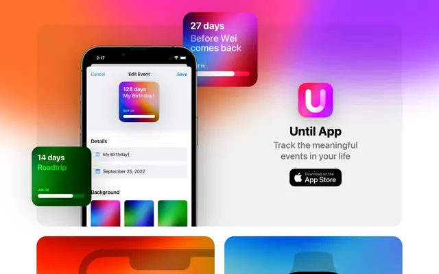
Preview image. Unlock full-res
iOS widget minimalism with expressive gradients
Color palette
Primary Call-to-Action buttons and interactive elements, providing a clear focal point
Background for widgets, indicating an aesthetic choice rather than a functional color for UI states
Background for widgets, providing a vibrant, warm visual
Background for widgets, adding a cool, contemplative hue
Accent hue within gradient backgrounds for specific widget elements
Accent hue within gradient backgrounds, contributing to energetic widget aesthetics
Accent hue within gradient backgrounds, adding a bright, refreshing touch
Primary text, core UI elements, high-emphasis icons; Lightly tinted card backgrounds against the white canvas, adding subtle visual separation without strong contrast
Body text, secondary links, and descriptive labels
Muted text for badges and subtle helper text
Page backgrounds, card backgrounds, and button text
Subdued text for copyright notices and less prominent links
Typography
- Weights
- 400
- Sizes
- 14px, 16px, 19px, 30px, 40px
- Line height
- 1.4
- Fallback
- Inter
Primary content, body text, link labels, and input fields. Relies on system-native rendering for clarity and legibility.
- Weights
- 500
- Sizes
- 14px, 16px, 19px, 30px, 40px
- Line height
- 1.2
- Fallback
- Inter
Medium emphasis headings and prominent labels, offering a subtle lift from regular body text without being overtly bold.
- Weights
- 700
- Sizes
- 14px, 16px, 19px, 30px, 40px
- Line height
- 1
- Fallback
- Inter
High-impact headlines and main titles, commanding attention while integrating with the system-font aesthetic.
- Weights
- 500
- Sizes
- 26px
- Line height
- 1.2
- Fallback
- Inter
Specifically for card titles, providing a distinct intermediate heading style that leverages system defaults.
Spacing & shape
Components
Filled with Action Blue (#0078ff), Platinum White (#ffffff) text, and a 16px border-radius. Padding is 16px on all sides.
Transparent background with a 32px border-radius. Content padding: 0px. No visible box shadow.
Background rgba(0,0,0,0.05) with 32px border-radius. No padding. Relies on subtle background tint for separation.
Transparent background, 0px border-radius, 64px top padding, 32px horizontal padding. No box shadow.
Transparent background, Pewter Mist (#808080) text, 0px border-radius, no padding. Used for secondary textual information.
Uses Midnight Graphite (#000000) for text and icon. Acts as a ghost button, relying on text and icon for visibility. Similar to a link but visually distinct due to icon.
Features gradients like Rainbow Horizon, Deep Space Purple, or Emerald Growth for background fills. Has a 32px border-radius and Platinum White text. Content and internal visual layout are varied.
Guidelines
- Prioritize system fonts (-apple-system, system-ui) for all text to maintain a native, lightweight feel.
- Use Platinum White (#ffffff) for all main page and card backgrounds to ensure a clean, high-contrast canvas.
- Apply a 32px border-radius to all card-like elements to consistently convey a soft, friendly aesthetic.
- Reserve Action Blue (#0078ff) exclusively for primary interactive elements, ensuring clear visual hierarchy for user actions.
- Employ the rgba(0,0,0,0.05) background tint for cards that require subtle elevation without strong shadows.
- Maintain an 8px base unit for all spacing, particularly an 8px elementGap for tight UI components and 16px for comfortable card padding.
- Incorporate vibrant gradient fills for 'widget' elements, creating points of visual interest and brand expression, distinct from the neutral UI.
- Avoid strong, heavy shadows for cards or any container element; opt for subtle background tints or filter-based treatments for elevation.
- Do not introduce new typefaces, as the system relies exclusively on -apple-system and system-ui for a clean, consistent experience.
- Refrain from using color as a decorative element in the primary UI; color should serve functional purposes (accent, action, gradient background for widgets), not simply for visual flair outside of defined gradients.
- Do not deviate from the established border radii values; 32px for cards and 16px for buttons are key to the brand's visual identity.
- Avoid creating content that breaks the implicit full-bleed layout; sections should stretch horizontally, with content contained fluidly within a conceptual maximum width.
- Do not use dark backgrounds for general page sections; the theme is predominantly light, with gradients reserved for specific, contained graphical elements.
- Do not clutter layouts with excessive elements or tight spacing; maintain a comfortable density with ample negative space around components, aligning with the 8px base unit system.
About this system
ShowHide
Until App employs a clean, iOS-native aesthetic characterized by high contrast typography over predominantly neutral backgrounds. Gradients are utilized as expressive surface fills within contained widgets, rather than affecting the overall canvas. Elements have generous border radii, signaling a soft, user-friendly interface. Interactions are marked by a singular vivid blue, providing clear functional highlights.
The page exhibits a full-bleed layout, where background elements and imagery extend to the viewport edges. The primary content appears loosely contained within a central column, though no explicit pageMaxWidth is enforced. The hero section prominently features a product screenshot (an iPhone mockup) against a vibrant gradient background. Vertical rhythm is established by section gaps around 153px, providing significant breathing room between content blocks. Content arrangement often juxtaposes product imagery and UI components against abstract, expressive gradients. There is a frequent use of card-like elements with generous radii, scattered dynamically across the layout, suggesting a less rigid grid and more artistic composition.
The visual language revolves around product screenshots and abstract gradients. The product screenshots showcase the app's UI within an iPhone frame, positioned organically and dynamically within the layout, sometimes overlapping. The treatment of these shots is clean and focused on showing functionality. Gradients are used as illustrative backdrops and as fills for app widgets, serving decorative and atmospheric roles rather than explanatory content. Icons and UI elements within the app are typically filled and simple, adhering to an iOS-native style. The overall density is balanced, allowing UI visuals to breathe within the page.
Reminiscent of Apple (Apps / iOS UI), Linear, Superhuman.
# Until App — Style Reference
> iOS widget minimalism with expressive gradients

**Theme:** light

**Site:** https://getuntil.app

Until App employs a clean, iOS-native aesthetic characterized by high contrast typography over predominantly neutral backgrounds. Gradients are utilized as expressive surface fills within contained widgets, rather than affecting the overall canvas. Elements have generous border radii, signaling a soft, user-friendly interface. Interactions are marked by a singular vivid blue, providing clear functional highlights.

## Tokens — Colors

| Name | Value | Token | Role |
|------|------|------|------|
| Action Blue | `#0078ff` | `--color-action-blue` | Primary Call-to-Action buttons and interactive elements, providing a clear focal point |
| Rainbow Horizon | `#ffb005` | `--color-rainbow-horizon` | Background for widgets, indicating an aesthetic choice rather than a functional color for UI states |
| Sunset Gradient | `#fa3d1d` | `--color-sunset-gradient` | Background for widgets, providing a vibrant, warm visual |
| Violet Skies | `#c679c4` | `--color-violet-skies` | Background for widgets, adding a cool, contemplative hue |
| Deep Space Purple | `#b41380` | `--color-deep-space-purple` | Accent hue within gradient backgrounds for specific widget elements |
| Electric Violet | `#5507ff` | `--color-electric-violet` | Accent hue within gradient backgrounds, contributing to energetic widget aesthetics |
| Skybound Blue | `#11a8ff` | `--color-skybound-blue` | Accent hue within gradient backgrounds, adding a bright, refreshing touch |
| Midnight Graphite | `#000000` | `--color-midnight-graphite` | Primary text, core UI elements, high-emphasis icons; Lightly tinted card backgrounds against the white canvas, adding subtle visual separation without strong contrast |
| Storm Gray | `#595959` | `--color-storm-gray` | Body text, secondary links, and descriptive labels |
| Pewter Mist | `#808080` | `--color-pewter-mist` | Muted text for badges and subtle helper text |
| Platinum White | `#ffffff` | `--color-platinum-white` | Page backgrounds, card backgrounds, and button text |
| Silver Cloud | `#999999` | `--color-silver-cloud` | Subdued text for copyright notices and less prominent links |

## Tokens — Typography

### -apple-system
- **Substitute:** Inter
- **Weights:** 400
- **Sizes:** 14px, 16px, 19px, 30px, 40px
- **Line height:** 1.4
- **Role:** Primary content, body text, link labels, and input fields. Relies on system-native rendering for clarity and legibility.

### -apple-system
- **Substitute:** Inter
- **Weights:** 500
- **Sizes:** 14px, 16px, 19px, 30px, 40px
- **Line height:** 1.2
- **Role:** Medium emphasis headings and prominent labels, offering a subtle lift from regular body text without being overtly bold.

### -apple-system
- **Substitute:** Inter
- **Weights:** 700
- **Sizes:** 14px, 16px, 19px, 30px, 40px
- **Line height:** 1
- **Role:** High-impact headlines and main titles, commanding attention while integrating with the system-font aesthetic.

### system-ui
- **Substitute:** Inter
- **Weights:** 500
- **Sizes:** 26px
- **Line height:** 1.2
- **Role:** Specifically for card titles, providing a distinct intermediate heading style that leverages system defaults.

## Tokens — Type Scale

Major Third (1.25) from 16px base.

| Role | Size | Line height | Letter spacing |
|------|------|------|------|
| caption | 14px | 1.4 | — |
| body | 16px | 1.4 | — |
| subheading | 19px | 1.2 | — |
| heading | 26px | 1.2 | — |
| heading-lg | 30px | 1.2 | — |
| display | 40px | 1 | — |

## Tokens — Spacing

- **Section gap:** 153px
- **Card padding:** 16px
- **Element gap:** 8px

## Tokens — Radius

- **Buttons:** 16px
- **Cards:** 32px

## Layout

The page exhibits a full-bleed layout, where background elements and imagery extend to the viewport edges. The primary content appears loosely contained within a central column, though no explicit pageMaxWidth is enforced. The hero section prominently features a product screenshot (an iPhone mockup) against a vibrant gradient background. Vertical rhythm is established by section gaps around 153px, providing significant breathing room between content blocks. Content arrangement often juxtaposes product imagery and UI components against abstract, expressive gradients. There is a frequent use of card-like elements with generous radii, scattered dynamically across the layout, suggesting a less rigid grid and more artistic composition.

## Imagery

The visual language revolves around product screenshots and abstract gradients. The product screenshots showcase the app's UI within an iPhone frame, positioned organically and dynamically within the layout, sometimes overlapping. The treatment of these shots is clean and focused on showing functionality. Gradients are used as illustrative backdrops and as fills for app widgets, serving decorative and atmospheric roles rather than explanatory content. Icons and UI elements within the app are typically filled and simple, adhering to an iOS-native style. The overall density is balanced, allowing UI visuals to breathe within the page.

## Components

### Primary Action Button
*Main call-to-action.*

Filled with Action Blue (#0078ff), Platinum White (#ffffff) text, and a 16px border-radius. Padding is 16px on all sides.

### Compact Card (Default)
*Standard information container.*

Transparent background with a 32px border-radius. Content padding: 0px. No visible box shadow.

### Raised Card (Subtle)
*Elevated card for content emphasis.*

Background rgba(0,0,0,0.05) with 32px border-radius. No padding. Relies on subtle background tint for separation.

### Hero Section Card
*Container at top of page, full-width.*

Transparent background, 0px border-radius, 64px top padding, 32px horizontal padding. No box shadow.

### Muted Text Badge
*Small, descriptive labels.*

Transparent background, Pewter Mist (#808080) text, 0px border-radius, no padding. Used for secondary textual information.

### App Store Download Button
*External download link button.*

Uses Midnight Graphite (#000000) for text and icon. Acts as a ghost button, relying on text and icon for visibility. Similar to a link but visually distinct due to icon.

### Widget Card (Gradient)
*Decorative card with a vibrant gradient background.*

Features gradients like Rainbow Horizon, Deep Space Purple, or Emerald Growth for background fills. Has a 32px border-radius and Platinum White text. Content and internal visual layout are varied.

## Guidelines

### Do

- Prioritize system fonts (-apple-system, system-ui) for all text to maintain a native, lightweight feel.
- Use Platinum White (#ffffff) for all main page and card backgrounds to ensure a clean, high-contrast canvas.
- Apply a 32px border-radius to all card-like elements to consistently convey a soft, friendly aesthetic.
- Reserve Action Blue (#0078ff) exclusively for primary interactive elements, ensuring clear visual hierarchy for user actions.
- Employ the rgba(0,0,0,0.05) background tint for cards that require subtle elevation without strong shadows.
- Maintain an 8px base unit for all spacing, particularly an 8px elementGap for tight UI components and 16px for comfortable card padding.
- Incorporate vibrant gradient fills for 'widget' elements, creating points of visual interest and brand expression, distinct from the neutral UI.

### Don't

- Avoid strong, heavy shadows for cards or any container element; opt for subtle background tints or filter-based treatments for elevation.
- Do not introduce new typefaces, as the system relies exclusively on -apple-system and system-ui for a clean, consistent experience.
- Refrain from using color as a decorative element in the primary UI; color should serve functional purposes (accent, action, gradient background for widgets), not simply for visual flair outside of defined gradients.
- Do not deviate from the established border radii values; 32px for cards and 16px for buttons are key to the brand's visual identity.
- Avoid creating content that breaks the implicit full-bleed layout; sections should stretch horizontally, with content contained fluidly within a conceptual maximum width.
- Do not use dark backgrounds for general page sections; the theme is predominantly light, with gradients reserved for specific, contained graphical elements.
- Do not clutter layouts with excessive elements or tight spacing; maintain a comfortable density with ample negative space around components, aligning with the 8px base unit system.

## Agent Prompt Guide

### Quick Color Reference
- text: #000000 (Midnight Graphite)
- background: #ffffff (Platinum White)
- border: no distinct border color
- accent: no distinct accent color
- primary action: #0078ff (filled action)

### 3-5 Example Component Prompts
1. Create a primary call-to-action button: Action Blue (#0078ff) background, Platinum White (#ffffff) text, '-apple-system' font weight 400, 16px font size, 16px radius, with 16px padding on all sides.
2. Design a subtle raised card: use rgba(0,0,0,0.05) as the background, 32px border-radius, no padding, with Midnight Graphite (#000000) for text set in '-apple-system' font weight 400 at 16px font size.
3. Build a widget card using the Rainbow Horizon gradient: linear-gradient(226deg, #c679c4, #fa3d1d, #ffb005) background, 32px border-radius. Headline text should be Platinum White (#ffffff), 'system-ui' font weight 500, 26px font size, with body text Platinum White (#ffffff), '-apple-system' font weight 400, 16px font size.
4. Construct a heading section: Midnight Graphite (#000000) text as 'Until App', '-apple-system' font weight 700, 40px font size. Followed by Storm Gray (#595959) subtext 'Track the meaningful events in your life', '-apple-system' font weight 400, 16px font size.
More like this








Keep what you find
A free account saves references to boards and can send you a weekly email of picks based on what you save.
To see every result, go Pro.