Preview image. Unlock full-res
Dark Slate Operational Hub
Color palette
Interactive link color, outlined button borders. A deep, saturated blue-violet for interaction
Orange outline accent for tags, dividers, and focused UI edges. Do not promote it to the primary CTA color
Orange outline accent for tags, dividers, and focused UI edges. Use as a supporting accent, not as a status color
Violet outline accent for tags, dividers, and focused UI edges. Use as a supporting accent, not as a status color
Yellow outline accent for tags, dividers, and focused UI edges. Use as a supporting accent, not as a status color
Green outline accent for tags, dividers, and focused UI edges. Use as a supporting accent, not as a status color
Primary text, critical UI elements, background sections in dark layouts. The foundational dark color
Primary background for light sections, inverse text on dark backgrounds, active states
Secondary page background, subtle dividers, input fields. Provides slight visual separation from White Canvas
Dark surface background for cards and panels, borders, secondary text in dark mode
Elevated dark backgrounds, footer background – darker than Charcoal Surface
Background for information cards, slightly lighter than text color in dark sections to create subtle contrast
Muted body text, placeholder text, secondary icons. Provides a softer alternative to Charcoal Surface for less prominent information
Typography
- Weights
- 400
- Sizes
- 12px
- Line height
- 1.2
sans-serif — detected in extracted data but not described by AI
- Weights
- 300, 400
- Sizes
- 24px, 30px, 40px, 60px
- Line height
- 1, 1.07, 1.33, 1.4
- Letter spacing
- -0.02em at 60px, -0.01em at 24px
- Fallback
- serif
Display and marketing headlines. Weight 300 for large sizes creates a sophisticated, authoritative tone, while 400 for smaller headings offers robust readability without losing elegance.
- Weights
- 400, 430
- Sizes
- 9px, 10px, 12px, 14px, 16px, 18px, 21px, 24px
- Line height
- 1, 1.08, 1.11, 1.14, 1.17, 1.25, 1.4, 1.43, 1.56
- Letter spacing
- -0.027em at 24px, -0.025em at 21px, -0.02em at 18px, -0.01em at 16px
- Fallback
- Roboto
Primary user interface text, navigation, and input labels. Its precise tracking ensures compact, information-dense areas remain legible and sharp.
- Weights
- 400, 500
- Sizes
- 12px
- Line height
- 1.33
- Letter spacing
- normal
- Fallback
- Inter
Small functional text, captions, and secondary information where legibility at small sizes is paramount.
- Weights
- 400
- Sizes
- 12px, 16px
- Line height
- 1.2
- Letter spacing
- normal
- Fallback
- Inter
System-level text, tooltips, and default body copy for straightforward content.
Spacing & shape
Components
Background: Charcoal Surface (#292929), Text: White Canvas (#ffffff), Border Radius: 160px, Padding: 12px vertical, 20px horizontal.
Background: transparent, Text: Link Ink (#00104e) or primary brand text for navigation, Border Color: Link Ink (#00104e), Border Radius: 160px, Padding: 12px vertical, 20px horizontal.
Background: White Canvas (#ffffff), Text: Midnight Ink (#000000), Border Radius: 160px, Padding: 0px.
Background: Card Gray (#484848), Border Radius: 14px, Padding: 10px.
Background: Card Gray (#484848), Border Radius: 7px, Padding: 4px.
Background: rgba(255, 255, 255, 0.12), Border Radius: 8px, Padding: 8px horizontal, 14px vertical.
Background: Ghost Gray (#f7f6f5), Text/Placeholder: Charcoal Surface (#292929), Border Color: Charcoal Surface (#292929), Border Radius: 160px, Padding: 10px vertical, 16px horizontal.
Guidelines
- Prioritize Martina Plantijn Light for all prominent headlines (H1-H3), using weight 300 for large sizes (above 40px) to achieve a sophisticated, non-shouting presence.
- Utilize STK Bureau for all UI text, navigation, and most body content, applying its tight letter-spacing to maintain a compact, high-information density aesthetic.
- Implement Action Orange (#ff683d) exclusively for primary calls-to-action and essential interactive highlights; avoid using it for decorative purposes.
- Apply Charcoal Surface (#292929) as the default background for cards and content blocks within dark sections, ensuring visual consistency across components.
- Ensure interactive elements like buttons and input fields feature prominent rounded borders (160px or 40px radius) to emphasize their clickable nature.
- Use Link Ink (#00104e) sparingly for outlined button borders and text links, establishing a secondary interactive color that complements the brand orange.
- Maintain a clear visual hierarchy by using Midnight Ink (#000000) for primary text against light backgrounds and White Canvas (#ffffff) for primary text against dark backgrounds.
- Do not introduce new saturated accent colors outside of the established brand and semantic palette; color should be functional, not decorative.
- Avoid using Martina Plantijn Light for body text or small UI elements, as its elegance is lost at smaller point sizes and its character designed for impact.
- Do not deviate from the specified border radii; the distinct rounding (e.g., 160px for buttons, 8px for cards) is a core part of the visual identity.
- Refrain from using drop shadows excessively; the system favors flat surfaces and subtle elevation, mainly rgba(0, 0, 0, 0.25) 0px 1px 2px 0px for minor depth.
- Do not mix light and dark surface colors randomly; sections should either commit to a full dark background (Charcoal Surface, Deep Gray) or a light background (White Canvas, Ghost Gray).
- Avoid generic system fonts unless explicitly specified for supplementary content; the custom typography is crucial for brand recognition and voice.
- Do not use Action Orange (#ff683d) for non-interactive elements or generic display text; its purpose is to guide user action.
About this system
ShowHide
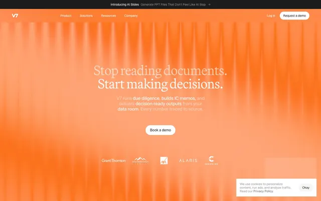
V7 presents a data-driven, operational aesthetic with a strong dark mode emphasis contrasted by a single vibrant orange accent. Heavy-set headlines command attention, while compact, meticulously tracked body text conveys information efficiency. Surfaces are cool and dark, often in shades of gray, creating a backdrop for the brand's bold orange highlights, which are reserved for functional elements. Component shapes lean towards pronounced circularity and soft, rounded containers.
Reminiscent of Rippling, Retool, Vanta, Gusto.
# V7labs — Style Reference
> Dark Slate Operational Hub

**Theme:** mixed

**Site:** https://www.v7labs.com

V7 presents a data-driven, operational aesthetic with a strong dark mode emphasis contrasted by a single vibrant orange accent. Heavy-set headlines command attention, while compact, meticulously tracked body text conveys information efficiency. Surfaces are cool and dark, often in shades of gray, creating a backdrop for the brand's bold orange highlights, which are reserved for functional elements. Component shapes lean towards pronounced circularity and soft, rounded containers.

## Tokens — Colors

| Name | Value | Token | Role |
|------|------|------|------|
| Link Ink | `#00104e` | `--color-link-ink` | Interactive link color, outlined button borders. A deep, saturated blue-violet for interaction |
| Action Orange | `#ff683d` | `--color-action-orange` | Orange outline accent for tags, dividers, and focused UI edges. Do not promote it to the primary CTA color |
| Danger Red | `#ec580a` | `--color-danger-red` | Orange outline accent for tags, dividers, and focused UI edges. Use as a supporting accent, not as a status color |
| Info Blue | `#2663eb` | `--color-info-blue` | Violet outline accent for tags, dividers, and focused UI edges. Use as a supporting accent, not as a status color |
| Warning Yellow | `#ce8c04` | `--color-warning-yellow` | Yellow outline accent for tags, dividers, and focused UI edges. Use as a supporting accent, not as a status color |
| Success Green | `#14a249` | `--color-success-green` | Green outline accent for tags, dividers, and focused UI edges. Use as a supporting accent, not as a status color |
| Midnight Ink | `#000000` | `--color-midnight-ink` | Primary text, critical UI elements, background sections in dark layouts. The foundational dark color |
| White Canvas | `#ffffff` | `--color-white-canvas` | Primary background for light sections, inverse text on dark backgrounds, active states |
| Ghost Gray | `#f7f6f5` | `--color-ghost-gray` | Secondary page background, subtle dividers, input fields. Provides slight visual separation from White Canvas |
| Charcoal Surface | `#292929` | `--color-charcoal-surface` | Dark surface background for cards and panels, borders, secondary text in dark mode |
| Deep Gray | `#1c1c1c` | `--color-deep-gray` | Elevated dark backgrounds, footer background – darker than Charcoal Surface |
| Card Gray | `#484848` | `--color-card-gray` | Background for information cards, slightly lighter than text color in dark sections to create subtle contrast |
| Muted Ash | `#989897` | `--color-muted-ash` | Muted body text, placeholder text, secondary icons. Provides a softer alternative to Charcoal Surface for less prominent information |

## Tokens — Typography

### sans-serif
- **Weights:** 400
- **Sizes:** 12px
- **Line height:** 1.2
- **Role:** sans-serif — detected in extracted data but not described by AI

### Martina Plantijn Light
- **Substitute:** serif
- **Weights:** 300, 400
- **Sizes:** 24px, 30px, 40px, 60px
- **Line height:** 1, 1.07, 1.33, 1.4
- **Letter spacing:** -0.02em at 60px, -0.01em at 24px
- **Role:** Display and marketing headlines. Weight 300 for large sizes creates a sophisticated, authoritative tone, while 400 for smaller headings offers robust readability without losing elegance.

### STK Bureau
- **Substitute:** Roboto
- **Weights:** 400, 430
- **Sizes:** 9px, 10px, 12px, 14px, 16px, 18px, 21px, 24px
- **Line height:** 1, 1.08, 1.11, 1.14, 1.17, 1.25, 1.4, 1.43, 1.56
- **Letter spacing:** -0.027em at 24px, -0.025em at 21px, -0.02em at 18px, -0.01em at 16px
- **Role:** Primary user interface text, navigation, and input labels. Its precise tracking ensures compact, information-dense areas remain legible and sharp.

### Inter Variable
- **Substitute:** Inter
- **Weights:** 400, 500
- **Sizes:** 12px
- **Line height:** 1.33
- **Letter spacing:** normal
- **Role:** Small functional text, captions, and secondary information where legibility at small sizes is paramount.

### Inter
- **Substitute:** Inter
- **Weights:** 400
- **Sizes:** 12px, 16px
- **Line height:** 1.2
- **Letter spacing:** normal
- **Role:** System-level text, tooltips, and default body copy for straightforward content.

## Tokens — Type Scale

| Role | Size | Line height | Letter spacing |
|------|------|------|------|
| heading | 18px | 1.17 | -0.36px |
| heading-lg | 21px | 1.14 | -0.525px |
| display | 60px | 1 | -1.2px |

## Tokens — Spacing

- **Section gap:** 39px
- **Card padding:** 12px
- **Element gap:** 4px

## Tokens — Radius

- **Buttons:** 160px
- **Cards:** 8px
- **circular:** 99px
- **forms:** 160px
- **secondaryElements:** 2px
- **tags:** 40px

## Components

### Pill Button - Filled
*Primary action button with a rounded, pill-like shape.*

Background: Charcoal Surface (#292929), Text: White Canvas (#ffffff), Border Radius: 160px, Padding: 12px vertical, 20px horizontal.

### Pill Button - Outlined
*Secondary action button with a distinct border accent.*

Background: transparent, Text: Link Ink (#00104e) or primary brand text for navigation, Border Color: Link Ink (#00104e), Border Radius: 160px, Padding: 12px vertical, 20px horizontal.

### White Text Button
*Light-themed or ghost button.*

Background: White Canvas (#ffffff), Text: Midnight Ink (#000000), Border Radius: 160px, Padding: 0px.

### Standard Content Card
*Container for information modules within a dark section.*

Background: Card Gray (#484848), Border Radius: 14px, Padding: 10px.

### Compact Content Card
*Smaller variant of the content card for denser information display.*

Background: Card Gray (#484848), Border Radius: 7px, Padding: 4px.

### Light Overlay Card
*Slightly transparent card for highlighting content over a dark background.*

Background: rgba(255, 255, 255, 0.12), Border Radius: 8px, Padding: 8px horizontal, 14px vertical.

### Pill Input Field
*Form input field with a distinctive pill shape.*

Background: Ghost Gray (#f7f6f5), Text/Placeholder: Charcoal Surface (#292929), Border Color: Charcoal Surface (#292929), Border Radius: 160px, Padding: 10px vertical, 16px horizontal.

## Guidelines

### Do

- Prioritize Martina Plantijn Light for all prominent headlines (H1-H3), using weight 300 for large sizes (above 40px) to achieve a sophisticated, non-shouting presence.
- Utilize STK Bureau for all UI text, navigation, and most body content, applying its tight letter-spacing to maintain a compact, high-information density aesthetic.
- Implement Action Orange (#ff683d) exclusively for primary calls-to-action and essential interactive highlights; avoid using it for decorative purposes.
- Apply Charcoal Surface (#292929) as the default background for cards and content blocks within dark sections, ensuring visual consistency across components.
- Ensure interactive elements like buttons and input fields feature prominent rounded borders (160px or 40px radius) to emphasize their clickable nature.
- Use Link Ink (#00104e) sparingly for outlined button borders and text links, establishing a secondary interactive color that complements the brand orange.
- Maintain a clear visual hierarchy by using Midnight Ink (#000000) for primary text against light backgrounds and White Canvas (#ffffff) for primary text against dark backgrounds.

### Don't

- Do not introduce new saturated accent colors outside of the established brand and semantic palette; color should be functional, not decorative.
- Avoid using Martina Plantijn Light for body text or small UI elements, as its elegance is lost at smaller point sizes and its character designed for impact.
- Do not deviate from the specified border radii; the distinct rounding (e.g., 160px for buttons, 8px for cards) is a core part of the visual identity.
- Refrain from using drop shadows excessively; the system favors flat surfaces and subtle elevation, mainly rgba(0, 0, 0, 0.25) 0px 1px 2px 0px for minor depth.
- Do not mix light and dark surface colors randomly; sections should either commit to a full dark background (Charcoal Surface, Deep Gray) or a light background (White Canvas, Ghost Gray).
- Avoid generic system fonts unless explicitly specified for supplementary content; the custom typography is crucial for brand recognition and voice.
- Do not use Action Orange (#ff683d) for non-interactive elements or generic display text; its purpose is to guide user action.

## Agent Prompt Guide

Quick Color Reference:
text: #000000 (light sections), #ffffff (dark sections)
background: #f7f6f5 (light base), #292929 (dark base)
border: #000000 (light UI elements), #00104e (interactive outlined buttons)
accent: #ff683d
primary action: #292929 (filled action)

Example Component Prompts:
1. Create a primary call-to-action button: background #292929, text #ffffff, border radius 160px, padding 12px vertical, 20px horizontal, using STK Bureau weight 430, size 16px.
2. Design a Dark Content Card: background #484848, border radius 14px, padding 10px, with content text #ffffff at STK Bureau weight 400, size 14px.
3. Implement a Hero Section Headline: Martina Plantijn Light weight 300, size 60px, color #ffffff, letter-spacing -1.2px, centered against a background of Action Orange (#ff683d).
More like this







Keep what you find
A free account saves references to boards and can send you a weekly email of picks based on what you save.
To see every result, go Pro.