Preview image. Unlock full-res
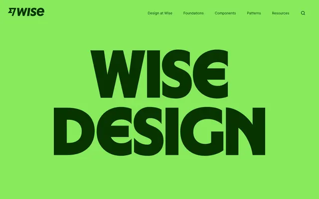
Neon market stall on a global street — electric lime signage that shouts across a crowded marketplace, then polished product UI slips in behind it.
Color palette
Hero backgrounds, pill button fill, category tag backgrounds — the single most identifiable brand signal; vivid green against dark ink creates energy no fintech blue could achieve
Primary text, dark headlines on lime, nav links, icon fills — deep forest green instead of black keeps everything on-brand even at body size
Accent headlines, decorative text color on dark backgrounds — electric yellow that pairs with deep burgundy for maximum punch
Warm accent card backgrounds, decorative section highlights
Soft accent backgrounds, section highlights in the mosaic grid
Dark card backgrounds, high-contrast panels in the content grid — deep purple-black that isn't neutral
Dark editorial backgrounds, heading color on light panels — near-black red that reads as richly dark without being neutral
Secondary body text, border colors, UI chrome
Page backgrounds, card surfaces, section backgrounds between color blocks
Success states, positive transaction indicators
Error states, negative transaction indicators
Interactive accent links, focus states
Warning states, attention-needed transaction labels
Typography
- Weights
- 400, 600
- Sizes
- 16px, 18px, 22px, 25px, 45px, 58px, 72px, 432px
- Line height
- 1, body uses 1.44–1.50)
- Letter spacing
- -2.16px at 72px, -1.39px at 58px, -0.50px at 45px, -0.18px at 25px, -0.12px at 22px, -0.09px at 18px, -0.08px at 16px
- Fallback
- Inter (Google Fonts — this IS Inter)
All UI text: nav links, body copy, subheadings, and medium display text. Weight 400 for body, 600 for subheadings and labels. The 'ss01' feature setting and negative letter-spacing at large sizes (-0.03em at 72px down to -0.005em at 22px) keep it tight without feeling condensed.
- Weights
- 400, 900
- Sizes
- 187px, 288px, 306px, 374px, 562px
- Line height
- 0.85
- Fallback
- Obviously (similar ultra-compressed display), or Neue Haas Grotesk Display at ultra weight
Hero and section display headlines exclusively. Weight 900 at 0.85 line-height is the defining typographic move — lines of text stack so tightly the cap-height of one line nearly touches the descender zone of the line above, creating billboard-compressed stacked type. This is the visual signature of the design system.
- Weights
- 600
- Sizes
- 432px
- Line height
- 1
- Fallback
- Noto Sans JP weight 600
Single-use mega-display for CJK character showcase — demonstrates multilingual typographic range of the system
Spacing & shape
Components
backgroundColor: #87ea5c (display-p3), color: #083400, borderRadius: 9999px, paddingTop: 11px, paddingBottom: 11px, paddingRight: 24px, paddingLeft: 24px. Font: Inter 400 16px. No border — the lime fill IS the button. Used for 'Components', 'Flags', 'Tone of voice' category navigation.
backgroundColor: transparent, color: #083400, borderRadius: 9999px, paddingTop: 11px, paddingBottom: 11px, paddingRight: 24px, paddingLeft: 24px. No visible border. Appears on same lime background surfaces where the lime fill would be redundant.
backgroundColor: #87ea5c, full-width. Wise Sans weight 900 at 288–562px, color: #083400, lineHeight: 0.85. Text is centered and stacked — 2 lines maximum, each word or pair filling near full width. No padding reduction at any viewport — the type fills edge-to-edge aggressively.
backgroundColor: #87ea5c (matches hero, seamless), logo left-aligned with Wise wordmark in #083400. Nav links center-right: 'Design at Wise', 'Foundations', 'Components', 'Patterns', 'Resources' in Inter 400 16px #083400 with -0.08px letter-spacing. Search icon (magnifier) far right. No divider between nav and hero — intentionally merged.
Variable backgroundColor per tile: #87ea5c, #ffd5f0, #ffbd89, #2a0831, #370305, #ffffff. borderRadius: 86px. Contains either large display type (Wise Sans 900), illustration, photography, or product UI at full bleed within the rounded card bounds. Each tile is a self-contained visual story for a design system section.
Inter 600 45px, color: #083400, lineHeight: 1.17, letterSpacing: -0.5px. Displayed on #ffffff background with generous whitespace above and below (80px+). Used for statements like 'Made for the world' — single short line, centered or left-aligned.
backgroundColor: #083400 (dark forest), borderRadius: 86px. Wise Sans weight 900 at 288px+, color: #87ea5c, lineHeight: 0.85. 'WISE SANS' stacked display — lime text on forest card. Demonstrates the inverse colorway from the hero.
Same as Lime Pill Button — backgroundColor: #87ea5c, color: #083400, borderRadius: 9999px, padding: 11px 24px, Inter 400 16px. Positioned floating at bottom edge of mosaic section to label content category ('Flags', 'Components', 'Tone of voice').
Guidelines
- Use Wise Sans weight 900 with lineHeight 0.85 for all hero display text — lines must stack tightly, almost touching, at 288px minimum
- Fill entire hero and nav sections with #87ea5c — the lime is a background, not a highlight; it should dominate, not accent
- Pair #083400 (Forest Ink) as the primary text color on lime and white backgrounds — never use pure black (#000000) anywhere in the system
- Assign 86px border-radius to content cards and mosaic tiles; reserve 9999px exclusively for pill buttons and tags
- Use the full accent palette (#ffea4b, #ffbd89, #ffd5f0, #2a0831, #370305) as full-bleed card backgrounds — each color is a distinct 'room', not a subtle tint
- Apply Inter font-feature-settings: "calt", "ss01" — the ss01 variant alternates specific letterforms that are part of the typographic identity
- Maintain negative letter-spacing on Inter at all display sizes: -2.16px at 72px, scaling to -0.08px at 16px
- Never use #87ea5c as a small accent detail — it must be used at large scale (full backgrounds, full buttons) or not at all
- Do not use weight 700 for body text — Inter weights are strictly 400 (body) and 600 (labels/subheadings)
- Never apply drop shadows or elevation effects — the system uses color contrast and scale for hierarchy, not shadow depth
- Do not use rectangular (0px radius) cards — content blocks must use either 86px radius or 9999px pill; sharp corners are absent from the system
- Never use conventional fintech blue as a primary brand color — #0097c7 exists only for semantic accent links and focus states, never as primary CTA or brand expression
- Do not place Wise Sans at sizes below 187px — it is a display-only typeface; Inter handles all UI and body text
- Never mix multiple chromatic background colors in a single section — each panel is monochromatic, switching color only at full section breaks
About this system
ShowHide
Wise Design hits like a silk-screened protest poster — electric lime green (#87ea5c) floods the hero at full saturation, then dark forest ink (#083400) type slams across it at display scale. The palette is deliberately non-fintech: vivid yellow (#ffea4b), peach (#ffbd89), cotton candy pink (#ffd5f0), and deep aubergine (#2a0831) coexist like a global currency collection. Wise Sans at weight 900 with 0.85 line-height is the signature — letterforms stack so tightly they almost collide, creating billboard compression at digital scale. Pills (9999px radius) are the only rounded UI element, while large content blocks use generous 86px radii creating soft-edged cards that contrast the aggressive type. The design system oscillates between screaming and whispering — massive stacked display type then a single quiet midsize line on white.
Full-bleed sections with no max-width constraint on hero and color blocks; content sections use ~1152-1440px max-width centered. Hero is full-viewport lime green with Wise Sans stacked display type, no image — the type IS the visual. Navigation merges seamlessly with hero background (same #87ea5c), creating a single unbroken color field from top of page through hero. Section rhythm alternates: massive color hero → white editorial pause → full-bleed photography → mosaic card grid → white section → dark panel → repeat. No decorative dividers — color is the divider. The mosaic grid uses 3-column irregular tile layout where tiles vary in height and background color, creating a collage effect. Individual content sections use centered single-column for editorial statements and 2-column for feature explanations. Spacious vertical breathing room (80-120px) between major sections ensures each color block reads as a distinct visual beat.
Three distinct visual modes coexist in the system. First: full-bleed real-world photography (street scenes with flags, city imagery) used full-width with no border-radius — raw, unmasked, documentary in feel, treated as atmospheric section dividers rather than product illustration. Second: product UI screenshots (transaction cards, app interfaces) contained within 86px-radius white cards, floating against colored backgrounds — the UI is the product showcase. Third: a mosaic of color-block tiles containing flags (circular crop), paper airplane illustrations, currency symbols, and illustrated characters — these are flat, graphic, brand-colored, and decorative. Icons visible in transaction UI are outlined stroke-style at ~1.5px weight, monochrome #083400. The overall density is image-heavy in the mosaic zones but text-dominant in editorial sections — the system alternates between visual feast and typographic silence.
Reminiscent of Monzo, Duolingo, Figma (brand site), Cash App, Mailchimp.
# Wise Design — Style Reference
> Neon market stall on a global street — electric lime signage that shouts across a crowded marketplace, then polished product UI slips in behind it.

**Theme:** mixed

**Site:** https://wise.design

Wise Design hits like a silk-screened protest poster — electric lime green (#87ea5c) floods the hero at full saturation, then dark forest ink (#083400) type slams across it at display scale. The palette is deliberately non-fintech: vivid yellow (#ffea4b), peach (#ffbd89), cotton candy pink (#ffd5f0), and deep aubergine (#2a0831) coexist like a global currency collection. Wise Sans at weight 900 with 0.85 line-height is the signature — letterforms stack so tightly they almost collide, creating billboard compression at digital scale. Pills (9999px radius) are the only rounded UI element, while large content blocks use generous 86px radii creating soft-edged cards that contrast the aggressive type. The design system oscillates between screaming and whispering — massive stacked display type then a single quiet midsize line on white.

## Tokens — Colors

| Name | Value | Token | Role |
|------|------|------|------|
| Lime Volt | `#87ea5c` | `--color-lime-volt` | Hero backgrounds, pill button fill, category tag backgrounds — the single most identifiable brand signal; vivid green against dark ink creates energy no fintech blue could achieve |
| Forest Ink | `#083400` | `--color-forest-ink` | Primary text, dark headlines on lime, nav links, icon fills — deep forest green instead of black keeps everything on-brand even at body size |
| Volt Yellow | `#ffea4b` | `--color-volt-yellow` | Accent headlines, decorative text color on dark backgrounds — electric yellow that pairs with deep burgundy for maximum punch |
| Papaya | `#ffbd89` | `--color-papaya` | Warm accent card backgrounds, decorative section highlights |
| Cotton Candy | `#ffd5f0` | `--color-cotton-candy` | Soft accent backgrounds, section highlights in the mosaic grid |
| Aubergine Night | `#2a0831` | `--color-aubergine-night` | Dark card backgrounds, high-contrast panels in the content grid — deep purple-black that isn't neutral |
| Crimson Depth | `#370305` | `--color-crimson-depth` | Dark editorial backgrounds, heading color on light panels — near-black red that reads as richly dark without being neutral |
| Fog | `#58717a` | `--color-fog` | Secondary body text, border colors, UI chrome |
| White | `#ffffff` | `--color-white` | Page backgrounds, card surfaces, section backgrounds between color blocks |
| Positive | `#008026` | `--color-positive` | Success states, positive transaction indicators |
| Negative | `#cf2929` | `--color-negative` | Error states, negative transaction indicators |
| Accent Blue | `#0097c7` | `--color-accent-blue` | Interactive accent links, focus states |
| Warning | `#9a6500` | `--color-warning` | Warning states, attention-needed transaction labels |

## Tokens — Typography

### Inter
- **Substitute:** Inter (Google Fonts — this IS Inter)
- **Weights:** 400, 600
- **Sizes:** 16px, 18px, 22px, 25px, 45px, 58px, 72px, 432px
- **Line height:** 1, body uses 1.44–1.50)
- **Letter spacing:** -2.16px at 72px, -1.39px at 58px, -0.50px at 45px, -0.18px at 25px, -0.12px at 22px, -0.09px at 18px, -0.08px at 16px
- **Role:** All UI text: nav links, body copy, subheadings, and medium display text. Weight 400 for body, 600 for subheadings and labels. The 'ss01' feature setting and negative letter-spacing at large sizes (-0.03em at 72px down to -0.005em at 22px) keep it tight without feeling condensed.

### Wise Sans
- **Substitute:** Obviously (similar ultra-compressed display), or Neue Haas Grotesk Display at ultra weight
- **Weights:** 400, 900
- **Sizes:** 187px, 288px, 306px, 374px, 562px
- **Line height:** 0.85
- **Role:** Hero and section display headlines exclusively. Weight 900 at 0.85 line-height is the defining typographic move — lines of text stack so tightly the cap-height of one line nearly touches the descender zone of the line above, creating billboard-compressed stacked type. This is the visual signature of the design system.

### Zen Kaku Gothic New
- **Substitute:** Noto Sans JP weight 600
- **Weights:** 600
- **Sizes:** 432px
- **Line height:** 1
- **Role:** Single-use mega-display for CJK character showcase — demonstrates multilingual typographic range of the system

## Tokens — Type Scale

| Role | Size | Line height | Letter spacing |
|------|------|------|------|
| body-sm | 16px | 1.5 | -0.08em |
| body | 18px | 1.44 | -0.09em |
| subheading | 22px | 1.25 | -0.12px |
| heading-sm | 25px | 1.25 | -0.18px |
| heading | 45px | 1.17 | -0.5px |
| heading-lg | 58px | 1.03 | -1.39px |
| display | 72px | 1 | -2.16px |

## Tokens — Spacing

- **Max width:** 1440px
- **Section gap:** 80-120px
- **Card padding:** 24px
- **Element gap:** 12px

## Tokens — Radius

- **Buttons:** 9999px
- **Cards:** 86px
- **body:** 1440px
- **contentBlocks:** 86px
- **tags:** 9999px

## Layout

Full-bleed sections with no max-width constraint on hero and color blocks; content sections use ~1152-1440px max-width centered. Hero is full-viewport lime green with Wise Sans stacked display type, no image — the type IS the visual. Navigation merges seamlessly with hero background (same #87ea5c), creating a single unbroken color field from top of page through hero. Section rhythm alternates: massive color hero → white editorial pause → full-bleed photography → mosaic card grid → white section → dark panel → repeat. No decorative dividers — color is the divider. The mosaic grid uses 3-column irregular tile layout where tiles vary in height and background color, creating a collage effect. Individual content sections use centered single-column for editorial statements and 2-column for feature explanations. Spacious vertical breathing room (80-120px) between major sections ensures each color block reads as a distinct visual beat.

## Imagery

Three distinct visual modes coexist in the system. First: full-bleed real-world photography (street scenes with flags, city imagery) used full-width with no border-radius — raw, unmasked, documentary in feel, treated as atmospheric section dividers rather than product illustration. Second: product UI screenshots (transaction cards, app interfaces) contained within 86px-radius white cards, floating against colored backgrounds — the UI is the product showcase. Third: a mosaic of color-block tiles containing flags (circular crop), paper airplane illustrations, currency symbols, and illustrated characters — these are flat, graphic, brand-colored, and decorative. Icons visible in transaction UI are outlined stroke-style at ~1.5px weight, monochrome #083400. The overall density is image-heavy in the mosaic zones but text-dominant in editorial sections — the system alternates between visual feast and typographic silence.

## Components

### Category Navigation Pills

### Transaction Card (Product UI)

### Mosaic Design System Cards

### Lime Pill Button
*Primary CTA and category tag navigation*

backgroundColor: #87ea5c (display-p3), color: #083400, borderRadius: 9999px, paddingTop: 11px, paddingBottom: 11px, paddingRight: 24px, paddingLeft: 24px. Font: Inter 400 16px. No border — the lime fill IS the button. Used for 'Components', 'Flags', 'Tone of voice' category navigation.

### Ghost Pill Button
*Secondary or transparent navigation action*

backgroundColor: transparent, color: #083400, borderRadius: 9999px, paddingTop: 11px, paddingBottom: 11px, paddingRight: 24px, paddingLeft: 24px. No visible border. Appears on same lime background surfaces where the lime fill would be redundant.

### Hero Display Block
*Full-viewport brand statement sections*

backgroundColor: #87ea5c, full-width. Wise Sans weight 900 at 288–562px, color: #083400, lineHeight: 0.85. Text is centered and stacked — 2 lines maximum, each word or pair filling near full width. No padding reduction at any viewport — the type fills edge-to-edge aggressively.

### Navigation Bar
*Site-level navigation*

backgroundColor: #87ea5c (matches hero, seamless), logo left-aligned with Wise wordmark in #083400. Nav links center-right: 'Design at Wise', 'Foundations', 'Components', 'Patterns', 'Resources' in Inter 400 16px #083400 with -0.08px letter-spacing. Search icon (magnifier) far right. No divider between nav and hero — intentionally merged.

### Mosaic Content Card
*Design system section showcase tiles in scrolling grid*

Variable backgroundColor per tile: #87ea5c, #ffd5f0, #ffbd89, #2a0831, #370305, #ffffff. borderRadius: 86px. Contains either large display type (Wise Sans 900), illustration, photography, or product UI at full bleed within the rounded card bounds. Each tile is a self-contained visual story for a design system section.

### Editorial Subheading
*Section introduction text between visual blocks*

Inter 600 45px, color: #083400, lineHeight: 1.17, letterSpacing: -0.5px. Displayed on #ffffff background with generous whitespace above and below (80px+). Used for statements like 'Made for the world' — single short line, centered or left-aligned.

### Typography Specimen Card
*Design system typography showcase tile*

backgroundColor: #083400 (dark forest), borderRadius: 86px. Wise Sans weight 900 at 288px+, color: #87ea5c, lineHeight: 0.85. 'WISE SANS' stacked display — lime text on forest card. Demonstrates the inverse colorway from the hero.

### Category Label Tag
*Section or content type identifier in mosaic grid*

Same as Lime Pill Button — backgroundColor: #87ea5c, color: #083400, borderRadius: 9999px, padding: 11px 24px, Inter 400 16px. Positioned floating at bottom edge of mosaic section to label content category ('Flags', 'Components', 'Tone of voice').

## Guidelines

### Do

- Use Wise Sans weight 900 with lineHeight 0.85 for all hero display text — lines must stack tightly, almost touching, at 288px minimum
- Fill entire hero and nav sections with #87ea5c — the lime is a background, not a highlight; it should dominate, not accent
- Pair #083400 (Forest Ink) as the primary text color on lime and white backgrounds — never use pure black (#000000) anywhere in the system
- Assign 86px border-radius to content cards and mosaic tiles; reserve 9999px exclusively for pill buttons and tags
- Use the full accent palette (#ffea4b, #ffbd89, #ffd5f0, #2a0831, #370305) as full-bleed card backgrounds — each color is a distinct 'room', not a subtle tint
- Apply Inter font-feature-settings: "calt", "ss01" — the ss01 variant alternates specific letterforms that are part of the typographic identity
- Maintain negative letter-spacing on Inter at all display sizes: -2.16px at 72px, scaling to -0.08px at 16px

### Don't

- Never use #87ea5c as a small accent detail — it must be used at large scale (full backgrounds, full buttons) or not at all
- Do not use weight 700 for body text — Inter weights are strictly 400 (body) and 600 (labels/subheadings)
- Never apply drop shadows or elevation effects — the system uses color contrast and scale for hierarchy, not shadow depth
- Do not use rectangular (0px radius) cards — content blocks must use either 86px radius or 9999px pill; sharp corners are absent from the system
- Never use conventional fintech blue as a primary brand color — #0097c7 exists only for semantic accent links and focus states, never as primary CTA or brand expression
- Do not place Wise Sans at sizes below 187px — it is a display-only typeface; Inter handles all UI and body text
- Never mix multiple chromatic background colors in a single section — each panel is monochromatic, switching color only at full section breaks

## Agent Prompt Guide

**Quick Color Reference**
- Text (primary): #083400 (Forest Ink)
- Background (hero/brand): #87ea5c (Lime Volt)
- Background (page): #ffffff
- Secondary text / borders: #58717a (Fog)
- CTA button fill: #87ea5c with #083400 text
- Dark panel: #2a0831 (Aubergine Night) or #370305 (Crimson Depth)
- Accent yellow: #ffea4b

**Example Component Prompts**

1. **Hero Section**: Full-bleed #87ea5c background, no padding. Wise Sans (substitute: Obviously or Impact) weight 900, color #083400, lineHeight 0.85, two stacked lines at ~288px each filling near-full width. Nav bar same #87ea5c background, Wise logo left, Inter 400 16px #083400 links centered-right, letterSpacing -0.08px.

2. **Category Tag**: backgroundColor #87ea5c, color #083400, borderRadius 9999px, padding 11px 24px, Inter 400 16px, no border. Use for labels like 'Components', 'Flags', 'Tone of voice'.

3. **Transaction Card**: backgroundColor #ffffff, borderRadius 86px, padding 24px. Header row: 'Transactions' Inter 600 16px #083400 left, 'See all' Inter 400 16px #083400 underlined right. Two transaction rows: 32px circular outlined icon, name Inter 600 16px #083400, amount Inter 600 16px #083400 right-aligned, status + day Inter 400 14px #58717a below name.

4. **Typography Specimen Card (dark)**: backgroundColor #083400, borderRadius 86px, full card. Wise Sans weight 900, color #87ea5c, lineHeight 0.85, stacked text at 288px+. This is the inverse hero — lime on forest.

5. **Editorial Section**: backgroundColor #ffffff, paddingTop 80px, paddingBottom 80px. Single centered line: Inter 600 45px #083400 letterSpacing -0.5px lineHeight 1.17. No decorative elements — the weight and scale carry the section.

## Wise Sans Usage Rules

Wise Sans is a custom typeface used exclusively for display-scale brand moments. It must not appear at sizes below 187px. Its defining characteristic is the 0.85 lineHeight — never increase this on display headlines or the stacked compression effect is lost. The two weights (400, 900) serve different roles: weight 900 for hero stacked headlines in the lime-on-forest or forest-on-lime colorways; weight 400 for secondary display moments. The 'ss01' OpenType feature must be enabled. When Wise Sans is unavailable, use a heavy-weight condensed grotesque (Obviously, Neue Haas Grotesk Display 900, or Anton) — the compression and weight are non-negotiable.

## Color Block System

The palette functions as a set of 'rooms' rather than a hierarchy. Each major section picks one background color from the set and fills the entire viewport width. The six primary backgrounds are: #87ea5c (Lime Volt), #ffffff (White), #083400 (Forest Ink), #2a0831 (Aubergine Night), #370305 (Crimson Depth), #ffbd89 (Papaya), #ffd5f0 (Cotton Candy). Text on dark backgrounds (#083400, #2a0831, #370305) uses #ffffff or #ffea4b. Text on light/lime backgrounds uses #083400. Never use more than one background color within a single section band. Transitions between sections are hard cuts — no gradients, no blends.
More like this





Keep what you find
A free account saves references to boards and can send you a weekly email of picks based on what you save.
To see every result, go Pro.