Preview image. Unlock full-res
white canvas, vibrant accents
Color palette
Primary action background, promotional badge accents. A vivid, singular accent color for interaction and highlighting offers
Outline button borders, secondary interactive text/icons. A moderate blue used for ghost/outlined CTA states
Decorative icon accents, subtle highlights. A warm yellow primarily used for small decorative elements
Supporting palette color for small decorative accents when the core palette needs contrast. Do not promote it to the primary CTA color
Primary text, darker backgrounds, footer background, primary button background for filled state. Creates a strong contrast against white
Page backgrounds, card surfaces, ghost button backgrounds, primary button text. Serves as the primary canvas
Hairline dividers, subtle borders, navigation separators. Provides soft visual separation without harsh lines
Subtle background for specific card sections, indicating a slight shift in surface level
Card borders, muted badge backgrounds. Offers a slightly darker neutral for structural guidance
Secondary text, descriptive elements within cards. A muted blue-gray for supporting content
Muted descriptive text, card subheadings. Softer than primary text for secondary information
Lighter supporting body text, small print. Even softer than Asphalt Gray for less prominent text
Typography
- Weights
- 400, 500, 600, 700
- Sizes
- 10px, 12px, 14px, 15px, 16px, 20px
- Line height
- 1, 1.14, 1.2, 1.33, 1.38, 1.5, 1.71, 1.8
- Letter spacing
- 1.3px at 10px, 1.0px at 12px
- Fallback
- Arial
Body copy, button text, navigation links, and smaller supporting text. Provides clear readability and a functional, modern sans-serif base.
- Weights
- 400, 500, 600, 700
- Sizes
- 14px, 15px, 16px, 18px, 20px, 22px, 24px, 28px, 32px, 36px, 44px, 48px
- Line height
- 1, 1.13, 1.17, 1.2, 1.22, 1.25, 1.29, 1.33, 1.43, 1.5, 1.75, 2
- Letter spacing
- -0.96px at 48px, -0.72px at 36px, -0.44px at 22px
- Fallback
- Georgia
Brand headlines, prominent titles. Its custom nature provides a unique, friendly yet authoritative voice, especially in larger sizes with subtle negative tracking.
- Weights
- 400, 500, 600
- Sizes
- 12px, 13px, 14px, 16px
- Line height
- 1, 1.08, 1.2, 1.23, 1.25, 1.33
- Letter spacing
- -1.04px at 13px, -0.28px at 12px
- Fallback
- Helvetica Neue
Card titles, meta information, and secondary headings. Complements Montserrat with slightly tighter tracking for structured content, offering a more contemporary feel.
- Weights
- 600
- Sizes
- 16px
- Line height
- 1
- Letter spacing
- 1.008px at 16px
- Fallback
- Impact
Promotional badges. Its chunky, bold display style with wide letter-spacing creates immediate visual impact for offers.
- Weights
- 400
- Sizes
- 13px
- Line height
- 1.2
Arial — detected in extracted data but not described by AI
Spacing & shape
Components
Background: Forest Green (#00852e), Text: Cloud White (#ffffff), Border Radius: 8px, Padding: 16px vertical, 32px horizontal. Uses Montserrat bold. For high-conversion actions.
Background: Cloud White (#ffffff), Text: Sky Blue (#91c3ff), Border: 1px solid Sky Blue (#91c3ff), Border Radius: 0px. Minimal padding, text-based. For actions that need emphasis but not a strong fill.
Background: Midnight Ink (#021422), Text: Cloud White (#ffffff), Border Radius: 5px, Padding: 18px vertical, 80px horizontal. Uses Montserrat with generous horizontal padding for visual weight.
Background: Cloud White (#ffffff), Text: Midnight Ink (#021422), Border: 1px solid Midnight Ink (#021422), Border Radius: 20px (pill shape), Padding: 20px vertical, 32px horizontal. Provides a friendly, selectable appearance.
Background: transparent, Border Radius: 8px 8px 0px 0px (top), 0px 0px 8px 8px (bottom), Box Shadow: none. Content padding: 16px. Designed as two stacked components (image part, text part) with subtle corner rounding, maintaining an airy feel.
Background: Forest Green (#00852e), Text: Cloud White (#ffffff), Border Radius: 3px, Padding: 3px vertical, 6px horizontal. Uses rift-soft font for high visibility.
Background: Smoke Stone (#ccd2d7), Text: Midnight Ink (#021422), Border Radius: 32px (pill shape). Minimal padding, often for icons or short labels.
Guidelines
- Use Midnight Ink (#021422) for all primary body text and most headings to ensure strong contrast and legibility.
- Apply Cloud White (#ffffff) as the dominant background color for pages and cards to maintain a spacious and clean aesthetic.
- Reserve Forest Green (#00852e) exclusively for primary call-to-action buttons and prominent promotional badges.
- Employ new-kansas for main headlines and titles, leveraging its custom weight and negative letter-spacing for brand distinction.
- Maintain an inverse border radius for card elements, using 8px at the product image's top and 8px at the content area's bottom, with a seamless middle for content flow.
- Use a minimum element gap of 16px to ensure comfortable spacing between UI elements and content blocks.
- Apply a 1px solid Fog Gray (#e6e8e9) border for subtle dividers and navigation item separation, not for card outlines.
- Do not use highly saturated colors for large background areas; limit them to accents and interactive elements.
- Avoid generic system fonts for headlines; the custom new-kansas and rift-soft families are integral to brand identity.
- Do not introduce strong drop shadows; keep elevation subtle, if present at all, to maintain the light and airy feel.
- Do not use multiple accent colors prominently; rely on Forest Green (#00852e) and Sky Blue (#91c3ff) for most interactive states.
- Avoid dense, information-heavy blocks of text; break content into manageable cards or sections with ample white space.
- Do not use hard, sharp corners on interactive elements; consistently apply 8px or 3px radii for buttons and badges, or 20px/32px for pill shapes.
- Refrain from dark mode implementations; the system is designed explicitly for a light theme with high contrast primary text and backgrounds.
About this system
ShowHide
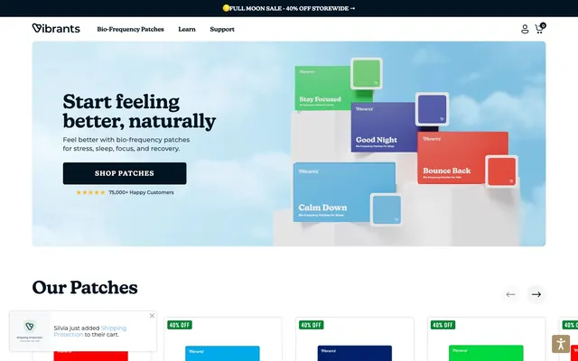
Vibrants uses a clean, bright aesthetic where information is presented on a spacious white canvas. Typography is primarily functional, with clear sans-serifs defining structure, while a custom display font adds a touch of friendly sophistication to headlines. The system relies on a focused color palette, primarily neutral for backgrounds and text, punctuated by a vibrant green accent color that signals action. Components are lightweight with subtle rounding and minimal elevation, maintaining an airy and approachable feel.
The page primarily utilizes a max-width contained layout, allowing for generous side margins on larger screens. The hero section is full-width with a split text-left/visual-right pattern, effectively introducing the product. Content below the hero alternates between full-width sections and grid-based arrangements. A prominent 3-column card grid is used for displaying product categories ('Our Patches', 'Our Bundles'), ensuring a consistent visual rhythm. Vertical spacing between sections is comfortable, contributing to the airy feel. Navigation consists of a sticky top bar with a left-aligned logo and right-aligned utilitarian icons.
The site uses a mix of minimal product photography and stylized abstract representations. Product imagery features tight crops of patches, often on a white or simple background, focusing solely on the item. Illustrations associated with products (like 'Calm Down' or 'Stay Focused') are stylized, flat, and incorporate gradient backgrounds or color overlays. Icons are simple, outlined, and monochromatic, used for navigation and minor functional elements. The overall visual language is one of clarity and focus, where images serve either to directly showcase the product or to convey an abstract benefit.
Reminiscent of Oura Ring, WHOOP, Calm.
# Vibrants — Style Reference
> white canvas, vibrant accents

**Theme:** light

**Site:** https://vibrants.com

Vibrants uses a clean, bright aesthetic where information is presented on a spacious white canvas. Typography is primarily functional, with clear sans-serifs defining structure, while a custom display font adds a touch of friendly sophistication to headlines. The system relies on a focused color palette, primarily neutral for backgrounds and text, punctuated by a vibrant green accent color that signals action. Components are lightweight with subtle rounding and minimal elevation, maintaining an airy and approachable feel.

## Tokens — Colors

| Name | Value | Token | Role |
|------|------|------|------|
| Forest Green | `#00852e` | `--color-forest-green` | Primary action background, promotional badge accents. A vivid, singular accent color for interaction and highlighting offers |
| Sky Blue | `#91c3ff` | `--color-sky-blue` | Outline button borders, secondary interactive text/icons. A moderate blue used for ghost/outlined CTA states |
| Star Dust | `#ffb931` | `--color-star-dust` | Decorative icon accents, subtle highlights. A warm yellow primarily used for small decorative elements |
| Rainbow Wash Gradient | `#724d99` | `--color-rainbow-wash-gradient` | Supporting palette color for small decorative accents when the core palette needs contrast. Do not promote it to the primary CTA color |
| Midnight Ink | `#021422` | `--color-midnight-ink` | Primary text, darker backgrounds, footer background, primary button background for filled state. Creates a strong contrast against white |
| Cloud White | `#ffffff` | `--color-cloud-white` | Page backgrounds, card surfaces, ghost button backgrounds, primary button text. Serves as the primary canvas |
| Fog Gray | `#e6e8e9` | `--color-fog-gray` | Hairline dividers, subtle borders, navigation separators. Provides soft visual separation without harsh lines |
| Canvas Ice | `#f2f6ff` | `--color-canvas-ice` | Subtle background for specific card sections, indicating a slight shift in surface level |
| Smoke Stone | `#ccd2d7` | `--color-smoke-stone` | Card borders, muted badge backgrounds. Offers a slightly darker neutral for structural guidance |
| Deep Ocean | `#001f38` | `--color-deep-ocean` | Secondary text, descriptive elements within cards. A muted blue-gray for supporting content |
| Asphalt Gray | `#808f9c` | `--color-asphalt-gray` | Muted descriptive text, card subheadings. Softer than primary text for secondary information |
| Charcoal Haze | `#6a7c89` | `--color-charcoal-haze` | Lighter supporting body text, small print. Even softer than Asphalt Gray for less prominent text |

## Tokens — Typography

### Montserrat
- **Substitute:** Arial
- **Weights:** 400, 500, 600, 700
- **Sizes:** 10px, 12px, 14px, 15px, 16px, 20px
- **Line height:** 1, 1.14, 1.2, 1.33, 1.38, 1.5, 1.71, 1.8
- **Letter spacing:** 1.3px at 10px, 1.0px at 12px
- **Role:** Body copy, button text, navigation links, and smaller supporting text. Provides clear readability and a functional, modern sans-serif base.

### new-kansas
- **Substitute:** Georgia
- **Weights:** 400, 500, 600, 700
- **Sizes:** 14px, 15px, 16px, 18px, 20px, 22px, 24px, 28px, 32px, 36px, 44px, 48px
- **Line height:** 1, 1.13, 1.17, 1.2, 1.22, 1.25, 1.29, 1.33, 1.43, 1.5, 1.75, 2
- **Letter spacing:** -0.96px at 48px, -0.72px at 36px, -0.44px at 22px
- **Role:** Brand headlines, prominent titles. Its custom nature provides a unique, friendly yet authoritative voice, especially in larger sizes with subtle negative tracking.

### Inter
- **Substitute:** Helvetica Neue
- **Weights:** 400, 500, 600
- **Sizes:** 12px, 13px, 14px, 16px
- **Line height:** 1, 1.08, 1.2, 1.23, 1.25, 1.33
- **Letter spacing:** -1.04px at 13px, -0.28px at 12px
- **Role:** Card titles, meta information, and secondary headings. Complements Montserrat with slightly tighter tracking for structured content, offering a more contemporary feel.

### rift-soft
- **Substitute:** Impact
- **Weights:** 600
- **Sizes:** 16px
- **Line height:** 1
- **Letter spacing:** 1.008px at 16px
- **Role:** Promotional badges. Its chunky, bold display style with wide letter-spacing creates immediate visual impact for offers.

### Arial
- **Weights:** 400
- **Sizes:** 13px
- **Line height:** 1.2
- **Role:** Arial — detected in extracted data but not described by AI

## Tokens — Type Scale

Perfect Fifth (1.5) from 14px base.

| Role | Size | Line height | Letter spacing |
|------|------|------|------|
| caption | 10px | 1.5 | 1.3px |
| body | 14px | 1.71 | — |
| heading-sm | 22px | 1.43 | -0.44px |
| heading | 36px | 1.25 | -0.72px |
| display | 48px | 1.2 | -0.96px |

## Tokens — Spacing

- **Section gap:** 39px
- **Card padding:** 16px
- **Element gap:** 16px

## Tokens — Radius

- **Buttons:** 8px
- **Inputs:** 8px
- **Cards:** 8px
- **badges:** 3px
- **pill:** 20px

## Layout

The page primarily utilizes a max-width contained layout, allowing for generous side margins on larger screens. The hero section is full-width with a split text-left/visual-right pattern, effectively introducing the product. Content below the hero alternates between full-width sections and grid-based arrangements. A prominent 3-column card grid is used for displaying product categories ('Our Patches', 'Our Bundles'), ensuring a consistent visual rhythm. Vertical spacing between sections is comfortable, contributing to the airy feel. Navigation consists of a sticky top bar with a left-aligned logo and right-aligned utilitarian icons.

## Imagery

The site uses a mix of minimal product photography and stylized abstract representations. Product imagery features tight crops of patches, often on a white or simple background, focusing solely on the item. Illustrations associated with products (like 'Calm Down' or 'Stay Focused') are stylized, flat, and incorporate gradient backgrounds or color overlays. Icons are simple, outlined, and monochromatic, used for navigation and minor functional elements. The overall visual language is one of clarity and focus, where images serve either to directly showcase the product or to convey an abstract benefit.

## Components

### Primary Filled Button
*Highlight key actions.*

Background: Forest Green (#00852e), Text: Cloud White (#ffffff), Border Radius: 8px, Padding: 16px vertical, 32px horizontal. Uses Montserrat bold. For high-conversion actions.

### Outline Accent Button
*Secondary calls to action, prominent links.*

Background: Cloud White (#ffffff), Text: Sky Blue (#91c3ff), Border: 1px solid Sky Blue (#91c3ff), Border Radius: 0px. Minimal padding, text-based. For actions that need emphasis but not a strong fill.

### Dark Filled Button
*Primary Call to action, often in hero sections.*

Background: Midnight Ink (#021422), Text: Cloud White (#ffffff), Border Radius: 5px, Padding: 18px vertical, 80px horizontal. Uses Montserrat with generous horizontal padding for visual weight.

### Pill Outline Button
*Filter options, secondary choices.*

Background: Cloud White (#ffffff), Text: Midnight Ink (#021422), Border: 1px solid Midnight Ink (#021422), Border Radius: 20px (pill shape), Padding: 20px vertical, 32px horizontal. Provides a friendly, selectable appearance.

### Product Card
*Display individual patch products.*

Background: transparent, Border Radius: 8px 8px 0px 0px (top), 0px 0px 8px 8px (bottom), Box Shadow: none. Content padding: 16px. Designed as two stacked components (image part, text part) with subtle corner rounding, maintaining an airy feel.

### Promotional Badge
*Highlight discounts and offers.*

Background: Forest Green (#00852e), Text: Cloud White (#ffffff), Border Radius: 3px, Padding: 3px vertical, 6px horizontal. Uses rift-soft font for high visibility.

### Neutral Tag Badge
*Categorization or status indicators.*

Background: Smoke Stone (#ccd2d7), Text: Midnight Ink (#021422), Border Radius: 32px (pill shape). Minimal padding, often for icons or short labels.

## Guidelines

### Do

- Use Midnight Ink (#021422) for all primary body text and most headings to ensure strong contrast and legibility.
- Apply Cloud White (#ffffff) as the dominant background color for pages and cards to maintain a spacious and clean aesthetic.
- Reserve Forest Green (#00852e) exclusively for primary call-to-action buttons and prominent promotional badges.
- Employ new-kansas for main headlines and titles, leveraging its custom weight and negative letter-spacing for brand distinction.
- Maintain an inverse border radius for card elements, using 8px at the product image's top and 8px at the content area's bottom, with a seamless middle for content flow.
- Use a minimum element gap of 16px to ensure comfortable spacing between UI elements and content blocks.
- Apply a 1px solid Fog Gray (#e6e8e9) border for subtle dividers and navigation item separation, not for card outlines.

### Don't

- Do not use highly saturated colors for large background areas; limit them to accents and interactive elements.
- Avoid generic system fonts for headlines; the custom new-kansas and rift-soft families are integral to brand identity.
- Do not introduce strong drop shadows; keep elevation subtle, if present at all, to maintain the light and airy feel.
- Do not use multiple accent colors prominently; rely on Forest Green (#00852e) and Sky Blue (#91c3ff) for most interactive states.
- Avoid dense, information-heavy blocks of text; break content into manageable cards or sections with ample white space.
- Do not use hard, sharp corners on interactive elements; consistently apply 8px or 3px radii for buttons and badges, or 20px/32px for pill shapes.
- Refrain from dark mode implementations; the system is designed explicitly for a light theme with high contrast primary text and backgrounds.

## Agent Prompt Guide

### Quick Color Reference
text: #021422
background: #ffffff
border: #e6e8e9
accent: #00852e
primary action: #00852e (filled action)

### 3-5 Example Component Prompts
1. Create a hero section: Cloud White (#ffffff) background. Headline 'Start feeling better, naturally' `new-kansas` at 48px, weight 700, Midnight Ink (#021422), letter-spacing -0.96px. Subtext 'Feel better with bio-frequency patches for stress, sleep, focus, and recovery.' `Montserrat` at 16px, weight 400, #021422. Primary Filled Button 'SHOP PATCHES': Forest Green (#00852e) background, Cloud White (#ffffff) text, 8px radius, 16px vertical, 32px horizontal padding.
2. Create a product card for a patch: Background transparent. Title 'Bounce Back Patches' `Inter` at 16px, weight 600, #021422. Subtitle 'Essential Pack' `Asphalt Gray` (#808f9c) at 14px, weight 400. Display a Promotional Badge '40% OFF': Forest Green (#00852e) background, Cloud White (#ffffff) text, 3px radius, 3px vertical, 6px horizontal padding.
3. Create a navigation link: `Montserrat` at 14px, weight 500, Midnight Ink (#021422). No background, no border, normal letter spacing. Use 12px vertical padding on hover. The hover state changes text color to Sky Blue (#91c3ff).
More like this









Keep what you find
A free account saves references to boards and can send you a weekly email of picks based on what you save.
To see every result, go Pro.