Preview image. Unlock full-res
Digital Atelier
Color palette
Primary action buttons, active navigation indicators, badges, brand accents
Hover state for Cosmic Teal elements, deeper brand accents
Primary background, dark card surfaces, primary text for dark sections
Page background, light card surfaces, secondary text for dark sections
Muted text, subheadings, soft borders, footer text and backgrounds
Body text, interactive link borders, subtle icon fills
Navigation text, secondary body copy, disabled button text
Subtle background for UI elements, hover states on neutral surfaces
Text on very light backgrounds, specific button borders and icon fills
Typography
- Weights
- 400, 500, 700
- Sizes
- 10px, 12px, 13px, 14px, 16px, 18px, 19px, 20px, 24px, 32px, 40px, 72px
- Line height
- 1, 1.1, 1.14, 1.2, 1.3, 1.35, 1.4, 1.58
- Letter spacing
- -0.0500em at 72px, -0.0400em at 40px, -0.0360em at 32px, -0.0300em at 24px and below
- Fallback
- Inter
Primary typeface for all UI text, headings, and body copy. Its range of weights and optical sizing provides both headline impact and legibility for dense information.
- Weights
- 400
- Sizes
- 16px
- Line height
- 1
- Letter spacing
- -0.0300em
- Fallback
- Space Mono
Monospace typeface used sparingly for specific data displays or code snippets where character alignment is critical.
Spacing & shape
Components
Filled with Cosmic Teal (#17d5ff) background and Midnight Graphite (#141a20) text, using a 12px border-radius, 12px vertical padding on 16px horizontal padding. Prominently guides user action.
Transparent background with Midnight Graphite (#141a20) text and border, using a 12px border-radius, 12px vertical padding on 16px horizontal padding. Offers interaction without demanding primary attention.
No explicit background or border. Uses Midnight Graphite (#141a20) text with 8px horizontal padding. Appears as a simple text link that is subtly interactive.
Semi-transparent background at rgba(255, 255, 255, 0.6) with 12px border-radius and 24px padding. Used for containing content over larger background imagery.
Solid Cloud Canvas (#fafcfd) background, 0px border-radius, with 56px top and bottom padding. Used for large content blocks.
Solid Midnight Graphite (#141a20) background, 0px border-radius, with 56px top and bottom padding. Used for large content blocks.
Cosmic Teal (#17d5ff) background with Deep Teal (#13b1d4) color text, 4px border-radius and minimal padding (1.5px vertical, 4px horizontal).
Transparent background with Midnight Graphite (#000000) text and 8px padding. Used in the main navigation bar.
Guidelines
- Use Cosmic Teal (#17d5ff) for primary call-to-action buttons to ensure immediate visibility and signify interactive elements.
- Employ Midnight Graphite (#141a20) as the default text color on light backgrounds and Cloud Canvas (#fafcfd) for text on dark backgrounds to ensure high contrast.
- Apply ABCRepro with a letter-spacing of -0.0500em to all display-level headings (72px) to enhance visual density and distinctiveness.
- Maintain a compact element spacing of 8px (elementGap) between inline components and form elements to create a dense, functional interface.
- Round corners of interactive elements such as buttons and cards to 12px, creating a friendly and approachable feel.
- Utilize Cloud Canvas (#fafcfd) as the universal base background for default page sections and light content areas.
- Ensure all numbers use the "lnum" font feature setting for consistent monospaced tabular figures.
- Avoid using saturated colors other than Cosmic Teal or Deep Teal for primary interactive elements; color should primarily be used for brand distinction, not excessive decoration.
- Do not introduce heavy shadows or strong borders for cards; rely on shifts in background tone (e.g., Midnight Graphite, Cloud Canvas, Light Mist) or subtle transparency to define surface layers.
- Refrain from using more than two levels of text hierarchy within a single content block to prevent overwhelming the user; prioritize clarity with body, subheading, and heading roles.
- Do not use letter-spacing values more open than -0.0300em for body text; the system maintains a compact, precise typographic rhythm.
- Avoid arbitrary border radii; adhere to the 12px for cards and buttons, 16px for large badges, and 8px for smaller interactive elements.
- Do not use pure white (#FFFFFF) or pure black (#000000) for primary canvas or text unless specifically for contrast in isolated components (e.g., specific icons); always favor the nuanced neutrals like Cloud Canvas and Midnight Graphite.
- Do not create hero sections that are full-bleed white backgrounds; hero sections should leverage background imagery or dark neutral tones with strong typography.
About this system
ShowHide
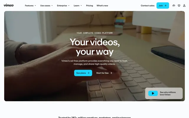
Vimeo's design system evokes a digital atelier: functional, content-focused, and subtly expressive. A dominant dark gray canvas anchors the experience, punctuated by a vivid, cool teal accent that signifies interactivity and brand presence. Typography is compact and precise, establishing clear hierarchy without visual fanfare. Components are lightweight with softened corners, relying on shifts in neutral tones rather than heavy shadows or borders.
The page primarily uses a max-width contained layout, centering content at approximately 1200px. The hero section breaks this containment by featuring a full-bleed dark background with a large, centered headline and subtext. Sections alternate between light (Cloud Canvas) and dark (Midnight Graphite) backgrounds, creating a distinct vertical rhythm. Content is generally arranged in centered stacks or two-column text-left/image-right patterns, with emphasis on clear visual hierarchy. Spacing between sections is generous, around 56px. Navigation is a sticky top bar with minimal styling.
The imagery strategy features high-resolution photography primarily focused on human interaction with digital devices, specifically hands typing on keyboards or using cameras. Product screenshots are integrated contextually. All visuals are contained within the layout, often appearing as large background elements in hero sections with dark overlays. There is an absence of abstract illustrations or 3D renders. Icons are minimal, predominantly line-based, and monochrome, integrating seamlessly into the UI rather than asserting strong visual identity.
Reminiscent of loom.com, webflow.com, discord.com.
# Vimeo — Style Reference
> Digital Atelier

**Theme:** light

**Site:** https://vimeo.com

Vimeo's design system evokes a digital atelier: functional, content-focused, and subtly expressive. A dominant dark gray canvas anchors the experience, punctuated by a vivid, cool teal accent that signifies interactivity and brand presence. Typography is compact and precise, establishing clear hierarchy without visual fanfare. Components are lightweight with softened corners, relying on shifts in neutral tones rather than heavy shadows or borders.

## Tokens — Colors

| Name | Value | Token | Role |
|------|------|------|------|
| Cosmic Teal | `#17d5ff` | `--color-cosmic-teal` | Primary action buttons, active navigation indicators, badges, brand accents |
| Deep Teal | `#13b1d4` | `--color-deep-teal` | Hover state for Cosmic Teal elements, deeper brand accents |
| Midnight Graphite | `#141a20` | `--color-midnight-graphite` | Primary background, dark card surfaces, primary text for dark sections |
| Cloud Canvas | `#fafcfd` | `--color-cloud-canvas` | Page background, light card surfaces, secondary text for dark sections |
| Ash Gray | `#23313b` | `--color-ash-gray` | Muted text, subheadings, soft borders, footer text and backgrounds |
| Steel Gray | `#3d4751` | `--color-steel-gray` | Body text, interactive link borders, subtle icon fills |
| Slate Blue | `#4c5864` | `--color-slate-blue` | Navigation text, secondary body copy, disabled button text |
| Light Mist | `#dfe4ea` | `--color-light-mist` | Subtle background for UI elements, hover states on neutral surfaces |
| Overlay Shadow | `#000000` | `--color-overlay-shadow` | Text on very light backgrounds, specific button borders and icon fills |

## Tokens — Typography

### ABCRepro
- **Substitute:** Inter
- **Weights:** 400, 500, 700
- **Sizes:** 10px, 12px, 13px, 14px, 16px, 18px, 19px, 20px, 24px, 32px, 40px, 72px
- **Line height:** 1, 1.1, 1.14, 1.2, 1.3, 1.35, 1.4, 1.58
- **Letter spacing:** -0.0500em at 72px, -0.0400em at 40px, -0.0360em at 32px, -0.0300em at 24px and below
- **Role:** Primary typeface for all UI text, headings, and body copy. Its range of weights and optical sizing provides both headline impact and legibility for dense information.

### ABCReproMono
- **Substitute:** Space Mono
- **Weights:** 400
- **Sizes:** 16px
- **Line height:** 1
- **Letter spacing:** -0.0300em
- **Role:** Monospace typeface used sparingly for specific data displays or code snippets where character alignment is critical.

## Tokens — Type Scale

Augmented Fourth (1.414) from 14px base.

| Role | Size | Line height | Letter spacing |
|------|------|------|------|
| caption | 10px | 1.4 | -0.03em |
| body | 14px | 1.4 | -0.03em |
| subheading | 18px | 1.35 | -0.03em |
| heading-sm | 24px | 1.2 | -0.03em |
| heading | 32px | 1.14 | -0.036em |
| heading-lg | 40px | 1.1 | -0.04em |
| display | 72px | 1 | -0.05em |

## Tokens — Spacing

- **Max width:** 1200px
- **Section gap:** 56px
- **Card padding:** 24px
- **Element gap:** 8px

## Tokens — Radius

- **Default:** 8px
- **Buttons:** 12px
- **Inputs:** 0px
- **Cards:** 12px
- **badges:** 16px
- **pill:** 9999px

## Layout

The page primarily uses a max-width contained layout, centering content at approximately 1200px. The hero section breaks this containment by featuring a full-bleed dark background with a large, centered headline and subtext. Sections alternate between light (Cloud Canvas) and dark (Midnight Graphite) backgrounds, creating a distinct vertical rhythm. Content is generally arranged in centered stacks or two-column text-left/image-right patterns, with emphasis on clear visual hierarchy. Spacing between sections is generous, around 56px. Navigation is a sticky top bar with minimal styling.

## Imagery

The imagery strategy features high-resolution photography primarily focused on human interaction with digital devices, specifically hands typing on keyboards or using cameras. Product screenshots are integrated contextually. All visuals are contained within the layout, often appearing as large background elements in hero sections with dark overlays. There is an absence of abstract illustrations or 3D renders. Icons are minimal, predominantly line-based, and monochrome, integrating seamlessly into the UI rather than asserting strong visual identity.

## Components

### Primary Action Button
*High-emphasis interactive element*

Filled with Cosmic Teal (#17d5ff) background and Midnight Graphite (#141a20) text, using a 12px border-radius, 12px vertical padding on 16px horizontal padding. Prominently guides user action.

### Ghost Button
*Secondary action or navigation*

Transparent background with Midnight Graphite (#141a20) text and border, using a 12px border-radius, 12px vertical padding on 16px horizontal padding. Offers interaction without demanding primary attention.

### Text Link Button
*Tertiary action or inline navigation*

No explicit background or border. Uses Midnight Graphite (#141a20) text with 8px horizontal padding. Appears as a simple text link that is subtly interactive.

### Transparent Card
*Informational grouping on hero/dark sections.*

Semi-transparent background at rgba(255, 255, 255, 0.6) with 12px border-radius and 24px padding. Used for containing content over larger background imagery.

### Light Surface Card
*Default informational grouping on light sections.*

Solid Cloud Canvas (#fafcfd) background, 0px border-radius, with 56px top and bottom padding. Used for large content blocks.

### Dark Surface Card
*Default informational grouping on dark sections.*

Solid Midnight Graphite (#141a20) background, 0px border-radius, with 56px top and bottom padding. Used for large content blocks.

### New Feature Badge
*Indicator for new features/content.*

Cosmic Teal (#17d5ff) background with Deep Teal (#13b1d4) color text, 4px border-radius and minimal padding (1.5px vertical, 4px horizontal).

### Nav Button
*Top-level navigation item*

Transparent background with Midnight Graphite (#000000) text and 8px padding. Used in the main navigation bar.

## Guidelines

### Do

- Use Cosmic Teal (#17d5ff) for primary call-to-action buttons to ensure immediate visibility and signify interactive elements.
- Employ Midnight Graphite (#141a20) as the default text color on light backgrounds and Cloud Canvas (#fafcfd) for text on dark backgrounds to ensure high contrast.
- Apply ABCRepro with a letter-spacing of -0.0500em to all display-level headings (72px) to enhance visual density and distinctiveness.
- Maintain a compact element spacing of 8px (elementGap) between inline components and form elements to create a dense, functional interface.
- Round corners of interactive elements such as buttons and cards to 12px, creating a friendly and approachable feel.
- Utilize Cloud Canvas (#fafcfd) as the universal base background for default page sections and light content areas.
- Ensure all numbers use the "lnum" font feature setting for consistent monospaced tabular figures.

### Don't

- Avoid using saturated colors other than Cosmic Teal or Deep Teal for primary interactive elements; color should primarily be used for brand distinction, not excessive decoration.
- Do not introduce heavy shadows or strong borders for cards; rely on shifts in background tone (e.g., Midnight Graphite, Cloud Canvas, Light Mist) or subtle transparency to define surface layers.
- Refrain from using more than two levels of text hierarchy within a single content block to prevent overwhelming the user; prioritize clarity with body, subheading, and heading roles.
- Do not use letter-spacing values more open than -0.0300em for body text; the system maintains a compact, precise typographic rhythm.
- Avoid arbitrary border radii; adhere to the 12px for cards and buttons, 16px for large badges, and 8px for smaller interactive elements.
- Do not use pure white (#FFFFFF) or pure black (#000000) for primary canvas or text unless specifically for contrast in isolated components (e.g., specific icons); always favor the nuanced neutrals like Cloud Canvas and Midnight Graphite.
- Do not create hero sections that are full-bleed white backgrounds; hero sections should leverage background imagery or dark neutral tones with strong typography.

## Agent Prompt Guide

**Quick Color Reference**
text: #141a20
background: #fafcfd
border: #3d4751
accent: #17d5ff
primary action: #17d5ff (filled action)

**3-5 Example Component Prompts**
*   Create a Primary Action Button: #17d5ff background, #000000 text, 9999px radius, compact pill padding. Use this filled treatment for the main CTA.
*   Design a feature card for a light section: Uses Cloud Canvas (#fafcfd) background, with a 12px border-radius, and 24px padding. Title is heading-sm (ABCRepro, 24px, weight 700, Midnight Graphite #141a20), body text is body (ABCRepro, 14px, weight 400, Steel Gray #3d4751). Contains a Ghost Button (transparent background, Midnight Graphite #141a20 text and border, 12px radius, 12px 16px padding).
More like this







Keep what you find
A free account saves references to boards and can send you a weekly email of picks based on what you save.
To see every result, go Pro.