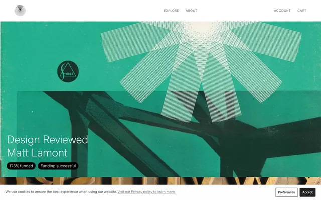
Preview image. Unlock full-res
Editorial archive, high contrast.
Color palette
Red wash for highlight backgrounds, decorative bands, and soft emphasis behind content
Orange wash for highlight backgrounds, decorative bands, and soft emphasis behind content
Orange wash for highlight backgrounds, decorative bands, and soft emphasis behind content
Page backgrounds, input fields, primary surface for content
Primary text, headings, navigation links, dark surface backgrounds
Muted text, secondary information, borders for form elements
Default button background, subtle accent
Deep canvas for dark sections, primary dark surfaces, and high-contrast framing
Placeholder text in dark input fields
Typography
- Weights
- 300, 350
- Sizes
- 14px, 18px, 20px, 32px, 50px, 80px
- Line height
- 1, 1.18, 1.4, 2
- Letter spacing
- -0.0200em at 50px, 0.0700em at 14px
- Fallback
- system-ui, sans-serif
The primary typeface for all text. Its lightness (300) for large headlines creates a refined, understated impact, while the moderate spacing (0.0700em) in smaller sizes ensures legibility and a classic, almost monospaced editorial feel.
Spacing & shape
Components
Solid 'Stone Button' (#949494) background, 'Canvas White' (#ffffff) text, with sharp 0px corners and generous vertical padding (18.75px top/bottom).
Transparent background with 0px border-radius, relying on imagery for visual separation. No explicit padding, content often full-bleed to card edges.
Dark 'Obsidian Pill' (#000000) background with 50px border-radius, 'Canvas White' (#ffffff) text. Padding is 7.5px vertical, 12px horizontal.
Dark red 'Crimson Pill' (#962921) background with 50px border-radius, 'Canvas White' (#ffffff) text. Padding is 7.5px vertical, 12px horizontal.
Bright red 'Scarlet Pill' (#c52910) background with 50px border-radius, 'Canvas White' (#ffffff) text. Padding is 7.5px vertical, 12px horizontal.
Orange 'Blaze Pill' (#e75a00) background with 50px border-radius, 'Canvas White' (#ffffff) text. Padding is 7.5px vertical, 12px horizontal.
Background is 'Canvas White' (#ffffff), text 'Ink Black' (#272727). Features a 1px solid 'Ash Gray' (#717171) bottom border and 0px border-radius. Padding is 12.5px vertical, 16.6667px horizontal.
Background is 'Ink Black' (#272727), text 'Whisper Text' (#cdcccc). Features a 1px solid 'Ash Gray' (#717171) bottom border and 0px border-radius. Minimal vertical padding, 13.0435px horizontal.
Guidelines
- Use 'Ink Black' (#272727) for all primary body and heading text for high contrast on light backgrounds.
- Apply Messina Sans weight 300 for display and large headings, and weight 350 for body text and navigation to maintain an editorial tone.
- Structure layouts with a maximum width of 1400px and ensure content is centered within this constraint.
- Employ 0px border-radius for main containers, buttons, and input fields to sustain a sharp, modern aesthetic, reserving 50px for small status pills.
- Utilize 'Canvas White' (#ffffff) as the dominant page and card background color to provide a clean reading experience.
- Maintain a comfortable element spacing of 10px between interactive items and form elements.
- Use distinct accent colors for 'Funding Status Pills' to immediately convey status or category, differentiating them from the main content.
- Avoid using decorative shadows or excessive gradients; keep surfaces flat and defined by solid colors or subtle borders.
- Do not introduce additional typefaces; Messina Sans is the sole typographic voice of the brand.
- Do not use highly saturated colors for large UI elements; confine chromatic accents to small, functional components like status pills.
- Refrain from altering the established 0px border-radius on major components, as this is a core aspect of the brand's sharp visual identity.
- Do not deviate from the high-contrast color pairings for text and backgrounds to preserve readability.
- Avoid arbitrary uses of spacing; adhere to the 10px element gap and 30px card padding for consistent rhythm.
- Do not apply `0.0700em` letter-spacing to large headlines; it is specifically for smaller text to enhance legibility.
About this system
ShowHide
Volume's design system evokes an editorial quality through stark contrasts and classic typographic choices. The visual style pairs deep, rich imagery with highly legible, monochrome UI elements. Text is typically dark on light, using a limited color palette that emphasizes clarity and content over decorative flair. Subtle radii are used primarily for interactive elements, while backgrounds remain sharp, creating a sophisticated and somewhat archival feel.
The page layout utilizes a max-width contained model (1400px) with content sections centered. The hero sections are full-bleed with large background images and overlaid text, establishing a strong visual anchor. The section rhythm appears to be based on distinct content blocks, some with dark backgrounds and light text, others following the primary light theme. Content often alternates between large imagery and text blocks, suggesting a journalistic or editorial spread. There's no evident grid for cards, which seem to be presented in sequential blocks rather than uniform columns. Navigation is a minimalist top bar, sticky or otherwise. The density is comfortable, providing sufficient breathing room around key content.
The visual language is characterized by bold, impactful photography or abstract graphics that often serve as full-bleed backgrounds for content sections. Imagery is central to defining specific content blocks, with text overlaid, often contained within semi-transparent overlays. When visible, icons appear to follow a simple, geometric style, primarily monochrome or using brand accent colors for highlighting. The overall impression is image-heavy, using visuals to establish mood and context rather than just decoration, with content often presented as product showcases.
Reminiscent of AIGA Journal, The New York Times, monocle.com, Taschen.
# Volume — Style Reference
> Editorial archive, high contrast.

**Theme:** light

**Site:** https://vol.co

Volume's design system evokes an editorial quality through stark contrasts and classic typographic choices. The visual style pairs deep, rich imagery with highly legible, monochrome UI elements. Text is typically dark on light, using a limited color palette that emphasizes clarity and content over decorative flair. Subtle radii are used primarily for interactive elements, while backgrounds remain sharp, creating a sophisticated and somewhat archival feel.

## Tokens — Colors

| Name | Value | Token | Role |
|------|------|------|------|
| Crimson Pill | `#962921` | `--color-crimson-pill` | Red wash for highlight backgrounds, decorative bands, and soft emphasis behind content |
| Scarlet Pill | `#c52910` | `--color-scarlet-pill` | Orange wash for highlight backgrounds, decorative bands, and soft emphasis behind content |
| Blaze Pill | `#e75a00` | `--color-blaze-pill` | Orange wash for highlight backgrounds, decorative bands, and soft emphasis behind content |
| Canvas White | `#ffffff` | `--color-canvas-white` | Page backgrounds, input fields, primary surface for content |
| Ink Black | `#272727` | `--color-ink-black` | Primary text, headings, navigation links, dark surface backgrounds |
| Ash Gray | `#717171` | `--color-ash-gray` | Muted text, secondary information, borders for form elements |
| Stone Button | `#949494` | `--color-stone-button` | Default button background, subtle accent |
| Obsidian Pill | `#000000` | `--color-obsidian-pill` | Deep canvas for dark sections, primary dark surfaces, and high-contrast framing |
| Whisper Text | `#cdcccc` | `--color-whisper-text` | Placeholder text in dark input fields |

## Tokens — Typography

### Messina Sans
- **Substitute:** system-ui, sans-serif
- **Weights:** 300, 350
- **Sizes:** 14px, 18px, 20px, 32px, 50px, 80px
- **Line height:** 1, 1.18, 1.4, 2
- **Letter spacing:** -0.0200em at 50px, 0.0700em at 14px
- **Role:** The primary typeface for all text. Its lightness (300) for large headlines creates a refined, understated impact, while the moderate spacing (0.0700em) in smaller sizes ensures legibility and a classic, almost monospaced editorial feel.

## Tokens — Type Scale

Augmented Fourth (1.414) from 18px base.

| Role | Size | Line height | Letter spacing |
|------|------|------|------|
| caption | 14px | 2 | 1.4px |
| body | 18px | 1.4 | — |
| subheading | 20px | 1.4 | — |
| heading-sm | 32px | 1.18 | — |
| heading | 50px | 1.18 | -1px |
| display | 80px | 1 | — |

## Tokens — Spacing

- **Max width:** 1400px
- **Section gap:** 45px
- **Card padding:** 30px
- **Element gap:** 10px

## Tokens — Radius

- **Buttons:** 0px
- **Inputs:** 0px
- **Cards:** 0px
- **pills:** 50px

## Layout

The page layout utilizes a max-width contained model (1400px) with content sections centered. The hero sections are full-bleed with large background images and overlaid text, establishing a strong visual anchor. The section rhythm appears to be based on distinct content blocks, some with dark backgrounds and light text, others following the primary light theme. Content often alternates between large imagery and text blocks, suggesting a journalistic or editorial spread. There's no evident grid for cards, which seem to be presented in sequential blocks rather than uniform columns. Navigation is a minimalist top bar, sticky or otherwise. The density is comfortable, providing sufficient breathing room around key content.

## Imagery

The visual language is characterized by bold, impactful photography or abstract graphics that often serve as full-bleed backgrounds for content sections. Imagery is central to defining specific content blocks, with text overlaid, often contained within semi-transparent overlays. When visible, icons appear to follow a simple, geometric style, primarily monochrome or using brand accent colors for highlighting. The overall impression is image-heavy, using visuals to establish mood and context rather than just decoration, with content often presented as product showcases.

## Components

### Filled Button
*Primary action button for sign-ups or confirmations.*

Solid 'Stone Button' (#949494) background, 'Canvas White' (#ffffff) text, with sharp 0px corners and generous vertical padding (18.75px top/bottom).

### Default Card
*Container for products, articles, or featured content.*

Transparent background with 0px border-radius, relying on imagery for visual separation. No explicit padding, content often full-bleed to card edges.

### Funding Status Pill (Obsidian)
*Small, rounded label indicating successful funding or status.*

Dark 'Obsidian Pill' (#000000) background with 50px border-radius, 'Canvas White' (#ffffff) text. Padding is 7.5px vertical, 12px horizontal.

### Funding Status Pill (Crimson)
*Small, rounded label indicating specific campaign status.*

Dark red 'Crimson Pill' (#962921) background with 50px border-radius, 'Canvas White' (#ffffff) text. Padding is 7.5px vertical, 12px horizontal.

### Funding Status Pill (Scarlet)
*Small, rounded label indicating urgent campaign status.*

Bright red 'Scarlet Pill' (#c52910) background with 50px border-radius, 'Canvas White' (#ffffff) text. Padding is 7.5px vertical, 12px horizontal.

### Funding Status Pill (Blaze)
*Small, rounded label indicating high visibility campaign status (e.g. sold out).*

Orange 'Blaze Pill' (#e75a00) background with 50px border-radius, 'Canvas White' (#ffffff) text. Padding is 7.5px vertical, 12px horizontal.

### Light Input Field
*Standard input field for light backgrounds.*

Background is 'Canvas White' (#ffffff), text 'Ink Black' (#272727). Features a 1px solid 'Ash Gray' (#717171) bottom border and 0px border-radius. Padding is 12.5px vertical, 16.6667px horizontal.

### Dark Input Field
*Standard input field for dark backgrounds.*

Background is 'Ink Black' (#272727), text 'Whisper Text' (#cdcccc). Features a 1px solid 'Ash Gray' (#717171) bottom border and 0px border-radius. Minimal vertical padding, 13.0435px horizontal.

## Guidelines

### Do

- Use 'Ink Black' (#272727) for all primary body and heading text for high contrast on light backgrounds.
- Apply Messina Sans weight 300 for display and large headings, and weight 350 for body text and navigation to maintain an editorial tone.
- Structure layouts with a maximum width of 1400px and ensure content is centered within this constraint.
- Employ 0px border-radius for main containers, buttons, and input fields to sustain a sharp, modern aesthetic, reserving 50px for small status pills.
- Utilize 'Canvas White' (#ffffff) as the dominant page and card background color to provide a clean reading experience.
- Maintain a comfortable element spacing of 10px between interactive items and form elements.
- Use distinct accent colors for 'Funding Status Pills' to immediately convey status or category, differentiating them from the main content.

### Don't

- Avoid using decorative shadows or excessive gradients; keep surfaces flat and defined by solid colors or subtle borders.
- Do not introduce additional typefaces; Messina Sans is the sole typographic voice of the brand.
- Do not use highly saturated colors for large UI elements; confine chromatic accents to small, functional components like status pills.
- Refrain from altering the established 0px border-radius on major components, as this is a core aspect of the brand's sharp visual identity.
- Do not deviate from the high-contrast color pairings for text and backgrounds to preserve readability.
- Avoid arbitrary uses of spacing; adhere to the 10px element gap and 30px card padding for consistent rhythm.
- Do not apply `0.0700em` letter-spacing to large headlines; it is specifically for smaller text to enhance legibility.

## Agent Prompt Guide

**Quick Color Reference:**
- text: #272727
- background: #ffffff
- border: #717171
- accent: #e75a00
- primary action: no distinct CTA color

**3-5 Example Component Prompts:**
No distinct primary action color was observed; use the extracted neutral button treatments instead of inventing a filled CTA color.
2.  Design a dark input field for a newsletter sign-up: 'Ink Black' (#272727) background, 'Whisper Text' (#cdcccc) placeholder for Messina Sans 350, with a 1px 'Ash Gray' (#717171) bottom border and 0px border-radius. Padding 0px vertical, 13.0435px horizontal.
3.  Build a 'Funding successful' status pill: 'Obsidian Pill' (#000000) background, 'Canvas White' (#ffffff) text at 14px using Messina Sans 350 with 0.0700em letter-spacing, and 50px border-radius. Padding 7.5px vertical, 12px horizontal.
4.  Generate a main heading for an article: 'Ink Black' (#272727) text using Messina Sans 300 at 80px with 1.0 lineHeight and -0.0200em letter-spacing.
More like this







Keep what you find
A free account saves references to boards and can send you a weekly email of picks based on what you save.
To see every result, go Pro.