Preview image. Unlock full-res
Warm, secure communication.
Color palette
Primary action buttons, active indicators, brand accent — a vivid green that signifies connection and positive interaction
Informational links and secondary interactive borders
Primary text, prominent headings, borders, and some backgrounds for high contrast elements
Footer background, input fields, and other deeper contrast elements
Page background, hero section background — a soft, off-white that creates a gentle foundational surface
Navigation backgrounds, card surfaces, button backgrounds (secondary), and primary text against darker backgrounds
Secondary text, muted helper text, and subtle borders
Subtle text and borders for less prominent information
Typography
- Weights
- 400, 700
- Sizes
- 12px, 16px, 18px, 48px, 60px, 80px
- Line height
- 1, 1.1, 1.2, 1.3, 1.33, 1.34, 1.38, 1.39
- Letter spacing
- normal
- Fallback
- system-ui, sans-serif
The core typeface for all content, from headings to body text. Its variable nature allows for distinct visual hierarchy without changing families, maintaining a consistent brand voice. Weights 400 and 700 are utilized to establish clear importance, providing a direct and friendly tone.
Spacing & shape
Components
Background: Forest Green (#25d366), Text: Midnight Graphite (#1c1e21), Radius: 50px, Padding: 16px vertical, 28px horizontal. Bold and inviting.
Background: transparent, Text: Midnight Graphite (#1c1e21), Border: 1px solid Midnight Graphite (#1c1e21), Radius: 50px, Padding: 16px vertical, 28px horizontal. Provides an alternative without overshadowing.
Background: Pure White (#ffffff), Text: Midnight Graphite (#1c1e21), Border: 1px solid Midnight Graphite (#1c1e21), Radius: 50px, Padding: 16px vertical, 28px horizontal. Offers visibility on contrasting surfaces.
Text: Midnight Graphite (#1c1e21), default styling. Emphasizes content over decorative elements.
Background: transparent, Border-radius: 0px, Padding: 32px. Allows content to breathe against the page background without explicit division.
Border-radius: 25px. Softens the display of images and visual content, matching the overall approachable aesthetic.
Background: Dark Forest (#111b21), Text: Pure White (#ffffff), Border: 1px solid Pure White (#ffffff), Radius: 50px, Padding: 16px vertical, 28px horizontal. Distinctive for user input within dark sections.
Guidelines
- Use Forest Green (#25d366) exclusively for primary action button backgrounds and critical active states. Do not use it for text or borders (unless outlined button).
- Apply a 50px border-radius to all buttons and input fields to maintain the soft, rounded aesthetic.
- Utilize Warm Canvas (#fcf5eb) as the default page background for sections, creating a consistent light foundation.
- Pair Midnight Graphite (#1c1e21) for primary text and headings against lighter backgrounds like Warm Canvas (#fcf5eb) or Pure White (#ffffff).
- Maintain generous padding of 16px vertically and 28px/32px horizontally for buttons to ensure clear touch targets and visual comfort.
- Structure primary content areas with a default vertical spacing of 64px between sections.
- Use WhatsApp Sans Var for all text hierarchy, with weights 400 for body and 700 for high-impact headlines and calls to action.
- Avoid using bright, saturated colors for decorative elements; stick to the defined accent and brand colors for functional highlights only.
- Do not introduce sharp, angular corners; all interactive elements and image containers should adhere to 25px or 50px radii.
- Do not add drop shadows to cards or primary elements; the design relies on flat surfaces and clear visual separation through background colors and spacing.
- Refrain from using thin, light fonts larger than body text; important headings should be WhatsApp Sans Var weight 700.
- Do not use multiple font families; WhatsApp Sans Var is the single typeface for all UI elements.
- Avoid tight element spacing; ensure a minimum of 16px gap between interactive elements and content blocks.
- Do not use dark backgrounds indiscriminately; reserve Dark Forest (#111b21) for specific footer or input contexts.
About this system
ShowHide
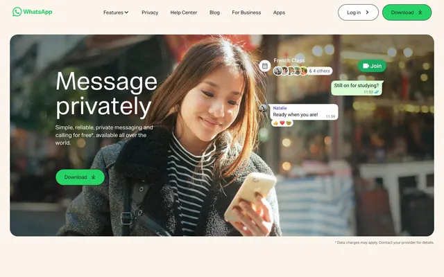
WhatsApp's visual system evokes a friendly, secure communication platform. It builds upon a soft, warm neutral base with a consistent, vibrant green acting as the core accent for primary calls to action. Rounded forms are prevalent, especially in buttons and imagery, contributing to a welcoming, approachable feel. Typography is direct and legible, maintaining clarity within a spacious layout. The overall impression is one of calm competence.
The page primarily uses a contained layout, centering content within a flexible max-width, though the hero section often employs a full-bleed visual element with contained text. The hero pattern is typically a split text-left, image-right composition, featuring a large headline paired with primary and secondary call-to-action buttons. Sections alternate between visual-heavy presentations (like the hero and 'Say what you feel' image) and text-dominant content blocks. Vertical rhythm is established through consistent section gaps (around 64px). The layout largely avoids complex grids, preferring clear, stacked content blocks or simple two-column arrangements for feature explanations. Navigation is a sticky top bar with a logo and clear calls to action, maintaining brand presence and accessibility.
The imagery predominantly features candid, natural-looking photography of diverse individuals using mobile devices, often smiling or engaged with their screens. These photos are contained within softly rounded shapes (25px radius) rather than hard-edged rectangles. Some sections also utilize stylized product screens with subtle chat bubbles appearing in a generative, playful manner, hinting at app functionality without being overly prescriptive. Icons are minimalist, outlined, and primarily monochromatic, using the Forest Green accent for interactive states or brand markers. Imagery serves to convey genuine human connection and product-in-use scenarios, creating an empathetic and aspirational tone.
Reminiscent of Telegram, Signal, Slack, Headspace.
# WhatsApp.com — Style Reference
> Warm, secure communication.

**Theme:** light

**Site:** https://www.whatsapp.com

WhatsApp's visual system evokes a friendly, secure communication platform. It builds upon a soft, warm neutral base with a consistent, vibrant green acting as the core accent for primary calls to action. Rounded forms are prevalent, especially in buttons and imagery, contributing to a welcoming, approachable feel. Typography is direct and legible, maintaining clarity within a spacious layout. The overall impression is one of calm competence.

## Tokens — Colors

| Name | Value | Token | Role |
|------|------|------|------|
| Forest Green | `#25d366` | `--color-forest-green` | Primary action buttons, active indicators, brand accent — a vivid green that signifies connection and positive interaction |
| Link Blue | `#0373e9` | `--color-link-blue` | Informational links and secondary interactive borders |
| Midnight Graphite | `#1c1e21` | `--color-midnight-graphite` | Primary text, prominent headings, borders, and some backgrounds for high contrast elements |
| Dark Forest | `#111b21` | `--color-dark-forest` | Footer background, input fields, and other deeper contrast elements |
| Warm Canvas | `#fcf5eb` | `--color-warm-canvas` | Page background, hero section background — a soft, off-white that creates a gentle foundational surface |
| Pure White | `#ffffff` | `--color-pure-white` | Navigation backgrounds, card surfaces, button backgrounds (secondary), and primary text against darker backgrounds |
| Stone Gray | `#5e5e5e` | `--color-stone-gray` | Secondary text, muted helper text, and subtle borders |
| Light Fog | `#f0f4f9` | `--color-light-fog` | Subtle text and borders for less prominent information |

## Tokens — Typography

### WhatsApp Sans Var
- **Substitute:** system-ui, sans-serif
- **Weights:** 400, 700
- **Sizes:** 12px, 16px, 18px, 48px, 60px, 80px
- **Line height:** 1, 1.1, 1.2, 1.3, 1.33, 1.34, 1.38, 1.39
- **Letter spacing:** normal
- **Role:** The core typeface for all content, from headings to body text. Its variable nature allows for distinct visual hierarchy without changing families, maintaining a consistent brand voice. Weights 400 and 700 are utilized to establish clear importance, providing a direct and friendly tone.

## Tokens — Type Scale

| Role | Size | Line height | Letter spacing |
|------|------|------|------|
| caption | 12px | 1.34 | — |
| body-sm | 16px | 1.39 | — |
| body | 18px | 1.33 | — |
| heading-sm | 48px | 1.2 | — |
| heading | 60px | 1.1 | — |
| display | 80px | 1 | — |

## Tokens — Spacing

- **Section gap:** 64px
- **Card padding:** 32px
- **Element gap:** 16px

## Tokens — Radius

- **Buttons:** 50px
- **Images:** 25px
- **heroContainer:** 25px
- **input:** 50px
- **messageBubbles:** 25px

## Layout

The page primarily uses a contained layout, centering content within a flexible max-width, though the hero section often employs a full-bleed visual element with contained text. The hero pattern is typically a split text-left, image-right composition, featuring a large headline paired with primary and secondary call-to-action buttons. Sections alternate between visual-heavy presentations (like the hero and 'Say what you feel' image) and text-dominant content blocks. Vertical rhythm is established through consistent section gaps (around 64px). The layout largely avoids complex grids, preferring clear, stacked content blocks or simple two-column arrangements for feature explanations. Navigation is a sticky top bar with a logo and clear calls to action, maintaining brand presence and accessibility.

## Imagery

The imagery predominantly features candid, natural-looking photography of diverse individuals using mobile devices, often smiling or engaged with their screens. These photos are contained within softly rounded shapes (25px radius) rather than hard-edged rectangles. Some sections also utilize stylized product screens with subtle chat bubbles appearing in a generative, playful manner, hinting at app functionality without being overly prescriptive. Icons are minimalist, outlined, and primarily monochromatic, using the Forest Green accent for interactive states or brand markers. Imagery serves to convey genuine human connection and product-in-use scenarios, creating an empathetic and aspirational tone.

## Components

### Primary Action Button
*Filled button for main calls to action*

Background: Forest Green (#25d366), Text: Midnight Graphite (#1c1e21), Radius: 50px, Padding: 16px vertical, 28px horizontal. Bold and inviting.

### Secondary Ghost Button
*Outlined button for less prominent actions, often paired with primary*

Background: transparent, Text: Midnight Graphite (#1c1e21), Border: 1px solid Midnight Graphite (#1c1e21), Radius: 50px, Padding: 16px vertical, 28px horizontal. Provides an alternative without overshadowing.

### White Background Button
*Alternative interaction button against darker backgrounds*

Background: Pure White (#ffffff), Text: Midnight Graphite (#1c1e21), Border: 1px solid Midnight Graphite (#1c1e21), Radius: 50px, Padding: 16px vertical, 28px horizontal. Offers visibility on contrasting surfaces.

### Navigation Link
*Text link within the main navigation bar*

Text: Midnight Graphite (#1c1e21), default styling. Emphasizes content over decorative elements.

### Card Surface
*Content containers*

Background: transparent, Border-radius: 0px, Padding: 32px. Allows content to breathe against the page background without explicit division.

### Rounded Image Container
*Visual media display*

Border-radius: 25px. Softens the display of images and visual content, matching the overall approachable aesthetic.

### Input Field
*Form entry*

Background: Dark Forest (#111b21), Text: Pure White (#ffffff), Border: 1px solid Pure White (#ffffff), Radius: 50px, Padding: 16px vertical, 28px horizontal. Distinctive for user input within dark sections.

## Guidelines

### Do

- Use Forest Green (#25d366) exclusively for primary action button backgrounds and critical active states. Do not use it for text or borders (unless outlined button).
- Apply a 50px border-radius to all buttons and input fields to maintain the soft, rounded aesthetic.
- Utilize Warm Canvas (#fcf5eb) as the default page background for sections, creating a consistent light foundation.
- Pair Midnight Graphite (#1c1e21) for primary text and headings against lighter backgrounds like Warm Canvas (#fcf5eb) or Pure White (#ffffff).
- Maintain generous padding of 16px vertically and 28px/32px horizontally for buttons to ensure clear touch targets and visual comfort.
- Structure primary content areas with a default vertical spacing of 64px between sections.
- Use WhatsApp Sans Var for all text hierarchy, with weights 400 for body and 700 for high-impact headlines and calls to action.

### Don't

- Avoid using bright, saturated colors for decorative elements; stick to the defined accent and brand colors for functional highlights only.
- Do not introduce sharp, angular corners; all interactive elements and image containers should adhere to 25px or 50px radii.
- Do not add drop shadows to cards or primary elements; the design relies on flat surfaces and clear visual separation through background colors and spacing.
- Refrain from using thin, light fonts larger than body text; important headings should be WhatsApp Sans Var weight 700.
- Do not use multiple font families; WhatsApp Sans Var is the single typeface for all UI elements.
- Avoid tight element spacing; ensure a minimum of 16px gap between interactive elements and content blocks.
- Do not use dark backgrounds indiscriminately; reserve Dark Forest (#111b21) for specific footer or input contexts.

## Agent Prompt Guide

Quick Color Reference:
- text: #1c1e21
- background: #fcf5eb
- border: #1c1e21
- accent: #25d366
- primary action: #25d366 (filled action)

Example Component Prompts:
- Create a Primary Action Button: #25d366 background, #111b21 text, 9999px radius, compact pill padding. Use this filled treatment for the main CTA.
- Design a feature card: Pure White (#ffffff) background, 32px padding on all sides, no border-radius. Include heading 'Voice and video calls' (WhatsApp Sans Var, 48px, weight 700, #1c1e21, lineHeight 1.2) and body text 'Keep conversations going with free, reliable calling on any device' (WhatsApp Sans Var, 18px, weight 400, #1c1e21, lineHeight 1.33).
- Generate a footer with a Dark Forest (#111b21) background. Include a copyright notice at 16px 400 weight Pure White (#ffffff) text, and navigation links (WhatsApp Sans Var, 16px, weight 400, Pure White #ffffff text) separated by 16px elementGap for vertical spacing. All text links should have a Pure White (#ffffff) color.
More like this







Keep what you find
A free account saves references to boards and can send you a weekly email of picks based on what you save.
To see every result, go Pro.