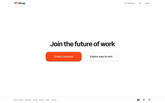
Preview image. Unlock full-res
Clean, bold, and energetic.
Color palette
Orange wash for highlight backgrounds, decorative bands, and soft emphasis behind content. Do not promote it to the primary CTA color
Orange outline accent for tags, dividers, and focused UI edges. Do not promote it to the primary CTA color
Page backgrounds, elevated card surfaces, main content areas
Primary text, prominent headings, borders on dark elements
Secondary text, muted links, subtle icon fills
Disabled states, helper text, less prominent button text
Hairline borders, subtle dividers, ghost button outlines
Subtle decorative borders, minor shadow outlines
Dark mode card backgrounds, specific elevated elements
Typography
- Weights
- 700
- Sizes
- 56px, 128px
- Line height
- 1
- Letter spacing
- -0.0300em
- Fallback
- Arial Black, sans-serif
Hero headlines, impactful display text — high-impact, tight tracking at large sizes provides a bold, modern voice.
- Weights
- 400, 500, 600, 700
- Sizes
- 13px, 14px, 16px, 20px
- Line height
- 1.4, 1.43, 1.5
- Letter spacing
- -0.0160em, -0.0140em, -0.0130em, -0.0110em, -0.0090em, -0.0060em
- Fallback
- system-ui, sans-serif
Body copy, navigation links, button text, secondary headings — provides a readable, versatile sans-serif base with varied tracking for specific type sizes.
- Weights
- 500, 600
- Sizes
- 12px, 13px, 14px, 16px
- Line height
- 1.5, 1.7
- Letter spacing
- normal
- Fallback
- SF Mono, Menlo, monospace
Code snippets, technical details, specific button labels — imparts a precise, technical feel where clarity of characters is paramount.
Spacing & shape
Elevation
Components
Filled with Whop Orange (#fa4616), white text (#ffffff) set in Inter weight 600, with 8px border radius and a distinct Orange Shadow (#b62600) for a confident, tangible feel.
Transparent background, Dark Graphite (#202020) text in Inter weight 500, with 8px border radius and a 1px Border Silver (#bbbbbb) outline. Used for less prominent actions.
Subtle button with transparent background, Light Gray (#838383) text in Inter weight 500 typically at 14px, with 8px border-radius and horizontal padding like 12px.
Cards with Canvas White (#ffffff) background, 24px border radius. Used for containing content and typically has 24px internal padding. Some variants might have a Dark Surface (#0a0a0a) background with 12px radius.
A variant card with rgba(0, 0, 0, 0.06) background (effectively a very light gray), 24px border radius. Often used for subtle visual separation of content blocks.
Guidelines
- Prioritize acidGroteskFont for any headline larger than 48px, always with letter-spacing -0.0300em and `Dark Graphite` text.
- Use `Whop Orange` (#fa4616) exclusively for primary interactive elements, brand iconography, and meaningful accents, never for decorative backgrounds.
- Apply an 8px border-radius consistently to all buttons, input fields, and small interactive elements.
- Maintain a clear visual hierarchy by limiting shadows primarily to the `Orange Shadow` (#b62600) on buttons, avoiding complex elevation stacks.
- Employ `Geist Mono` for all code-style text, ensuring fixed width and 1.5 lineHeight.
- Ensure `Canvas White` (#ffffff) is the dominant page background, reserving `Dark Surface` (#0a0a0a) for specific, clearly delineated card or container elements.
- Utilize 24px as a standard vertical and horizontal gap between major content sections and card grids.
- Do not deviate from the specified type scale and letter spacing values for headlines; the tight tracking is a signature element.
- Avoid using multiple chromatic colors; `Whop Orange` is the sole brand accent and color should primarily be achromatic.
- Do not apply drop shadows to elements other than the Primary Action Button, as distinct elevation is kept minimal.
- Never use arbitrary gray shades; adhere strictly to `Dark Graphite`, `Medium Gray`, `Light Gray`, and `Border Silver` for all neutral text and border needs.
- Do not create rounded corners on cards that are not either 24px or 12px, as these are the established card radius values.
- Avoid background patterns or gradients unless they are an integral part of explicit primary calls-to-action and aligned with `Whop Orange`.
- Do not use `Whop Orange` text on `Canvas White` for body copy, as it is reserved for higher-impact accents.
About this system
ShowHide
Whop presents a confident, high-contrast digital canvas with a striking orange accent. Typography is central, using large, tightly tracked sans-serif headlines for impactful statements and a comfortable mono-spaced font for technical details. Surfaces are predominantly white, creating a crisp backdrop for the energetic primary orange, grounded by a subtle shadow effect that adds minimal depth. Interactivity is clearly defined through the bold orange for primary actions and soft, rounded ghost buttons for secondary choices, balancing directness with approachability.
The page maintains a centered, max-width layout, approximately 1200px wide, framed by a full-bleed `Canvas White` background, creating a spacious feel. The hero section features a prominent, centered headline with a primary call-to-action. Content sections typically alternate between full-width centered text blocks and multi-column grids, notably a 5-column layout for showcasing product categories with individual mobile app previews. Vertical rhythm is established with generous `64px` section gaps, ensuring clear separation and comfortable reading. A sticky top navigation bar provides consistent access to key links.
The site uses product screenshots of mobile apps, meticulously framed within device mockups, sometimes on slightly varied gray backgrounds. These are mainly explanatory, showcasing the core product functionality with a direct, focused approach. Iconography is minimal, primarily leveraging outlined or filled monochrome icons (`Dark Graphite` or `Medium Gray`). The design avoids lifestyle photography or abstract illustrations, opting for a functional, product-centric visual language.
Reminiscent of Stripe, Vercel, Linear, Notion.
# Whop — Style Reference
> Clean, bold, and energetic.

**Theme:** light

**Site:** https://whop.com

Whop presents a confident, high-contrast digital canvas with a striking orange accent. Typography is central, using large, tightly tracked sans-serif headlines for impactful statements and a comfortable mono-spaced font for technical details. Surfaces are predominantly white, creating a crisp backdrop for the energetic primary orange, grounded by a subtle shadow effect that adds minimal depth. Interactivity is clearly defined through the bold orange for primary actions and soft, rounded ghost buttons for secondary choices, balancing directness with approachability.

## Tokens — Colors

| Name | Value | Token | Role |
|------|------|------|------|
| Whop Orange | `#fa4616` | `--color-whop-orange` | Orange wash for highlight backgrounds, decorative bands, and soft emphasis behind content. Do not promote it to the primary CTA color |
| Orange Shadow | `#b62600` | `--color-orange-shadow` | Orange outline accent for tags, dividers, and focused UI edges. Do not promote it to the primary CTA color |
| Canvas White | `#ffffff` | `--color-canvas-white` | Page backgrounds, elevated card surfaces, main content areas |
| Dark Graphite | `#202020` | `--color-dark-graphite` | Primary text, prominent headings, borders on dark elements |
| Medium Gray | `#646464` | `--color-medium-gray` | Secondary text, muted links, subtle icon fills |
| Light Gray | `#838383` | `--color-light-gray` | Disabled states, helper text, less prominent button text |
| Border Silver | `#bbbbbb` | `--color-border-silver` | Hairline borders, subtle dividers, ghost button outlines |
| Very Light Gray | `#e1e4e8` | `--color-very-light-gray` | Subtle decorative borders, minor shadow outlines |
| Dark Surface | `#0a0a0a` | `--color-dark-surface` | Dark mode card backgrounds, specific elevated elements |

## Tokens — Typography

### acidGroteskFont
- **Substitute:** Arial Black, sans-serif
- **Weights:** 700
- **Sizes:** 56px, 128px
- **Line height:** 1
- **Letter spacing:** -0.0300em
- **Role:** Hero headlines, impactful display text — high-impact, tight tracking at large sizes provides a bold, modern voice.

### Inter
- **Substitute:** system-ui, sans-serif
- **Weights:** 400, 500, 600, 700
- **Sizes:** 13px, 14px, 16px, 20px
- **Line height:** 1.4, 1.43, 1.5
- **Letter spacing:** -0.0160em, -0.0140em, -0.0130em, -0.0110em, -0.0090em, -0.0060em
- **Role:** Body copy, navigation links, button text, secondary headings — provides a readable, versatile sans-serif base with varied tracking for specific type sizes.

### Geist Mono
- **Substitute:** SF Mono, Menlo, monospace
- **Weights:** 500, 600
- **Sizes:** 12px, 13px, 14px, 16px
- **Line height:** 1.5, 1.7
- **Letter spacing:** normal
- **Role:** Code snippets, technical details, specific button labels — imparts a precise, technical feel where clarity of characters is paramount.

## Tokens — Type Scale

| Role | Size | Line height | Letter spacing |
|------|------|------|------|
| body-lg | 16px | 1.5 | -0.013em |
| subheading | 20px | 1.4 | -0.011em |
| heading | 56px | 1 | -0.03em |
| display | 128px | 1 | -0.03em |

## Tokens — Spacing

- **Section gap:** 64px
- **Card padding:** 24px
- **Element gap:** 24px

## Tokens — Radius

- **Buttons:** 8px
- **Cards:** 24px
- **forms:** 8px
- **misc:** 16px
- **tags:** 8px

## Tokens — Elevation

- **Primary Action Button:** `rgb(182, 38, 0) 0px 3px 0px 0px`

## Layout

The page maintains a centered, max-width layout, approximately 1200px wide, framed by a full-bleed `Canvas White` background, creating a spacious feel. The hero section features a prominent, centered headline with a primary call-to-action. Content sections typically alternate between full-width centered text blocks and multi-column grids, notably a 5-column layout for showcasing product categories with individual mobile app previews. Vertical rhythm is established with generous `64px` section gaps, ensuring clear separation and comfortable reading. A sticky top navigation bar provides consistent access to key links.

## Imagery

The site uses product screenshots of mobile apps, meticulously framed within device mockups, sometimes on slightly varied gray backgrounds. These are mainly explanatory, showcasing the core product functionality with a direct, focused approach. Iconography is minimal, primarily leveraging outlined or filled monochrome icons (`Dark Graphite` or `Medium Gray`). The design avoids lifestyle photography or abstract illustrations, opting for a functional, product-centric visual language.

## Components

### Primary Action Button
*Main call-to-action*

Filled with Whop Orange (#fa4616), white text (#ffffff) set in Inter weight 600, with 8px border radius and a distinct Orange Shadow (#b62600) for a confident, tangible feel.

### Ghost Secondary Button
*Alternative action, navigation*

Transparent background, Dark Graphite (#202020) text in Inter weight 500, with 8px border radius and a 1px Border Silver (#bbbbbb) outline. Used for less prominent actions.

### Tab Button
*Category filtering, sub-navigation*

Subtle button with transparent background, Light Gray (#838383) text in Inter weight 500 typically at 14px, with 8px border-radius and horizontal padding like 12px.

### Feature Card
*Information display, product showcases*

Cards with Canvas White (#ffffff) background, 24px border radius. Used for containing content and typically has 24px internal padding. Some variants might have a Dark Surface (#0a0a0a) background with 12px radius.

### Subtle Background Card
*Grouped content section*

A variant card with rgba(0, 0, 0, 0.06) background (effectively a very light gray), 24px border radius. Often used for subtle visual separation of content blocks.

## Guidelines

### Do

- Prioritize acidGroteskFont for any headline larger than 48px, always with letter-spacing -0.0300em and `Dark Graphite` text.
- Use `Whop Orange` (#fa4616) exclusively for primary interactive elements, brand iconography, and meaningful accents, never for decorative backgrounds.
- Apply an 8px border-radius consistently to all buttons, input fields, and small interactive elements.
- Maintain a clear visual hierarchy by limiting shadows primarily to the `Orange Shadow` (#b62600) on buttons, avoiding complex elevation stacks.
- Employ `Geist Mono` for all code-style text, ensuring fixed width and 1.5 lineHeight.
- Ensure `Canvas White` (#ffffff) is the dominant page background, reserving `Dark Surface` (#0a0a0a) for specific, clearly delineated card or container elements.
- Utilize 24px as a standard vertical and horizontal gap between major content sections and card grids.

### Don't

- Do not deviate from the specified type scale and letter spacing values for headlines; the tight tracking is a signature element.
- Avoid using multiple chromatic colors; `Whop Orange` is the sole brand accent and color should primarily be achromatic.
- Do not apply drop shadows to elements other than the Primary Action Button, as distinct elevation is kept minimal.
- Never use arbitrary gray shades; adhere strictly to `Dark Graphite`, `Medium Gray`, `Light Gray`, and `Border Silver` for all neutral text and border needs.
- Do not create rounded corners on cards that are not either 24px or 12px, as these are the established card radius values.
- Avoid background patterns or gradients unless they are an integral part of explicit primary calls-to-action and aligned with `Whop Orange`.
- Do not use `Whop Orange` text on `Canvas White` for body copy, as it is reserved for higher-impact accents.

## Agent Prompt Guide

Quick Color Reference:
text: #202020
background: #ffffff
border: #bbbbbb
accent: #fa4616
primary action: no distinct CTA color

Example Component Prompts:
No distinct primary action color was observed; use the extracted neutral button treatments instead of inventing a filled CTA color.
2. Create a Hero Headline: 'Join the future of work' using `Dark Graphite` (#202020) color, acidGroteskFont weight 700 at 56px, with letter-spacing -0.0300em.
3. Create a Ghost Secondary Button: Background transparent, `Dark Graphite` (#202020) text (Inter weight 500 at 16px), 8px border radius, 1px solid `Border Silver` (#bbbbbb) outline. Text content: 'Explore ways to earn'.
4. Create a Feature Card: `Canvas White` (#ffffff) background, 24px border radius, 24px padding inside. For body text, use `Dark Graphite` (#202020) Inter weight 400 at 16px.`
More like this
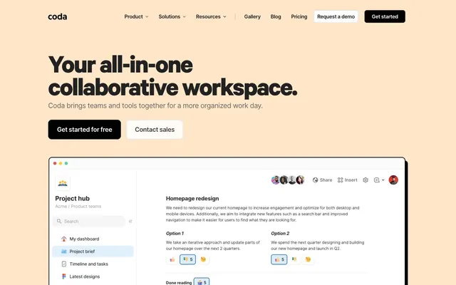







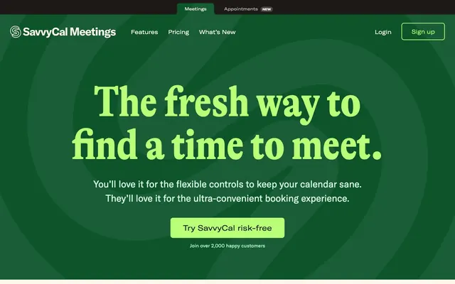

Keep what you find
A free account saves references to boards and can send you a weekly email of picks based on what you save.
To see every result, go Pro.