Preview image. Unlock full-res
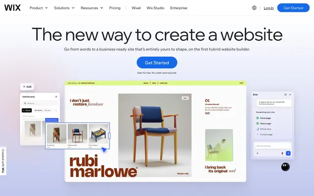
Animated digital canvas – an interactive, slightly playful yet authoritative workspace.
Color palette
Primary action buttons, prominent icons, focus indicators – the main interactive accent color
Decorative accents in headings and backgrounds, contributing to the brand's creative and digital essence
Decorative fills and borders, providing a vibrant, energetic visual counterpoint
Accent text in headlines, adding depth and a premium feel; Dynamic background for hero sections, communicating energy and innovation
Background for specific card types, indicating a distinct content category
Subtle background for specific card types, a gentle, organic accent
Distinct background for specific card types, providing warmth and earthiness
Background for specific card types, a soft, creative violet hue
Background for specific card types, a bright, playful pink accent
Decorative borders and text accents, adding a cheerful, optimistic touch
Subtle background for hero sections or elevated areas, creating a soft, ethereal atmosphere
Background for informational or immersive content blocks
Background for feature highlights, softening the UI with a playful tone
Primary text, icon fill, borders for ghost components, neutral action outlines. Serves as a grounding contrast against the light canvas
Page backgrounds, default card surfaces, primary button text, input backgrounds – the dominant base layer
Subtle background surfaces for secondary sections and elevated cards, providing a soft visual break from Canvas White
Divider lines, subtle borders, disabled states, and muted interface elements
Secondary text, subheadings, providing a slightly softer yet highly readable alternative to Midnight Ink
Blue state accent for badges, validation surfaces, and short status labels. Do not promote it to the primary CTA color
Typography
- Weights
- 400
- Sizes
- 10px, 13px, 14px, 16px, 21px, 24px, 31px, 48px, 82px, 89px, 104px, 184px
- Line height
- 0.85, 1, 1.1, 1.2, 1.3, 1.4, 1.48, 1.5, 1.6
- Letter spacing
- -0.03, -0.02, -0.01
- Fallback
- Arial
Headlines and prominent display text. Its range of oversized sizes and tight tracking creates a bold, modern voice.
- Weights
- 400, 500
- Sizes
- 20px, 21px, 53px
- Line height
- 1, 1.1, 1.2
- Letter spacing
- normal
- Fallback
- Arial
Main display headings, offering a slightly refined take on the primary display font with additional weight options.
- Weights
- 400
- Sizes
- 10px, 13px, 14px, 15px, 16px, 18px, 21px, 25px
- Line height
- 1, 1.2, 1.29, 1.3, 1.5, 1.6, 1.71
- Letter spacing
- -0.01
- Fallback
- Arial
Body text and functional interface elements, ensuring readability at smaller sizes with minimal tracking.
- Weights
- 400
- Sizes
- 15px, 21px
- Line height
- 1.3, 1.35, 1.5
- Letter spacing
- normal
- Fallback
- Arial
Supplementary body text and longer-form content, optimized for reading comfort.
- Weights
- 400
- Sizes
- 12px, 14px, 15px, 16px, 18px, 20px, 21px, 23px, 24px
- Line height
- 1.1, 1.2, 1.3, 1.5, 1.6, 1.71
- Letter spacing
- -0.01
- Fallback
- Arial
Highlighting key information within body text and navigation elements. The subtle weight increase provides emphasis without shouting.
- Weights
- 400
- Sizes
- 15px
- Line height
- 1.6
- Letter spacing
- normal
- Fallback
- Arial
Emphasized body text details, providing direct highlights.
- Weights
- 400
- Sizes
- 10px, 13px
- Line height
- 1.2
- Letter spacing
- normal
- Fallback
- sans-serif
System fallback and micro-text, used for elements like timestamps or metadata where a simple, universal font is preferred.
Spacing & shape
Elevation
Components
Filled with Sky Blue (#166aea), white text (#ffffff), and a 50px border-radius. Padding is 0px top/bottom, 12px horizontal from text edges. Uses madefor-display-v2 at 16px.
Transparent background, Midnight Ink (#000000) text, no border or padding visible in data. Uses Arial at 13px.
Filled with Midnight Ink (#000000), white text (#ffffff), and a 50px border-radius. Padding is 0px top/bottom, 10px right, 36px left. Uses madefor-display at 16px.
Transparent background, no shadow, 0px border-radius. No explicit padding detected by default, content dictates spacing.
Transparent background, no shadow, 20px border-radius. No explicit padding detected by default. Often features soft background fills like Cloud Gray (#f1f5f9) or accent colors.
White background, with a subtle dark shadow: `rgba(0, 0, 0, 0.1) 0px -1px 0px 0px`. Contains navigation links and primary actions. Heights vary.
White background (#ffffff), Midnight Ink (#000000) text, Info Blue (#538ab6) border on focus. 999px border-radius creates a pill shape. Padding is 3px top/bottom.
Guidelines
- Prioritize Canvas White (#ffffff) for primary backgrounds and Cloud Gray (#f1f5f9) for secondary content sections, ensuring a bright, spacious feel.
- Use Sky Blue (#166aea) exclusively for primary interactive elements, reserving it for clear calls to action and active states.
- Apply 50px border-radius to all buttons and tags, creating a consistent, friendly pill shape.
- Employ madefor-display for all headlines, utilizing its generous sizes and tight letter-spacing for impact.
- Maintain a comfortable rhythm with an 81px section gap, creating clear visual separation between content blocks.
- Use subtle borders and dividers with Silver Mist (#d0d0d0) to structure content without adding visual weight.
- Infuse dynamism into hero sections with gradient backgrounds like Sky Gradient (#bdc5ec) or Electric Gradient (#2c34af) for visual interest.
- Avoid using Midnight Ink (#000000) as a solid background fill for large sections; its primary role is text and sparse borders.
- Refrain from using Sky Blue (#166aea) for purely decorative purposes; it's reserved for functional interactions.
- Do not deviate from the established 20px radius for cards and images, as it's a signature element of the design language.
- Avoid excessive letter-spacing on display fonts; madefor-display benefits from its naturally tight tracking.
- Do not introduce strong, opaque shadows for elevation, as the system relies on subtle, tinted shadows or no shadows at all for depth.
- Do not use generic system fonts for branding or display text, as the custom madefor family is key to visual identity.
- Avoid overly complex nested layouts; prefer clear sectioning with alternating backgrounds and distinct component areas.
About this system
ShowHide
Wix.com's system is a canvas of light, subtly animated surfaces, where interactive elements pulse with a vivid blue. The visual style balances a strong, opinionated display typography with more conventional body text for clarity. Cards and interactive components feature generous rounded corners, giving the interface a friendly, approachable feel, while the dominant white background is punctuated by soft, pastel-toned background fills and gradients.
The page primarily uses a max-width contained model for content, though the hero sections often go full-bleed with gradients or background patterns. The hero pattern frequently features a centered headline over a background that can be either white, a soft gradient, or a dynamic electric gradient. Sections alternate between standard white backgrounds and Cloud Gray (#f1f5f9) bands, creating a clear vertical rhythm. Content arrangement frequently uses a 2-column text+image pattern or centered stacks, with features often presented in multi-column card grids. Navigation is a sticky top bar with global links and primary actions, retaining visibility while scrolling.
The site predominantly uses product screenshots and abstract graphics. Product screenshots are typically contained within cards, often with rounded corners (20px radius) and sometimes featuring a subtle drop-shadow (rgba(50, 48, 126, 0.28) 5.04px 6.48px 15.84px) that visually lifts them from the surface. Illustrations are geometric and often leverage brand accent colors like Lime Zest and Deep Violet. Icons are typically filled with Midnight Ink or Sky Blue, sometimes outlined. Imagery plays an explanatory and product-showcase role, rather than purely decorative, creating a moderately image-heavy but content-dominant density across sections.
Reminiscent of Figma, Webflow, Notion, Canva.
# wix.com — Style Reference
> Animated digital canvas – an interactive, slightly playful yet authoritative workspace.

**Theme:** light

**Site:** https://www.wix.com

Wix.com's system is a canvas of light, subtly animated surfaces, where interactive elements pulse with a vivid blue. The visual style balances a strong, opinionated display typography with more conventional body text for clarity. Cards and interactive components feature generous rounded corners, giving the interface a friendly, approachable feel, while the dominant white background is punctuated by soft, pastel-toned background fills and gradients.

## Tokens — Colors

| Name | Value | Token | Role |
|------|------|------|------|
| Sky Blue | `#166aea` | `--color-sky-blue` | Primary action buttons, prominent icons, focus indicators – the main interactive accent color |
| Deep Violet | `#101585` | `--color-deep-violet` | Decorative accents in headings and backgrounds, contributing to the brand's creative and digital essence |
| Lime Zest | `#dff994` | `--color-lime-zest` | Decorative fills and borders, providing a vibrant, energetic visual counterpoint |
| Twilight Indigo | `#2c34af` | `--color-twilight-indigo` | Accent text in headlines, adding depth and a premium feel; Dynamic background for hero sections, communicating energy and innovation |
| Ocean Teal | `#024051` | `--color-ocean-teal` | Background for specific card types, indicating a distinct content category |
| Pale Sage | `#d1e6d1` | `--color-pale-sage` | Subtle background for specific card types, a gentle, organic accent |
| Terracotta | `#863a29` | `--color-terracotta` | Distinct background for specific card types, providing warmth and earthiness |
| Amethyst | `#bea3e7` | `--color-amethyst` | Background for specific card types, a soft, creative violet hue |
| Cerise Glow | `#ffc2fe` | `--color-cerise-glow` | Background for specific card types, a bright, playful pink accent |
| Sunflower Yellow | `#fdf4a1` | `--color-sunflower-yellow` | Decorative borders and text accents, adding a cheerful, optimistic touch |
| Sky Gradient | `#bdc5ec` | `--color-sky-gradient` | Subtle background for hero sections or elevated areas, creating a soft, ethereal atmosphere |
| Deep Sea Gradient | `#095b71` | `--color-deep-sea-gradient` | Background for informational or immersive content blocks |
| Lavender Gradient | `#8f69ff` | `--color-lavender-gradient` | Background for feature highlights, softening the UI with a playful tone |
| Midnight Ink | `#000000` | `--color-midnight-ink` | Primary text, icon fill, borders for ghost components, neutral action outlines. Serves as a grounding contrast against the light canvas |
| Canvas White | `#ffffff` | `--color-canvas-white` | Page backgrounds, default card surfaces, primary button text, input backgrounds – the dominant base layer |
| Cloud Gray | `#f1f5f9` | `--color-cloud-gray` | Subtle background surfaces for secondary sections and elevated cards, providing a soft visual break from Canvas White |
| Silver Mist | `#d0d0d0` | `--color-silver-mist` | Divider lines, subtle borders, disabled states, and muted interface elements |
| Steel Blue | `#1c1d21` | `--color-steel-blue` | Secondary text, subheadings, providing a slightly softer yet highly readable alternative to Midnight Ink |
| Info Blue | `#538ab6` | `--color-info-blue` | Blue state accent for badges, validation surfaces, and short status labels. Do not promote it to the primary CTA color |

## Tokens — Typography

### madefor-display
- **Substitute:** Arial
- **Weights:** 400
- **Sizes:** 10px, 13px, 14px, 16px, 21px, 24px, 31px, 48px, 82px, 89px, 104px, 184px
- **Line height:** 0.85, 1, 1.1, 1.2, 1.3, 1.4, 1.48, 1.5, 1.6
- **Letter spacing:** -0.03, -0.02, -0.01
- **Role:** Headlines and prominent display text. Its range of oversized sizes and tight tracking creates a bold, modern voice.

### wix-madefor-display-v2
- **Substitute:** Arial
- **Weights:** 400, 500
- **Sizes:** 20px, 21px, 53px
- **Line height:** 1, 1.1, 1.2
- **Letter spacing:** normal
- **Role:** Main display headings, offering a slightly refined take on the primary display font with additional weight options.

### madefor-text
- **Substitute:** Arial
- **Weights:** 400
- **Sizes:** 10px, 13px, 14px, 15px, 16px, 18px, 21px, 25px
- **Line height:** 1, 1.2, 1.29, 1.3, 1.5, 1.6, 1.71
- **Letter spacing:** -0.01
- **Role:** Body text and functional interface elements, ensuring readability at smaller sizes with minimal tracking.

### wix-madefor-text-v2
- **Substitute:** Arial
- **Weights:** 400
- **Sizes:** 15px, 21px
- **Line height:** 1.3, 1.35, 1.5
- **Letter spacing:** normal
- **Role:** Supplementary body text and longer-form content, optimized for reading comfort.

### madefor-text-mediumbold
- **Substitute:** Arial
- **Weights:** 400
- **Sizes:** 12px, 14px, 15px, 16px, 18px, 20px, 21px, 23px, 24px
- **Line height:** 1.1, 1.2, 1.3, 1.5, 1.6, 1.71
- **Letter spacing:** -0.01
- **Role:** Highlighting key information within body text and navigation elements. The subtle weight increase provides emphasis without shouting.

### madefor-text-bold
- **Substitute:** Arial
- **Weights:** 400
- **Sizes:** 15px
- **Line height:** 1.6
- **Letter spacing:** normal
- **Role:** Emphasized body text details, providing direct highlights.

### Arial
- **Substitute:** sans-serif
- **Weights:** 400
- **Sizes:** 10px, 13px
- **Line height:** 1.2
- **Letter spacing:** normal
- **Role:** System fallback and micro-text, used for elements like timestamps or metadata where a simple, universal font is preferred.

## Tokens — Type Scale

| Role | Size | Line height | Letter spacing |
|------|------|------|------|
| caption | 10px | 1.2 | — |
| subheading | 21px | 1.2 | -0.21px |
| heading-sm | 31px | 1.3 | — |
| heading | 48px | 1.2 | -1.44px |
| heading-lg | 82px | 1.1 | -1.64px |
| display | 184px | 0.85 | -5.52px |

## Tokens — Spacing

- **Section gap:** 81px
- **Card padding:** 12px
- **Element gap:** 12px

## Tokens — Radius

- **Buttons:** 50px
- **Inputs:** 999px
- **Cards:** 20px
- **Images:** 20px
- **tags:** 50px

## Tokens — Elevation

- **Navigation Bar:** `rgba(0, 0, 0, 0.1) 0px -1px 0px 0px`

## Layout

The page primarily uses a max-width contained model for content, though the hero sections often go full-bleed with gradients or background patterns. The hero pattern frequently features a centered headline over a background that can be either white, a soft gradient, or a dynamic electric gradient. Sections alternate between standard white backgrounds and Cloud Gray (#f1f5f9) bands, creating a clear vertical rhythm. Content arrangement frequently uses a 2-column text+image pattern or centered stacks, with features often presented in multi-column card grids. Navigation is a sticky top bar with global links and primary actions, retaining visibility while scrolling.

## Imagery

The site predominantly uses product screenshots and abstract graphics. Product screenshots are typically contained within cards, often with rounded corners (20px radius) and sometimes featuring a subtle drop-shadow (rgba(50, 48, 126, 0.28) 5.04px 6.48px 15.84px) that visually lifts them from the surface. Illustrations are geometric and often leverage brand accent colors like Lime Zest and Deep Violet. Icons are typically filled with Midnight Ink or Sky Blue, sometimes outlined. Imagery plays an explanatory and product-showcase role, rather than purely decorative, creating a moderately image-heavy but content-dominant density across sections.

## Components

### Primary Filled Button
*Call to action, primary interaction*

Filled with Sky Blue (#166aea), white text (#ffffff), and a 50px border-radius. Padding is 0px top/bottom, 12px horizontal from text edges. Uses madefor-display-v2 at 16px.

### Ghost Button
*Secondary action, navigation*

Transparent background, Midnight Ink (#000000) text, no border or padding visible in data. Uses Arial at 13px.

### Black Rounded Button
*Alternative call to action, often accentuating a dark background.*

Filled with Midnight Ink (#000000), white text (#ffffff), and a 50px border-radius. Padding is 0px top/bottom, 10px right, 36px left. Uses madefor-display at 16px.

### Square Corner Card
*Content container, information display*

Transparent background, no shadow, 0px border-radius. No explicit padding detected by default, content dictates spacing.

### Rounded Corner Card
*Elevated content container, featured information*

Transparent background, no shadow, 20px border-radius. No explicit padding detected by default. Often features soft background fills like Cloud Gray (#f1f5f9) or accent colors.

### Shadowed Navigation Bar
*Global navigation header*

White background, with a subtle dark shadow: `rgba(0, 0, 0, 0.1) 0px -1px 0px 0px`. Contains navigation links and primary actions. Heights vary.

### Rounded Input Field
*User data entry*

White background (#ffffff), Midnight Ink (#000000) text, Info Blue (#538ab6) border on focus. 999px border-radius creates a pill shape. Padding is 3px top/bottom.

## Guidelines

### Do

- Prioritize Canvas White (#ffffff) for primary backgrounds and Cloud Gray (#f1f5f9) for secondary content sections, ensuring a bright, spacious feel.
- Use Sky Blue (#166aea) exclusively for primary interactive elements, reserving it for clear calls to action and active states.
- Apply 50px border-radius to all buttons and tags, creating a consistent, friendly pill shape.
- Employ madefor-display for all headlines, utilizing its generous sizes and tight letter-spacing for impact.
- Maintain a comfortable rhythm with an 81px section gap, creating clear visual separation between content blocks.
- Use subtle borders and dividers with Silver Mist (#d0d0d0) to structure content without adding visual weight.
- Infuse dynamism into hero sections with gradient backgrounds like Sky Gradient (#bdc5ec) or Electric Gradient (#2c34af) for visual interest.

### Don't

- Avoid using Midnight Ink (#000000) as a solid background fill for large sections; its primary role is text and sparse borders.
- Refrain from using Sky Blue (#166aea) for purely decorative purposes; it's reserved for functional interactions.
- Do not deviate from the established 20px radius for cards and images, as it's a signature element of the design language.
- Avoid excessive letter-spacing on display fonts; madefor-display benefits from its naturally tight tracking.
- Do not introduce strong, opaque shadows for elevation, as the system relies on subtle, tinted shadows or no shadows at all for depth.
- Do not use generic system fonts for branding or display text, as the custom madefor family is key to visual identity.
- Avoid overly complex nested layouts; prefer clear sectioning with alternating backgrounds and distinct component areas.

## Agent Prompt Guide

Quick Color Reference:
text: #000000
background: #ffffff
border: #d0d0d0
accent: #dff994
primary action: #000000 (filled action)

Example Component Prompts:
1. Create a Primary Action Button: #000000 background, #ffffff text, 9999px radius, compact pill padding. Use this filled treatment for the main CTA.
2. Design a feature card: Cloud Gray (#f1f5f9) background, 20px border-radius, with an Ocean Teal (#024051) accent bar at the top (use as background color). Place a subheading 'Intuitive Design Tools' using madefor-text-mediumbold at 21px, weight 400, in Steel Blue (#1c1d21). Follow with body text in madefor-text at 16px, weight 400, in Midnight Ink (#000000).
3. Generate a form section with a Rounded Input Field for 'Email Address'. The input should have a white background (#ffffff), Midnight Ink (#000000) text at 16px madefor-text, 999px border-radius, and an Info Blue (#538ab6) border on focus. Below the input, add a Ghost Button 'Learn More' using Midnight Ink (#000000) for text.
More like this









Keep what you find
A free account saves references to boards and can send you a weekly email of picks based on what you save.
To see every result, go Pro.